
Emmanuel Ajayi
Shopify E-commerce Manager | Website Design, SEO Specialist
- 4
- Followers


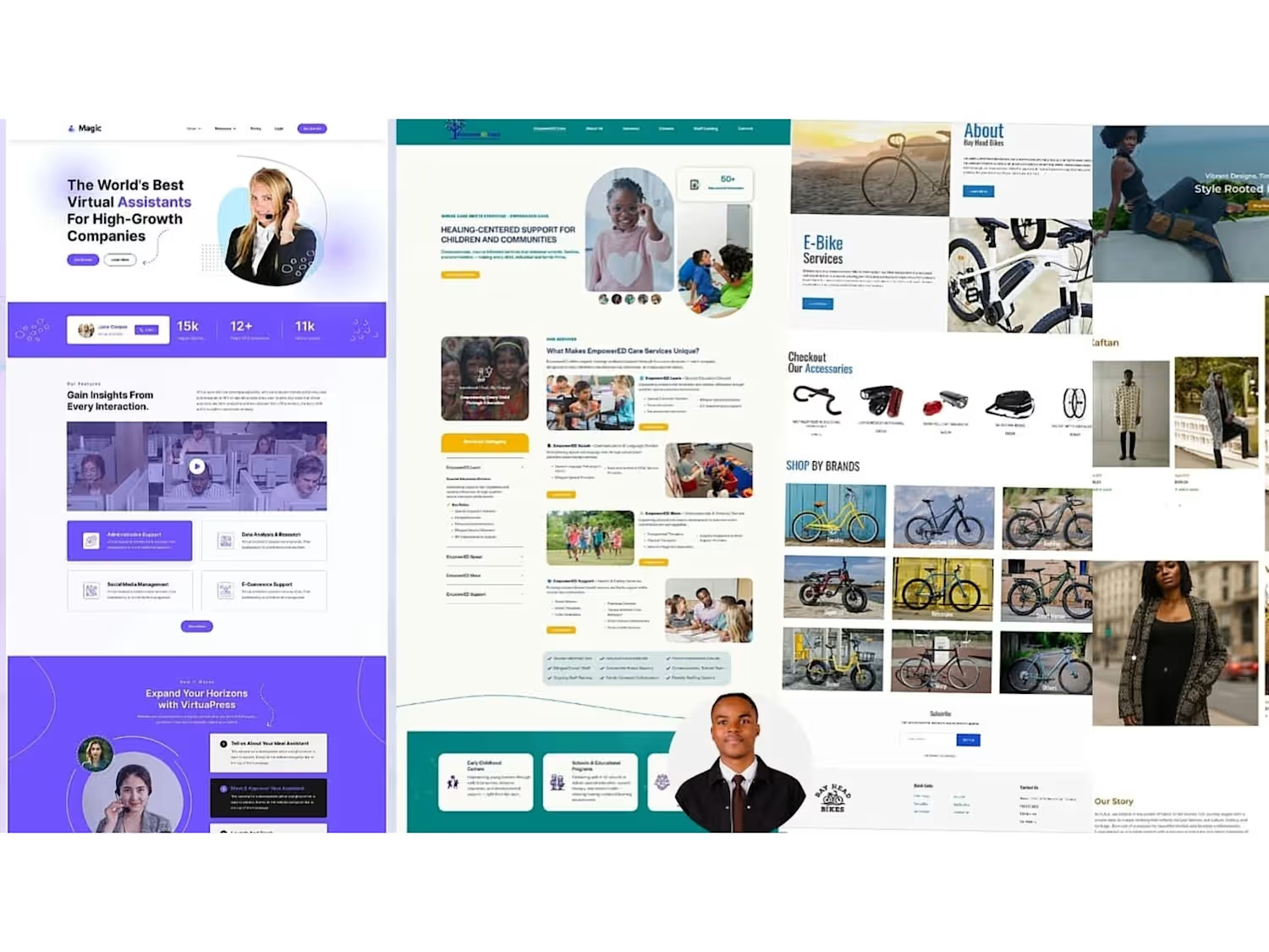
FUFUA Collections - Luxury Afro-global Fashion E-commerce Website
Role: E-commerce Designer & Developer | UI/UX | Fashion Branding | Shopify.
FUFUA Collections is a luxury Afro-global fashion brand rooted in indigenous African fabrics, blending traditional artistry with contemporary design.
The Problem:
They had powerful culture - handcrafted textiles, tribal art, heritage stories - but their old store looked generic and didn't convey luxury or cultural depth. Needed a site that feels like high fashion, not fast fashion, while honoring African roots and driving global sales.
What I Did:
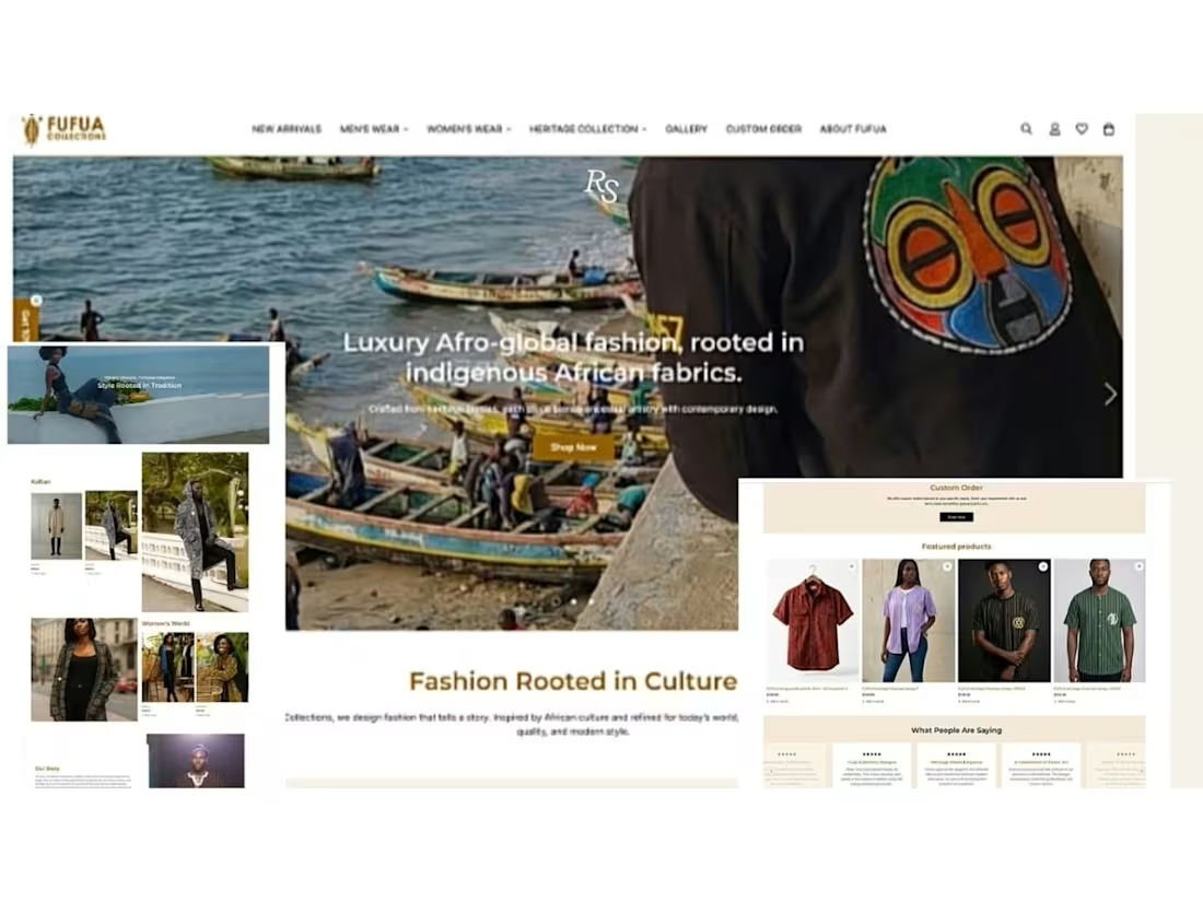
Designed iconic hero: "Luxury Afro-global fashion, rooted in indigenous African fabrics" overlaid on authentic fishing boats scene + close-up of embroidered tribal mask shirt (black jacket with colorful Yoruba-inspired face) - instant culture + luxury
Built complete e-commerce navigation: New Arrivals, Men's Wear, Women's Wear, Heritage Collection, Gallery, Custom Order, About FUFUA - structured for discovery
Developed collection showcases: Kaftan, Men's Heritage looks (patterned agbada / hooded kaftan), Women's World (Ankara blazers, prints), Style Rooted in Tradition editorial
Added conversion features: Custom Order section for bespoke tailoring, Featured Products (4 products - red vintage shirt, lilac stripes, black heritage stripe, green pinstripe) with quick view
Integrated trust: "What People Are Saying" 5-star testimonials, Our Story heritage narrative
Fully responsive, SEO-optimized, optimized for lookbook photography, fast loading for global audience
Result:
Luxury fashion e-commerce that feels like Burberry meets Africa. Turns cultural heritage into high-value fashion brand. Clear shop by gender, heritage collection for storytelling, custom orders for premium clients. Designed to sell indigenous luxury to Afro-global audience in diaspora and home.
Tools Used:
Figma, Shopify /Fashion E-commerce UI/UX, Lookbook Design, Afro-luxury Branding, Responsive Design.
1
96
Bistro & Parker's - Restaurant, Food Menu & Takeout Ordering Website
Role: Web Designer & Developer | UI/UX | Restaurant Website | Webflow.
Parker's Bistro is a premium dine-in and takeout restaurant that needed a mouth-watering, conversion-focused website to turn hungry visitors into orders.
The Problem:
Old site didn't showcase food quality. No clear menu structure, no separation between dine-in vs. takeout, no chef story, no customer testimonials. Losing orders to delivery apps.
What I Did:
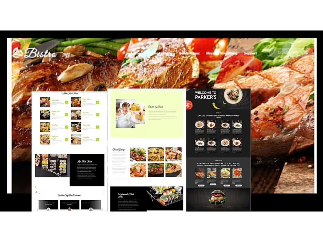
Designed craving-inducing hero: Diagonal steak, salmon & green beans montage with "Bistro" branding - instant appetite appeal
Built dual-concept layout: Light "Bistro" version + Dark "Welcome to Parker's" version for day/night menu feel
Created structured food menus: Skilled Food Menu with 8 dishes, Featured Dishes & Top-Rated Items (8 dishes), Most Popular Takeout Options (4 dishes) - each with image, price, add-to-cart
Added storytelling sections: "Baked by Food" with chef profile (female chef with cakes), "Life Roll Food" sushi story, "Food Gallery" 6-image grid, "Restaurant Food Idea"
Included social proof: "What Say Our Customer?" testimonials
Designed for conversions: Dine In vs. Dine Out sections - "Perfect for enjoying at home or on the go", clear burger CTA footer - "The best burger of the place"
Used black and lime accent for premium steakhouse feel, contrasted with white/light green for fresh bakery
Fully responsive, SEO-optimized, fast loading, optimized for food photography
Result:
Restaurant website that makes you hungry instantly. Clear separation of dine-in experience vs. takeout convenience, builds trust with chef story and gallery, drives direct orders instead of third-party commissions.
Tools Used:
Figma, WordPress, Elementor, Restaurant UI, Food Menu Design, Responsive Design, UI/UX.
0
66
Rootborn - Eco-Friendly Kitchen & Dining Essentials E-commerce Store
Role: E-commerce Designer & Developer | UI/UX | Shopify |
Rootborn is a premium eco-friendly kitchen and wellness brand selling organic cookware, dining, and healthy living essentials.
The Problem:
They were selling sustainable, high-quality copper, wood, and steel products but their old store looked like a generic dropship shop. No premium feel, no wellness story, low conversion on high-ticket items. Needed luxury organic aesthetic to justify premium pricing.
What I Did:
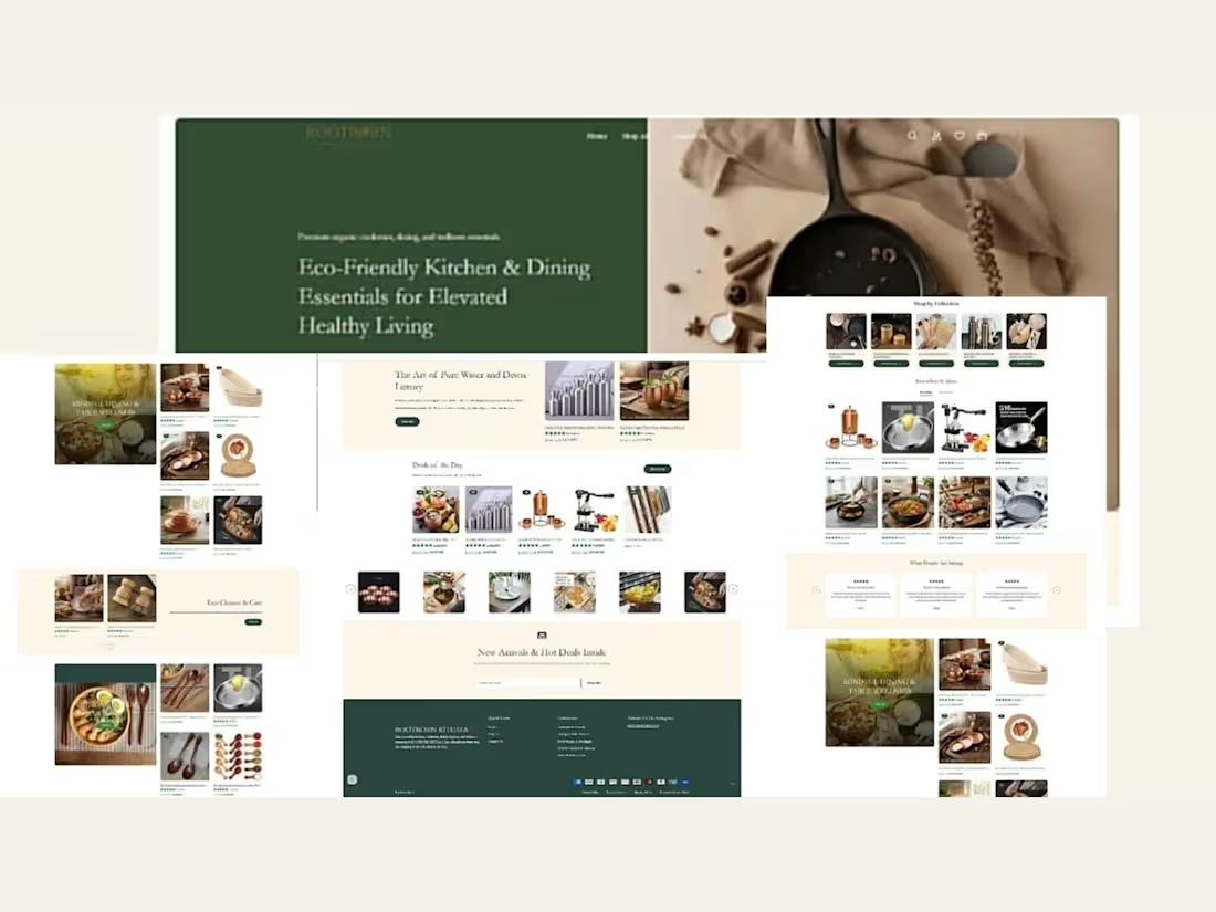
Designed luxury hero: "Eco-Friendly Kitchen & Dining Essentials for Elevated Healthy Living" with dark green #25412D for natural trust + cast iron pan editorial shot
Built conversion-focused e-commerce structure: Shop by Collection (5 categories), Bestsellers & More with star ratings
Created storytelling sections: "Mindful Dining & Table Wellness", "The Art of Pure Water and Detox Luxury", "Eco Cleaner & Care"
Added urgency + curation: Deals of the Day, New Arrivals & Hot Deals Inside with email capture
Integrated trust: What People Are Saying with 5-star testimonials, product ratings on every item
Showcased diverse catalog: Copper water bottles, Moscow mule mugs, juicers, cast iron, wooden spoons, bamboo essentials, ceramic cookware
Used warm cream #F4F1E8 background for organic, handcrafted feel, paired with premium green footer
Fully responsive, SEO-optimized, fast loading - optimized for high SKU count
Result:
Luxury eco e-commerce store that feels like Whole Foods meets Anthropologie. Turns wellness-conscious shoppers into high-value customers. Clear collections, strong social proof, mindful messaging that sells elevated healthy living, not just products.
Tools Used:
Figma, Shopify, E-commerce UI/UX, Responsive Design, Wellness Branding.
0
47
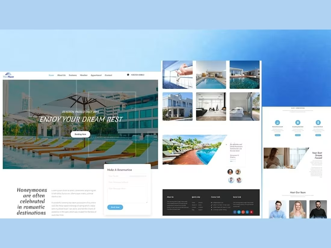
The Place - Luxury Resort & Dream Rest Booking Website
The Place is a high-end resort and apartment booking platform that needed a premium, vacation-focused website to convert dreamers into bookers.
The Problem:
Their old site felt cluttered and didn't convey luxury. Booking was confusing, honeymoon/romantic appeal was missing, and property gallery was buried. Losing bookings to Airbnb and http://Booking.com.
What I Did:
Designed luxury hero: "ENJOY YOUR DREAM REST - Season Passed Only 209$" with poolside loungers, clear "Booking Now" CTA
Created trust-building sections: "Honeymoons are often celebrated in romantic destinations" with storytelling copy
Built functional reservation block: "Make A Reservation" form with Name, Email, Subject, Message, Book Now button
Developed immersive gallery: 6-image grid showing pool, villa exterior, luxury interiors, bedroom - plus panoramic pool view
Added features: Natural Environment, Everything Book Pack, Luxury Hotel Book with iconography
Included social proof: Testimonials with star ratings + Meet Our Team (3 members)
Structured footer: About Us, Quick Links, Contact Info, Social Links for trust
Used soft blue gradient for calm, luxury resort feel
Fully responsive, fast loading, SEO-optimized
Result:
Premium resort website that feels like a vacation. Easy to browse properties, easy to book, builds trust with real team and testimonials. Designed to increase direct bookings vs. third-party platforms.
Tools Used:
Figma, Webflow, Elementor, Hotel Booking UI, Responsive Design, UI/UX.
0
36