
Emma Breer
A creative devoted to writing and digital media.
- 4
- Followers


This video appeared on my writer's Instagram account as a promotion for my manuscript, Perfect, which is entering the publication phase as it gets sent out to different places.The purple background represents the theme of the story, domestic assault, a color associated with the tragic issue. The images in the beginning of perfect grades, scholarship winnings, and acceptances play towards another part of the story where Kayla Meyers, the protagonist, was labeled perfect because of her immense intellect. The image at the end is a graphic designed as a potential cover idea when the book is published.
1
6
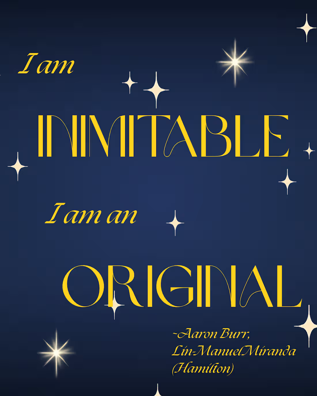
The image pulls a quote from the musical, "Hamilton". This quote is framed specifically to address topics of creativity and uniqueness. The color scheme is used more for complimentary decision for the visual benefit of the audience. The blue, though, was selected because the uniform Aaron Burr wears when saying this quote is blue (not the same shade, but still blue). The graphics of stars were implemented because, often, it's a visual representation of special, unique, or one-of-a-kind. The brighter stars are seen next to the words of focus, "Inimitable" and "Original".
1
13
This video was used on my writer's instagram account to introduce myself on the new account. The timing between each word appearing and disappearing varied based on how long it may take the viewer to read the statement; shorter statements absorbed less time, longer statements used more time. It also incorporated images of me since the video is introducing myself as owner of the account. The pictures used were chosen for specific reasons. The first one was an image used in an author bio for one of my short stories while the other three were pictures of me reading my work out loud in different settings and at different times.
1
2
55
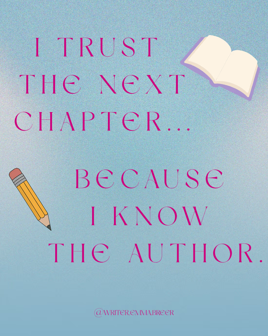
This image was posted on my writer's instagram account. The small graphics go along with the theme of the quote: writing. I also chose the color for the text because it visually complimented the background, making it easy to read. The hope was for this image to just be simple so the quote is the main focus of everything.
1
30