Elisa Bernard
Graphist artist creating abstract whimsy and modern visuals
Ready for work
Elisa is ready for their next project!
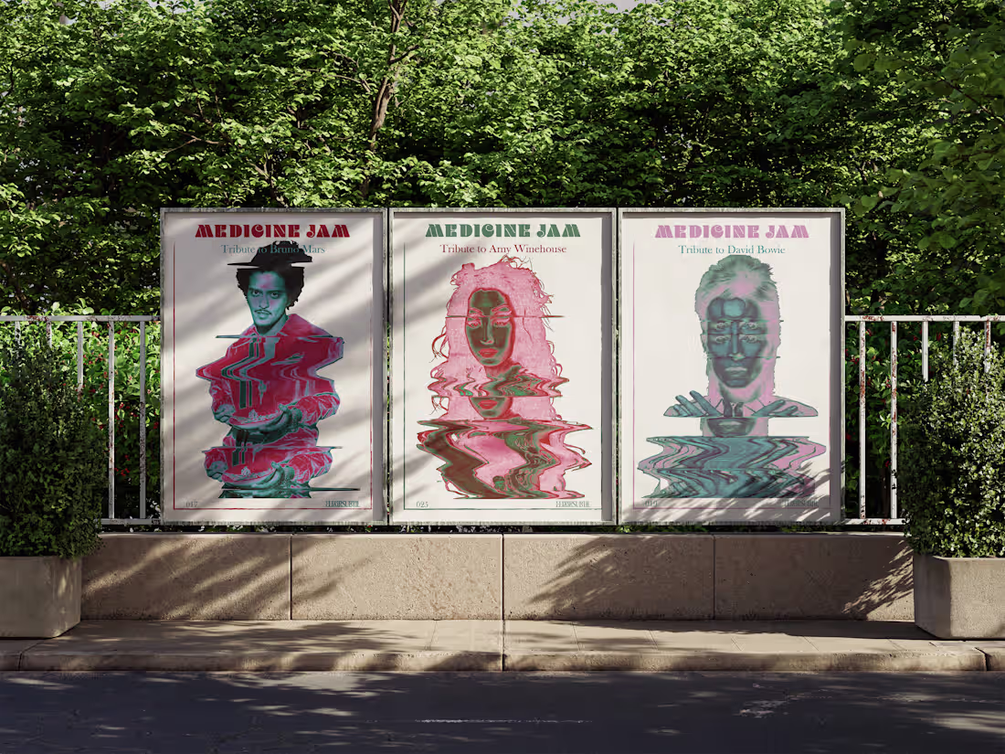
From 2023 to 2025 I created the visual identity of the Medicine Jam, with approximately 50 posters, one for each event. The concerts were tributes to well known artists. I created for them a stand alone logo based on the M with the wave echoing the scan movement of the posters.
1
1
67
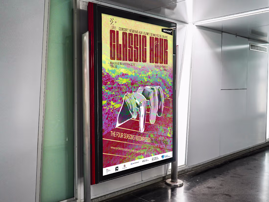
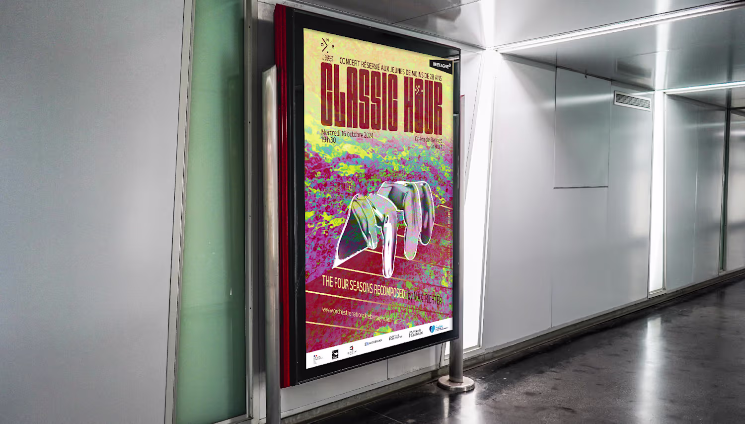
This organic and artistic poster project was made for the annual concert organised by the (french) National Britannic Orchestra 2024. The hands and line represent the musician playing. The colours take a very important part of this creation as they illustrate the theme of the concert: The four seasons recomposed by Max Richter. The blue/pink and green of the background represent the freshness of Spring, the deep red the warmth of summer, the pale yellow the decay of autumn and the cold grey hands the last phase of the cycle: winter.
0
68
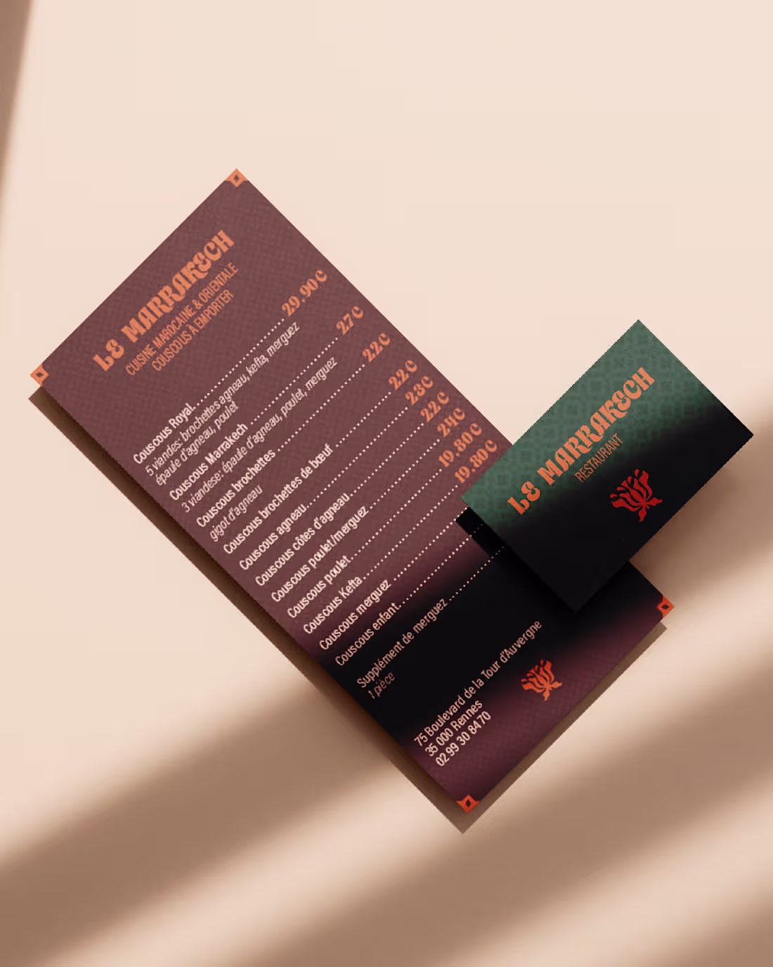
"Le Marrakech" is a rebranding project including typography, colour palette, menu and take away packaging renewal. I kept the original logo and worked on mosaic illustration to add depth to the guideline, new modern and unique typography. The new business card and prints give to this restaurant a whole new identity, high quality, traditional cuisine. As they to lots of delivery I created a take away menu and bag to expand their visuals to clients home.
1
1
86
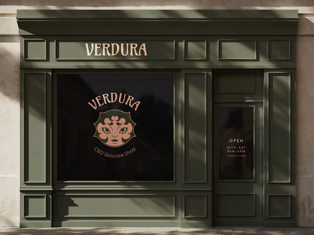
Verdura is a project around a CBD Skincare Shop, for which i created a new logo representing a bud through a cute and organic portrait mixing the idea of natural products and selfcare. The colour palette adds to this natural feels contrasting wonderfully with the calming blush pink.
1
103
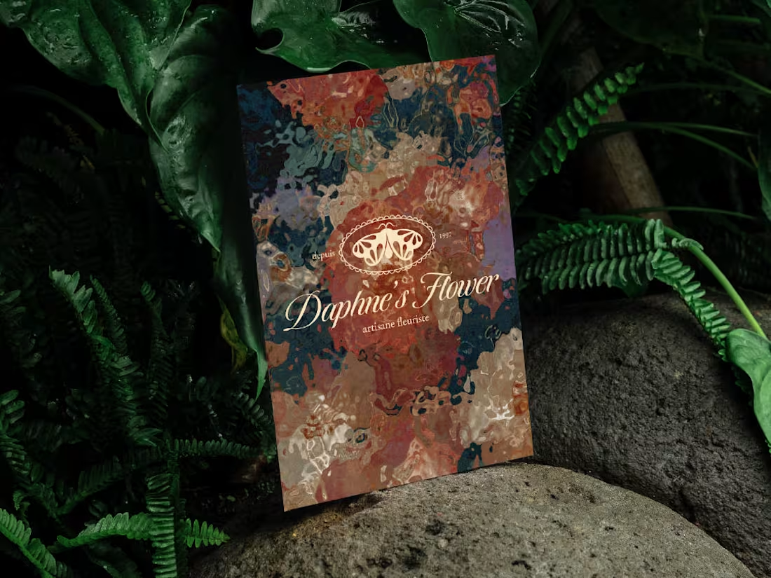
Daphne's Flower is a branding project around a florist shop. I created a logo and its variations to adapt in any situation with a deep an elegant color palette and pattern. The logo represents a butterfly (a pollinating insect) with subtle petals in its wings. The typography is also very elegant choice to match with the color palette.
0
89
This video is a trailer video for the post punk music band "Totology". I created this hand drawn lyrics animation to promote their single "Shame".
1
129
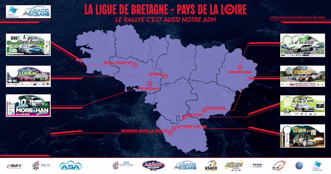
This creative proposition was made for the final rally, displaying all the cities participating from the rally brittanic league. I wanted to create something different from what is generally made in this field. This visual is more elegant, easy to read and using codes of science (lines, lisibility) to promote motor racing sports in a modern way.
2
2
115
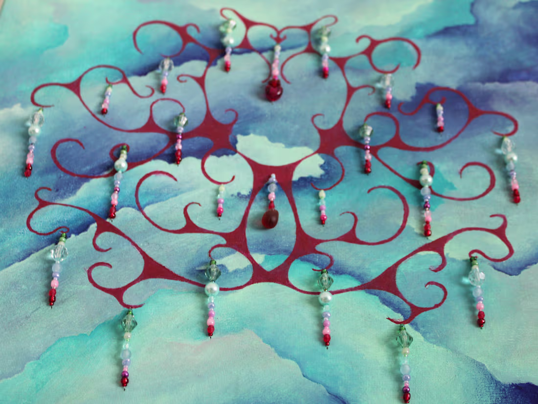
I love to create abstract paintings with a symetrical design, this one is named True Heart.
I also create hanging pearls to add depth and sparks of light to the composition.
1
101
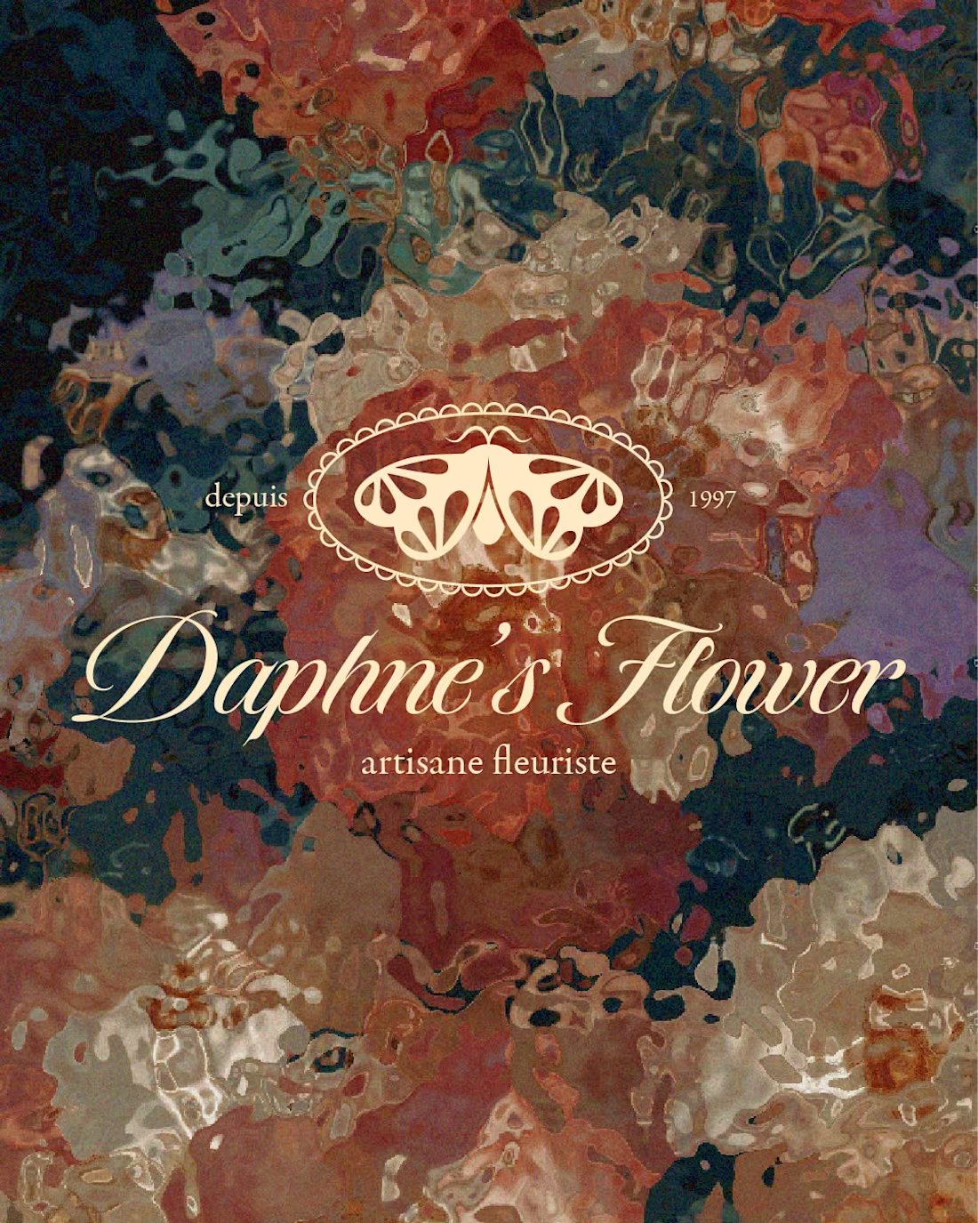
Daphne's flower, artisane fleuriste is a project for a flower shop hold by a women. I wanted to create a very elegant and unique logo mixing modern and vintage look.
The pictogram is a butterfly with petal wings, the meaning behind the choice of this pollinator insect is that they have a huge role in the growth and reproduction of plants and flowers.
13
33
274
This teaser video is an handmade animation of a walking adaptation of the logo for the french punk band Totology.
Their visual identity mixes punk rebellion and childlike innocence.
It's an instagram communication support to promote their single called "Playground" out last September.
4
11
200
It won't be the last time I talk about this project that has been going on for a while now...
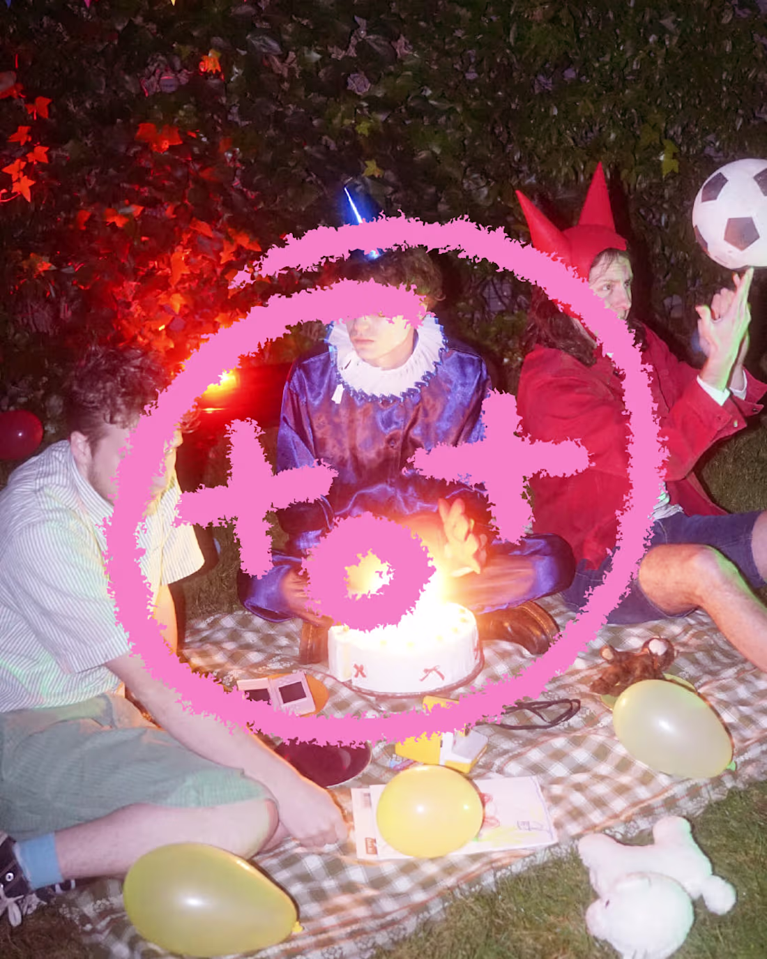
Totology is a french punk band I work with as their graphic designer. Here i present you the joyfull palette of colours and their logo.
They are called toto because in french we say "0+0 equals toto's face". This is why I created this funny child like logo where the + looks like a T and the 0 like an O redirecting 0+0 to look like toto.
1
161
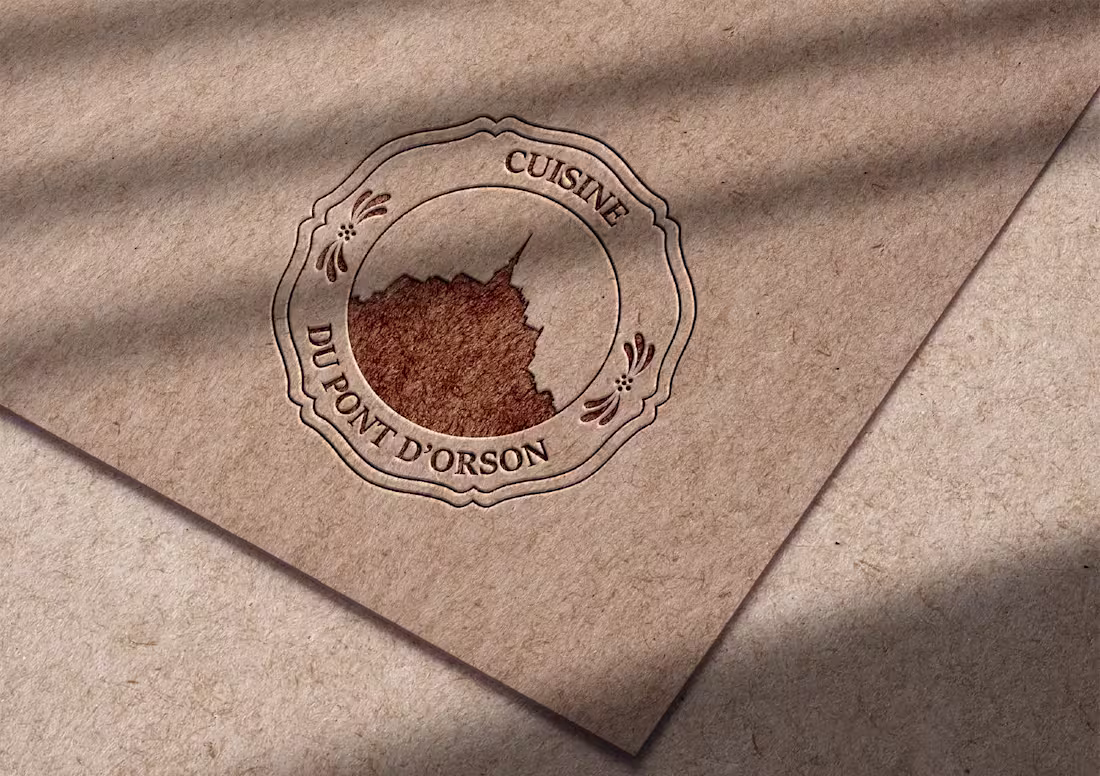
I'm a french designer based next to the Mont-Saint Michel and so I created this project for a collective cuisine delivering fresh and homemade food all around them from hospitals to schools.
I wanted to highlight what really matters to them and represent their skills:
-traditionnal and homemade meals
-local and fresh ingredients
The traditionnal plate from normandy truly captures this idea of experts in their craft, local skills and products without the over used iconography of a fork and a knife, food or chef's hat.
0
129