
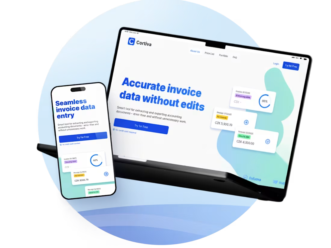
Cortiva — MVP landing page without the interface
0
2
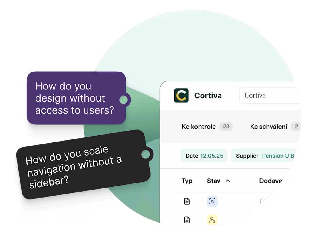
UX Redesign for Cortiva's Invoice Automation
0
0
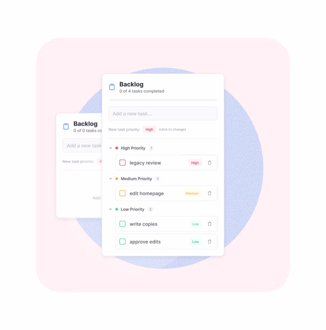
Backlog widget for Figma
A to-do list inside your design file. Vibe-coded it in one evening because I was sick of switching between three windows to track tasks. It does one thing and does it well — keeps your backlog where your actual work happens. No integrations, no settings, no onboarding. Just a list.
1
76
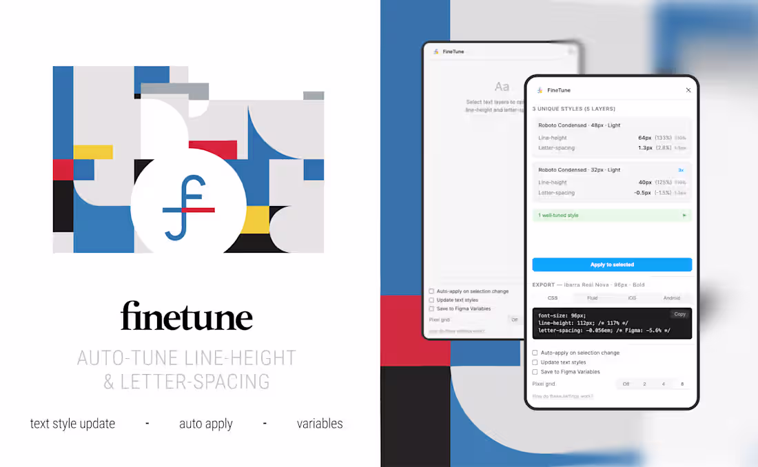
FineTune — typography auto-tuning for Figma
A Figma plugin that calculates optimal line-height and letter-spacing based on font metrics, weight, size, background brightness, and baseline grid — then exports in code-ready units.
30 hand-tuned font profiles. Regressive line-height scale. 4px grid snap. Background-aware. Exports to CSS, iOS, and Android.
Built because TypeBalance picks pretty numbers. FineTune picks pretty numbers that work in code.
Stack: TypeScript · Figma Plugin API
0
91
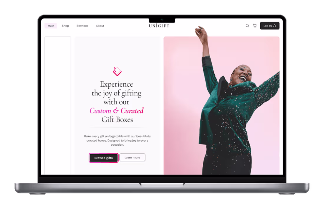
UniGift — Brand & UI for a gifting platform
Scope: Visual identity · UI design · Styleguide · Interactive prototype
Timeline: 2 weeks
A personalized gift box service targeting women 25–40. The brief was specific: warm, premium, nothing that oversells. Two weeks from brief to prototype.
I started with emotional direction before opening Figma — moodboard first, then identity. The visual language that followed: Cormorant & Pathway Extreme, Stone and Rose as main colors. A secondary diamond element runs through the whole system as both decorative detail and functional UI marker.
The UI system covers homepage, catalog, card components, buttons, and responsive breakpoints — all WCAG-validated. The interface softens as it scales down: radius drops from 20px to 8px, tone stays consistent.
0
90