
Ebuka Obisike
Product Designer, Designing ideas to life.
Ready for work
Ebuka is ready for their next project!
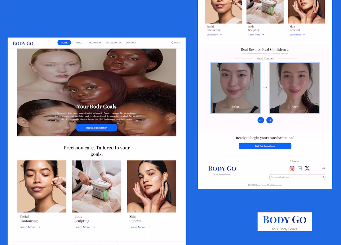
📌 Project: BODY GO
📌 Role: Product Designer
📌 Tools: Figma
📌 Deliverables: Landing Page + Booking Page
📌 Goal: Create a modern, luxurious, trust-building digital experience for a high-end aesthetics brand.
1
7
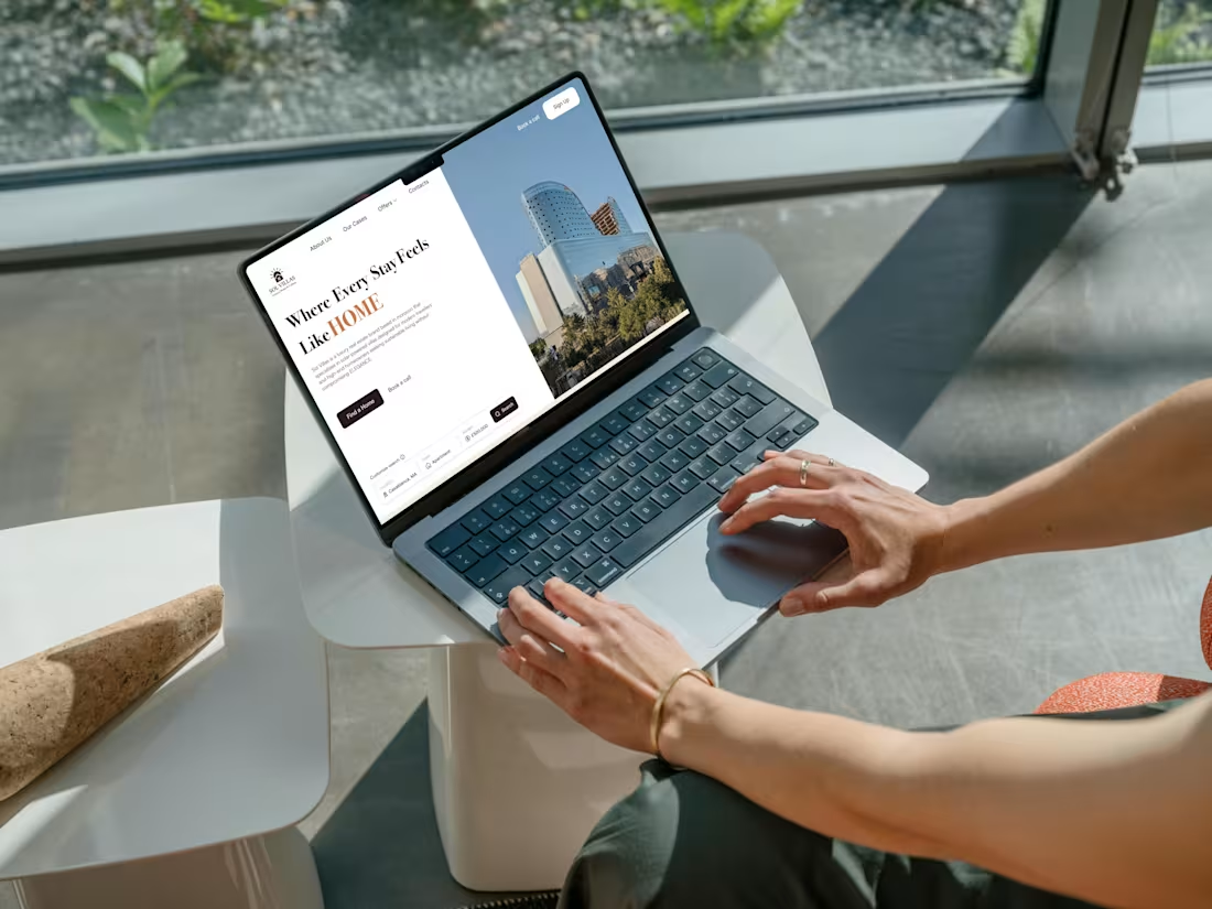
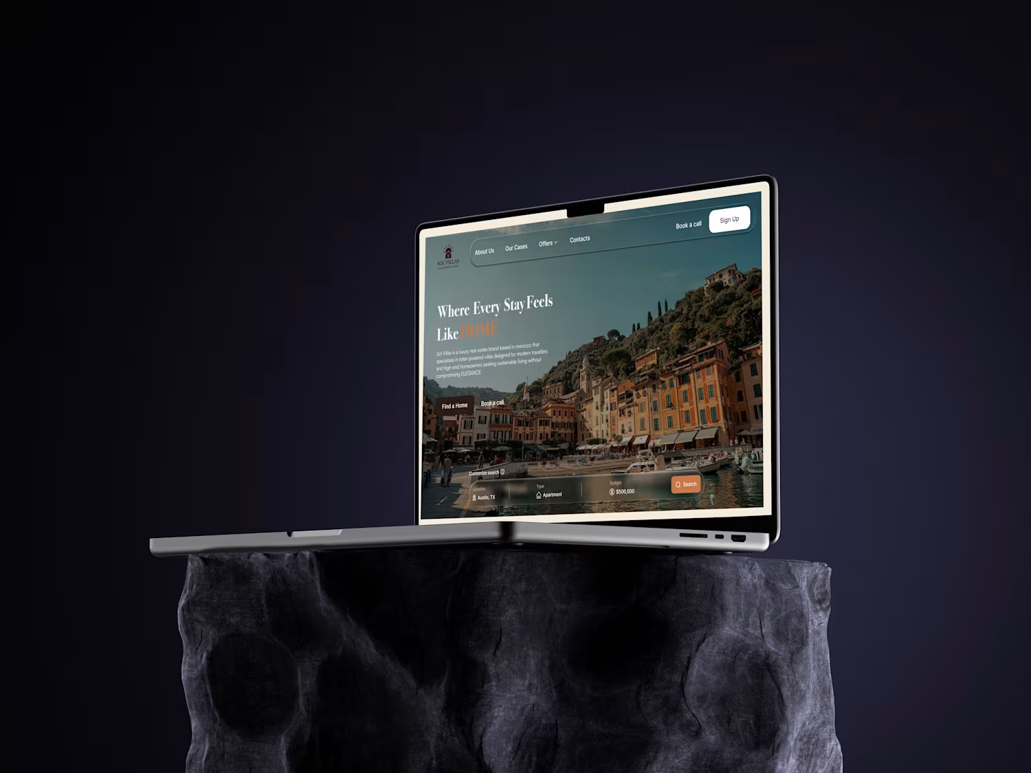
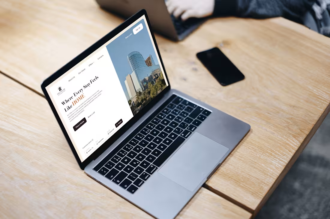
Project Title: Sol Villas — Luxury Real Estate Landing Page
Summary:
Designed a modern and elegant landing page for a luxury real estate brand inspired by Moroccan architecture. The goal was to communicate “Luxury, Home & Culture” through balance, storytelling, and simplicity.
My Role:
UX/UI Design
Brand Visual Direction
Prototyping
Tools Used:
Figma · Adobe Illustrator
Design Outcome:
A polished landing page that combines storytelling and usability, driving trust and engagement for premium audiences.
Key Highlights:
Elegant hero layout with strong emotional appeal.
Clean property grid for easy browsing.
Brand storytelling through culture and craftsmanship.
Optimized for modern real estate clients.
Keywords for Searchability:
Real Estate Website · Landing Page Design · UI/UX Design · Luxury Brand · Figma
2
18
Sol Villas — Luxury, Home & Culture.
A hero section exploration for a luxury real estate brand, designed to evoke warmth, sophistication, and belonging.
Two contrasting directions — one clean and modern, the other cinematic and emotional — both centered on creating a sense of “home” through design.
✦ Services: UI/UX Design, Brand Visual Direction
✦ Tools: Figma, Adobe Photoshop
0
14
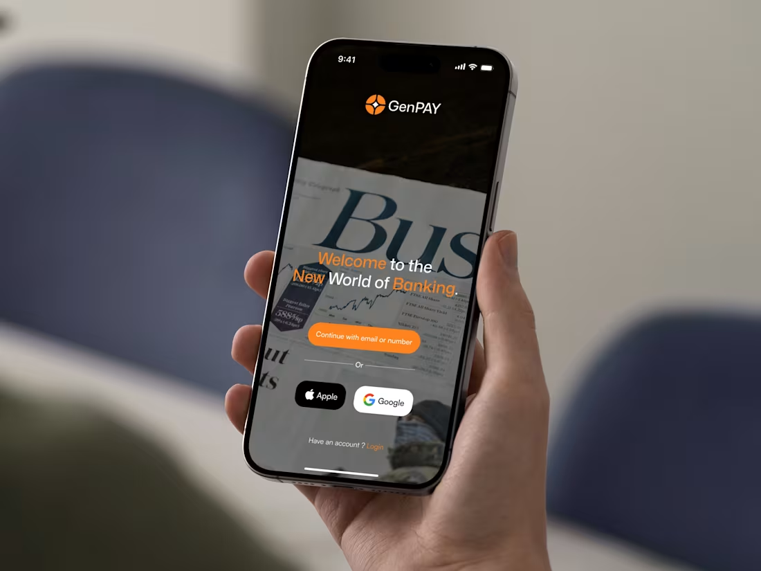
Banking doesn’t have to feel boring. GenPAY reimagines how people connect with money — fast, simple, and stress-free. From quick transfers to smart savings, the experience focuses on effortless control and modern energy. The design blends motion, clarity, and a bold visual identity to speak directly to today’s digital generation
1
22
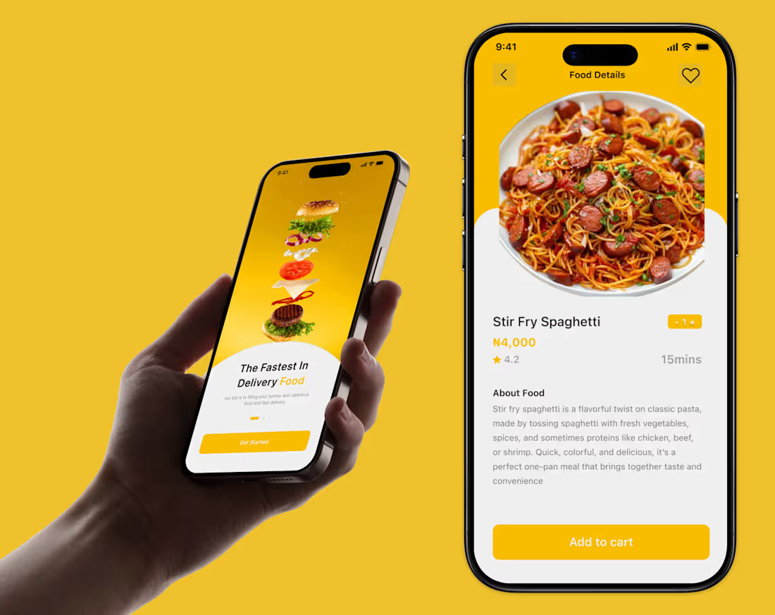
Brought this Food Delivery App design to life
1
23
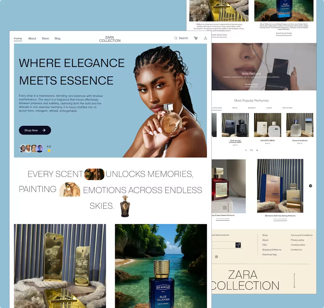
Case Study: Designing “Zara Collection” Where Elegance Meets Essence
This concept explores a luxury perfume web experience that blends emotion, sophistication, and storytelling through design.
The goal was to create a digital space that feels as refined and immersive as the fragrances themselves.
I focused on visual hierarchy, balance, and mood using soft tones, elegant typography, and high-quality imagery to evoke emotion and depth.
Each section flows like a scent journey, from discovery to desire, guiding users through a seamless narrative of elegance and essence.
The result is a clean, modern layout that elevates the brand’s identity and connects emotionally with users through visuals and storytelling.
1
18

Case Study: Redesigning the Profile Experience
The goal was to make the profile screen more intuitive and engaging.
The old layout lacked hierarchy, key actions like payment and language settings were easy to miss.
The new design introduces clear card layouts, improved spacing, and a referral banner to drive engagement.
I refined the visual hierarchy, grouped related actions, and used consistent icons and color balance for a smoother, more connected experience.
The result is a cleaner, modern interface that improves usability and encourages user interaction.
0
20