pro
Dusan Tomic
Expert Product Designer & Design Engineer (Mobile + SaaS)
Ready for work
Dusan is ready for their next project!
Unpopular opinion: the standard tab bar looks better than the liquid glass version.
1 voted
25%
3 voted
75%
4 votes
Closed
I used to shrink buttons on press for years. Since ios 26 and liquid glass, I've switched to expanding them instead. It works surprisingly well.
Do you prefer shrinking or expanding on press?

Redesigning the app with a liquid-glass style. Which option works better? (Reposting now that Contra has this awesome Taste Test feature 🤩)
1 voted
20%
4 voted
80%
5 votes
Closed
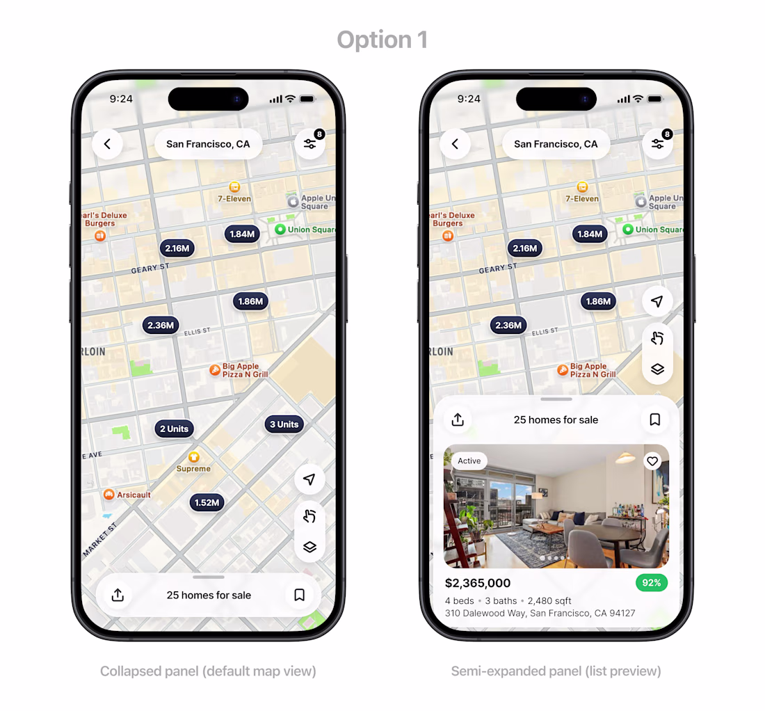
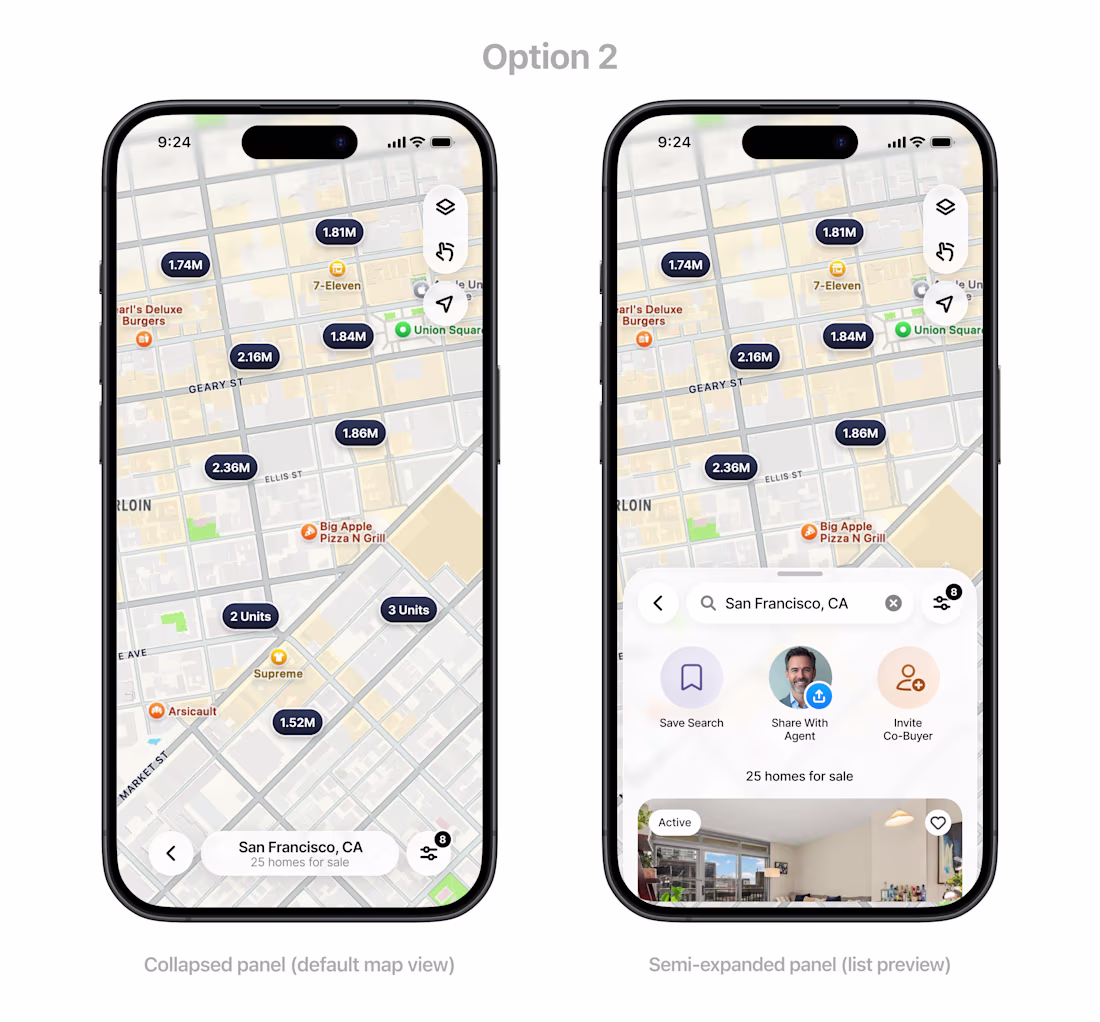
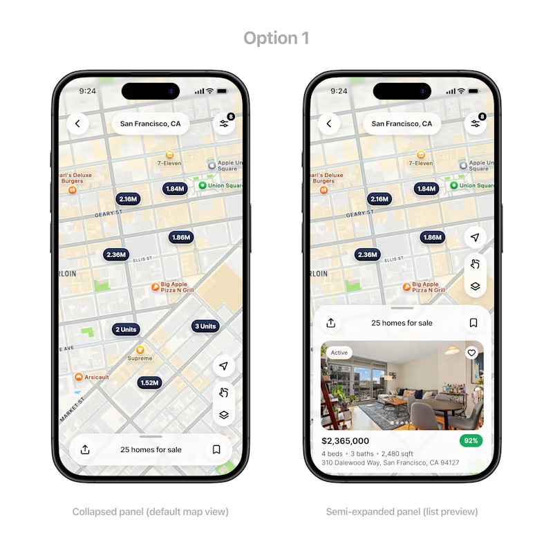
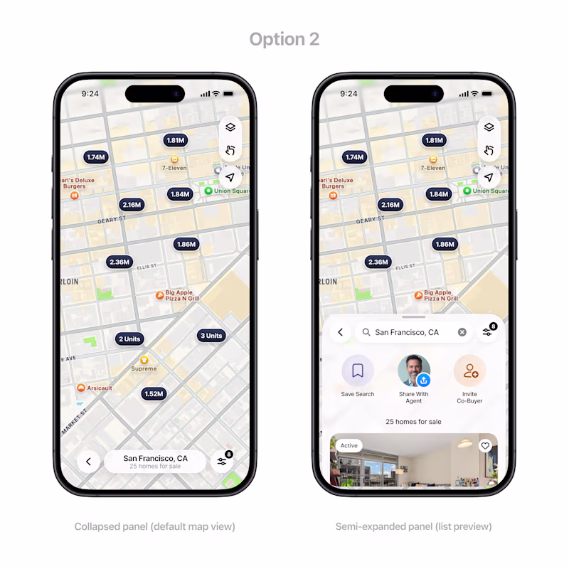
Which layout feels better: Option 1 (search bar on top) vs Option 2 (search bar on bottom)? (for context, this is a collaborative real estate app. The back button takes back to the main search page with bottom navigation and all)