
doris james
WordPress & WooCommerce Website Developer
- 11
- Followers


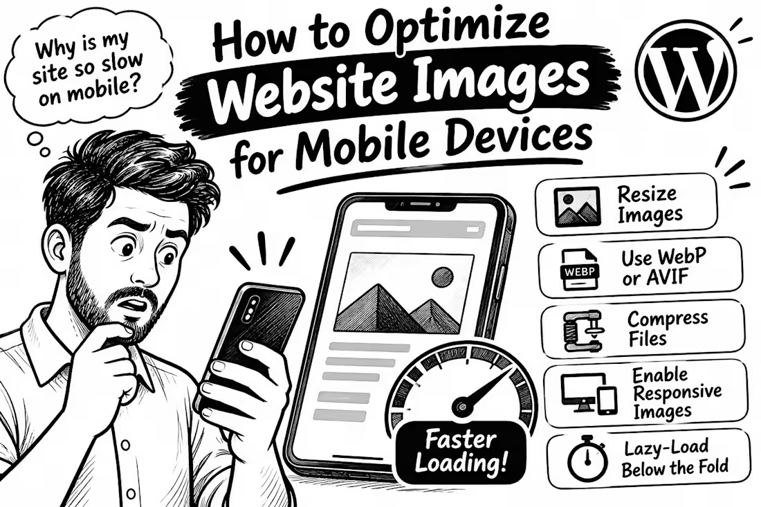
How to Optimize WordPress Images for Faster Mobile Pages
0
0
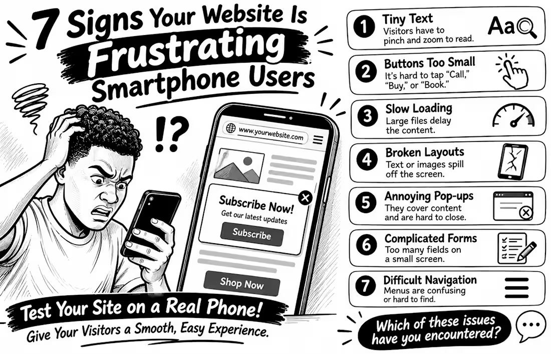
7 Signs Your Website Is Frustrating Smartphone Users
Your website may look perfect on a laptop but feel like hard work on a phone. And that matters: the 2025 Web Almanac found that only 48% of mobile websites achieved good Core Web Vitals, compared with 56% on desktop
Here are 7 warning signs to check
1️⃣ Tiny text Visitors have to pinch and zoom just to read.
2️⃣ Buttons too small People struggle to tap “Call,” “Buy,” or “Book” without hitting something else.
3️⃣ Slow loading Large images and heavy scripts delay the content people came to see.
4️⃣ Broken layouts Text, images, or menus spill off the screen or overlap.
5️⃣ Annoying pop-ups Full-screen offers cover the content and are difficult to close.
6️⃣ Complicated forms Too many fields make enquiries or checkout tiring on a small screen.
7️⃣ Difficult navigation Menus are confusing, links are crowded, or important actions are hard to find.
Don't just shrink your desktop website and call it mobile-friendly. Open it on a real phone and try to complete a task as a customer would
💬 Which of these problems have you encountered on a business website?
2
1
69
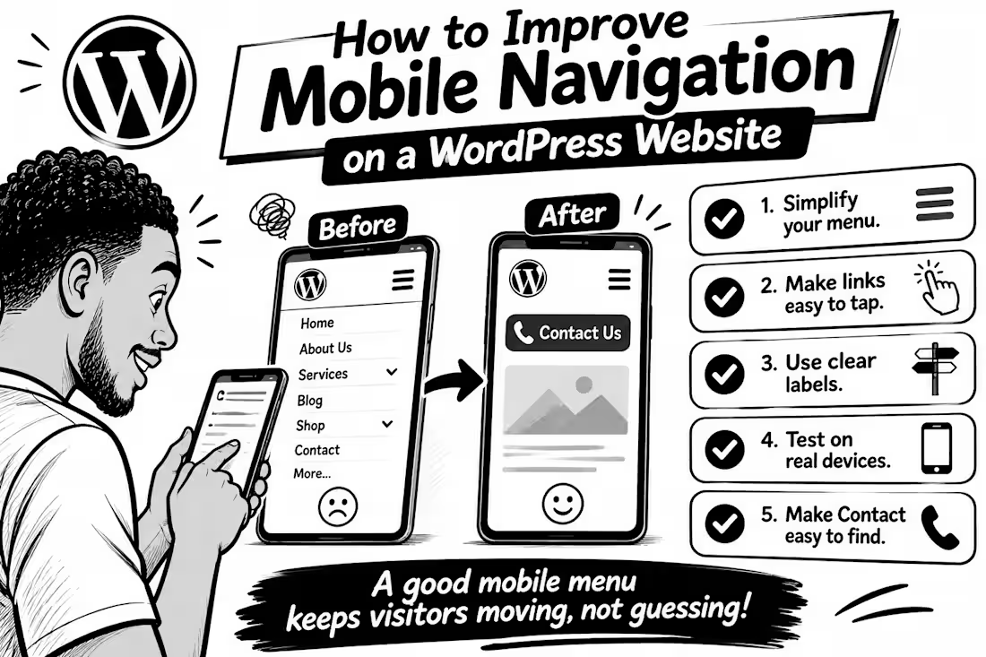
How to Improve Mobile Navigation on a WordPress Website
Ever tried to find a service on a website, only to give up because the menu was confusing? Visitors can face the same frustration on mobile.
Here are 5 practical fixes
1. Keep the menu simple. Prioritise pages people need most: Services, About, Contact, or Shop. Too many options make decisions harder.
2. Make links easy to tap. Digital.gov (http://Digital.gov) recommends touch targets around 48 CSS pixels, with enough space between them to reduce accidental taps.
3. Use clear labels. “Get a Quote” tells visitors more than “Explore.” Make each menu item’s destination obvious.
4. Test on a real phone. Try every link, check submenus, and make sure the menu opens and closes easily.
5. Make the next step easy to find. If calls or bookings matter, keep Contact, Book Now, or Call visible without crowding the menu.
WordPress’s Navigation block lets you control how menus collapse into a mobile icon and how submenus open so check those settings in your editor.
💬 What frustrates you most on mobile websites: tiny links, confusing menus, or too many options? Tell me below.
1
68
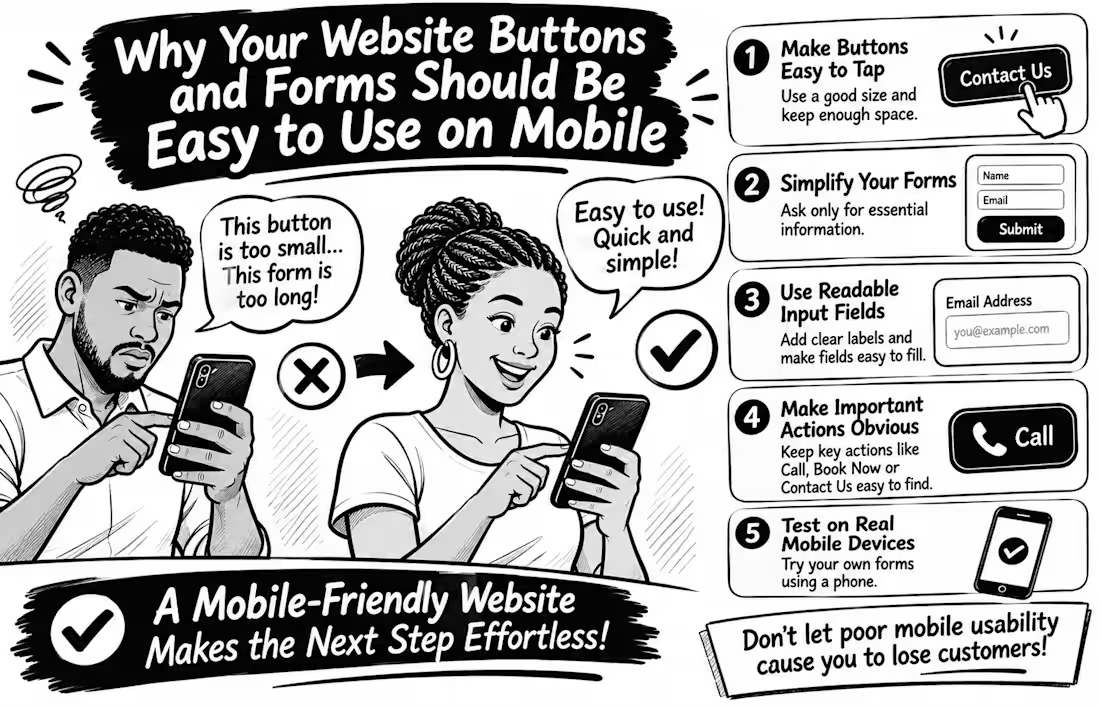
Why Your Website Buttons and Forms Should Be Easy to Use on Mobile
Imagine a potential customer visiting your website, ready to contact you, but struggling to tap your tiny contact button or complete your enquiry form.
What happens next? They may simply leave.
Mobile usability goes beyond making your website fit a smaller screen. Every interaction should feel effortless.
Here are 5 things every business website should get right
Make buttons easy to tap. Avoid tiny buttons and keep enough space between clickable elements to prevent accidental taps.
Simplify your forms. Ask only for information you genuinely need. Too many fields can make enquiries feel like hard work.
Use readable input fields. Make text clear, provide visible labels, and ensure fields are easy to select and complete.
Make important actions obvious. Your Call, Book Now, Contact Us, and Submit buttons should be easy to find.
Test on real mobile devices. Don't rely only on desktop previews. Try completing your own contact form using your phone.
Here's an important detail WCAG 2.2 recommends a minimum target size of 24 × 24 CSS pixels for many interactive controls, with certain exceptions. Bigger, well-spaced buttons can make mobile interactions even easier.
Remember: A website shouldn't just attract visitors; it should make taking the next step easy.
Have you ever abandoned a website because its buttons or forms were difficult to use on your phone? Share your experience
1
62