Divya Khilnani
Brand and website designer
New to Contra
Divya is ready for their next project!
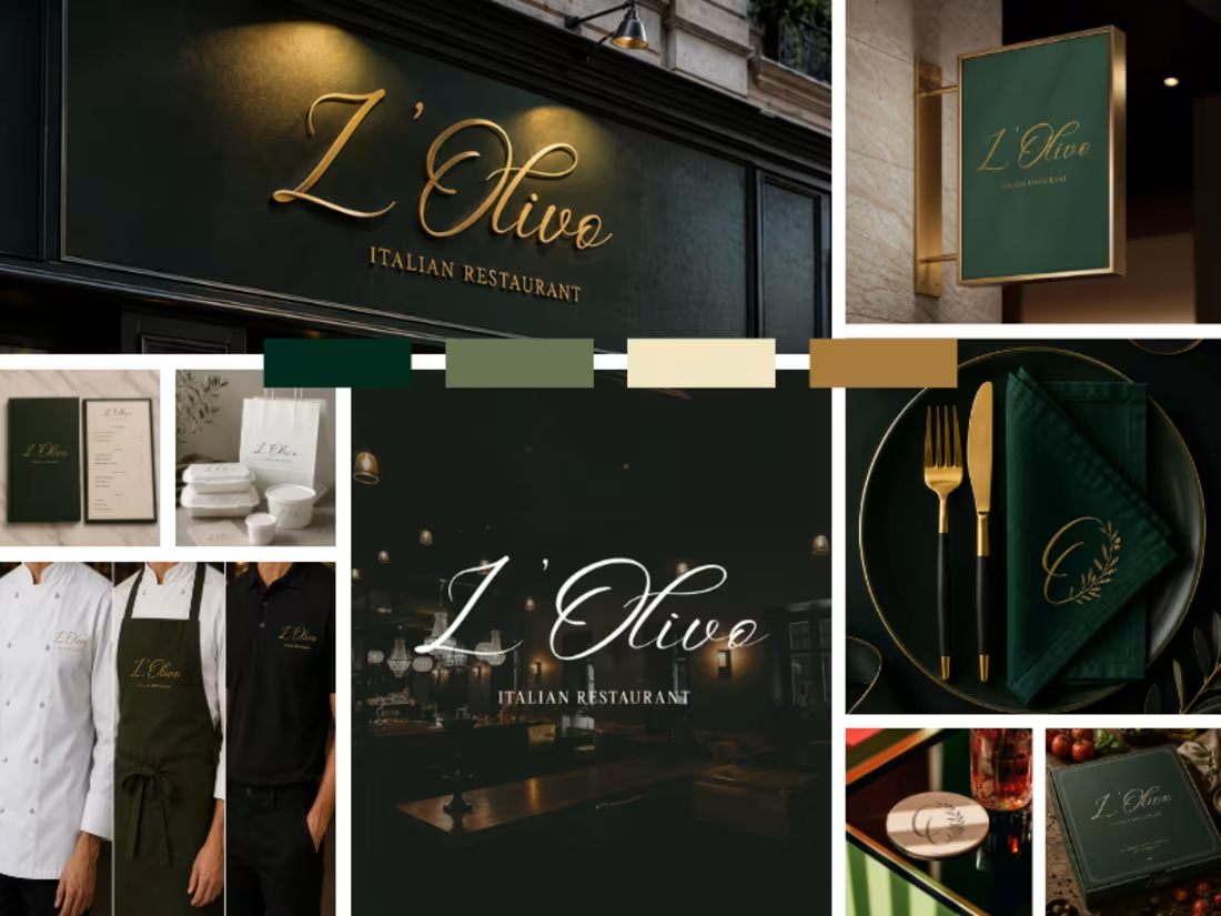
Luxury meets warmth.
A refined brand identity crafted for an Italian restaurant that celebrates timeless elegance through every detail from signage and menus to uniforms and tableware.
Deep forest greens, warm gold accents, and graceful typography come together to create a dining experience that's as memorable as the cuisine.
Brand Identity • Logo Design • Visual System • Print Collateral • Hospitality Branding
Open to branding projects for restaurants, cafés, and premium hospitality brands.
0
30
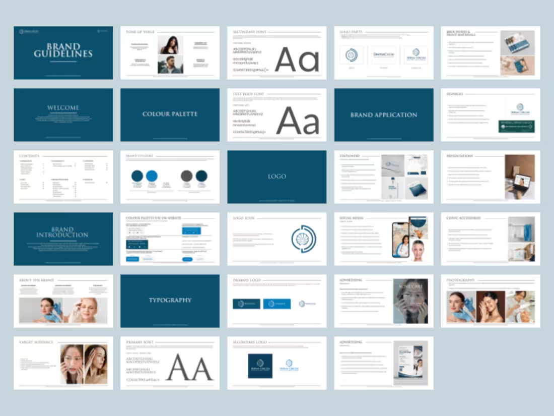
Created brand guidelines and strategy for a dermatologist.
1
3
67
Architecture logos are surprisingly difficult to get right.
Most end up looking the same:
Generic buildings
Generic monograms
Generic skylines
For Spaceborne Architects, I wanted something that felt modern, ambitious, and instantly recognizable.
The three structures represent architectural growth and scale, while the orbital lines introduce a sense of movement, innovation, and the idea of shaping spaces beyond the ordinary.
Simple.
Bold.
Memorable.
What was the first thing you saw when you looked at this logo?
6
5
210
One of my favorite branding collaborations so far.
Working on Ishdaara gave me the space to truly explore creatively the client came in with a strong vision and trusted me with the freedom to shape and elevate it visually.
From strategy to identity, every detail was crafted to reflect the elegance and character of the brand. Grateful for clients who trust the process and make collaboration this seamless.
2
4
147
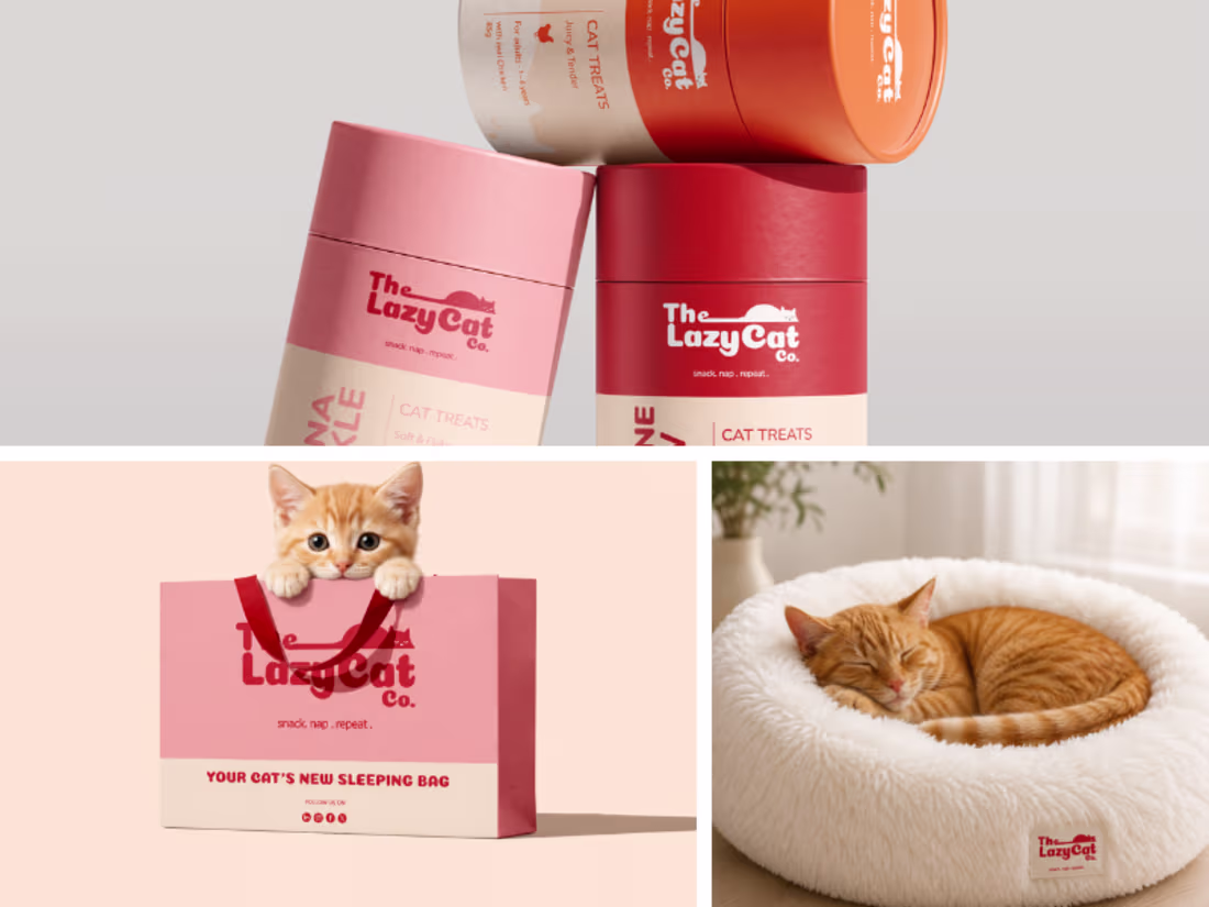
Built a brand for a business that refuses to take itself too seriously and that constraint made for the most fun I've had in a project.
The Lazy Cat Co needed identity that felt playful without going cheap, quirky without losing polish. Here's how we got there. 🐱
Full case study on Behance → https://www.behance.net/gallery/249299613/The-Lazy-Cat-Co-Branding-and-App-design
2
71
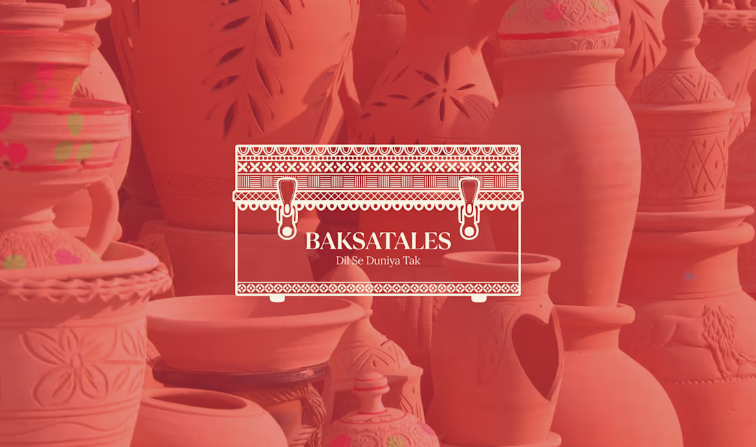
Logo Revamp for Baksatales
0
4
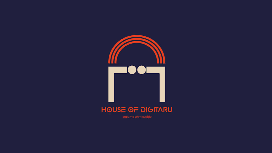
House of Digitaru
0
1
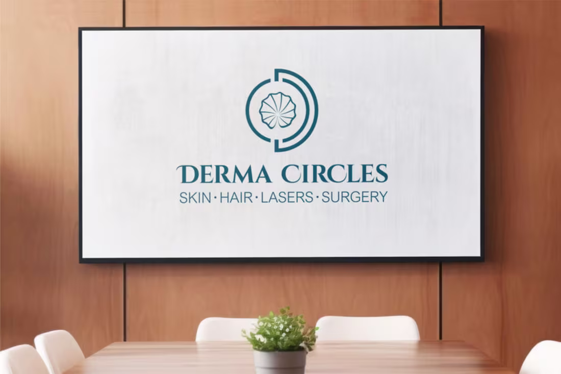
Derma Circle Branding
0
1
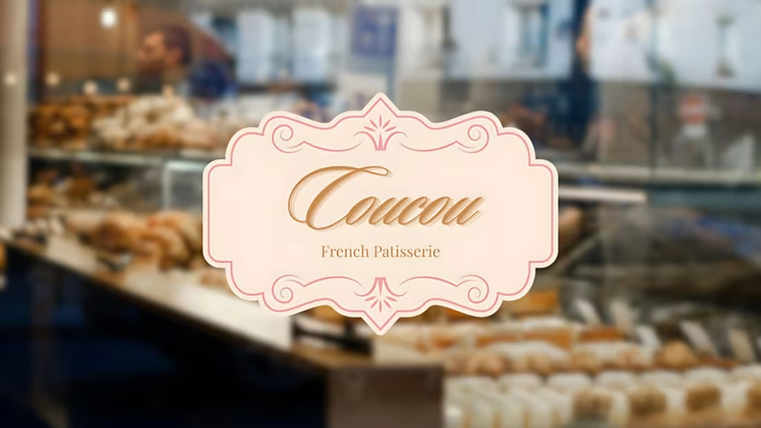
Brand Identity for Coucou
0
3
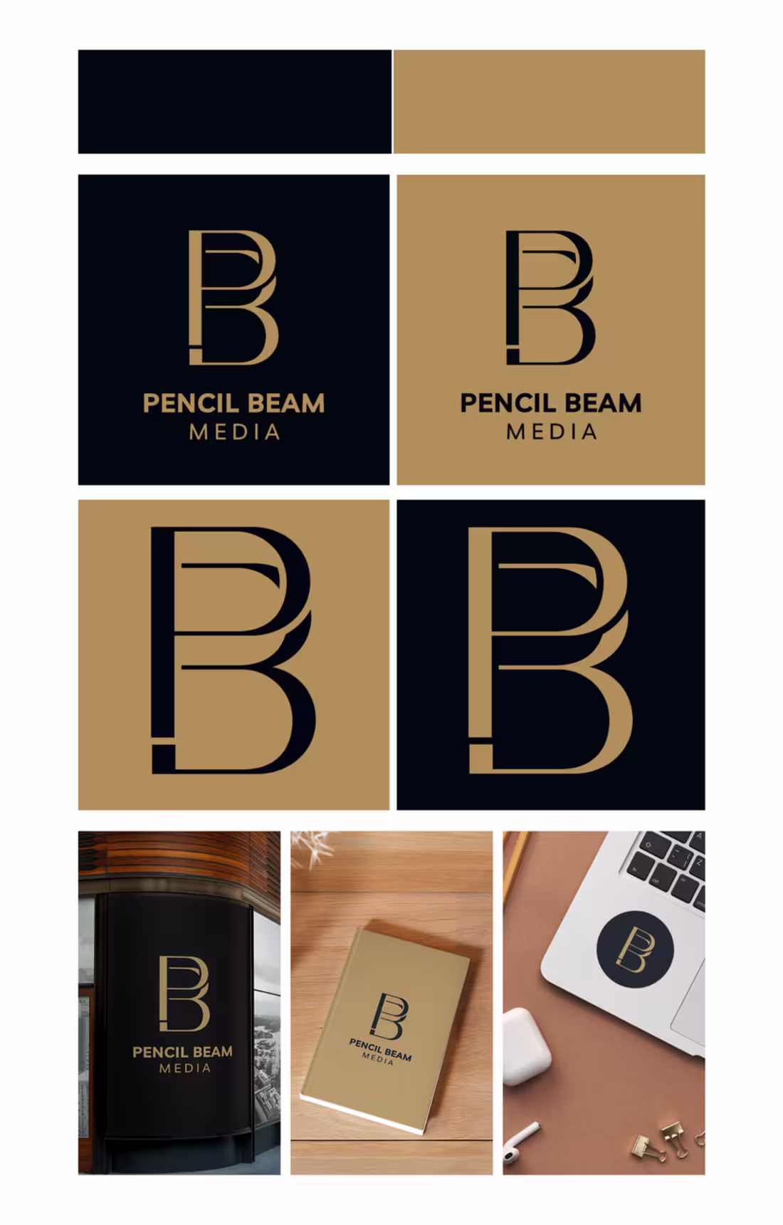
Logo Design for Pencil Beam Media
0
4
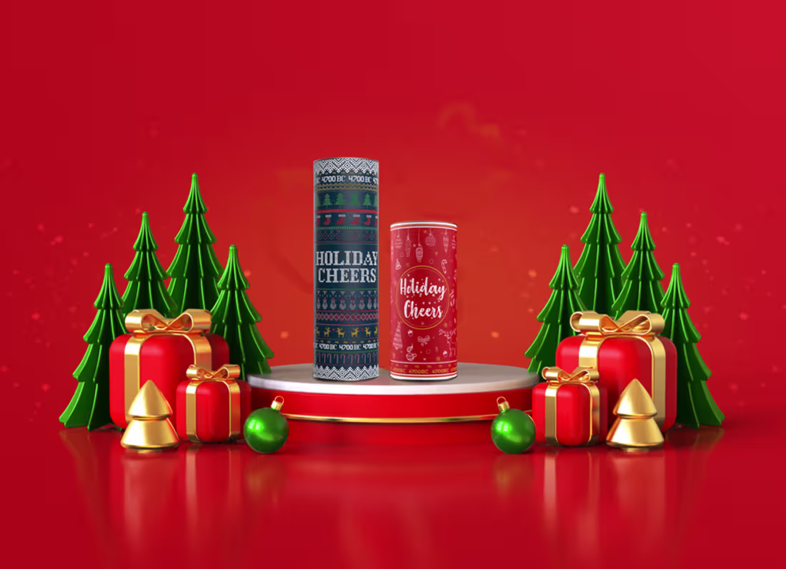
4700BC Popcorn Packaging Design
0
2
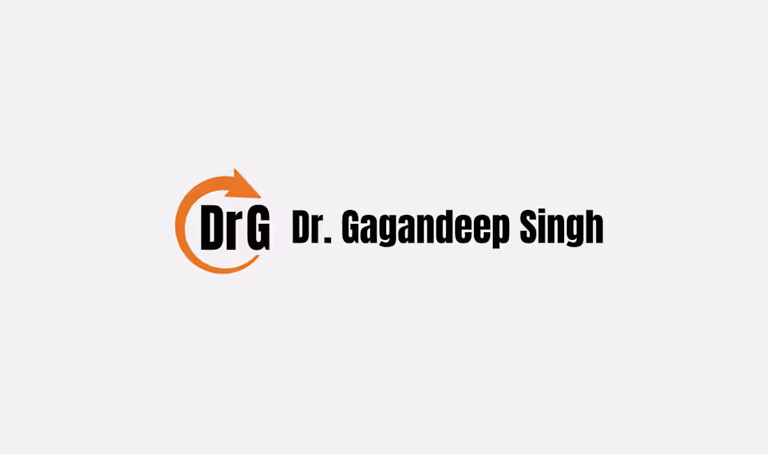
Dr.G Branding Project
0
2
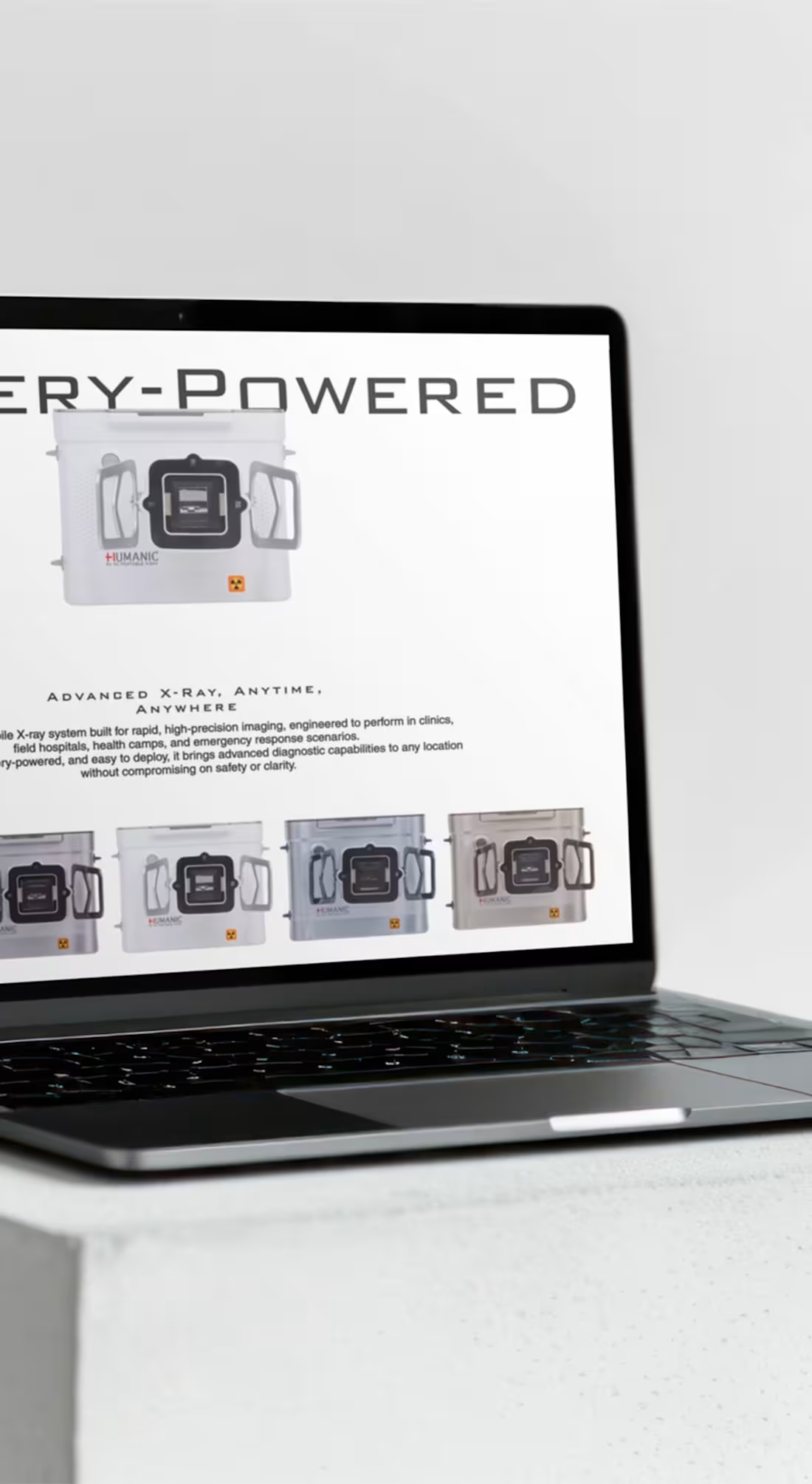
Humanic India
0
4
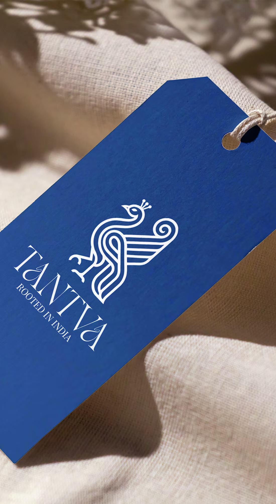
Tantva Branding Project
0
2
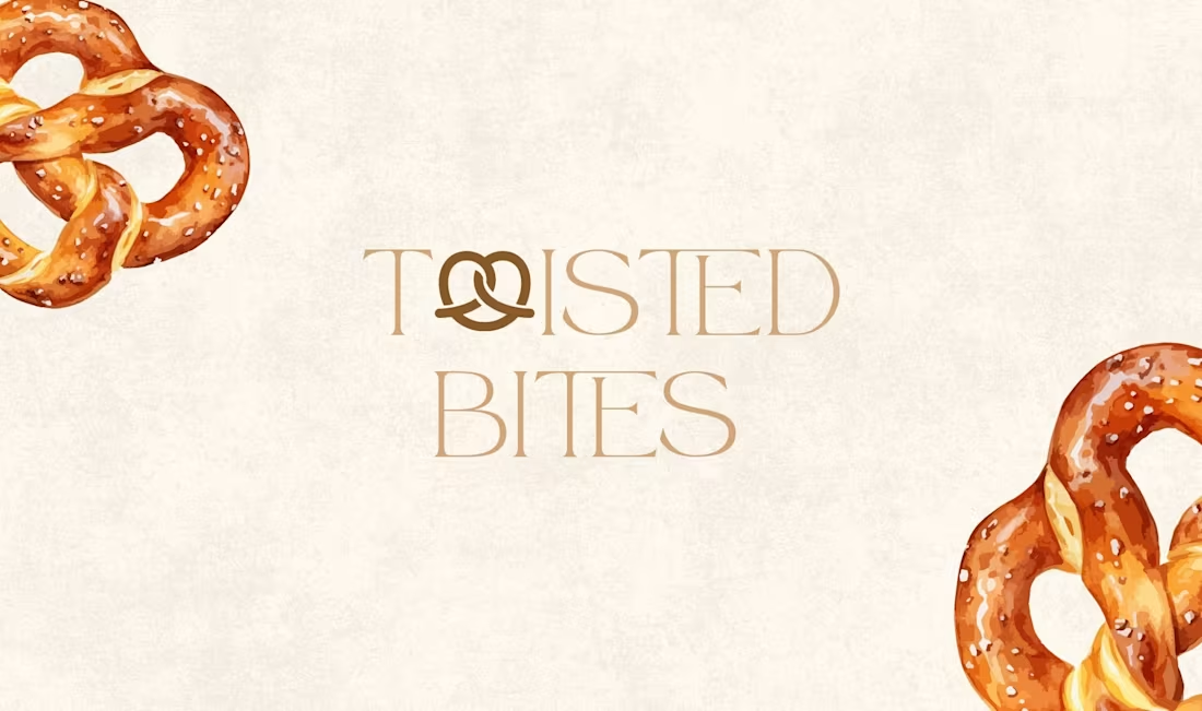
Twisted Bites
0
2
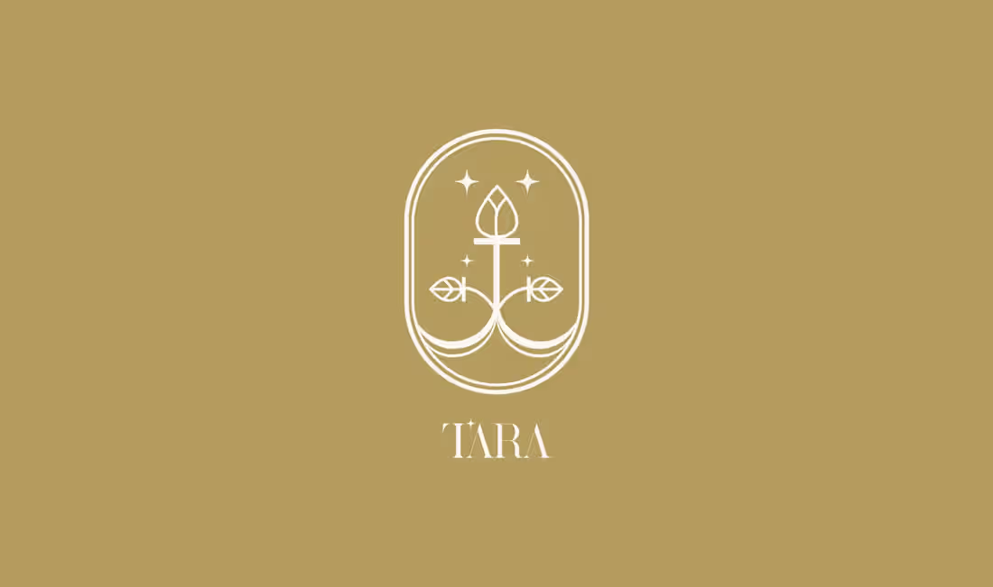
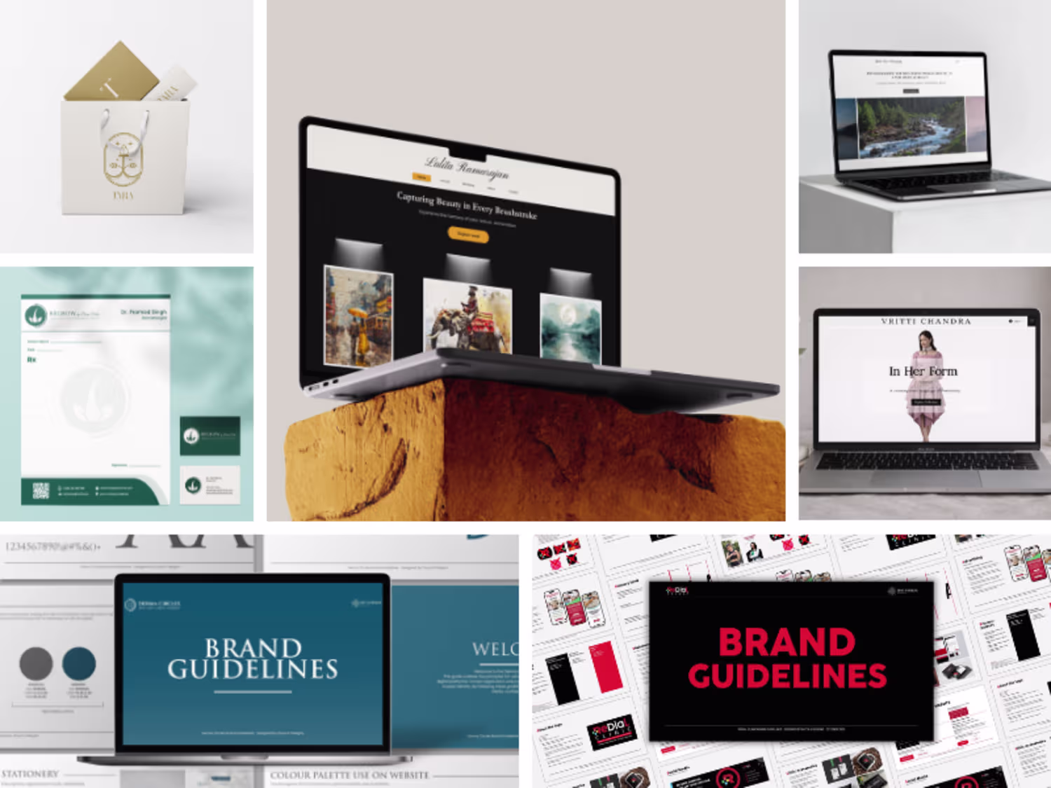
TARA Branding Project
0
3
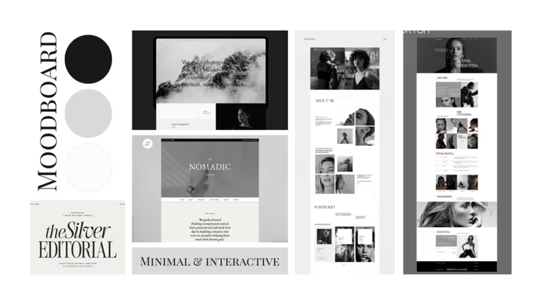
Lalima Bose Photography Website Design
0
5
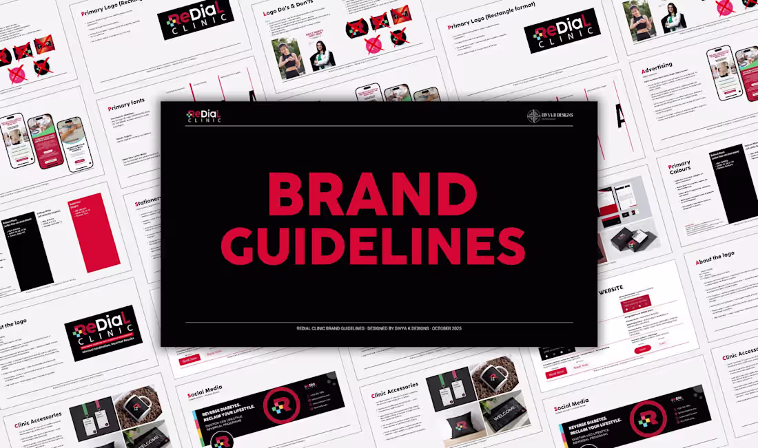
Redial Clinic Branding
0
3
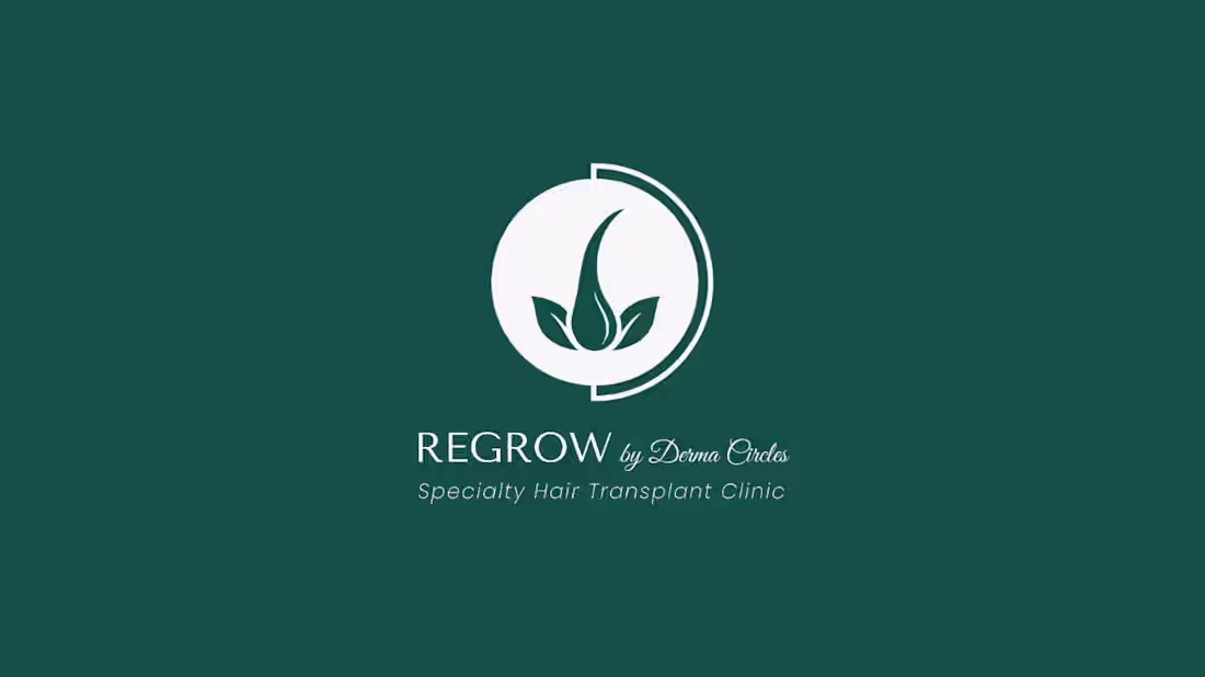
Regrow by Derma Circles
0
4
Jeev Daya Website and Logo Design
0
5
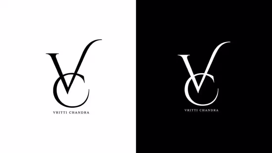
Vritti Chandra Rebranding & Website Design
0
4