Experienced Drupal Developer
Experienced Drupal Developer


Full stack developer, Top 1% at Contra
Full stack developer, Top 1% at Contra


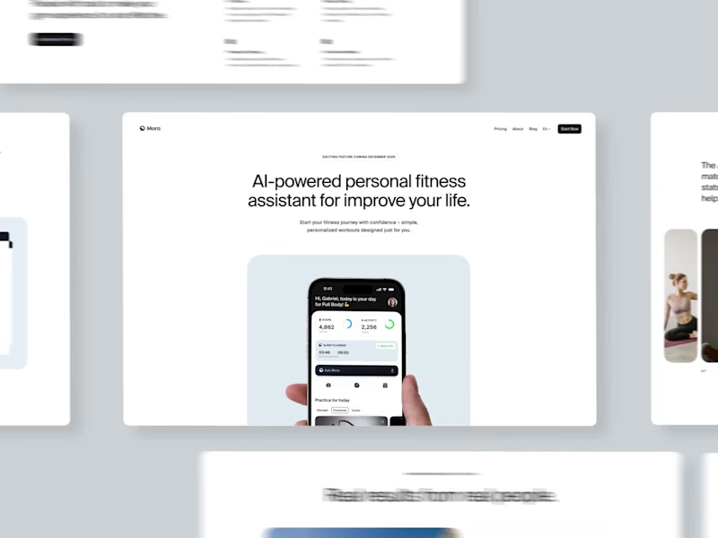
Senior Full stack Web&Mobile app developer , AI agents
Senior Full stack Web&Mobile app developer , AI agents


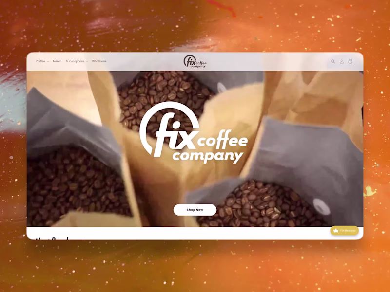
Web Designer/Developer | Wordpress, Shopify, E-commerce, CMS
- $1k+
- Earned
- 2x
- Hired
- 5.0
- Rating
- 31
- Followers
Web Designer/Developer | Wordpress, Shopify, E-commerce, CMS


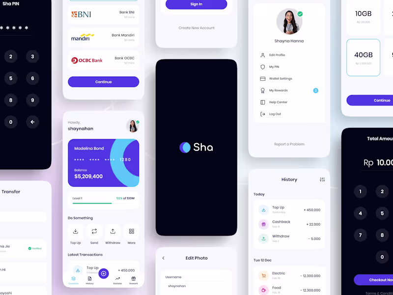
AI App & SaaS | AI Agents & Automations | AI Video & UGC Ads
- $1k+
- Earned
- 3x
- Hired
- 4.9
- Rating
- 27
- Followers
AI App & SaaS | AI Agents & Automations | AI Video & UGC Ads


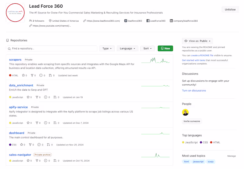
Data automation for real estate, e-com & SaaS
- $25k+
- Earned
- 2x
- Hired
- 5.0
- Rating
- 34
- Followers
Data automation for real estate, e-com & SaaS


Framer Designer • React Web & Mobile Developer
Framer Designer • React Web & Mobile Developer


IT Solutions – Execute your Concepts
- $10k+
- Earned
- 4x
- Hired
- 5.0
- Rating
- 19
- Followers
IT Solutions – Execute your Concepts