Verified Framer Partner, Unicorn Club Top 1% Framer Creator
Verified Framer Partner, Unicorn Club Top 1% Framer Creator


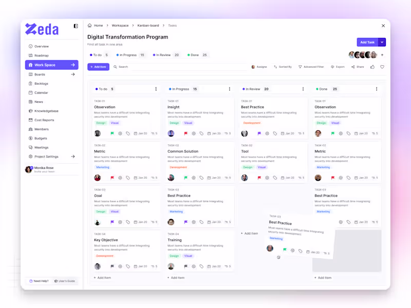
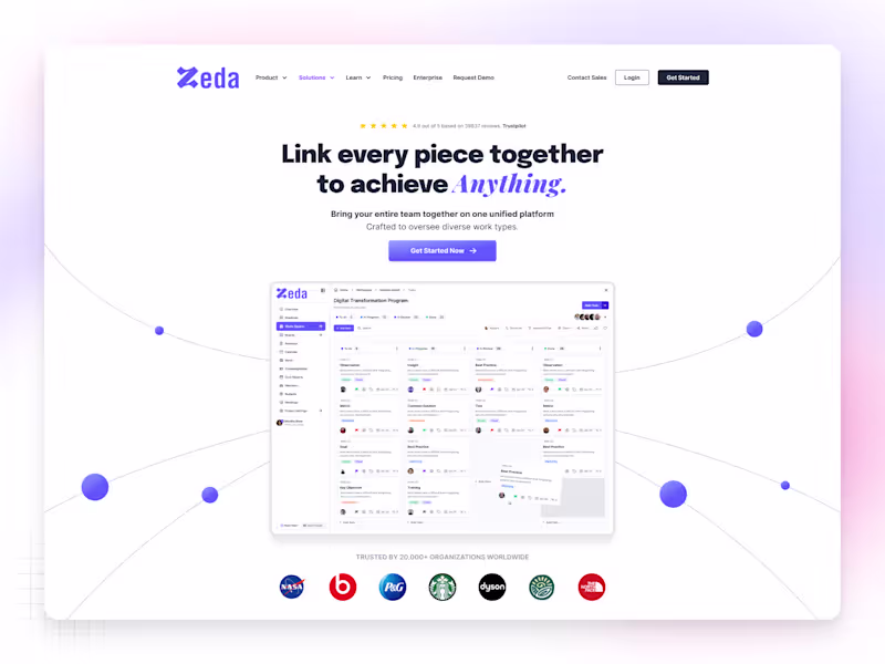
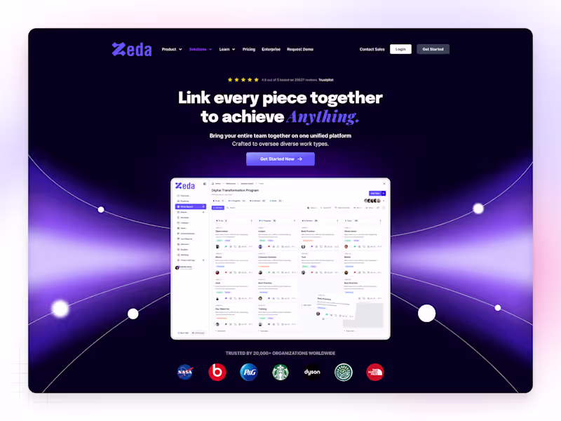
Achieving Great
Brand Evolution Using Webflow & Figma ✨
- $5k+
- Earned
- 3x
- Hired
- 5.0
- Rating
- 23
- Followers
Achieving Great
Brand Evolution Using Webflow & Figma ✨


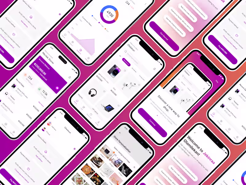
Product Designer (UI/UX) for SaaS & Mobile Apps
- 5.0
- Rating
- 12
- Followers
Product Designer (UI/UX) for SaaS & Mobile Apps
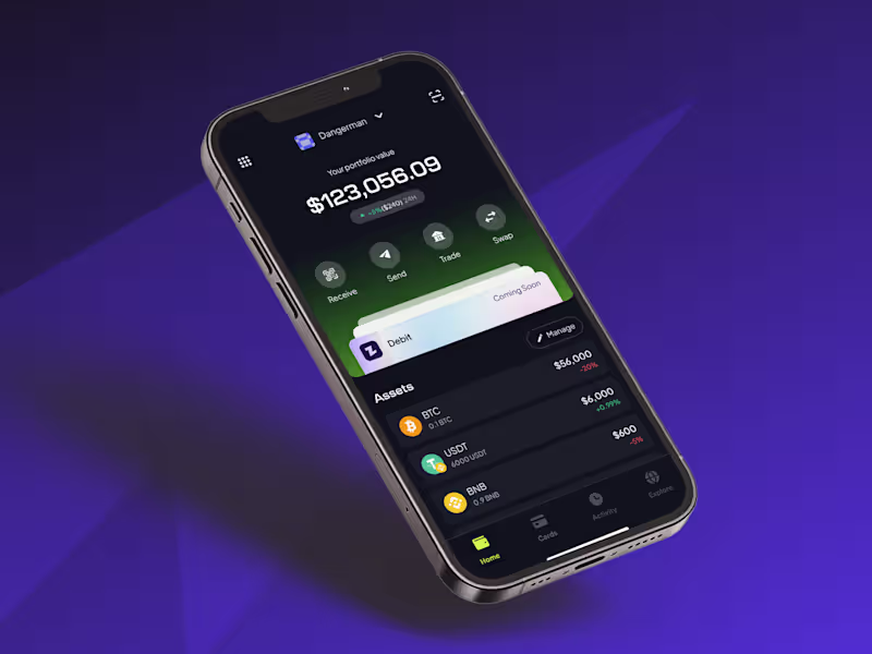
UI/UX Designer building for humans, not just for screens.
- 23
- Followers
UI/UX Designer building for humans, not just for screens.
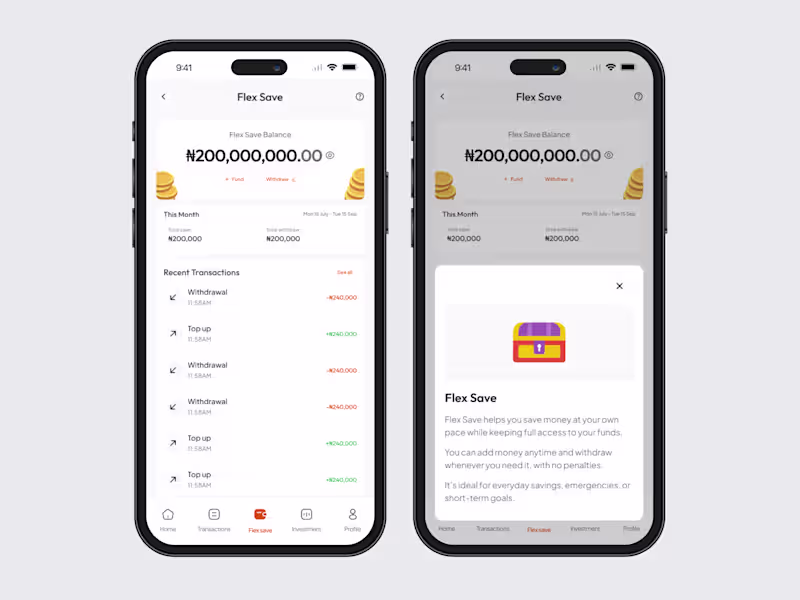
Product Designer ✧ Developer ✧ Branding 🚀

Certified Framer PRO Expert
Certified Framer PRO Expert

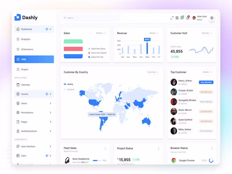
Modern Brand Designer for Startups


Framer Developer | Product Designer
Framer Developer | Product Designer