WFH Studio Website Redesign
Amr Mohamed

✅ PROJECT TYPE
Web Design · UX/UI · Strategic Positioning
✅ PROJECT OVERVIEW
WFH Studio helps businesses build digital products and creative campaigns — but their old website didn’t reflect that level of clarity or quality.
The original design was vague, hard to navigate, and didn’t clearly tell visitors:
What WFH Studio does
Who it helps
Why someone should care
I stepped in to rethink the entire site experience — not just how it looks, but how it communicates and converts.
✅ MY ROLE
Website Audit
Strategic Repositioning
UI/UX Redesign
Full Build in Webflow
Copywriting Guidance
✅ THE CHALLENGE
WFH Studio had great work under its belt — but the website didn’t say that clearly or confidently.
Visitors were bouncing.
The message was muddy.
The visual identity felt generic.
The challenge: turn the site into a sharp, conversion-focused asset that builds trust in seconds.
✅ WHAT I DID
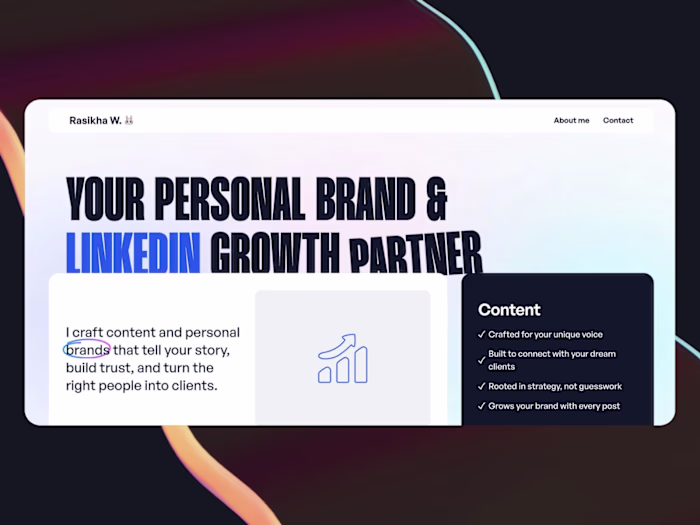
🔹 Clear, Confident Hero Section
I rewrote the headline to immediately answer what WFH Studio is and who it’s for.
🔹 Minimalist, Premium Layout
I kept the design clean and punchy — giving space for each section to breathe and build trust.
🔹 Stronger Brand Positioning
Every section now tells a story: here’s what we do, here’s how we think, and here’s why it matters.
🔹 Mobile Optimization
The mobile version was rebuilt to be scroll-friendly, tap-friendly, and faster.
🔹 Future-Proof Webflow Build
Easy for the internal team to update and expand without touching code.
✅ RESULT
✅ The site now feels like a modern studio
✅ Clearer messaging means visitors don’t get confused
✅ Stronger structure for future case studies and lead generation
✅ A confident, professional online presence that actually reflects the team’s talent
✅ FINAL THOUGHT
This project is a reminder that design isn’t about pixels — it’s about perception.
The old WFH site made people question the brand.
The new one makes them want to work with it.
Link of the website:
Like this project
Posted Jul 3, 2025
Redesigned WFH Studio's website for better clarity, communication, and conversion.
Likes
0
Views
11
Timeline
Jun 5, 2025 - Jun 30, 2025