Designed this law firm website concept focused on one thing: trust at first glance.
When someone lands on a legal site, they’re not browsing — they’re evaluating risk.
So the design prioritizes:
• strong authority visuals
• calm, confident typography
• clear service hierarchy
• immediate consultation path
No flashy trends.
Just credibility and clarity.
Built in Figma → ready for Webflow.
2
515


Designed a modern, high converting lawyer website homepage ⚖️
This is not a mockup, it’s a real client-style website built to establish trust, authority, and generate qualified leads.
The goal was simple: create a professional and structured experience that builds credibility from the first click.
✔ Clean, authority driven hero section
✔ Trust-focused layout for legal services
✔ Strategic content flow to guide potential clients
✔ Mobile-optimized and built for performance
Every section was designed to communicate expertise, build confidence, and encourage inquiries.
For law firms, your website is more than just an online presence, it’s your first impression.
If you are looking to attract more clients and position your brand professionally, your website needs to do more than exist… it needs to convert.
Let’s build something that works.
#WebsiteDesign #LawyerWebsite #LawFirm #WebDesign #GoHighLevel #BusinessWebsite #LeadGeneration #UIUX #ProfessionalServices #LandingPage.
1
11
277

Median didn’t start from a visual. I started it from a question: what does fairness actually look like when it holds under pressure, not just in theory. That became the base. Not styling. Not aesthetics. Just structure.
As the idea developed, it became clear balance isn’t something applied at the end. It has to exist from the start. Every decision around form, spacing, and proportion followed that. Nothing decorative. Everything stable.
The logomark came out of that thinking. Two equal forms, held in place within a controlled system. No dominance. No absence. Not symbolic for the sake of it. Just a direct expression of balance.
The name followed; Median. The point that remains when everything unnecessary is removed. Not the extremes. Just what holds. In law, that idea carries weight. Because what matters is what stands when tested.
Most firms lean into authority and legacy. Very few focus on balance and structure. That’s where Median sits. Quiet, but deliberate.
Not built to impress. Built to hold.
Full casestudy: https://www.behance.net/gallery/245375919/Median-Brand-Identity
4
200

How can your brand guidelines be reflected in your documentation? #legaldesign
Fonts, colors, layout — they’re not just design choices.
They speak your brand’s tone even before a client reads the first clause.
A contract that looks like your brand builds trust, continuity, and professionalism. When your legal docs share the same typography, palette, and visual rhythm as your website or pitch deck — it feels like one story, not a separate universe of “legal stuff.”
Recently, I finished a contract for a gamedev studio where the engaging, energetic, gameful design transformed the agreement into a seamless part of their identity — not just paperwork.
Curious how you approach this — do your contracts follow your brand style?
p.s. - client explicitly gave his consent to reference the look of the contract :)
25
339

Are you a Lawyer, Offering Attorney services, into Legal activities?
The goal was to create a professional platform that showcases legal services, highlights attorney expertise, and makes it easy for clients to connect. Every page was built with a balance of elegance, usability, and authority ensuring the firm stands out online.
Proud to help another business strengthen their credibility and attract more clients through great design.
Need a professional website for your law practice or service-based business? Let’s create one that works for you.
#LawFirmWebsite #LegalWebDesign #WixWebsite #WordPressDesign #WebDeveloper #ResponsiveDesign #LawyerBranding #BusinessWebsite #attorneyservices
2
27
235
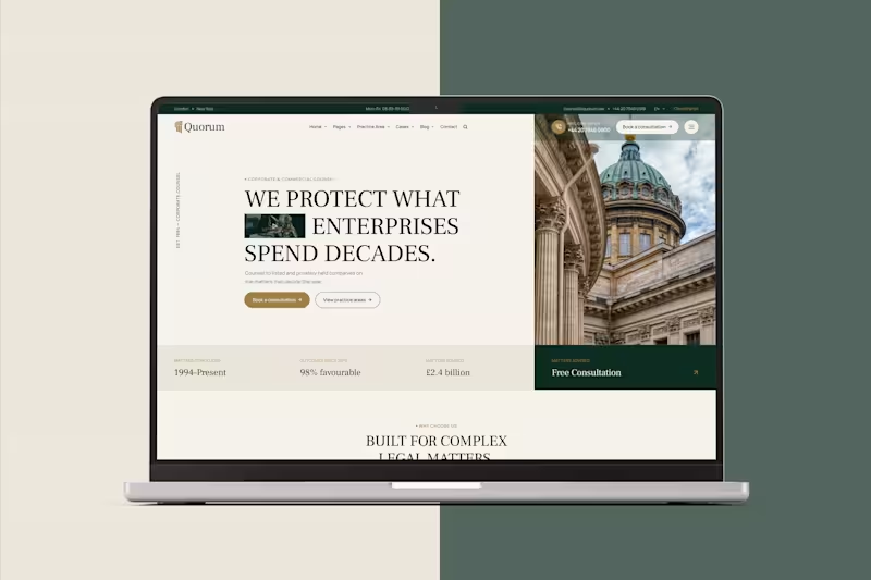
A premium law firm website concept built for corporate and commercial legal practices.
I wanted the design to feel established, confident, and sophisticated without falling into the usual corporate law website patterns. Editorial typography, architectural imagery, muted tones, asymmetric composition, and strong content hierarchy create a more distinctive legal brand experience.
The design focuses on:
— Corporate & commercial law positioning
— Clear, conversion-focused consultation CTAs
— Trust-building statistics and outcomes
— Premium editorial visual direction
— Practice areas and case-led storytelling
— A polished, responsive experience designed for modern law firms
Designed to communicate one thing from the first screen: serious legal counsel deserves a serious digital presence.
0
247