

Launch Videos for AI Startups | Creative Director | Design


Launch Videos for AI Startups | Creative Director | Design



Unity Game Developer: Detail-Oriented & Reliable
Unity Game Developer: Detail-Oriented & Reliable


Design student, formgiver of 3D models & bright ideas.
Design student, formgiver of 3D models & bright ideas.


Premium UI/UX & Web Design for Fintech, SaaS & Web3 | Framer

Premium UI/UX & Web Design for Fintech, SaaS & Web3 | Framer
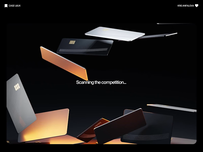
Credit card landing page design for a fintech startup — an interactive 3D claw machine that turns the offer into the hero instead of another floating card at 15 degrees.
Every card brand ships the same hero: a card hovering over a gradient. Clawd sells one card, not a marketplace, and the entire pitch is "stop comparing — we already did the comparing". So the landing page had to make a single-product offer read as a win rather than a shortage of options, and pull early-access sign-ups from people who are deliberate about money: the ones who actually track spending and read the APR line.
The metaphor does the positioning work. A claw machine that never misses, plus "we already picked the best one", means the visual is the argument and the headline doesn't have to explain itself.
I built the scene in Blender as an interactive element rather than a still render — the claw follows the cursor, the card tilts in the grip, and the pile underneath reacts, so a visitor plays with the product's core idea for a few seconds instead of scrolling past it.
Hero plus full page structure, desktop and mobile designed separately, the Blender scene with web-ready exports, interaction notes, and a developer-ready Figma file.
39
116
6.4K
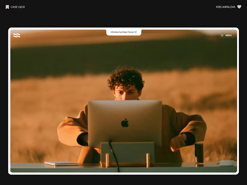
Deep Focus is a fictional macOS app that silences notifications so people can do deep work. The catch is the audience: people who need a productivity app are already tired of apps. Every competitor promises more features, so this page had to promise relief and turn it into a download within seconds.
What I did
I started from the pain, not the product. The second screen lists what a normal day looks like: push notifications, endless pings, 142 unread emails, context switching. I styled those chips like the four benefit chips in the hero, only white instead of frosted, so the visitor reads before and after without a line of explanation.
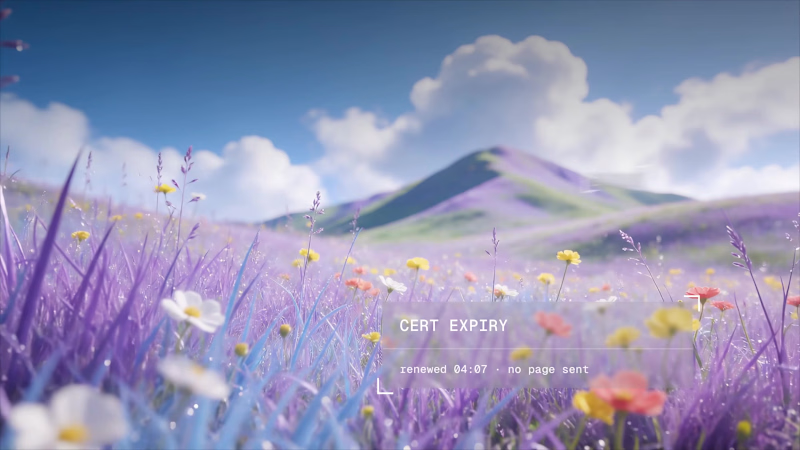
The hero section design shows no interface on purpose. This product is about absence, and a screenshot would add noise, so a person alone in a field does the proving. The headline “Deep focus. Anywhere.” is a high-contrast serif because every tool in this category speaks in a grotesque, and a serif sounds calm and human.
I kept one action, Download for macOS, with no pricing and no form. The first job of this landing page design is a download, and everything else can wait until after it.
Would you keep the serif for the headline, or switch to a grotesque so it feels more like software?
16
35
664
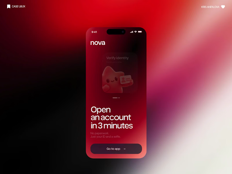
What if sending money felt a little more like giving a gift?
For Nova, I explored a banking app that brings payments, cards, and a bit of personality together. You can check your balance, browse recent transactions, send or request money, top up, and pay bills.
My favorite part is the digital postcard feature. Before sending a transfer, you can add a little illustrated card—a heart, a birthday greeting, or a playful character. A simple way to make birthday money or a thank-you feel more personal.
I carried that same 3D character into onboarding, pairing it with bold red gradients and large, clear payment details. There’s room for play, while the recipient and amount stay easy to check.
Would you add a postcard to a transfer? I’d love to know what occasion you’d use it for.
37
92
5.9K
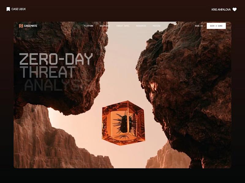
Casemate: making malware analysis feel calm instead of scary
Cybersecurity websites usually look the same: black background, green code, a hooded guy. I wanted to try the opposite for Casemate, a concept for a malware analysis tool.
The idea is simple: the product keeps a suspicious file in a sealed chamber and watches what it does. So I put a bug frozen in amber in the middle of a canyon. It’s dangerous and under control at the same time, and you get it without reading a word.
Then I made sure the page still works for a security lead who wants facts. The stats sit right next to the headline: threats isolated, latency, endpoints covered.
The hardest part was keeping it warm without losing trust. I stayed with one terracotta colour, wide capitals and mono labels, so it reads like a serious tool and not a poster.
I’m taking on new projects for SaaS and tech teams. If you have a product that’s hard to explain in one glance, send me a message.
What do you think, would you trust a security product with a canyon on the homepage?
30
91
3.2K

Webflow/Framer Expert & UXUI Designer for growing businesses
- $1k+
- Earned
- 2x
- Hired
- 4.6
- Rating
- 60
- Followers
Webflow/Framer Expert & UXUI Designer for growing businesses

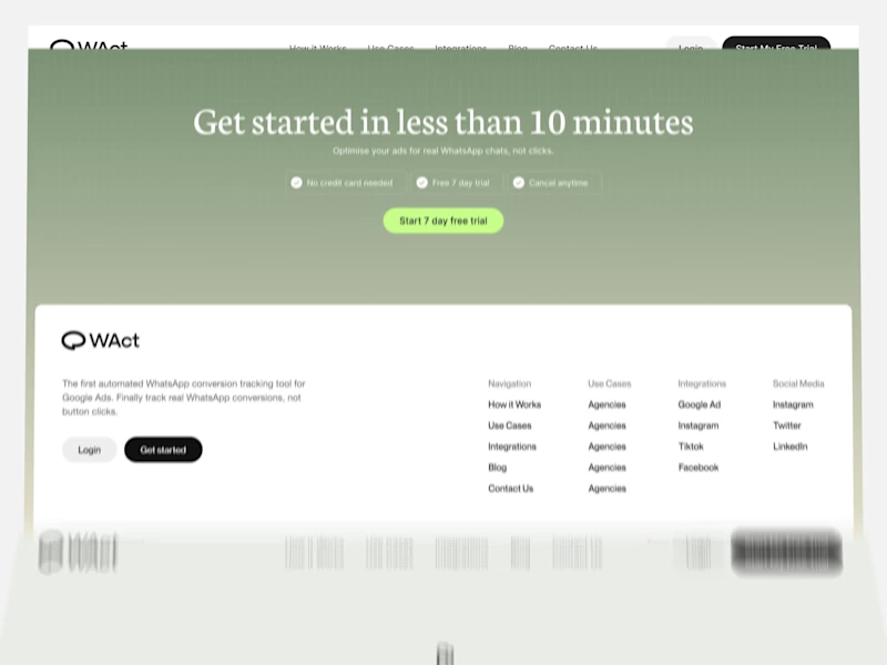
A quick look through the landing page layout for WAct 👀
🔗 Explore the full case study on Behance: WAct on Behance
(https://www.behance.net/gallery/253815513/WACT)I believe most founders know the frustration of running paid ads that bring plenty of clicks, but zero qualified leads. The WAct team needed more than just a visually appealing layout, they needed a site that immediately explains how their platform connects ad spend to actual WhatsApp conversations.
What I focused on here:
Clear hero section: Addresses the pain point right away by showing how ad budget converts directly into real customer chats.
Logical flow: Guides the reader step-by-step from the main problem to key analytics, integrations, and the contact form without any fluff.
Approachable visual style: Combines warm editorial tones and sharp typography so complex B2B data feels straightforward and easy to digest.
For me, combining UI architecture with clean technical implementation is what transforms a site from a static showcase into a high-converting product tool.
I'm currently open to new project opportunities and collaborations. DM me if you have a project in mind!
3
297
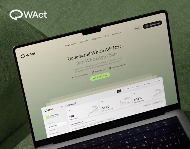
When designing WAct, the main challenge was to make complex analytics feel calm, approachable, and actionable.
Marketing tech platforms often suffer from visual noise: endless charts, aggressive contrast, and buried data.
For WAct, I took an editorial SaaS approach:
Visual Hierarchy: Kept the primary metric cards (CPL, Lead Quality Score) instantly readable at a glance.
Warm Aesthetic: Used a soft, olive-green gradient backdrop paired with editorial typography to make the brand stand out from generic blue dashboard templates.
Dashboard Logic: Structured the flow so users can track multi-channel ad conversions straight into WhatsApp chats without getting overwhelmed.
Building a complex B2B platform or analytics tool? Let’s connect and create a seamless UI/UX for your product.
🔗 Explore the full case study on Behance:
Check out WAct on Behance (https://www.behance.net/gallery/253815513/WACT)
7
22
705

When selling a premium service, mentorship, or high-value framework, a generic template fails to convey the true depth of your offer. The challenge I solved here was translating a multi-stage methodology into an intuitive, high-converting digital experience, built natively on Webflow.
By combining an editorial landscape aesthetic with modern, scroll-triggered interactions, I turned an abstract concept into a seamless visual journey.
Methodology Visualized: I designed custom interactive nodes (Relaxation → Attention → Motivation) that walk users step-by-step through the core process.
Webflow Build: I developed the full site on Webflow with clean HTML/CSS architecture, fluid animations, and fast load speeds.
Editorial Identity: I paired a warm color palette and subtle grid architecture with vintage illustration elements to build immediate authority.
Flexibility: I set up a clean Webflow CMS structure so you can easily update content without touching code.
Need a custom site that clearly communicates the value of your framework and converts visitors into clients? Send me a message and let’s discuss your project!
23
53
2.6K

Art Director & Branding/Packaging/ Graphic desinger
- $1k+
- Earned
- 1x
- Hired
- 5.0
- Rating
- 6
- Followers
Art Director & Branding/Packaging/ Graphic desinger


We design products and brands for companies that care
We design products and brands for companies that care

Car interfaces keep gaining features, but experience gets lost in complexity. With River, we stripped that back: only surface what the driver needs, when they need it.
We wanted the HMI to belong to the car, not sit on top. So we designed both as one system: car, interior, cluster, main display, app.
Rive was key to bringing the whole system to life. We used joysticks and blend states to animate the cluster gauges, solos to play back a pre-rendered Blender navigation scene on the central display, and state machine inputs to bring the whole prototype to life.
We then built a companion app and plugged it into a manufacturer's API to test against real vehicle data. The app works like a key: gives you access and gets out of the way. Just the right function at the right moment.
One ecosystem where every screen earns its place.
31
114
5.1K


Flod. We design products and brands for companies that care. A senior team, together for over a decade. Products, brands, motion and 3D for fintech, SaaS, AI and Web3. You work directly with the people doing the work, from brief to launch.
2
4
471

We created the Arrow Markets brand from zero and designed the entire Web3 trading platform including Lite and Pro modes, competition flows and advanced derivatives mechanics. The UX turns complex options logic into clear, actionable steps, while the visual identity gives Arrow a confident technical presence across all surfaces. The result is a platform that feels deep enough for experienced users yet approachable for those new to crypto derivatives.
0
438