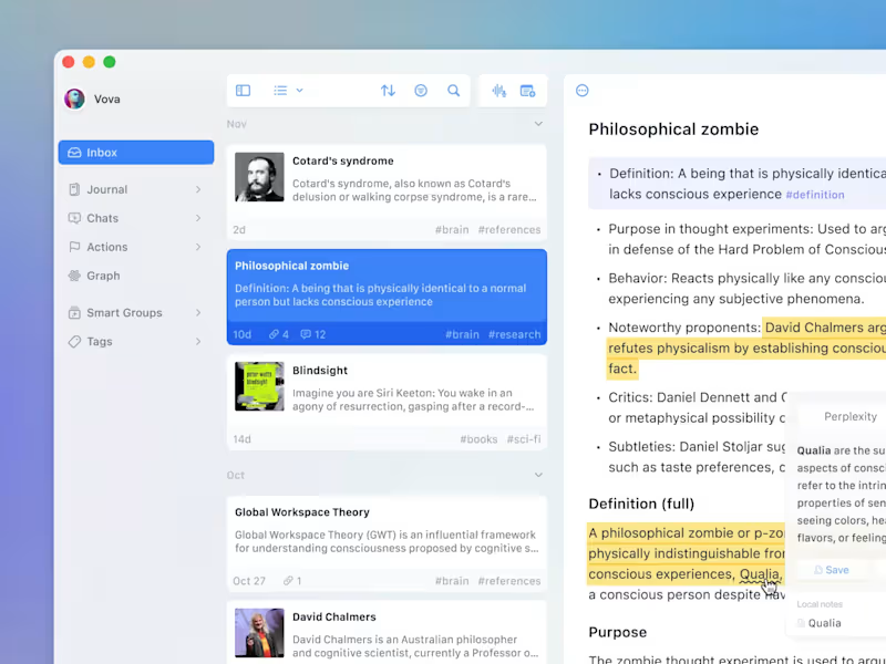
Freelancers in WarsawFreelancers in Warsaw
Designer for your SaaS, app, deck and brand.
$5k+
Earned
2x
Hired
5.0
Rating
54
Followers
Designer for your SaaS, app, deck and brand.
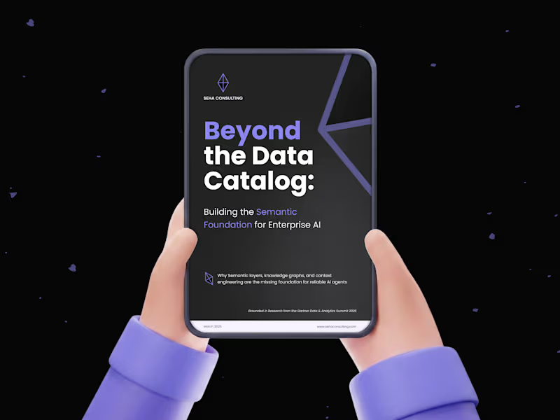
Premium design to grow your business - DesignMe
$10k+
Earned
5x
Hired
5.0
Rating
228
Followers
Premium design to grow your business - DesignMe
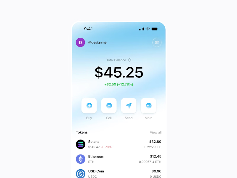
SaaS Product Designer | UI/UX, Webflow & B2B Websites
$1k+
Earned
3x
Hired
5.0
Rating
129
Followers
SaaS Product Designer | UI/UX, Webflow & B2B Websites
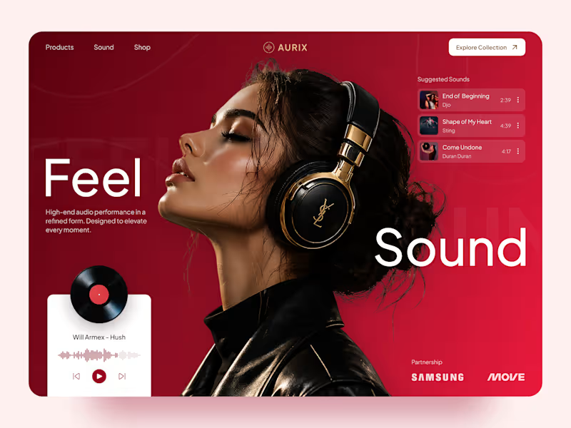
Cover image for AURIX — Premium Audio Product
AURIX — Premium Audio Product Landing Page 🎧✨ AURIX is a bold landing page concept created for a premium audio brand focused on high-end sound, refined design, and an immersive listening experience. The goal was to make the product feel aspirational from the first screen while keeping the interface clear, modern, and easy to explore. The visual direction combines rich red tones, editorial typography, premium lifestyle imagery, and interactive music elements to create a digital experience that feels both luxurious and emotionally engaging. Special attention was given to: • a cinematic hero section that places the headphones and listening experience at the center; • premium product positioning supported by elegant typography and a refined color system; • responsive desktop and mobile layouts designed for smooth product discovery 📱; • music player components that add interaction and reinforce the audio-focused concept; • suggested tracks and collection navigation that make the experience feel more dynamic; • strong calls to action guiding users toward exploring the product collection; • a scalable visual system suitable for product launches, campaigns, and future e-commerce pages. The result is a memorable digital experience that helps AURIX feel premium, modern, and emotionally connected to music — combining product storytelling with a clear path toward discovery and purchase 🎶 Looking to create a bold landing page for your audio, lifestyle, technology, or consumer product brand? Let’s build something people can feel ⚡
33
81
1.5K
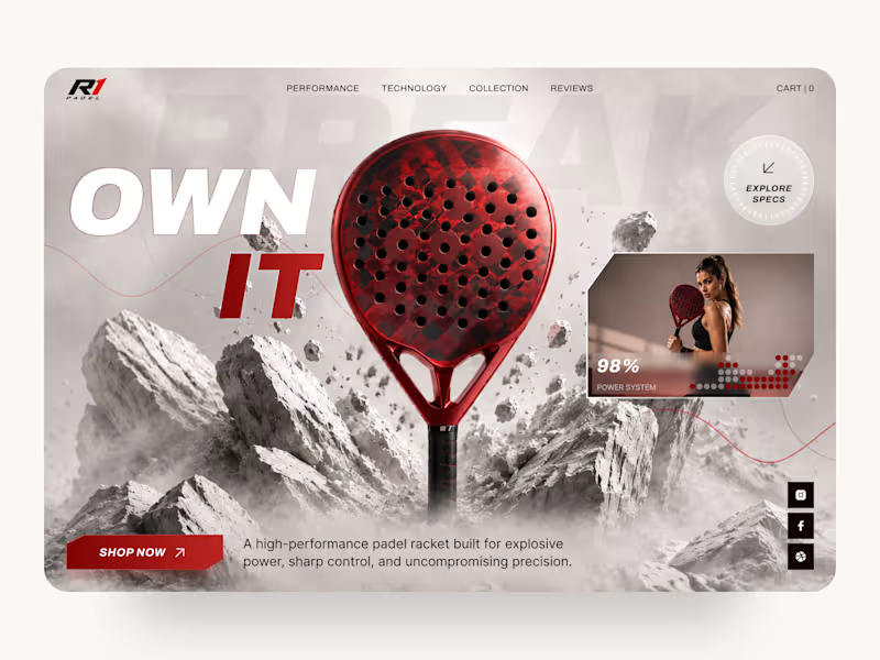
Cover image for R1 Padel — High-Performance Sports
R1 Padel — High-Performance Sports Equipment Landing Page 🎾 Performance starts long before the first match. This landing page concept for R1 Padel was designed to capture the energy, precision, and premium quality behind a high-performance padel racket. The goal was to create a bold digital experience that immediately communicates speed, power, and confidence while keeping the product at the center of attention. The design combines dramatic visuals, strong typography, and a clean interface to deliver an immersive shopping experience for athletes and sports enthusiasts. Key design highlights: • a cinematic hero section focused entirely on the product; • dynamic visual composition inspired by movement, impact, and performance; • premium product presentation with detailed specifications and feature highlights; • responsive desktop and mobile layouts for a seamless shopping experience 📱; • bold call-to-action elements that naturally guide users toward purchase; • clean navigation and intuitive content hierarchy for effortless browsing; • a modern visual language that reinforces a premium sports brand identity. The result is a conversion-focused landing page that blends impactful storytelling with ecommerce usability, helping transform visitors into customers while strengthening the brand's premium positioning. Looking to create a modern ecommerce experience or product landing page for your sports brand? Let's build something that performs as well as your product. 🚀
2
6
166
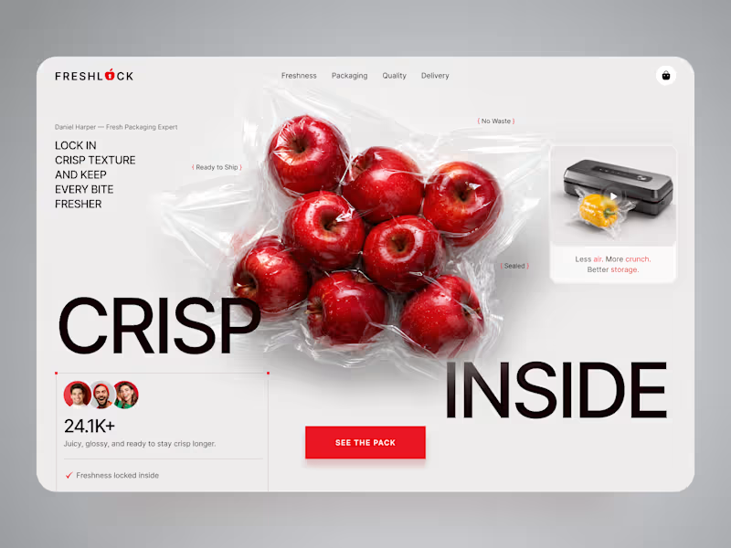
Cover image for FreshLock — Food Packaging Landing
FreshLock — Food Packaging Landing Page Design 🍎📦 FreshLock is a modern landing page concept created for a food packaging brand focused on preserving freshness, reducing waste, and presenting innovative packaging solutions through a clean digital experience. The goal was to communicate product benefits instantly while making the website feel fresh, premium, and trustworthy. The visual direction combines bold typography, minimal layouts, realistic product imagery, and vibrant red accents to create a strong first impression while keeping the focus on the product. Special attention was given to: • a product-first hero section that immediately highlights freshness and packaging quality; • clean visual hierarchy that makes key messages easy to scan; • responsive desktop and mobile layouts optimized for every device 📱; • trust-building elements showcasing product quality, freshness, and customer confidence; • bold CTAs that encourage users to explore the product and learn more; • a minimal interface that lets the packaging and product visuals become the center of attention; • a scalable landing page design suitable for future product launches and marketing campaigns. The result is a modern, conversion-focused landing page that helps communicate product value, strengthens brand credibility, and creates an engaging experience from the very first screen ✨ Looking to create a modern landing page for your food, packaging, FMCG, or consumer product brand? Let's build something fresh together 🚀
67
184
3.9K
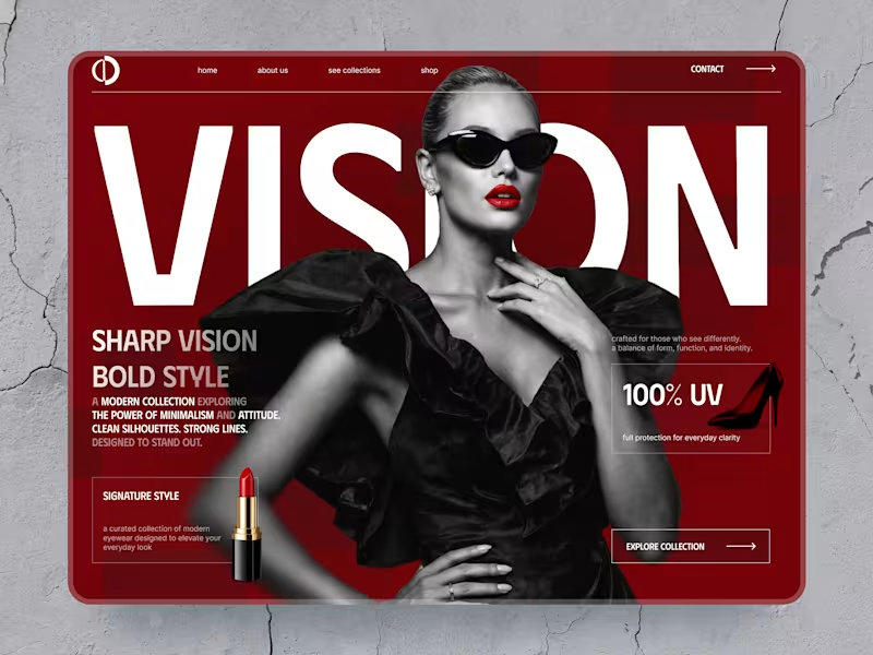
Cover image for VISION — Luxury Eyewear Landing
VISION — Luxury Eyewear Landing Page for a Fashion Brand 🕶️✨ VISION is a bold fashion landing page concept created for a premium eyewear brand focused on sharp silhouettes, strong identity, and modern luxury. The challenge was to make the product feel exclusive and editorial while keeping the shopping experience clear and conversion-focused. The visual direction combines oversized typography, dramatic black-and-white imagery, deep red tones, and clean product presentation to create a strong first impression. Special attention was given to: • a high-impact hero section that immediately communicates the brand’s premium positioning; • editorial layouts inspired by luxury fashion campaigns and magazine design; • responsive desktop and mobile experiences optimized for product discovery 📱; • featured product cards with clear pricing and collection-focused actions; • trust-building details such as UV protection, premium materials, easy returns, and shipping benefits; • strong CTAs that guide users toward exploring and shopping the collection; • a distinctive visual system built around contrast, bold typography, and selective color accents. The result is a memorable e-commerce experience that helps the eyewear brand feel premium, confident, and easy to shop — blending fashion storytelling with clear product navigation ❤️‍🔥 Looking to create a bold digital experience for your fashion, beauty, luxury, or e-commerce brand? Let’s build something that stands out together ✨
3
12
382
Premium UI/UX & Web Design for Fintech, SaaS & Web3 | Framer
$10k+
Earned
1x
Hired
5.0
Rating
201
Followers
Premium UI/UX & Web Design for Fintech, SaaS & Web3 | Framer
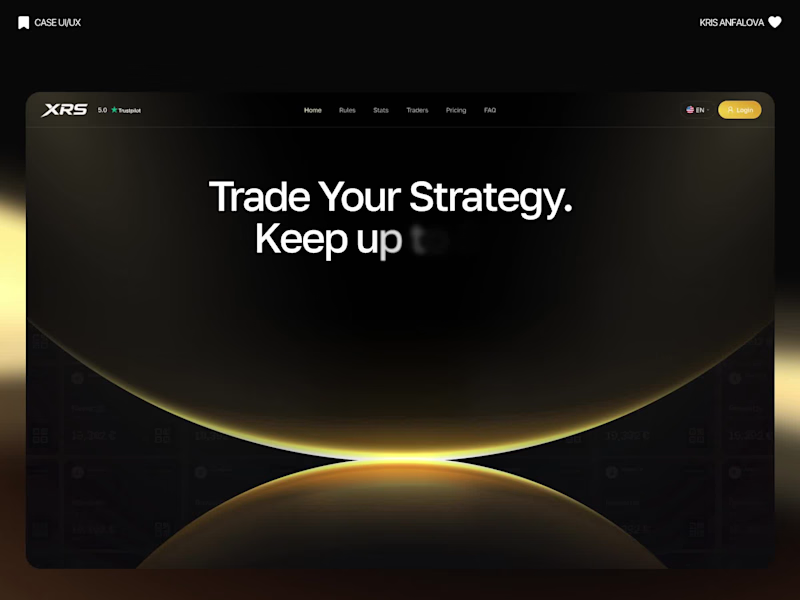
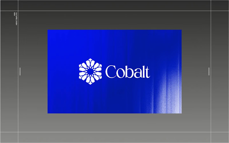
Cover image for Architect of Chaos: Branding Cobalt
Architect of Chaos: Branding Cobalt Analytics for the Envato Challenge AI has completely changed the creative landscape, but it hasn’t changed what makes a digital product functional. For the Envato Challenge, I set out to design the brand identity and UI concept for a B2B SaaS platform, Cobalt Analytics. The goal was to show the crucial difference between machine generation and human curation. The Insight: The Azulejo Metaphor  Data analytics is often visually represented by clichéd glowing nodes and neon webs. I wanted a metaphor with history. I turned to Azulejo — traditional Portuguese ceramic tiles. Historically, the art of Azulejo was about taking thousands of fragmented, independent tiles and assembling them into one grand, coherent narrative. This is exactly what a predictive data platform does: it turns chaotic metrics into a clear system. The Process: AI as the Miner, Human as the Filter  I started by feeding AI historical references of Azulejo tiles. The result? Absolutely stunning, yet completely unusable visual noise. AI generated beautiful chaos, but as a designer, I know that algorithms don't understand scalability, negative space, or modular grids. The Extraction: I rejected 95% of the AI generations, extracting just one perfect geometric silhouette hidden in the noise. The Clean-Up: I moved to Envato Elements to source mathematically perfect vector shapes and rebuilt the AI's concept into a clean, scalable brand mark. The System (Figma): I established a strict modular Bento-grid, paired the complex geometry with a brutalist sans-serif typography, and built out the core UI dashboard widgets in Figma. The Execution (Zero Photoshop): To bring the brand into the real world, I utilized Envato’s native mockup generator. I applied my designs directly to premium physical and digital mockups right inside Envato's browser tool—no Photoshop required. A completely streamlined, modern workflow. The Result: Cobalt Analytics.  A brand identity that is mathematically precise, highly scalable, and ready for development. AI generated the noise, but human judgment built the system. And for the brave souls, here is the link to the full Figma file. Fair warning: it’s a typical creative mess inside, you know how it is 😅 https://www.figma.com/design/5Du5Sjr7jCCZYNgH5Y9QtB/Envato-Challenge?node-id=17-2181&t=vap8tOu6fACNieNW-1
12
29
7K
Cover image for The Design Oracle is Live
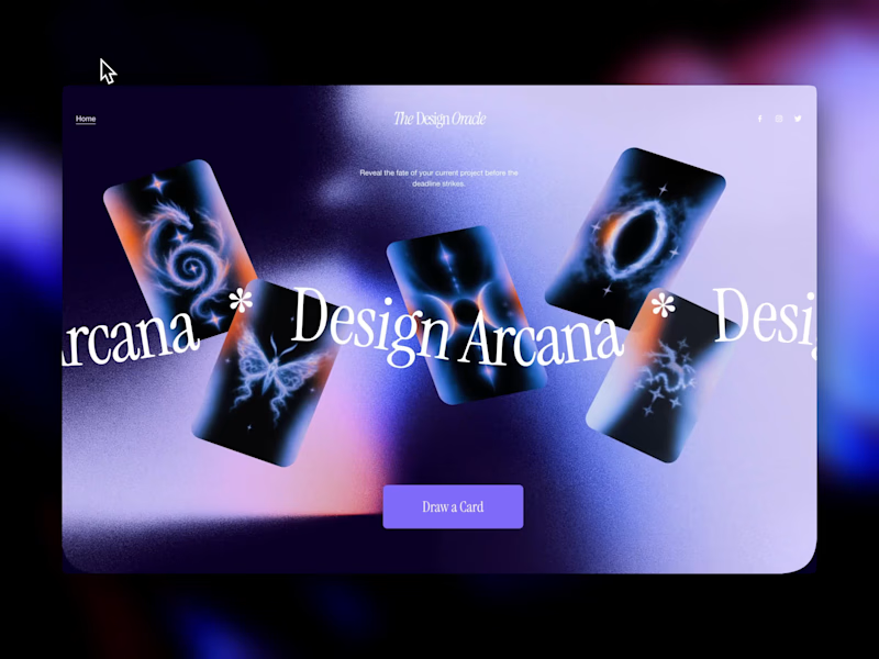
The Design Oracle is Live ✨ | Squarespace Make It Real Challenge Ever wondered if that "final_FINAL_v4" file is actually the last one? Or if the client will ask to make the logo just a little bit bigger? Let the cards decide. 🔮 I’m thrilled to unveil The Design Oracle (or Design Arcana)—an interactive, mystical tarot experience created specifically for freelancers and designers to reveal the fate of their current projects. This is my official submission for the Squarespace Make It Real Challenge. My goal was to completely break away from standard grid layouts and see how far I could push the creative boundaries using the new Finish Layer tools. Here is how the magic works behind the scenes (without a single line of custom code): Z-Axis & Overlapping: Used Fluid Engine to scatter the cards and floating stickers across the canvas, creating depth and a true "spread" feel. Hover Reveals: Leveraged native image swap effects so users can organically "draw" a card just by exploring the screen. Mobile Overrides: Rebuilt the entire chaotic desktop spread into a sleek, functional vertical stack for perfect mobile UX. After over a decade in UI/UX and brand design, I still believe the best projects start with pure creativity before locking into rigid systems. This was incredibly fun to build. Will you pull "The Golden Client" or "The Wheel of Feedback"? Take a deep breath, align your pixels, and draw your card here: https://round-herring-m73p.squarespace. Password: contrathebest I'd love to hear which destiny you got in the comments! 👇
21
67
2K