SaaS Product Designer | UI/UX, Webflow & B2B Websites
- $1k+
- Earned
- 4x
- Hired
- 5.0
- Rating
- 448
- Followers
SaaS Product Designer | UI/UX, Webflow & B2B Websites
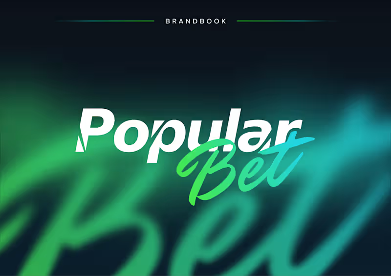
Popular Bet — Bold Brand Identity for an iGaming Platform 🎯⚡
Popular Bet is a dynamic brand identity concept created for a modern betting and entertainment platform built around speed, energy, and instant recognition.
The visual direction combines sharp typography, expressive script lettering, and a vivid green-to-cyan gradient to create a brand that feels competitive, digital-first, and highly memorable. The identity was designed to stand out across fast-moving environments while remaining clear and consistent across different formats.
Special attention was given to:
• a distinctive wordmark combining bold sans-serif typography with expressive handwritten lettering;
• a vibrant gradient palette that communicates energy, motion, and digital innovation 🎨;
• flexible logo versions for light, dark, monochrome, and complex backgrounds;
• clear-space and usage guidelines that protect readability and visual consistency;
• a scalable identity system suitable for digital platforms, social media, campaigns, and promotional materials;
• a high-impact visual language inspired by competition, momentum, and modern entertainment.
The result is a confident and adaptable brand system that helps Popular Bet feel recognizable, energetic, and ready to compete in a crowded digital market 🚀
Looking to build a bold identity for your iGaming, entertainment, sports, or digital platform? Let’s create a brand people remember ✨
1
16
974
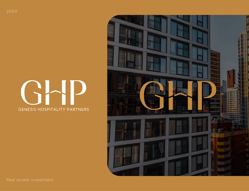
Genesis Hospitality Partners — Luxury Real Estate Brand Identity 🏙️✨
We designed a premium visual identity for Genesis Hospitality Partners 🏢 — a real estate investment brand focused on creating trust, sophistication, and long-term value perception from the very first interaction.
The challenge was to develop a brand system that feels timeless and refined while standing confidently within the highly competitive real estate and hospitality investment space. Through elegant typography, architectural references, and a restrained premium palette, we created an identity that communicates stability, credibility, and ambition.
Special attention was given to:
• a distinctive monogram logo inspired by architectural forms and premium property aesthetics;
• elegant typography designed to balance luxury positioning with corporate professionalism;
• a sophisticated color palette combining warm gold tones with deep neutrals to reinforce exclusivity and trust;
• scalable branding assets optimized for presentations, investment materials, digital platforms, and print applications;
• visual language inspired by modern urban architecture and high-end hospitality developments;
• a timeless identity system built to support long-term brand growth and market recognition.
The result is a refined brand experience that helps communicate confidence, premium positioning, and investment credibility — creating a strong foundation for future growth in the hospitality and real estate sectors.
Looking to create a premium brand identity for your real estate, investment, hospitality, or professional services business? Let's build something memorable together 🤝
1
19
988
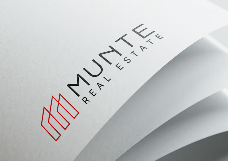
Munte Real Estate — Logo & Brand Identity Design
We designed a clean and modern logo identity for Munte Real Estate, a property-focused brand that needed to feel professional, structured, and easy to recognize.
The goal was to create a visual mark that reflects:
🏢 real estate and architecture
🤝 stability and trust
❤️ modern premium positioning
🧩 clear brand recognition across digital and print materials
The logo combines a minimal geometric symbol with clean typography, creating a strong and flexible identity system for real estate communication.
What we designed:
✔️ Logo concept
✔️ Brand mark
✔️ Typography direction
✔️ Color system
✔️ Logo variations
✔️ Real-world brand mockups
Result:
A simple but memorable real estate identity that feels professional, scalable, and ready to use across websites, presentations, documents, signage, and marketing materials.
Looking to build a clear and trustworthy brand identity for your real estate or B2B company? Let’s create something strategic and memorable 🚀
9
33
1.7K

Sunblock — Logo & Brand Identity Design for an Automotive Gadgets Brand ✦
We developed a complete brand identity for Sunblock — an automotive gadgets company whose products sit at the intersection of technology, comfort, and on-road innovation.
🧩 The design system is built around a single, strong idea: a sun rendered through horizontal lines — simultaneously evoking light filtering through a visor, motion, and precision engineering. Clean, confident, instantly recognisable.
Special attention was given to:
- logo mark construction with clear geometric logic;
- full colour system — signature yellow for energy, deep black for technology, white for clarity;
- monochrome logo variations for print, engraving, and embroidery use cases;
- brandbook layout with consistent visual language across all applications;
- mockup presentation showing real-world brand feel.
A sharp and modern identity that positions Sunblock as a premium player in the automotive accessories space — technical enough to feel credible, bold enough to stand out.
Looking to build a brand identity that reflects the true character of your product? Let's create something that lasts!
3
29
2K

Art Director & Branding/Packaging/ Graphic desinger
- $1k+
- Earned
- 1x
- Hired
- 5.0
- Rating
- 6
- Followers
Art Director & Branding/Packaging/ Graphic desinger


Expert Web Design, Branding & Marketing

The new look for iLingua! 🚀
It was an amazing journey to work with this incredible team to create a fresh visual identity that truly reflects their modern approach to language coaching.
This rebrand is more than just a new logo; it's a new brand voice, a new colour palette, and a new look and feel to help more people master the English language.
2
28
243


Brand & Website Designer


Professional Brand & Logo Designer | UX\UI Design
Professional Brand & Logo Designer | UX\UI Design



View more →

Brand Identity Designer
Brand Identity Designer

🕶️ Redefining Vision: AO Optical Brand Identity 🕶️
I am thrilled to finally share the full brand identity system I’ve been developing for AO Optical!
The goal for this project was to create a visual language that balances high-end luxury with modern precision. AO Optical isn't just about seeing better; it’s about "Vision with Authority."
0
30

Headline: Beauty meets luminosity. ✨
There is something magical about that moment when skincare crosses the threshold into ritual. Today, I am thrilled to officially unveil Lumièra.
Introducing PureGlow—a cornerstone of our philosophy that confidence is the best thing you can carry.
We believe in botanical magic, modern minimalism, and creating that elusive midnight glow that doesn't just sit on your skin, but radiates from within. At Lumièra, we aren't just creating products; we are crafting the feeling of carrying your best self with you, wherever you go.
A huge thank you to everyone who has been part of this journey. The best is yet to come.
0
40

Revolutionizing the Digital Space: W3 Innovation Branding Reveal ⚡️
Meet W3 Innovation, a digital agency built on the pillars of speed, precision, and future-forward strategy. 🚀
For this visual identity, I focused on "Architecting Digital Excellence." The logo merges the 'W' and '3' into a dynamic lightning bolt, symbolizing the high-voltage energy we bring to every project.
Design Details:
✔️ Typography: A pairing of the bold, industrial Hemi Head for impact and the clean, versatile Montserrat for readability.
✔️ Color Palette: A high-contrast "Electric Orange" and "Deep Charcoal" to evoke innovation and professional trust.
✔️ The Vibe: Sleek, tech-driven, and undeniably bold. From office stationery to digital interfaces, the brand is designed to scale and inspire.
0
63

✔️ Majlis Muslim Restaurant Branding and Visuals
The comprehensive brand identity design for Majlis Restaurant, a concept that bridges the gap between traditional Middle Eastern warmth and contemporary luxury.
The word "Majlis" translates to a place of sitting, and this identity was crafted to evoke that very essence—a space of gathering, comfort, and exceptional service.
0
72

Clean & Modern Graphic Design Specialist


Crow Detailing is a brand specializing in professional car detailing – from paint correction and ceramic coatings to upholstery cleaning and impregnation. The company needed a modern visual identity that would emphasize the premium quality of its services, precision, and an exclusive character. I developed a complete branding package, including: Logo and Business Cards and Brandbook.
2
127


Brand designer
Brand designer