Freelancers in WarsawFreelancers in Warsaw
Premium Design Partner | Launch Videos & Branding
$50k+
Earned
10x
Hired
5.0
Rating
210
Followers
Premium Design Partner | Launch Videos & Branding
Designer for your SaaS, app, deck and brand.
$5k+
Earned
2x
Hired
5.0
Rating
54
Followers
Designer for your SaaS, app, deck and brand.
Premium design to grow your business - DesignMe
$10k+
Earned
5x
Hired
5.0
Rating
232
Followers
Premium design to grow your business - DesignMe
SaaS Product Designer | UI/UX, Webflow & B2B Websites
$1k+
Earned
3x
Hired
5.0
Rating
151
Followers
SaaS Product Designer | UI/UX, Webflow & B2B Websites
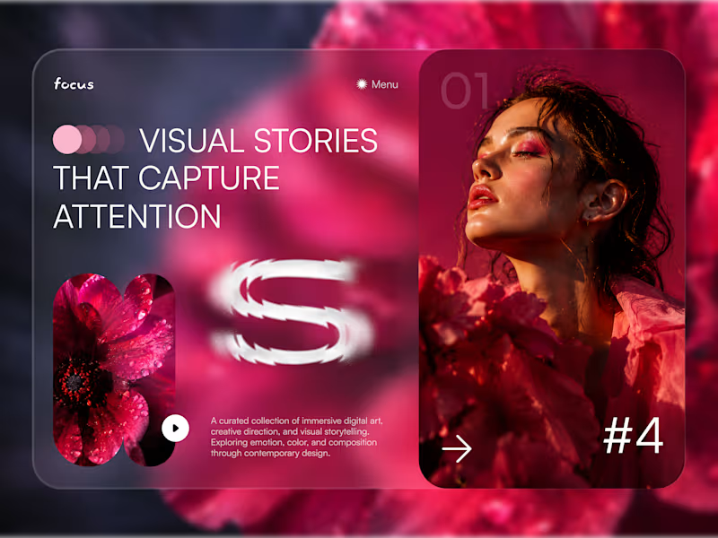
Cover image for Focus — Immersive Visual Storytelling
Focus — Immersive Visual Storytelling Experience 🌺✨ Focus is a bold digital concept created for a curated platform that brings together visual stories, creative direction, and immersive editorial content. The goal was to make every screen feel emotional, cinematic, and highly engaging while keeping the browsing experience clear and intuitive. The visual direction combines deep pink tones, layered imagery, soft transparency, and oversized typography to create a strong sense of atmosphere from the very first interaction. Special attention was given to: • a dramatic hero section built around visual storytelling and emotional impact; • editorial compositions that blend photography, typography, and motion-inspired elements; • responsive mobile screens designed for immersive browsing and content discovery 📱; • story cards that help users explore collections through clear visual hierarchy; • soft glassmorphism effects and layered gradients that add depth without overwhelming the interface; • simple navigation and directional controls that keep the experience intuitive; • a scalable visual system suitable for creative portfolios, digital magazines, and art-focused platforms. The result is a memorable digital experience that turns content discovery into something more expressive and immersive — helping every visual story feel distinct, emotional, and worth exploring 🎨 Looking to create a bold digital experience for your creative, fashion, art, or lifestyle brand? Let’s build something people remember 💫
36
73
2K
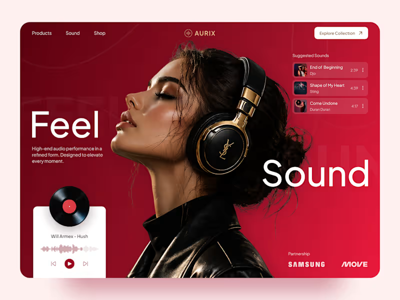
Cover image for AURIX — Premium Audio Product
AURIX — Premium Audio Product Landing Page 🎧✨ AURIX is a bold landing page concept created for a premium audio brand focused on high-end sound, refined design, and an immersive listening experience. The goal was to make the product feel aspirational from the first screen while keeping the interface clear, modern, and easy to explore. The visual direction combines rich red tones, editorial typography, premium lifestyle imagery, and interactive music elements to create a digital experience that feels both luxurious and emotionally engaging. Special attention was given to: • a cinematic hero section that places the headphones and listening experience at the center; • premium product positioning supported by elegant typography and a refined color system; • responsive desktop and mobile layouts designed for smooth product discovery 📱; • music player components that add interaction and reinforce the audio-focused concept; • suggested tracks and collection navigation that make the experience feel more dynamic; • strong calls to action guiding users toward exploring the product collection; • a scalable visual system suitable for product launches, campaigns, and future e-commerce pages. The result is a memorable digital experience that helps AURIX feel premium, modern, and emotionally connected to music — combining product storytelling with a clear path toward discovery and purchase 🎶 Looking to create a bold landing page for your audio, lifestyle, technology, or consumer product brand? Let’s build something people can feel ⚡
46
137
3.1K
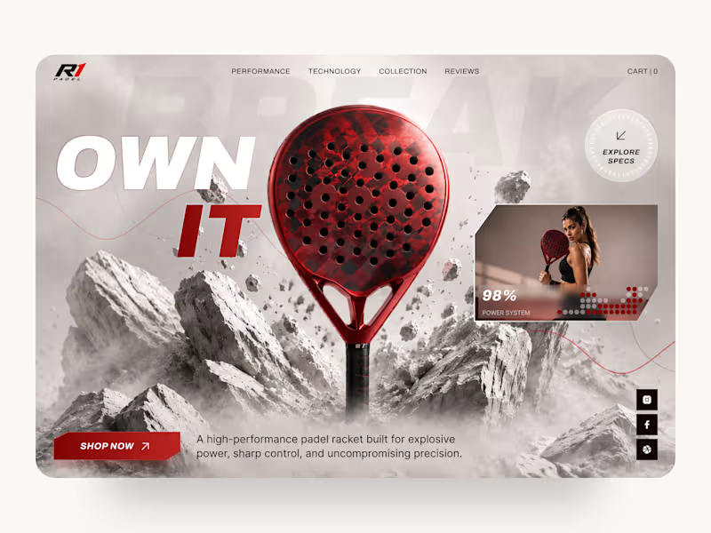
Cover image for R1 Padel — High-Performance Sports
R1 Padel — High-Performance Sports Equipment Landing Page 🎾 Performance starts long before the first match. This landing page concept for R1 Padel was designed to capture the energy, precision, and premium quality behind a high-performance padel racket. The goal was to create a bold digital experience that immediately communicates speed, power, and confidence while keeping the product at the center of attention. The design combines dramatic visuals, strong typography, and a clean interface to deliver an immersive shopping experience for athletes and sports enthusiasts. Key design highlights: • a cinematic hero section focused entirely on the product; • dynamic visual composition inspired by movement, impact, and performance; • premium product presentation with detailed specifications and feature highlights; • responsive desktop and mobile layouts for a seamless shopping experience 📱; • bold call-to-action elements that naturally guide users toward purchase; • clean navigation and intuitive content hierarchy for effortless browsing; • a modern visual language that reinforces a premium sports brand identity. The result is a conversion-focused landing page that blends impactful storytelling with ecommerce usability, helping transform visitors into customers while strengthening the brand's premium positioning. Looking to create a modern ecommerce experience or product landing page for your sports brand? Let's build something that performs as well as your product. 🚀
3
12
1.3K
Premium UI/UX & Web Design for Fintech, SaaS & Web3 | Framer
$10k+
Earned
1x
Hired
5.0
Rating
216
Followers
Premium UI/UX & Web Design for Fintech, SaaS & Web3 | Framer
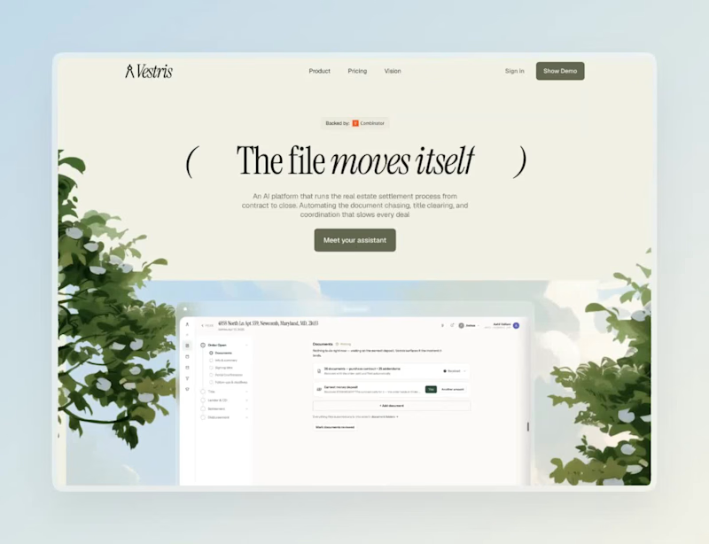
Cover image for Vestris — from ratified contract
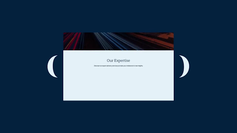
Vestris — from ratified contract to closing-ready, on autopilot Just wrapped one-week sprint designing the landing page for Vestris, a YC S26 startup automating mortgage title & closing work. Sharing the process because a few things about it were genuinely different from a typical SaaS landing page project. The brief Vestris automates the unglamorous middle of a real estate closing — chasing documents, prorating taxes, drafting closing disclosures, coordinating between lender/agents/title company. The founder wanted the site to feel "homey," not like enterprise software — because the buyers here are mom-and-pop title companies, not enterprise IT departments. Process 2 hero concepts tested in parallel (a quieter parenthetical headline vs. a bold full-width one), each with copy variants, sent as a single comparison sheet rather than one "final" direction — let the founder react to real trade-offs instead of guessing what I meant. Redesigned the site's core interactive block — an 11-step "how it works" breakdown — three separate times based on live feedback: first a desktop accordion, then a mobile-specific pass (accordions don't compress well under ~380px), then a full restructure into a 2×2 grid after the client flagged the original zig-zag layout for being "repetitive and too long to scroll." The illustrated hero background (watercolor countryside, cottage) needed to dissolve into the brand's cream background at the edges — but a standard blur/gradient looked flat next to the painterly art style. Built a small custom tool (canvas + JS) that applies ordered Bayer dithering to fade the illustration into the background color pixel-by-pixel instead of blending — it reads as grain, not gradient, and matches the hand-painted texture instead of fighting it. Turned it into a reusable tool with adjustable fade area, blur radius, dot size, and a transparent-overlay export, so it's not a one-off script. Figma for design, Framer for the build, custom canvas/JS tooling for the image-edge treatment, Midjourney for the base illustrations. vestris.ai (http://vestris.ai) — live now.
6
12
269
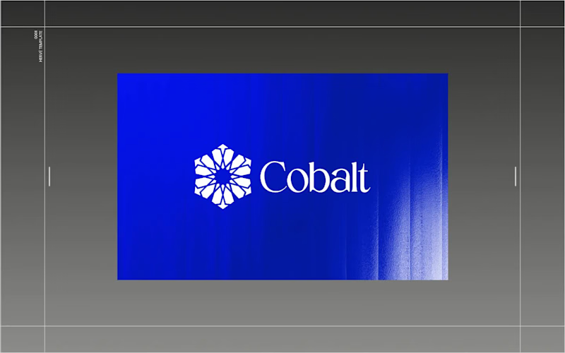
Cover image for Architect of Chaos: Branding Cobalt
Architect of Chaos: Branding Cobalt Analytics for the Envato Challenge AI has completely changed the creative landscape, but it hasn’t changed what makes a digital product functional. For the Envato Challenge, I set out to design the brand identity and UI concept for a B2B SaaS platform, Cobalt Analytics. The goal was to show the crucial difference between machine generation and human curation. The Insight: The Azulejo Metaphor  Data analytics is often visually represented by clichéd glowing nodes and neon webs. I wanted a metaphor with history. I turned to Azulejo — traditional Portuguese ceramic tiles. Historically, the art of Azulejo was about taking thousands of fragmented, independent tiles and assembling them into one grand, coherent narrative. This is exactly what a predictive data platform does: it turns chaotic metrics into a clear system. The Process: AI as the Miner, Human as the Filter  I started by feeding AI historical references of Azulejo tiles. The result? Absolutely stunning, yet completely unusable visual noise. AI generated beautiful chaos, but as a designer, I know that algorithms don't understand scalability, negative space, or modular grids. The Extraction: I rejected 95% of the AI generations, extracting just one perfect geometric silhouette hidden in the noise. The Clean-Up: I moved to Envato Elements to source mathematically perfect vector shapes and rebuilt the AI's concept into a clean, scalable brand mark. The System (Figma): I established a strict modular Bento-grid, paired the complex geometry with a brutalist sans-serif typography, and built out the core UI dashboard widgets in Figma. The Execution (Zero Photoshop): To bring the brand into the real world, I utilized Envato’s native mockup generator. I applied my designs directly to premium physical and digital mockups right inside Envato's browser tool—no Photoshop required. A completely streamlined, modern workflow. The Result: Cobalt Analytics.  A brand identity that is mathematically precise, highly scalable, and ready for development. AI generated the noise, but human judgment built the system. And for the brave souls, here is the link to the full Figma file. Fair warning: it’s a typical creative mess inside, you know how it is 😅 https://www.figma.com/design/5Du5Sjr7jCCZYNgH5Y9QtB/Envato-Challenge?node-id=17-2181&t=vap8tOu6fACNieNW-1
12
30
7.3K