
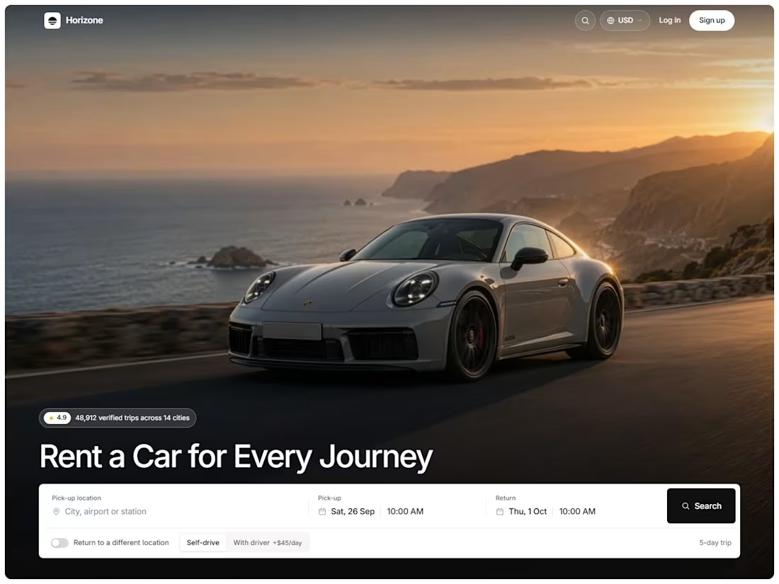
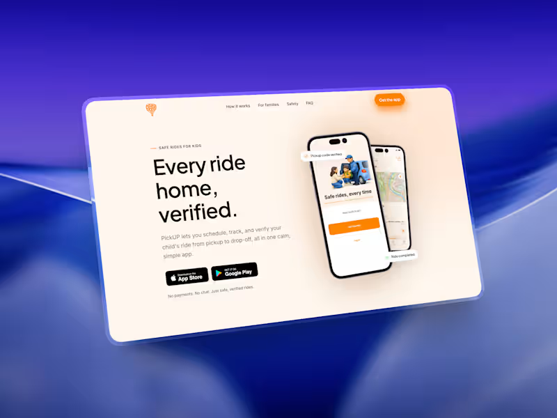


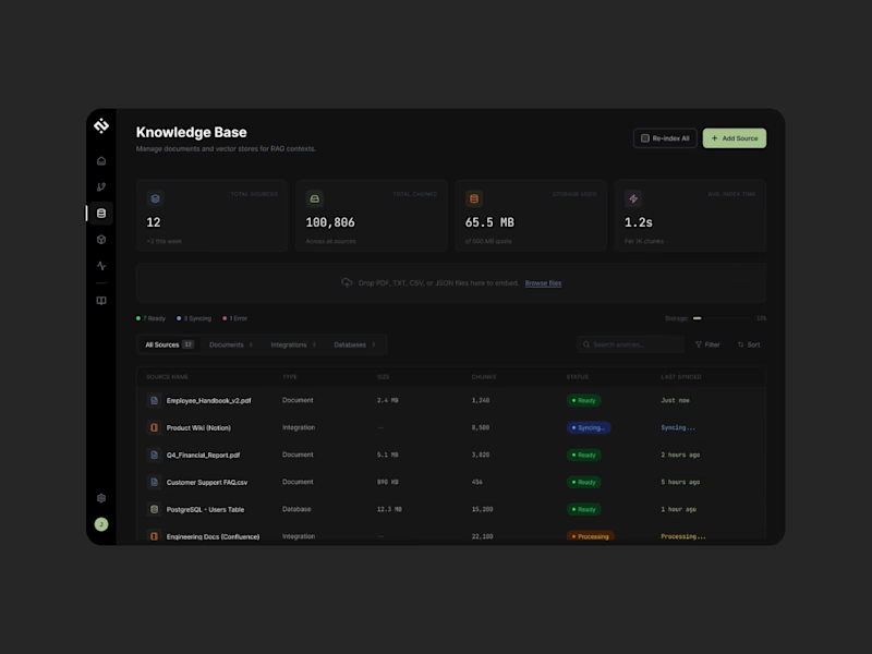
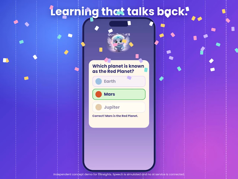
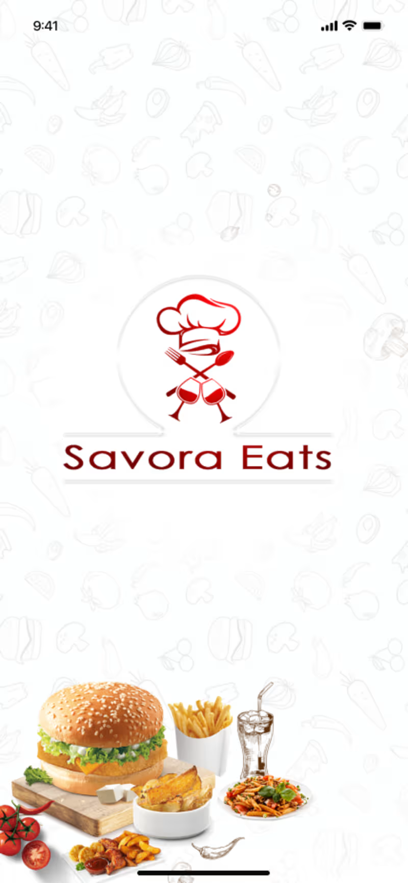
I'm excited to share the full case study of Savora Eats, a restaurant app designed to make discovering food and ordering meals simple, smooth, and enjoyable.
The goal was to create a seamless food-ordering experience where users can explore menus, discover dishes, and move through the ordering journey with ease.
The project focused on improving key UX touchpoints, including navigation, menu browsing, and the checkout flow. The result is a structured, user-friendly interface designed to reduce friction, simplify decision-making, and make ordering more convenient.
Through thoughtful UX research, intuitive user flows, and a consistent UI design system, Savora Eats brings together usability and a modern visual experience.
Project impact: The design prioritizes three key areas: easier food discovery, smoother navigation, and a more streamlined ordering journey.
Want to collaborate on a UI/UX project? Let's connect!
3
156
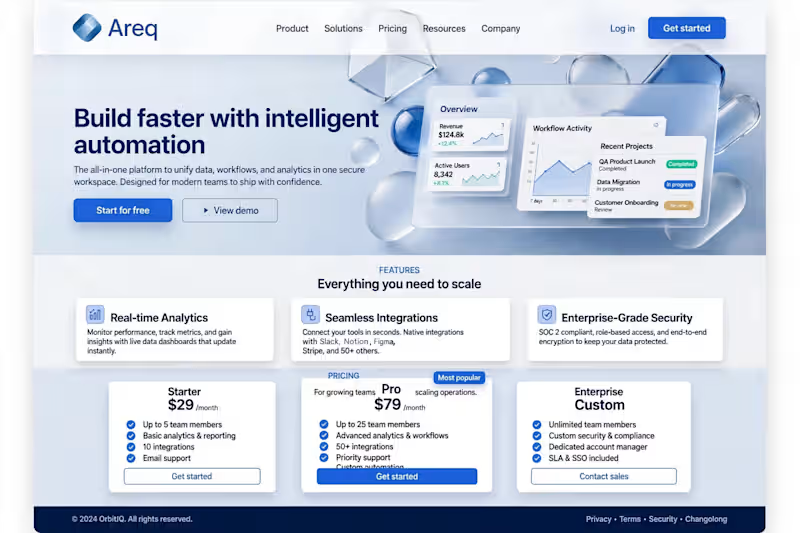
Areq
SaaS Landing Page Design.
SaaS / Website / Hero Section Design.
Areq is a smart automation platform. The goal of this design is to make the brand look clean and premium.
. What I Did:
Changed the name to Areq, fixed the tilted Overview dashboard to make it straight, and set up the hero, features, and pricing sections in a clean layout.
. Result:
A modern and premium SaaS landing page that is fast and user-friendly.
2
0
29
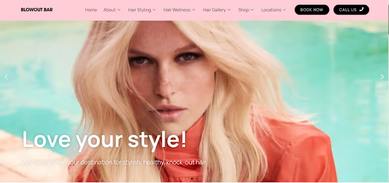
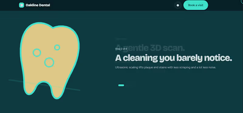
From an IDEA to Live Website: Building and Deploying a Dentist Website 🦷✨
I recently worked on a dentist website designed to deliver a clean, modern, and engaging experience for dental clinic and healthcare businesses.
The goal was to create more than just a static landing page - I wanted to build an interactive website experience that looks professional, feels smooth, and works well across devices.
✨ What’s included?
Modern UI/UX: A clean layout with professional typography and a polished visual style.
Interactive animations: Smooth scroll effects and engaging page interactions.
Treatment sections: Organized content to present dental services clearly.
Testimonials carousel: A dedicated section to showcase patient reviews.
Theme toggle: Light and dark mode functionality.
Interactive elements: Including a tooth-brushing animation and a booking form interface.
Responsive design: Built to provide a consistent experience across screen sizes.
🚀 From an IDEA to live deployment
I also deployed the template using GitHub Pages, making it publicly accessible without requiring paid hosting.
This project was a great opportunity to combine frontend development, UI/UX thinking, interactive elements, and deployment into one complete workflow.
🔗 Live Demo: https://comeonai.github.io/TemplatesDentist/
💡 What's next?
I’m continuing to explore ways to make websites more engaging through thoughtful design, smooth animations, and practical functionality — without compromising usability.
I’d love to hear your feedback!
What would you improve or add to this dental website template? If you're building a website for a clinic, healthcare brand, or local business, feel free to connect.
#WebDesign #FrontendDevelopment #UIUX #WebsiteDevelopment #Contra
1
64

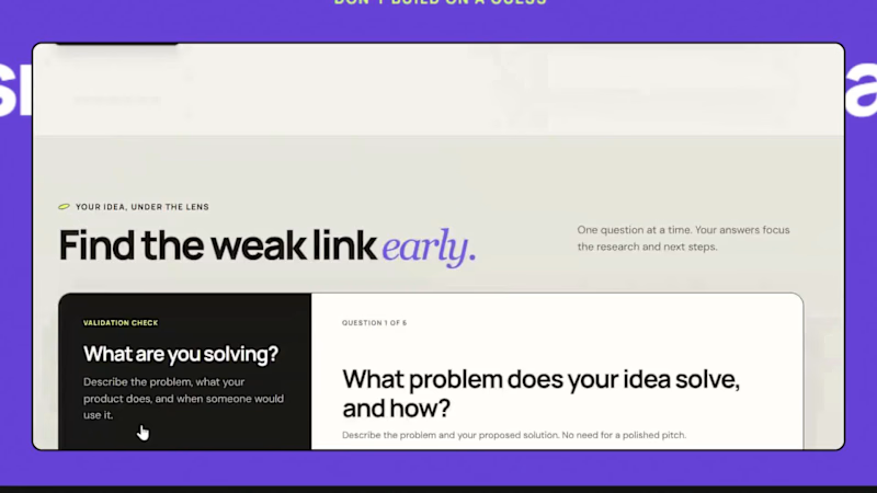
I built Idea Validator.
1. WHAT IS IT?
A validation tool for early-stage founders. Answer 6 simple questions, and it analyzes your competitors, pulls real-time market insights, and rates your idea: strong, medium, or unclear.
2. WHY I BUILT IT
Most early-stage founders start building on gut feeling. They skip research because it is slow and confusing.
3. WHAT PROBLEM DOES IT SOLVE?
Founders waste months on ideas nobody needs. Idea Validator replaces guesswork with real market insights and shows:
-> Problem and demand
-> Reason to choose your idea
-> What could stop it
-> Your next validation steps
-> You can download the full report in one click.
-> Know before you build.
Try it here: https://idea-validator-check.netlify.app/
What would you want this tool to tell you about your idea? Let me know in the comments.
#startups #saas #founders #productdesign #uiux #buildinpublic
3
3
256

Before → After: Small UI changes can make a BIG difference.
I redesigned this dashboard with 3 simple goals:
→ Clearer visual hierarchy
→ Better spacing & typography
→ Faster access to key actions
Good UI isn't just about making things look beautiful.
It's about making products easier to understand and use.
What would you improve first?
1️⃣ Layout
2️⃣ Typography
3️⃣ CTA
4️⃣ User flow
Drop your answer 👇
#UIDesign #UXDesign #ProductDesign #Figma #WebDesign #Contra #DesignCommunity
4
199