
Web & Product Design Agency for SaaS Companies & White-Label


Web & Product Design Agency for SaaS Companies & White-Label


We bring ideas to life. UX/UI, Branding, and Development
- $5k+
- Earned
- 4x
- Hired
- 5.0
- Rating
- 19
- Followers
We bring ideas to life. UX/UI, Branding, and Development
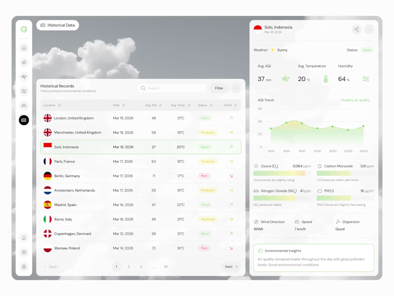
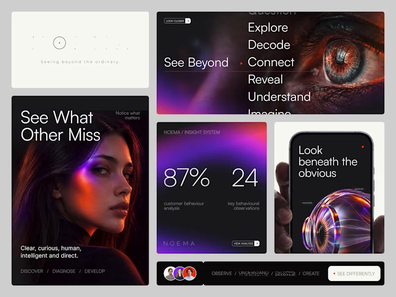


UI/UX & Product Design Partner for SaaS, Fintech, Web Apps
- $10k+
- Earned
- 4x
- Hired
- 5.0
- Rating
- 61
- Followers
UI/UX & Product Design Partner for SaaS, Fintech, Web Apps



Visual Branding Designer

The latest visual exploration for Croissant Bakery, I tried using Pop color, Raw style illustration and minimalist layout.
What do you think? Full visual case study on my contra profile 👀
Maybe you have same exploration just drop on reply!
1
2
512


My team and I have recently been conducting visual exploration regarding the contractor brand. The approach taken here is to use bold lines that are synonymous with a contractor's work.
In addition, the use of yellow and black as contrasting colors can make Aro eye-catching and more recognizable outdoors.
What do you think, contractor people? Perhaps you have some input and feedback on what we have done.
6
5
562

Designer and Creative Director


Versatile designer, that helps make your brands stand-out


Branding & Visual Identity Design
Branding & Visual Identity Design

Identity Design - Jumphigh
Full Project (https://www.behance.net/gallery/240872025/JUMPHIGH-Health-Club)
0
50

Hi, everyone
I’d like to share a little bit about my latest project for the fitness and wellness brand—Jumphigh
Check out the full details here:
Full Project (https://www.behance.net/gallery/240872025/JUMPHIGH-Health-Club)
0
61


Brand & Visual Designer
Brand & Visual Designer


View more →