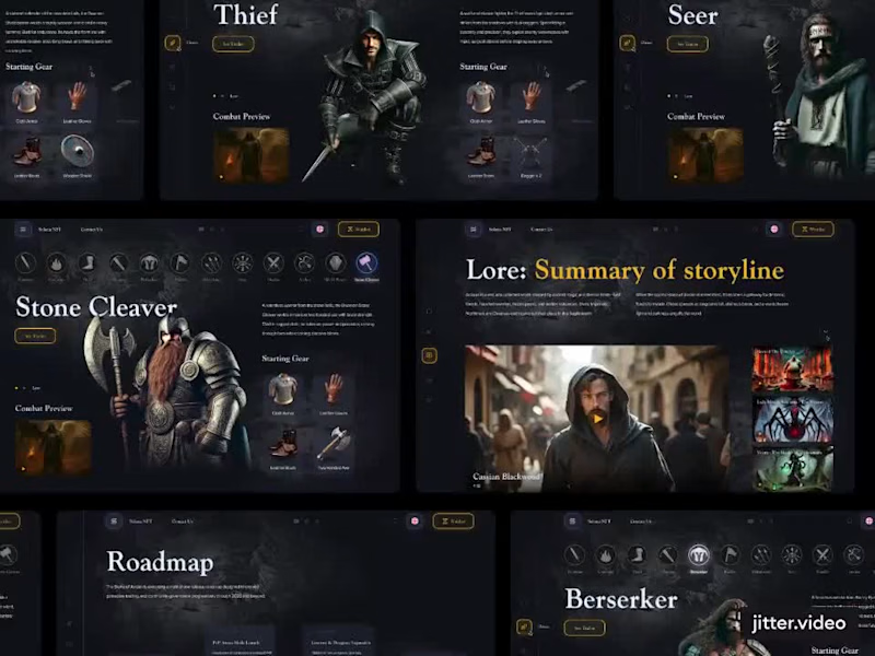
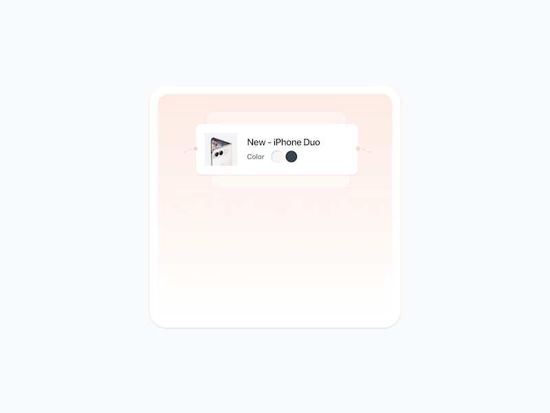
A Shopify theme I designed and built end to end, with conversion as the brief rather than something added at the end. Every section is hand-written Liquid with real schema settings, and that matters more than it sounds. When the merchant can change hierarchy, copy, and layout themselves, they can actually run tests. Hardcode it and every experiment needs a developer, so no experiments happen.
No page builder either. That weight lands on LCP, and a slow page loses the buyer before the design gets a say.
Aevum. Designed and built by one person. Want something like this for your store? Send me a message, happy to talk it through.
Demo brand, real build.
Take a look: https://clvn-avenir.myshopify.com/
(https://clvn-avenir.myshopify.com/)Password: aevum
1
4
210
I've been paying attention to how architecture firms present their work online, and one thing I kept coming back to was how much the first few seconds matter.
Large project photography, minimal distraction, strong project information, and recognition placed close to the work itself.
I kept those ideas in mind while designing Kingsley Architects.
The homepage opens with a project slideshow where the imagery, project name, location and recognition change together, so each project gets its own moment rather than feeling like another item in a grid.
I approached motion the same way.
Using GSAP, I focused on transitions that guide attention, create hierarchy and give the architectural photography enough room to carry the experience.
But I also wanted Kingsley to work beyond the initial launch.
Architecture practices keep evolving. New projects are completed, photography gets updated, awards are received, and the portfolio grows.
So I built a content management system behind the website that allows the studio to add projects, replace imagery and update content without touching the code.
That was an important part of the concept for me.
A studio website shouldn't only look good when it launches. It should be something the practice can continue building on as its body of work grows.
Kingsley is a fictional architecture practice, but the design decisions came from patterns I found while studying real architecture firms and how they present projects, recognition and studio credibility online.
I designed and developed the full experience with Next.js, Tailwind CSS, GSAP and CMS, covering visual direction, responsive development, motion, project presentation and content management.
🔗 Live site:
https://kingsley-architecture.vercel.app/
For architects and studio teams, how important is it for your team to be able to update your portfolio without relying on a developer?
0
72
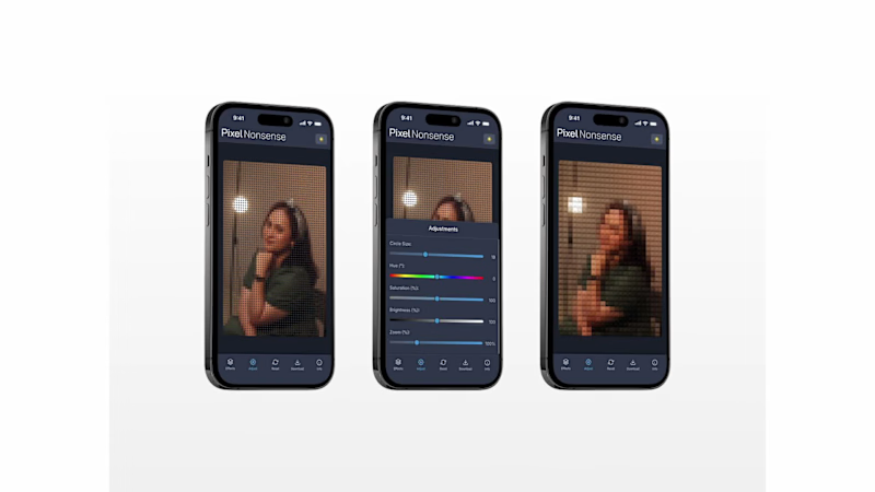
Allow me to reintroduce myself.
My name is Rudy, a visual designer working across product design, brand identity, editorial design, icon design, and illustration.
I've finally put together a collection of my work from 2025–2026. A mix of freelance projects, personal explorations, and visual experiments.
Here's a look at what I've been making over the past two years.
More of my work at https://rudypagnel.me
4
2
122

I made an app where you turn your days into flames. It's called Amber.
I wanted something that captures the intensity of a day instead of scoring it, a quiet day isn't a failed day, it's just a quiet one.
One question: How did your day go? You slide to the flame that matches, add a note if you feel like it, done in about fifteen seconds. A month later your calendar is a grid of flames you can actually feel.
On the build: I made all five flame states in Figma Weave, and I designed every screen myself in Figma and handed it to Make through MCP.
Try Amber: https://amber-app.figma.site
(https://amber-app.figma.site)Figma community file: https://www.figma.com/community/file/1649128971567301375
Social post: https://www.linkedin.com/posts/kevinnkwok_configmakeathon-figma-figmamake-ugcPost-7473065471005794304-cNLR/?utm_source=share&utm_medium=member_desktop&rcm=ACoAADdlQK8B1qbSyrKktjzva-q_3NUicLCvWQ8
Built for #ConfigMakeathon
2
4
222
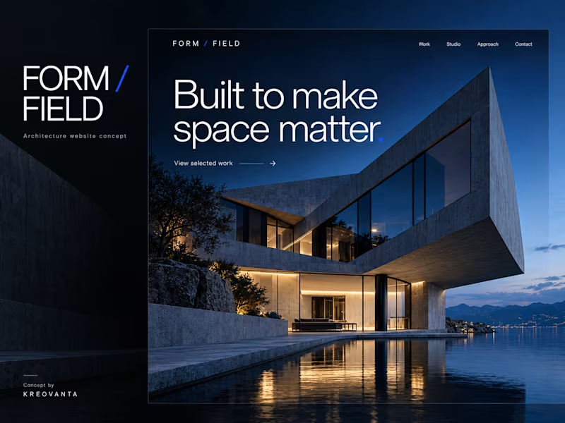
Form / Field — Architecture Website Concept
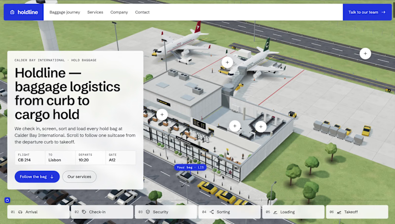
Form / Field is an independent website design concept by Kreovanta for contemporary architecture and interior design studios.
The goal was to create a confident, editorial presentation that lets the architecture lead. Bold typography, generous whitespace, an ink and cobalt palette, and large architectural images establish a clear visual identity.
The concept explores a homepage, a detailed project page, a studio and approach page, and mobile layouts. The visitor journey moves from discovering selected work to understanding the studio and starting a conversation.
My role covered visual direction, page structure, interface design exploration, and portfolio presentation. The six visuals show the proposed desktop and mobile experience alongside its design direction.
This is a self-initiated concept project, not commissioned client work. The visuals are AI-assisted mockups; a functioning website has not yet been developed.
1
0
110