
Authentic Design with Cultural Insight


Put feelings into pixels. Illustrator & graphic designer.
- $10k+
- Earned
- 4x
- Hired
- 5.0
- Rating
- 31
- Followers
Put feelings into pixels. Illustrator & graphic designer.

I finally received the custom lenticular cards (https://metroboard.backerkit.com/hosted_preorders/689567) I created the illustrations for! They feature iconic USA cities along with their metro lines.
The Design Rules Company (https://www.instagram.com/designrulesco/) hired me to create this set and it was part of their Metroboard (https://www.designrules.co/) launch campaign (a live map of the metro system in each of these cities!).
All done in Photoshop! You can see the sketches in the case study.
Illustrations done by me, packaging and back of the card by The Design Rules Company.
I shared the full project as a case study on my Contra profile (https://contra.com/p/WgbPcloo-metroboard-lenticular-cards?r=abdallahmarcos) and on Behance (https://www.behance.net/gallery/237001715/Metroboard-Lenticular-Cards).
16
295


Hey guys, just got access to the community!
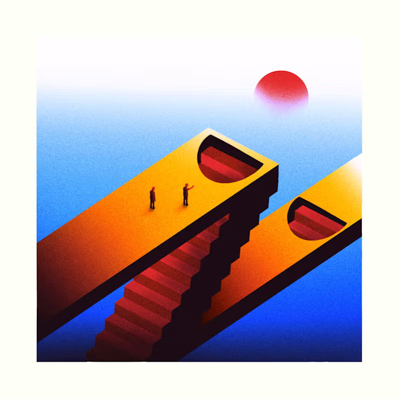
I'm Marcos Abdallah, a freelance illustrator and I love working with retro-futuristic scenes and compositions.
Recently I did a set of two posters for the launch of Beyond Identity (https://www.behance.net/gallery/236049647/Beyond-Identity-launch-posters)'s new brand.
Happy to be part of the community!
7
40
328

Art director and graphic designer. +10y XP.
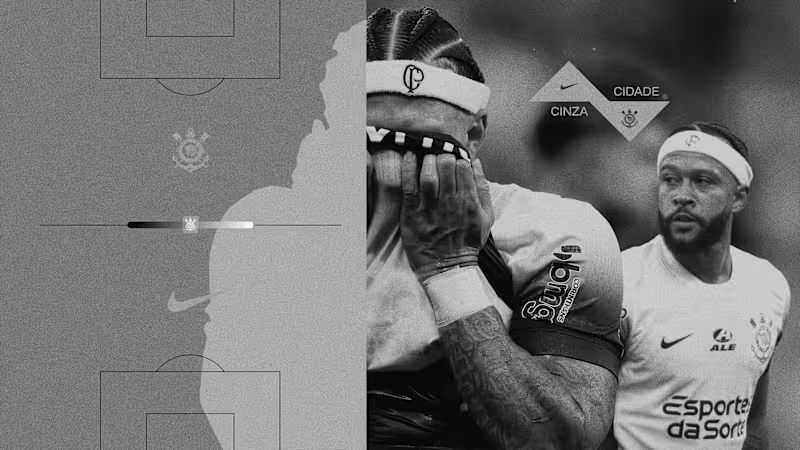
A personal art direction and graphic design study inspired by the football club Corinthians.
Concept: “Cidade Cinza”
The idea explores the symbolism behind black and white — the club’s iconic colors — blending into grey as a metaphor for unity. Just like a city where different stories, cultures, and people coexist, the project connects the team’s visual identity with the diversity of its supporters.
Through bold typography, compositions, and the fusion of black and white elements, the visual language creates a “grey city” where differences merge into collective strength.
This is a personal creative exploration of how graphic design and art direction can translate identity, city culture, and unity through the symbolism of color.
1
1
231
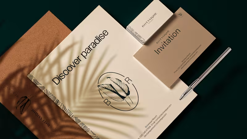
A personal branding study for a luxury resort concept called Botanique.
This project explores a visual identity designed to express refinement, calm, and deep connection with nature. The concept positions Botanique as a destination where time slows down and relaxation becomes the central experience.
The branding is built around elegant typography, organic shapes, and a restrained visual language, creating a sense of sophistication and serenity. Soft compositions and natural-inspired elements reinforce the idea of a place designed for rest, balance, and quiet luxury.
The goal was to craft an identity that communicates Botanique not just as a resort, but as a sanctuary for relaxation and wellbeing.
This is a personal creative exploration of how branding can translate tranquility and refined hospitality into a visual system.
1
6
297
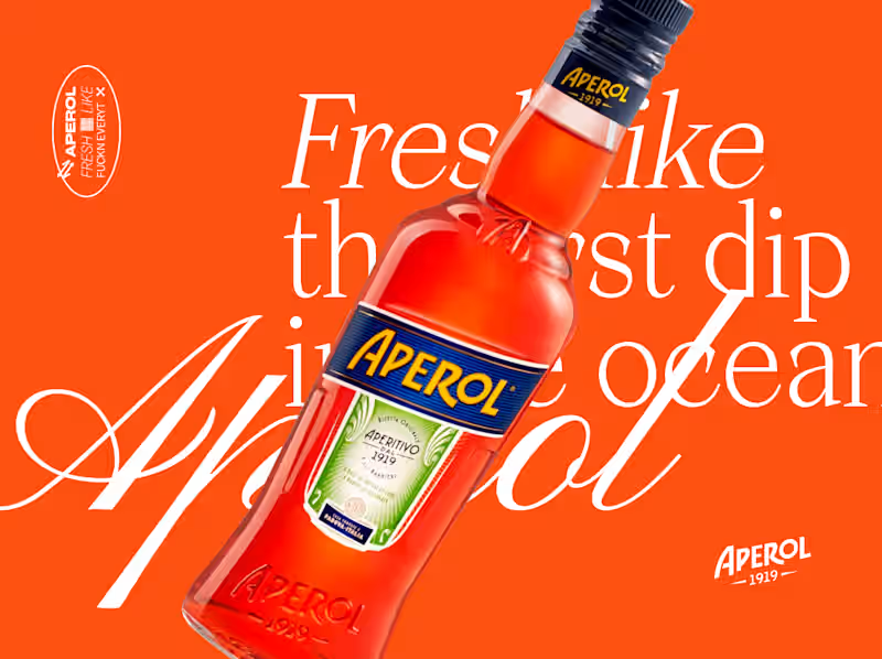
A personal art direction study inspired by Aperol.
Concept: “Fresh dip like a…🔥”
This project explores the refreshing sensation of summer — that instant feeling when you dive into a pool or take the first cold sip of a drink under the sun. The idea was to translate that moment visually through a mix of photography and bold graphic shapes.
By blending cut-out photography with fluid and geometric forms, the compositions create a sense of movement and immersion, as if the images themselves were dipping into color and freshness.
The goal was to create a playful and contemporary aesthetic that captures the light, social, and refreshing spirit associated with Aperol.
This is a personal creative exploration of how graphic forms and photography can merge to express the feeling of a refreshing summer “dip”.
10
27
674
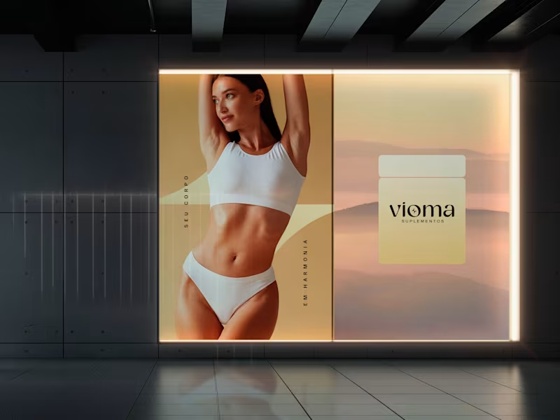
Vioma is a supplement brand built around the idea that wellness should feel as refined as it is effective.
I developed the complete brand identity, creating a visual system that moves away from the conventional fitness aesthetic in favor of a clean, premium, and lifestyle-driven approach. From the logo and packaging to social media and brand applications, every element was designed to communicate balance, vitality, and modern wellbeing.
Scope: Brand Identity · Art Direction · Packaging Design · Visual System · Social Media · Brand Applications
2
181

Motion Designer transforming ideas into visual stories
Motion Designer transforming ideas into visual stories


Graphic Designer/Art Director/Creative/Freelancer
Graphic Designer/Art Director/Creative/Freelancer


View more →

Art-Driven Graphic Designer
Art-Driven Graphic Designer


I help to value businesses and people through Digital Art.
I help to value businesses and people through Digital Art.


2D Animation Pro: Bring Ideas to Life ✨
2D Animation Pro: Bring Ideas to Life ✨


View more →