Projects using Adobe InDesign in Sorocaba
Projects using Adobe InDesign in Sorocaba
Sign Up
Post a job
Sign Up
Log In
Filters
2
Projects
People
Message
1
Gabriel de Castro
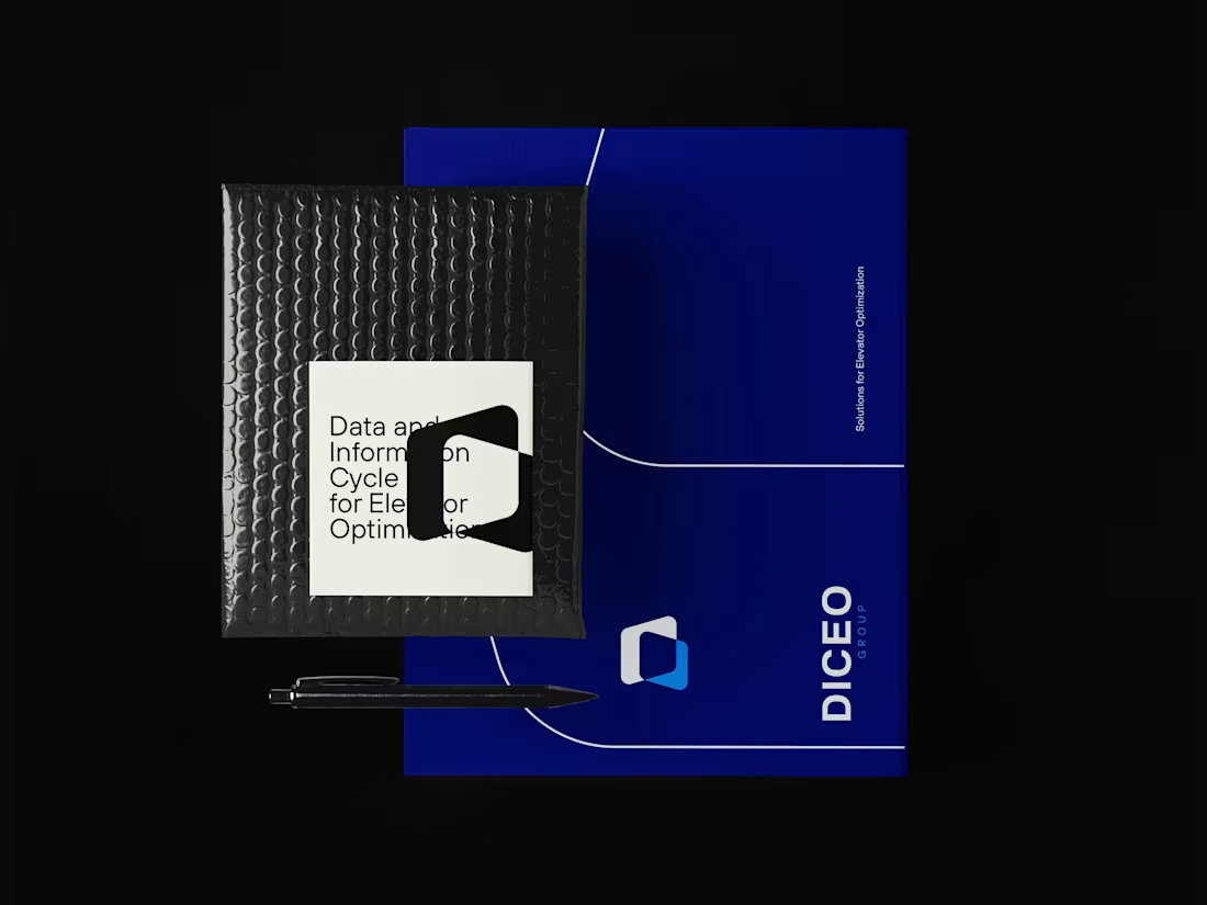
I developed the branding for DICEO — a German company built around the concept of transforming data into meaningful, actionable information. DICEO stands for Data and Information Cycle for Elevator Optimization, and the entire brand was designed to reflect this core idea: collecting, organizing, and cross-referencing data from elevators to generate smarter, more efficient solutions. The visual identity is rooted in this logic. The logo is constructed from two integrated data blocks, creating an intersection that forms the letter “D” — a direct representation of data connection and information flow. This geometric approach reinforces the idea of structure, precision, and intelligence behind the system.
1
113
Message
27
Gabriel de Castro
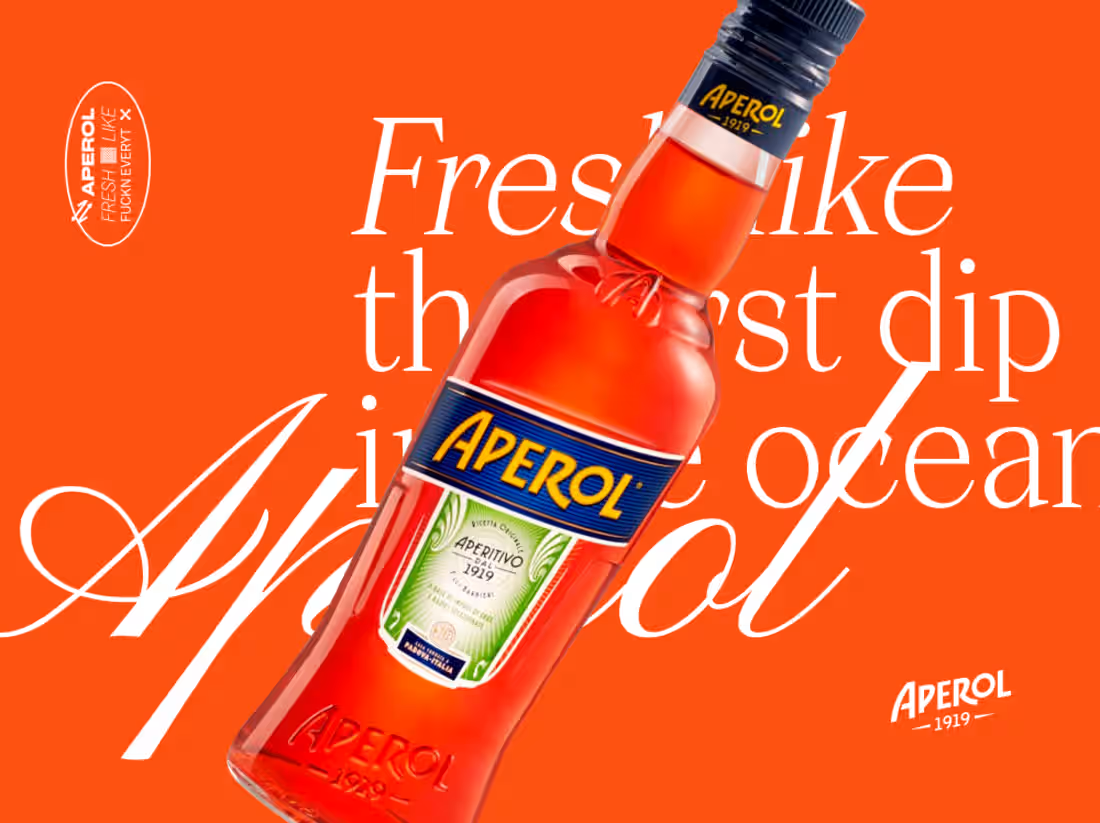
A personal art direction study inspired by Aperol. Concept: “Fresh dip like a…🔥” This project explores the refreshing sensation of summer — that instant feeling when you dive into a pool or take the first cold sip of a drink under the sun. The idea was to translate that moment visually through a mix of photography and bold graphic shapes. By blending cut-out photography with fluid and geometric forms, the compositions create a sense of movement and immersion, as if the images themselves were dipping into color and freshness. The goal was to create a playful and contemporary aesthetic that captures the light, social, and refreshing spirit associated with Aperol. This is a personal creative exploration of how graphic forms and photography can merge to express the feeling of a refreshing summer “dip”.
10
27
623
Message
6
Gabriel de Castro
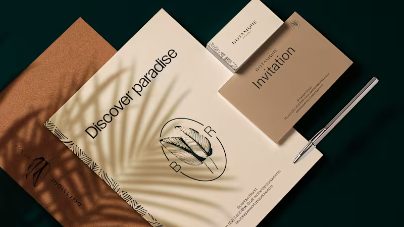
A personal branding study for a luxury resort concept called Botanique. This project explores a visual identity designed to express refinement, calm, and deep connection with nature. The concept positions Botanique as a destination where time slows down and relaxation becomes the central experience. The branding is built around elegant typography, organic shapes, and a restrained visual language, creating a sense of sophistication and serenity. Soft compositions and natural-inspired elements reinforce the idea of a place designed for rest, balance, and quiet luxury. The goal was to craft an identity that communicates Botanique not just as a resort, but as a sanctuary for relaxation and wellbeing. This is a personal creative exploration of how branding can translate tranquility and refined hospitality into a visual system.
1
6
261
Explore projects