Brand Strategy Projects in Severna Park
Brand Strategy Projects in Severna Park
Sign Up
Post a job
Sign Up
Log In
Filters
2
Projects
People
Message
0
Zach Edmunds
Unleashing Clarity Through Dynamic Product Naming
0
19
Message
0
Jennifer White
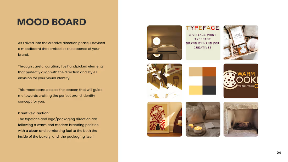
Flour Power Bakery Branding & Web
0
10
Message
1
Shakya Vaughn
pro
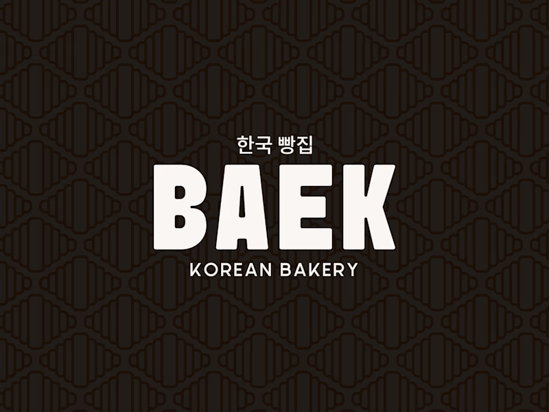
MEET BAEK 🥐🖤 A modern Korean Bakery + Cafe where heritage gets a bold, contemporary identity. The vision: clean yin-yang aesthetic, loud personality. The croissant’s natural pattern became the foundation woven into the logo mark, echoed in the brand pattern, and carried all the way through to the menu card and loyalty stamp shape. Every touchpoint designed with intention. This is what it looks like when a bakery brand has strategy behind the designs. Scope of work: ✨Brand Strategy & Identity ✨Menu Card Design ✨Pattern Design ✨Social Media Revamp
1
137
Message
0
Myles Parham
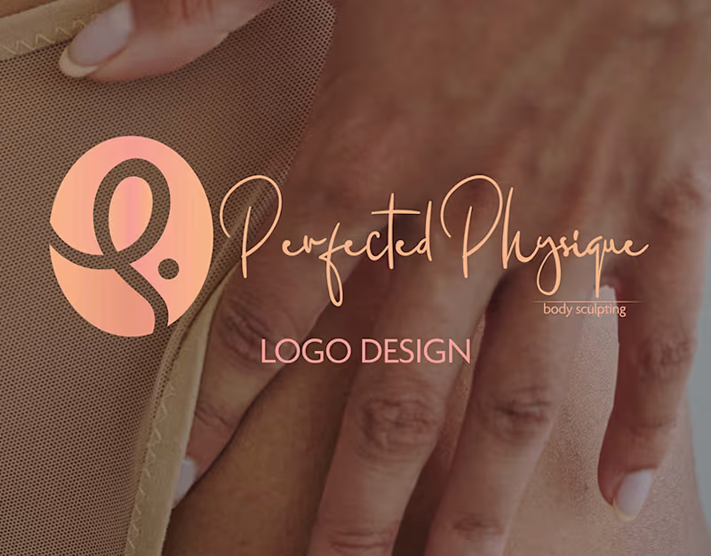
Perfected Physique Brand Identity Design
0
8
Message
0
Anna Mooney
Graphic Design Examples
0
31
Message
0
Fannie Mukua
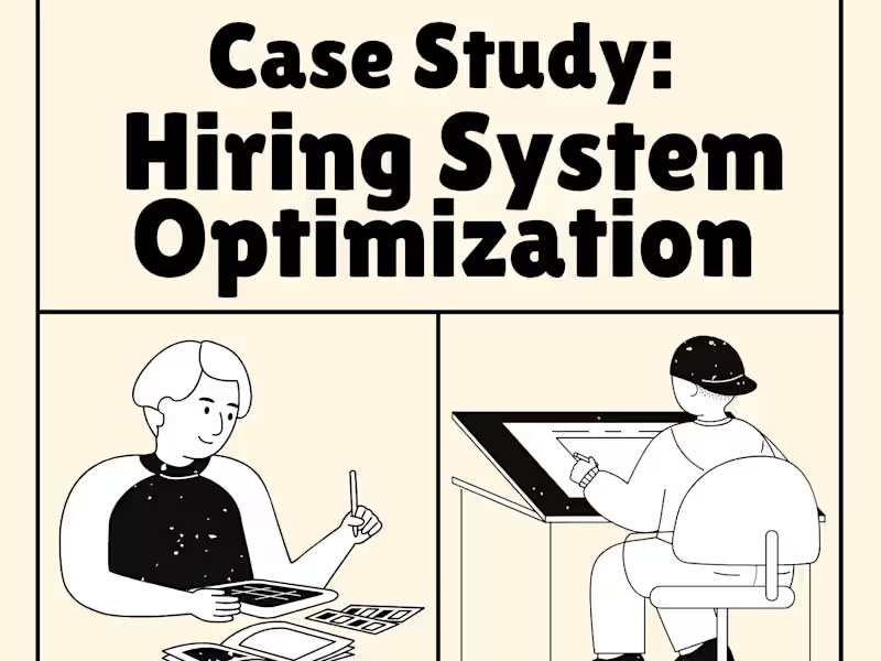
Case Study: Hiring System Optimization for ShopEase
0
14
Message
0
Joe Samuel II
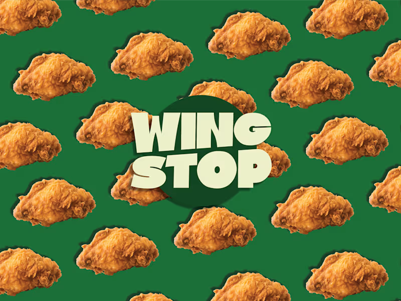
REIMAGINING WINGSTOP WITH BOLD FLAVOR
0
4
Message
0
Parastoo Parsa
Parastoo Parsa - Bio Site
0
2
Message
0
Mary Leaf
Custom Brand Guidelines: Elevating Consistency & Refinement
0
12
Message
0
Zach Edmunds
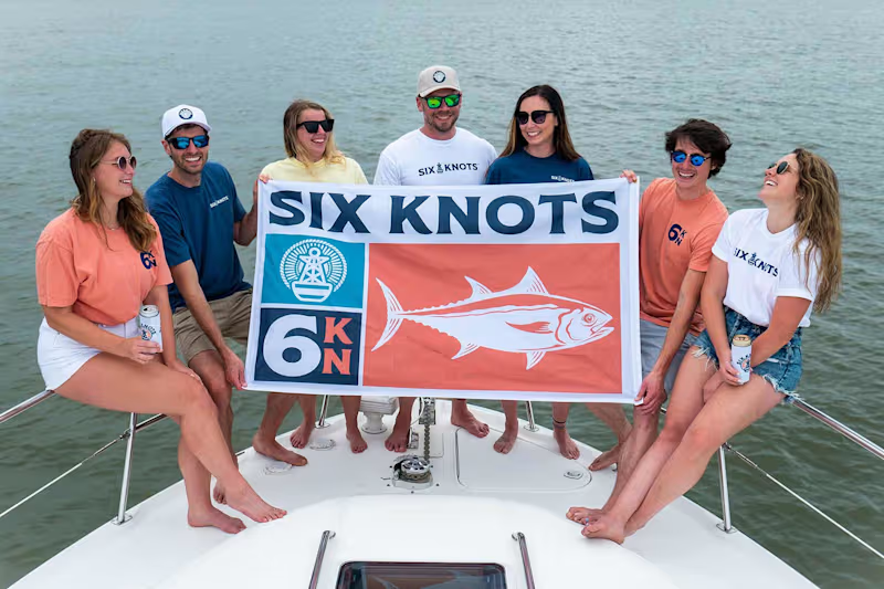
Crafting a New Lifestyle Apparel Brand in Six Knots
0
13
Message
0
Shakya Vaughn
pro
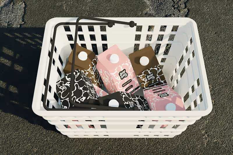
Every milk brand wants to be "bold." However, most of them just slap a cow on the carton and call it a day. How Dairy needed to actually feel bold. Not "we added a sans-serif" bold. Bold as in: you see it from 10 feet away and you already know it's not the same organic plain thing you've seen 50 times. I built the brand identity and packaging system from scratch. The name does the heavy lifting tonally (playful, modern, irreverent), so I let the visual system match that energy: high-contrast colors, type hierarchy, and zero overused dairy imagery. The carton design reads more like a streetwear drop than a dairy aisle staple. The goal: make someone grab it because it looks like it has personality and speaks to their values, not just protein content. If your product is blending into the shelf, let's talk → contra.com/shakya_vaughn (https://contra.com/shakya_vaughn) #PackagingDesign #CPG #BrandIdentity #FoodAndBeverage
0
124
Message
0
Myles Parham
Power Plant Brand Identity Design
0
10
Message
0
Anna Mooney
Potomac River Interiors – Social Media Marketing Plan
0
20
Message
0
Mary Leaf
Refined Narratives: Bespoke Content for Exceptional Brands
0
3
Message
2
Shakya Vaughn
pro
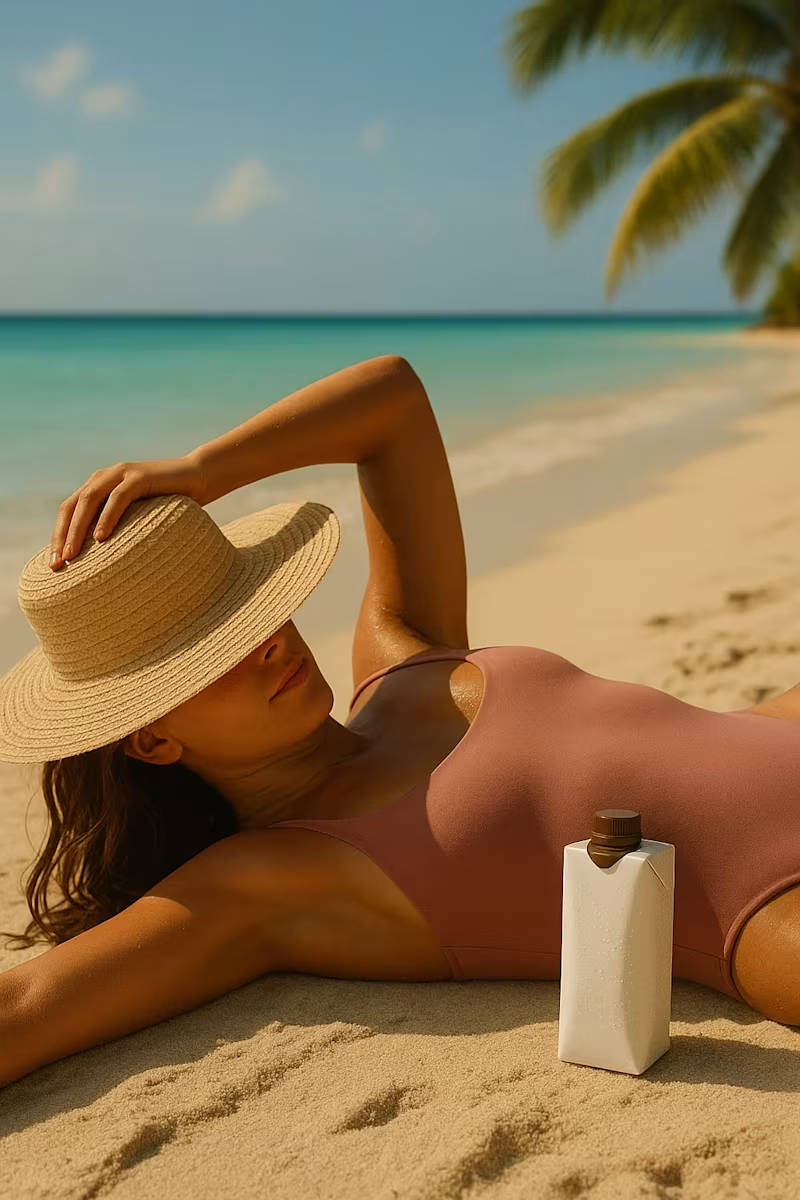
Here's my first post for the #stealmyprompt sprint! First, this prompt was created in Chatgpt ✨ Then used in Sora to create this base mockup image for Tropina✨ Left: Before Right: After Prompt: "A woman in a muted pink swimsuit lounging on her back on a sandy tropical beach, one arm resting over her head holding a wide-brimmed straw hat that partially covers her face. Her skin is sun-kissed and she’s relaxed beside the shoreline. Next to her in the sand is a small plain white rectangular beverage bottle with a brown cap, similar to a coconut water carton, The bottle is covered in light condensation, glistening slightly in the sun to emphasize its refreshingly cold temperature. The background includes turquoise water and a softly sunlit sky, capturing a luxurious, serene summer vibe"
2
2
187
Message
0
Myles Parham
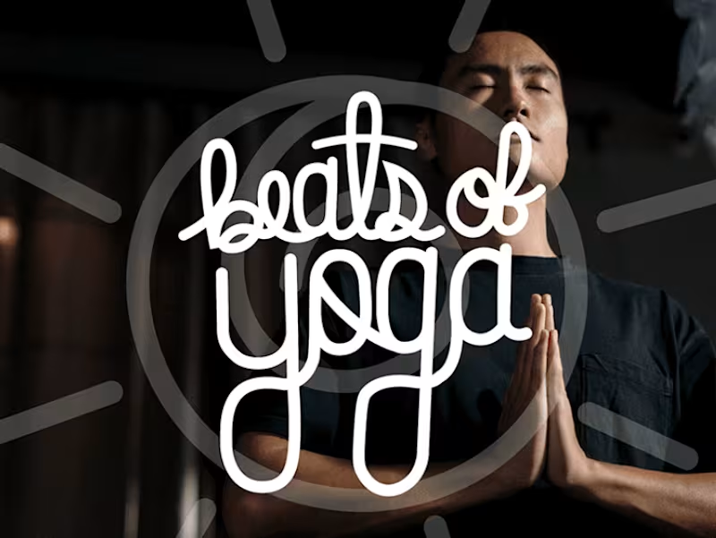
Beats Of Yoga Brand Design
0
8
Explore projects