


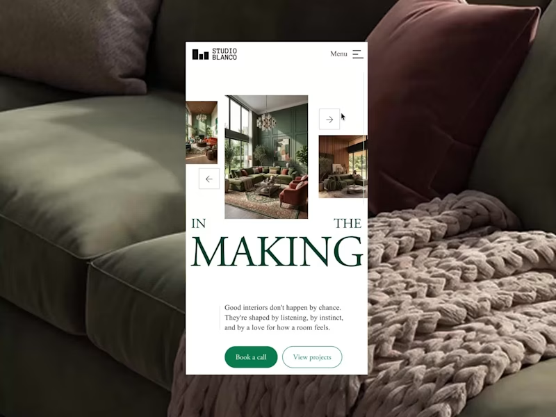
Editorial responsive website - Studio Blanco
Editorial. Minimal. Intentional.
A layout where rooms speak for themselves, bold type grounded in calm, delivering a magazine-like experience across every screen. The slider doesn’t scroll, it glides. Because luxury isn’t loud. It’s in the pace.
—
I help brands create more than just a website. I design digital experiences that leave a lasting impression, while increasing perceived value, strengthening brand presence, and supporting conversion. Curious what this could look like for your brand? Send me a message.
1
150


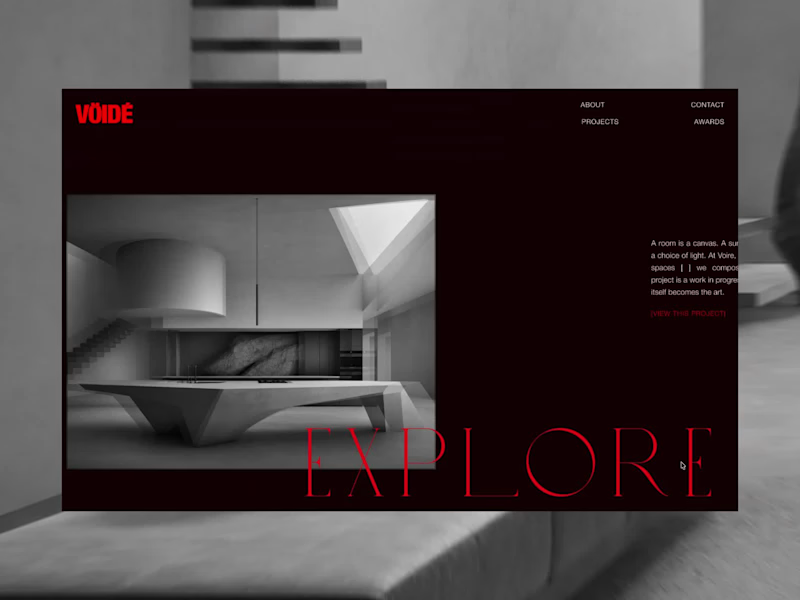
Vöidé: desktop layout, in motion.
An editorial take on an interior brand, where type and image carry the story, and now hand it off.
Negative space as a design language: oversized type, generous margins, imagery allowed to sit and be seen. Then it moves. Immersive transitions turn the layout into something that unfolds, a heading doesn't cut to the next section, it carries you there. Imagery doesn't load, it arrives.
1
155

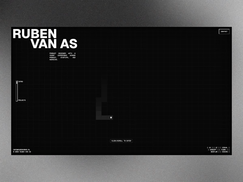
I think working on my portfolio is the coolest thing ever because I can go as crazy as I want, who is there to stop me? 😅
It's been seven years since I first discovered Webflow and built my very first portfolio site. A few redesigns later, at the end of this summer, it felt like the time to push myself again and come up with something fresh.
This time I wanted to create something that doesn’t really follow the standard web design rules. I mixed GSAP with some custom code to build this grid-like setup, which functions as an online archive of everything I’m proud of, from paid projects to passion projects.
Check it out: https://www.rubenvanas.nl/
Would love to hear what you think!
92
175
1.5K
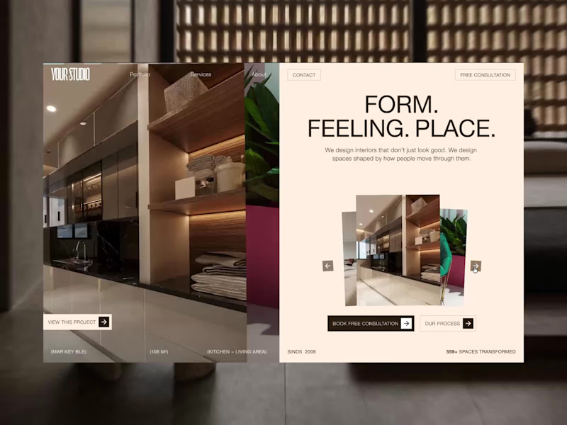
Good responsive design removes things. Not because they don't fit, but because less sometimes says more.
The layered slider on desktop creates atmosphere and depth. On mobile, the essence remains: the project, large, immediate, with all the context that matters. Name. Space. Square metres.
The CTA copy adapts without losing urgency. The warm cream palette carries the whole, the same feeling of quiet luxury across every screen.
This is how you build a site that represents a studio that knows what it's doing.
5
2
214
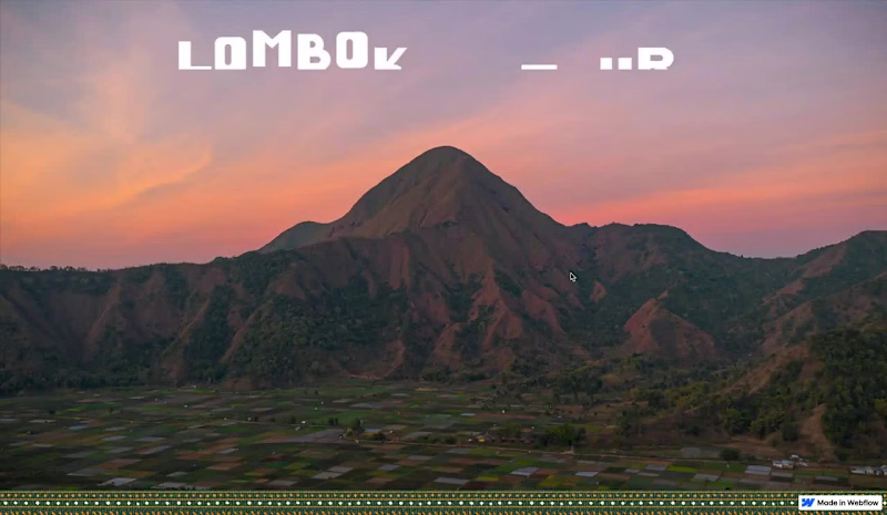
Last Friday, a friend from Lombok asked if I could help him create a website for booking local tours on the island.
Even though the deadline was coming up, I couldn’t pass up this opportunity.
I loved the challenge to explore a new concept and create something that truly stands out in both look and feel.
After a very intense weekend, I’m proud to share the result with you all and I’d love to hear your feedback!
👉 Lombok Local Tours (https://lombok-local-tours.webflow.io/#GuidesSection)
66
123
2K