Projects in RiversProjects in RiversSHOPIFY WEBSITE FOR A FOOTWEAR BRAND
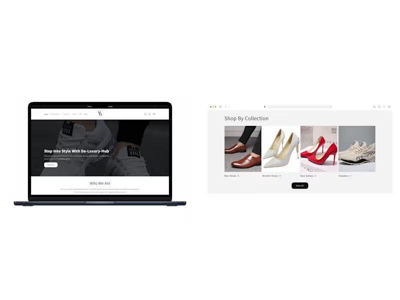
Designed and optimized a Shopify dropshipping store with a focus on SEO, customer experience, product presentation, and conversion.
PROJECT OVERVIEW
This project involved designing and setting up a fully functional Shopify dropshipping store for a footwear brand.
The goal was to create a clean, responsive storefront that presented the products professionally while making the shopping experience straightforward. The project covered store structure, product organization, product-page experience, supporting content, SEO, and conversion-focused improvements.
The store was built around products sourced through CJ Dropshipping, with the catalogue organized into relevant collections to make products easier to browse and discover.
SHOPIFY STORE SETUP & STRUCTURE
I built the storefront as a complete Shopify dropshipping store, organizing the key elements needed for a functional online shopping experience.
The structure connects the homepage, collections, and individual product pages to create a clearer path through the catalogue.
Key areas included:
Shopify store setup
Product organization
Collection structure
Product-page setup
Supporting store pages
Responsive storefront layout
SEO-focused store structure
PRODUCT SOURCING & COLLECTION ORGANIZATION
Products were sourced through CJ Dropshipping and organized into relevant Shopify collections.
This gave visitors a clearer way to browse the catalogue and helped create a more organized relationship between the products and the store's navigation.
PRODUCT PAGE DESIGN
A major part of the project was creating product pages that presented the footwear clearly and gave customers the information needed to understand the products.
The pages used clear product descriptions and a clean presentation focused on making product evaluation straightforward.
The focus was on creating product pages that were:
Clear and easy to understand
Visually organized
Responsive across devices
Focused on the product
Structured with conversion in mind
The aim was to create a smooth transition from browsing a collection to evaluating an individual product.
CUSTOMER-FOCUSED STORE CONTENT
Beyond the product catalogue, I created supporting pages and sections to provide a more complete customer experience.
This included:
About Us
FAQ
Blog
Customer review sections
The About Us section gave the brand space to communicate more about itself, while the FAQ provided answers to common customer questions.
Customer review sections were included to support buyer confidence, while the blog provided space for SEO-focused content and additional information.
SEO OPTIMIZATION
SEO was incorporated into the overall store setup through optimization and keyword research focused on relevant search terms.
This included:
Product titles
Product descriptions
Relevant keywords
Collection organization
SEO-focused content
Blog content opportunities
The objective was to establish a stronger SEO foundation while keeping the content useful and understandable to shoppers.
CONVERSION-FOCUSED DESIGN
The store was designed with conversion in mind, considering how visitors move from discovering the store to evaluating products.
Product presentation, collection organization, descriptions, reviews, FAQ content, and the overall layout were considered as connected parts of the customer journey.
The design approach focused on helping visitors:
Discover → Browse → Understand → Build confidence → Purchase
The goal was to create a storefront where the design and content support the path from product discovery to purchase.
RESPONSIVE USER EXPERIENCE
The storefront was designed with a clean, responsive layout so the shopping experience could adapt across different screen sizes.
The relationship between the navigation, collections, product pages, supporting content, product information, and reviews was considered as part of the overall storefront experience.
The focus was on maintaining usability and a clean visual presentation across the store.
VISUAL HIERARCHY & BRANDING
Visual hierarchy was used to present important information clearly without overwhelming the customer.
Product presentation, descriptions, and supporting sections were organized to create a more understandable visual flow.
The design also maintained consistency across the storefront so the different pages and sections felt like parts of the same footwear brand.
CONVERSION & SEO WORKING TOGETHER
A key consideration was treating traffic generation and conversion as connected parts of the store.
SEO and keyword research provide a foundation for attracting relevant search traffic, while the storefront needs to give those visitors a clear and useful experience once they arrive.
The project therefore brought together:
SEO + Product Presentation + Navigation + Customer Information + Reviews + Responsive Design + Conversion-Focused Layout
The objective was to give visitors coming from search a clear path toward discovering and evaluating the products.
FINAL OUTCOME
The result was a fully functional Shopify dropshipping storefront combining product sourcing, collection organization, product-page design, supporting content, SEO, responsive design, visual hierarchy, and conversion-focused thinking.
The different parts of the storefront were structured to work together as one customer journey, from discovering the store and browsing collections to evaluating products and building confidence before purchase. A cinematic AI-generated visual exploring a mystical, celestial world filled with light, crystals, and spiritual symbolism. The scene was designed to create a powerful sense of mystery, wonder, and otherworldly beauty through atmospheric lighting, detailed environments, and cinematic composition.
This piece showcases how AI video can be used to turn imaginative concepts into immersive visual stories for film, music, entertainment, storytelling, and creative campaigns. Kutuku | Cross-Platform E-Commerce Mobile App Concept
Built a modern cross-platform e-commerce mobile application with React Native and Expo, featuring seamless shopping, secure authentication, order tracking, and responsive user experiences for iOS and Android.
Project Type: Mobile Application (iOS & Android) Product Concept
Objective: Design and prototype a scalable, modern e-commerce application that simplifies product discovery, shopping, and order management while delivering a fast, intuitive mobile experience across Android and iOS.
Overview
Kutuku is a modern e-commerce mobile application designed to provide customers with a complete shopping experience from discovering products to securely placing orders and tracking deliveries in real time.
The project explores the complete customer journey from onboarding and product discovery to cart management, checkout, and order tracking while focusing on responsive layouts, reusable components, accessibility, and scalable application architecture.
This mobile app serves as a product engineering showcase, highlighting how I approach mobile application architecture, UI implementation, state management, navigation, and backend integration.
The Concept
Many mobile shopping apps become cluttered as new features are added, making navigation confusing and slowing down the shopping experience.
Kutuku explores a cleaner, mobile-first approach that prioritizes:
Simple product discovery
Fast navigation
Clear shopping flows
Consistent visual hierarchy
Scalable architecture
Reusable design patterns
The goal was to design an application that feels intuitive for customers while remaining maintainable for developers.
The Challenge
Building an e-commerce application goes beyond displaying products. Users expect fast navigation, personalized experiences, secure authentication, real-time updates, and a frictionless checkout process.
The challenge was to design an architecture that could support multiple shopping flows including product discovery, store management, cart management, order tracking, and customer profiles while keeping the experience smooth, responsive, and easy to scale.
The application also needed to support offline capabilities, secure local storage, responsive layouts for different mobile device sizes, and reusable components that simplify future feature development.
The Solution
I designed and developed a modular React Native application using Expo that combines modern UI patterns with scalable engineering practices. Rather than treating each screen as an isolated feature, I structured the application around reusable components, shared state management, and consistent navigation to ensure maintainability as the product grows.
The application delivers a complete shopping experience while remaining flexible enough to integrate additional commerce features, payment gateways, and AI-powered recommendations in future releases.
My Role
As the sole mobile engineer, I was responsible for the application's architecture, frontend implementation, and user experience.
My responsibilities included:
Product architecture and feature planning
Cross-platform mobile development with React Native and Expo
UI implementation from Figma designs
Component library development
Navigation architecture with React Navigation
Authentication flow implementation
State management and reusable hooks
Local data persistence using SQLite and Secure Store
Supabase backend integration
Map integration for order tracking
Performance optimization
Responsive layouts for phones and tablets
Core Features
Product Discovery
Browse featured products, categories, recommendations, and collections through a clean shopping experience optimized for mobile users.
Store Profiles
Dedicated storefront pages allow customers to explore merchants, browse their products, and follow favorite stores.
Search Experience
Search products with recent searches, suggestions, filtering, and category organization to help customers quickly discover relevant items.
Shopping Cart & Checkout
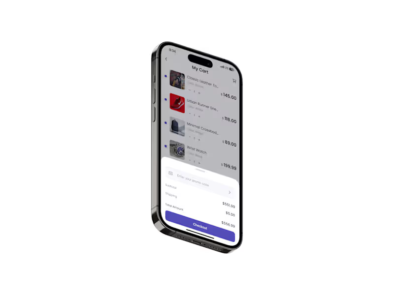
Complete cart experience with quantity management, address selection, order summaries, and a streamlined checkout flow.
Order Tracking
Real-time delivery tracking with interactive maps, shipment status, and progress indicators to improve transparency after processing payment and purchase.
Secure Authentication
Account registration, login, verification, and profile management powered by secure authentication and protected application routes.
Technical Highlights
Cross-Platform Architecture
Developed using React Native and Expo SDK 54, allowing a single codebase to power both Android and iOS applications while reducing maintenance costs.
Modern Navigation
Implemented scalable navigation using React Navigation 7, supporting nested navigators, authentication flows, and deep linking.
Secure User Data
Integrated Supabase, Expo Secure Store, and SQLite for secure authentication, local persistence, and offline-ready functionality.
Interactive Maps
Integrated React Native Maps to visualize delivery progress and improve the post-purchase customer experience.
Reusable Component System
Built reusable UI components and shared utilities to ensure design consistency, simplify maintenance, and accelerate future development.
Performance Optimization
Optimized rendering, navigation, asset loading, and local storage to deliver smooth interactions and responsive performance across a wide range of mobile devices.
Outcome
The project showcases best practices in mobile application development, including reusable component architecture, scalable navigation, secure authentication, offline-ready storage, responsive design, and clean code organization.
Its modular foundation makes it easy to extend with additional capabilities such as payment processing, push notifications, wishlists, loyalty programs, AI-powered product recommendations, and live order updates.