
Social Media Manager & Meta Ads Strategist


Book Editor, Ghostwriter & Amazon KDP Book Designer

Blogger & Blogspot Web Creation | Customization | Redesign
New to Contra
Blogger & Blogspot Web Creation | Customization | Redesign
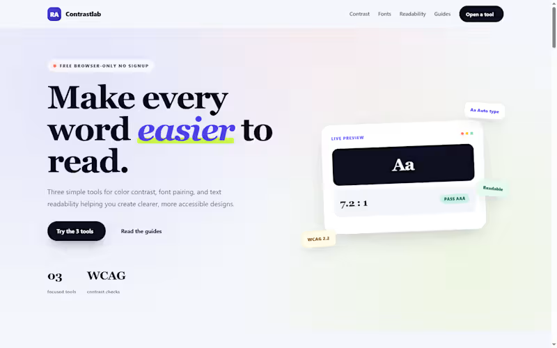
𝐂𝐨𝐧𝐭𝐫𝐚𝐬𝐭𝐋𝐚𝐛 — 𝐅𝐫𝐞𝐞 𝐀𝐜𝐜𝐞𝐬𝐬𝐢𝐛𝐢𝐥𝐢𝐭𝐲 𝐓𝐨𝐨𝐥𝐬 𝐖𝐞𝐛𝐬𝐢𝐭𝐞
𝐏𝐫𝐨𝐣𝐞𝐜𝐭 𝐎𝐯𝐞𝐫𝐯𝐢𝐞𝐰
ContrastLab (https://contrastlab.blogspot.com/) is a free, browser-based toolkit I built on Blogger to help designers, developers, bloggers, and content creators check the three most common readability problems: 𝐜𝐨𝐥𝐨𝐫 𝐜𝐨𝐧𝐭𝐫𝐚𝐬𝐭, 𝐟𝐨𝐧𝐭 𝐩𝐚𝐢𝐫𝐢𝐧𝐠, and 𝐭𝐞𝐱𝐭 𝐝𝐢𝐟𝐟𝐢𝐜𝐮𝐥𝐭𝐲. The site hosts three interactive tools a Color Contrast Checker, a Font Pairing Generator, and a Text Readability Checker all built from scratch with vanilla HTML, CSS, and JavaScript, and all running entirely in the browser with no signup, no downloads, and no server-side processing.
𝐓𝐡𝐞 𝐏𝐫𝐨𝐛𝐥𝐞𝐦
Most accessibility and typography tools fall into one of two camps. Either they are enterprise software with a subscription wall, or they are single-purpose checkers that do one thing and stop. A designer checking WCAG contrast has to open one tab, then a different tool for font pairing, then a third for readability. None of them talk to each other, and most require an account before you can test a single color pair.
For bloggers and small teams, the friction is worse. A content creator who wants to check whether a post is readable at grade 8 has to install a Chrome extension, or open Google Docs, or find a free calculator that only runs one formula. The tools that actually work are scattered, inconsistent, and rarely free.
𝐓𝐡𝐞 𝐒𝐨𝐥𝐮𝐭𝐢𝐨𝐧
ContrastLab consolidates the three most common readability checks into one free site:
𝐂𝐨𝐥𝐨𝐫 𝐂𝐨𝐧𝐭𝐫𝐚𝐬𝐭 𝐂𝐡𝐞𝐜𝐤𝐞𝐫 — Tests any foreground and background color pair against WCAG AA and AAA standards. Returns the exact contrast ratio, flags pass/fail at normal and large text sizes, and supports hex, RGB, and opacity values. Includes an image pixel sampler for text over photos.
𝐅𝐨𝐧𝐭 𝐏𝐚𝐢𝐫𝐢𝐧𝐠 𝐆𝐞𝐧𝐞𝐫𝐚𝐭𝐨𝐫 — Previews Google Fonts combinations at real heading and body sizes. Pick a category (sans, serif, display, or script), select a heading and body font, adjust the size sliders, and copy the production-ready CSS. The tool flags weak pairings so the output is usable without a second check.
𝐓𝐞𝐱𝐭 𝐑𝐞𝐚𝐝𝐚𝐛𝐢𝐥𝐢𝐭𝐲 𝐂𝐡𝐞𝐜𝐤𝐞𝐫 — Pastes any text and returns Flesch Reading Ease, Flesch-Kincaid Grade Level, Gunning Fog, SMOG, ARI, and Dale-Chall scores in a single pass. Also reports word count, sentence count, syllables, and complex words.
Every tool runs entirely in the browser using JavaScript. No text, color value, or image is sent to a server. Nothing is stored. When the user closes the tab, the data is gone.
𝐓𝐞𝐜𝐡𝐧𝐢𝐜𝐚𝐥 𝐇𝐢𝐠𝐡𝐥𝐢𝐠𝐡𝐭𝐬
Lightweight tool code: Each tool is a single HTML block with inline CSS and vanilla JavaScript. No jQuery, no external libraries, no build step.
Blogger-friendly integration: Tools are embedded directly into Blogger pages via HTML view, with no server-side dependencies.
Custom theme: Built on a customized Blogger theme with a responsive layout, gradient header cards, and mobile-first CSS.
Mobile-first design: All three tools use responsive grid layouts that collapse to single columns on mobile, with touch-friendly controls.
Zero data storage: No backend, no database, no cookies, no tracking on tool inputs. All processing happens client-side.
Copy-ready output: The font pairing tool exports production CSS; the contrast checker exports design tokens; the readability checker exports scores.
𝐒𝐄𝐎 𝐚𝐧𝐝 𝐂𝐨𝐧𝐭𝐞𝐧𝐭 𝐒𝐭𝐫𝐚𝐭𝐞𝐠𝐲
Beyond the tools themselves, the site includes a content strategy built around long-tail keyword clusters:
30+ planned posts per tool, each targeting a specific keyword group with no overlap.
FAQ schema, WebApplication schema, and Article schema on every page.
Internal linking between all three tools so users can move from contrast to typography to readability in one session.
Essential pages — About, Contact, Privacy Policy — written with E-E-A-T signals and structured data.
Answer-first formatting for AI search optimization (AEO), with direct answers in the first sentence of every H2 section.
The content is optimized for both traditional search engines and AI search surfaces, with specific data, named tools, and clear Q&A structures.
𝐃𝐞𝐬𝐢𝐠𝐧 𝐀𝐩𝐩𝐫𝐨𝐚𝐜𝐡
The site uses a colorful, card-based design that avoids the sterile look of most accessibility tools:
Gradient header cards in indigo, pink, teal, and amber — one color family per tool.
Icon circles and pill badges for visual hierarchy.
Live preview panels that update as the user types, so the tool feels responsive and immediate.
Verdict cards that explain why a result is what it is, not just report a number.
The design goal was to make accessibility checks feel approachable rather than clinical the kind of tool a blogger would use before publishing, not the kind of audit software an enterprise compliance team would run once a year.
𝐑𝐞𝐬𝐮𝐥𝐭𝐬 𝐚𝐧𝐝 𝐎𝐮𝐭𝐜𝐨𝐦𝐞𝐬
Three fully functional tools running entirely client-side on a free blogging platform.
No hosting costs, no server maintenance, no subscription fees the entire site runs on Blogger's infrastructure.
Structured data on every page WebApplication, FAQ, and Article schema for search visibility.
SEO content architecture covering 90+ planned posts across three tool categories.
Cross-tool internal linking so each tool page recommends the other two where relevant.
Mobile-first, all-device-friendly layout with responsive grids and touch-friendly controls.
1
0
34
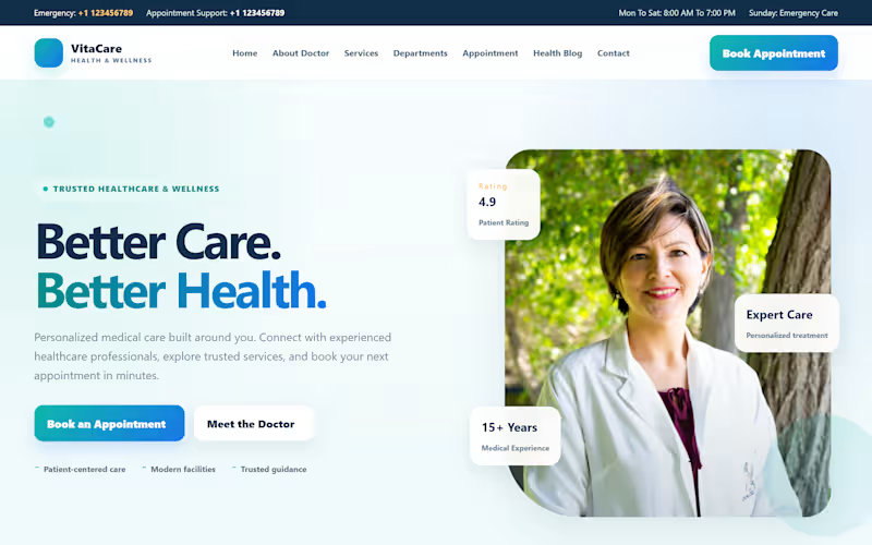
𝐕𝐢𝐭𝐚𝐂𝐚𝐫𝐞 | 𝐏𝐫𝐞𝐦𝐢𝐮𝐦 𝐇𝐞𝐚𝐥𝐭𝐡𝐜𝐚𝐫𝐞 𝐁𝐥𝐨𝐠𝐠𝐞𝐫 𝐖𝐞𝐛𝐬𝐢𝐭𝐞
𝐕𝐢𝐭𝐚 𝐂𝐚𝐫𝐞 is a modern, premium-style healthcare website concept designed for clinics, doctors, and medical practices using Blogger. It combines a clean medical aesthetic with smooth animations, responsive layouts, and a patient-focused user experience.
The project features a welcoming hero section, 𝐦𝐞𝐝𝐢𝐜𝐚𝐥 𝐝𝐞𝐩𝐚𝐫𝐭𝐦𝐞𝐧𝐭𝐬, doctor profiles, healthcare services, appointment booking, patient testimonials, FAQs, and contact information all brought together in a polished, professional design.
𝐁𝐮𝐢𝐥𝐭 𝐟𝐨𝐫 𝐄𝐚𝐬𝐲 𝐂𝐮𝐬𝐭𝐨𝐦𝐢𝐳𝐚𝐭𝐢𝐨𝐧
Designed as a ready-to-customize website, Vita Care allows clients to replace demo content, images, contact details, services, and other section content through Blogger Layout. Regular health blog posts can be published directly through Blogger.
◔◡◔ 𝐊𝐞𝐲 𝐅𝐞𝐚𝐭𝐮𝐫𝐞𝐬 ◔◡◔
Premium, modern healthcare design
Responsive desktop, tablet, and mobile layout
Smooth scrolling and lightweight animations
Editable homepage sections through Blogger Layout
Built-in health blog for regular publishing
Appointment form layout ready for integration
Clean, user-friendly navigation
Easy branding and content customization
ıllıllı 𝐏𝐫𝐨𝐣𝐞𝐜𝐭 𝐆𝐨𝐚𝐥 ıllıllı
To demonstrate how 𝐁𝐥𝐨𝐠𝐠𝐞𝐫 can deliver a professional healthcare website experience without requiring a traditional WordPress setup.
Created by 𝐑𝐀𝐕𝐎𝐑𝐀 (https://ravoraweb.blogspot.com/) — Modern web design, thoughtfully built for customization.
0
185
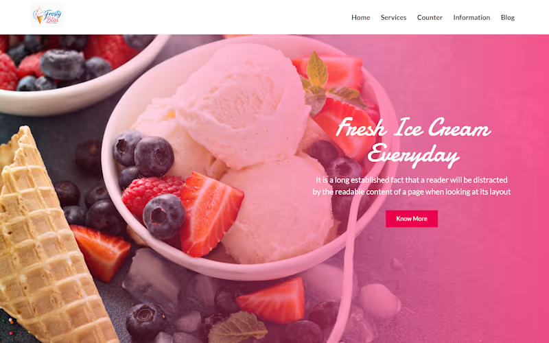
𝐅𝐫𝐨𝐬𝐭𝐲 𝐁𝐥𝐢𝐬𝐬 I 𝐏𝐫𝐨𝐟𝐞𝐬𝐬𝐢𝐨𝐧𝐚𝐥 𝐈𝐜𝐞 𝐂𝐫𝐞𝐚𝐦 𝐁𝐮𝐬𝐢𝐧𝐞𝐬𝐬 𝐖𝐞𝐛𝐬𝐢𝐭𝐞 𝐃𝐞𝐬𝐢𝐠𝐧
𝐅𝐫𝐨𝐬𝐭𝐲 𝐁𝐥𝐢𝐬𝐬 is a modern ice cream business website concept designed and developed on the Blogger/Blogspot platform. The project started with a pre-designed Blogger theme and was transformed into a complete, professional, responsive business website with a fresh ice cream brand style.
The goal was to turn a basic Blogger template into a polished website structure that an ice cream business could easily use for its products, services, promotions, information, and customer-facing content.
💧︎𝐖𝐞𝐛𝐬𝐢𝐭𝐞 𝐒𝐭𝐫𝐮𝐜𝐭𝐮𝐫𝐞💧︎
The homepage was organized into a complete business website flow:
𝐇𝐞𝐫𝐨 𝐒𝐞𝐜𝐭𝐢𝐨𝐧 → Business Introduction → Key Features → Ice Cream Menu → Promotional CTA → Information/Blog Content → Footer
𝐓𝐡𝐢𝐬 creates a clear customer journey from discovering the brand to exploring products and taking action.
◔◡◔𝐂𝐥𝐢𝐞𝐧𝐭-𝐑𝐞𝐚𝐝𝐲 𝐂𝐨𝐧𝐭𝐞𝐧𝐭 𝐒𝐭𝐫𝐮𝐜𝐭𝐮𝐫𝐞◔◡◔
The website was prepared with 𝐫𝐞𝐩𝐥𝐚𝐜𝐞𝐚𝐛𝐥𝐞 content areas so a client can easily update
𝐅𝐢𝐧𝐚𝐥 𝐑𝐞𝐬𝐮𝐥𝐭💛
The original Blogger theme was transformed into a complete ice cream business website concept with a professional homepage, customized sections, product/menu presentation, promotional areas, informational content and a client-ready content structure.
The result demonstrates how Blogger can be customized beyond a standard blog layout and used to create a modern business-focused website.
𝐏𝐥𝐚𝐭𝐟𝐨𝐫𝐦 & 𝐓𝐞𝐜𝐡𝐧𝐨𝐥𝐨𝐠𝐲
𝐏𝐥𝐚𝐭𝐟𝐨𝐫𝐦: Blogger / Blogspot
𝐓𝐡𝐞𝐦𝐞: Customized Blogger Template
𝐓𝐞𝐜𝐡𝐧𝐨𝐥𝐨𝐠𝐲: HTML, CSS, Blogger XML, Responsive Web Design
𝐏𝐫𝐨𝐣𝐞𝐜𝐭 𝐓𝐲𝐩𝐞: Business Website / Product Showcase Website
0
260
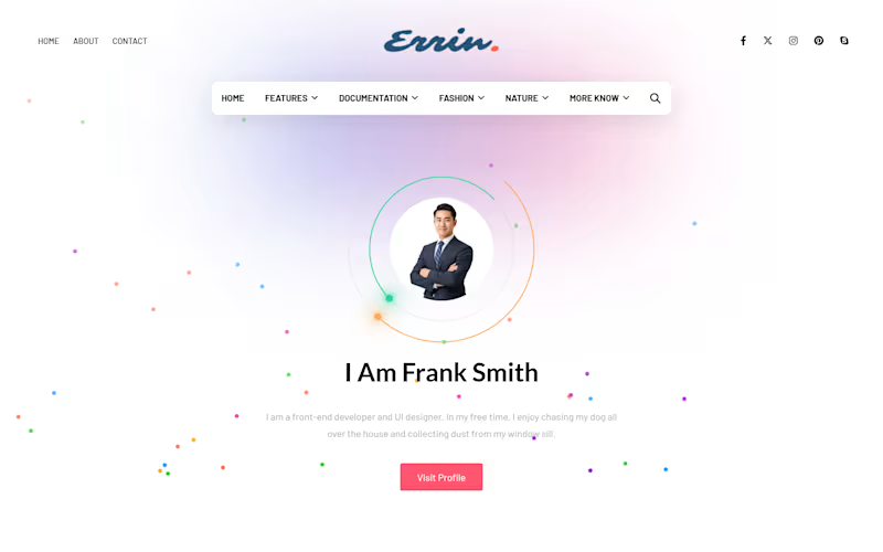
𝐄𝐫𝐫𝐢𝐫 𝐖𝐞𝐛 𝐈 𝐁𝐥𝐨𝐠𝐠𝐞𝐫 𝐓𝐞𝐦𝐩𝐥𝐚𝐭𝐞 𝐂𝐮𝐬𝐭𝐨𝐦𝐢𝐳𝐚𝐭𝐢𝐨𝐧
𝐏𝐫𝐨𝐣𝐞𝐜𝐭 𝐎𝐯𝐞𝐫𝐯𝐢𝐞𝐰
Errir Web is a customized Blogger website built from an uploaded template and transformed into a structured, client-ready blog website. The template was customized with additional sections, improved content organization, and a practical layout so the client can replace the existing demo content with their own content directly through Blogger.
𝐌𝐲 𝐑𝐨𝐥𝐞: Blogger Website Designer & Customization
𝐏𝐥𝐚𝐭𝐟𝐨𝐫𝐦: Blogger / Blogspot
𝐏𝐫𝐨𝐣𝐞𝐜𝐭 𝐓𝐲𝐩𝐞:Template Customization & Website Setup
𝐁𝐫𝐚𝐧𝐝:RAVORA (https://ravoraweb.blogspot.com/)
💎 𝐓𝐡𝐞 𝐂𝐡𝐚𝐥𝐥𝐞𝐧𝐠𝐞
A template alone is not always ready for practical client use. It needs proper setup, organized sections, and a clear structure that makes content management easier.
💎 𝐌𝐲 𝐀𝐩𝐩𝐫𝐨𝐚𝐜𝐡
I uploaded the Blogger template, customized its layout, added the required sections, and organized the website into a usable structure. The focus was to turn the template into a complete website that the client can personalize without rebuilding the design from scratch.
💎 𝐊𝐞𝐲 𝐅𝐞𝐚𝐭𝐮𝐫𝐞𝐬
1️⃣ Customized Blogger template
2️⃣ Additional website sections and widgets
3️⃣ Organized blog layout and content areas
4️⃣ Navigation and content presentation
5️⃣ Client-editable content using Blogger
6️⃣ Ready-to-personalize website structure
🅵🅸🅽🅰🅻 🅾🆄🆃🅲🅾🅼🅴
The website is now set up as a complete Blogger project, ready for the client to replace the demo text, images, and posts with their own content.
Designed and customized by RAVORA. (https://ravoraweb.blogspot.com/)
0
344

Social Media Manager & Digital Creative ✦
New to Contra
Social Media Manager & Digital Creative ✦
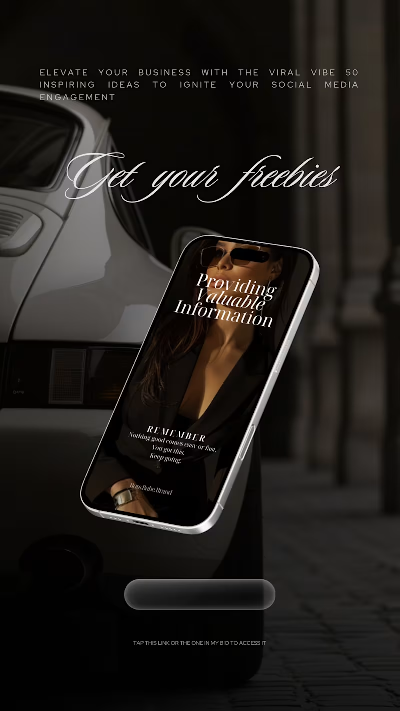
Boss Babe Brand - Story & Digital Product Design
Designed by Business Wifey Agency
The Project
Boss Babe Brand is a digital product and content brand built for ambitious women who are done playing small. BWA designed a full Instagram story series to promote their digital offerings - freebie funnels, stock image collections, and value-driven content - all wrapped in a dark, luxury aesthetic that makes every swipe feel intentional.
What We Created
Freebie Funnel Story → A cinematic dark-background story promoting their free resource - 50 viral social media ideas - presented on a floating phone mockup against a luxury car backdrop. Elegant script typography, a clear CTA, and a visual world that makes a free resource feel premium.
Dark Aesthetic Collection Promo → A full product story showcasing their 125-image dark aesthetic stock collection. Bold display type, editorial grid layout, product mockup on phone screens, and a complete product description that sells the value without overselling the copy.
Collection Launch Story → Three phones floating in a dark luxury interior - each displaying a different image from the collection. Minimal. Editorial. The kind of story that stops the thumb.
Why These Images Story → A split-layout story pairing editorial imagery with audience targeting copy - entrepreneurs, content creators, graphic designers, digital product sellers, and marketing experts. Clean and direct. Every word earns its place.
Note
This is a client story design project created by Business Wifey Agency for Boss Babe Brand's digital product promotion. ✦
Skills Used
Story Design · Digital Product Marketing · Funnel Design · Dark Aesthetic Direction · Typography · Instagram Content Design
0
67
Brand & Product Design Showcase - BWA Creative Direction
A collection of design work by Business Wifey Agency
The Project
Not every great design starts with a brief. Some of the best work comes from a designer who simply needed to create to explore a concept, push a visual direction, and see how far an idea could go without any limits.
This project is exactly that. Four completely original designs across four completely different categories a restaurant logo, a luxury skincare mockup, a premium food product, and an editorial typographic piece. No client. No brief. Pure creative direction from Business Wifey Agency.
Because the range of what we can do shouldn't be limited to what we've been asked to do.
What's In This Collection
Khai Restaurant Logo Design →
A blackletter gothic logo for a restaurant concept established in 2025. Dark, bold, and completely unapologetic. The kind of logo that makes you want to know what's on the menu before you've even walked in. This is brand identity that leads with character and refuses to blend in.
LS Skincare Luxury Product Mockup →
An amber jar against a dramatic mountain landscape, raw terrain, stormy skies, and a product that looks like it was born from the earth itself. The LS monogram is delicate against the weight of everything around it. This is what luxury skincare content looks like when the photographer understands that the environment is part of the product.
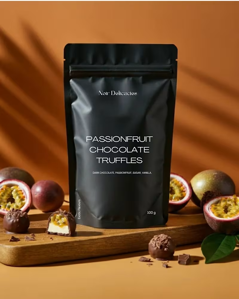
Noir Delicactes Product Packaging Design →
A matte black pouch. Passionfruit Chocolate Truffles. Dark chocolate, passionfruit, sugar, vanilla. 100g. The packaging is minimal and confident and the product photography does the rest. Warm amber backgrounds, fresh passionfruit split open, truffles scattered on a wooden board. Food design that makes you reach for your wallet before you've finished reading.
Closed Reality Editorial Typography →
A psychedelic typographic wallpaper piece "CLOSED" running in a warped border around "REALITY REALITY REALITY" stacked and dissolving into itself. A woman's face beneath it all, hair in motion, skin catching light. This is not content. This is art direction. The kind of piece that ends up saved, shared, and screenshotted by people who don't even know why they need it on their phone.
What This Showcases
These four pieces together demonstrate something important about BWA we are not a one-aesthetic studio. We move between gothic restaurant branding and luxury skincare editorial. Between premium food product design and experimental typographic art. The thread that connects all of it is intentionality. Every single piece was made with a point of view, a visual language, and a reason for every decision.
Range without losing identity. That is the BWA difference. ✦
Skills & Tools Used
Logo Design · Product Packaging Design · Luxury Mockup Design · Editorial Typography · Art Direction · Brand Identity Concept · Food & Beverage Design · Creative Direction
0
45
Eluxe Branding - Social Media Design & Brand Content
An ongoing client project by Business Wifey Agency
The Project
Eluxe Branding is not just an agency. It is a name of luxury - established in 2024 by Nadya El Saidi, one of the most recognisable businesswomen in the global luxury market, with a presence spanning New York City, Los Angeles, Miami, Montreal, and Jeddah.
BWA has been the creative studio behind Eluxe's social media design since 2024. This is not a concept. This is a real, ongoing partnership and what you see here is the work we built together to position Eluxe Branding exactly where it belongs: at the very top of the luxury branding world.
What We Created
A complete social media content system designed to communicate one thing with every single post: Eluxe Branding operates at a level most agencies can only aspire to.
Brand Identity Content → Deep black backgrounds, private jets, architectural luxury spaces, and the Eluxe monogram front and centre. Every post was designed to feel like the brand had existed for decades - established, authoritative, and completely untouchable. "A Name of Luxury." That line doesn't need explaining. Neither does the visual world we built around it.
Mission & Founder Content → A full brand mission post featuring Nadya's personal signature - because Eluxe isn't just a company, it is an extension of her vision. We craft engaging brands for bespoke businesses. We elevate them to luxury status through innovative strategies and timeless elegance. That mission needed to look as powerful as it sounds.
Who Is Eluxe? → An editorial brand introduction post - stark, minimal, and completely commanding. Pure black. Sparse copy. Maximum presence. Because a brand at this level doesn't need to shout. It simply needs to exist and be undeniable.
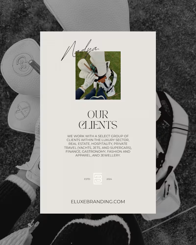
Our Clients → A dual-world layout - dark exterior photography against a clean ivory card - presenting Eluxe's client sectors: luxury, real estate, hospitality, private travel (yachts, jets, supercars), finance, gastronomy, fashion, apparel, and jewellery. The visual contrast alone communicates exactly who Eluxe works with and why they're different.
Our Team → A cinematic portrait of Nadya mid-flight because the Eluxe team doesn't sit still. Masterminds of luxury branding, elegant digital marketing, and software development. Shot with intention. Designed to match.
The Aesthetic
Two deliberate worlds working as one.
The dark universe near-black, cinematic, architectural. Private jets, luxury interiors, and Nadya herself as the visual anchor. And the ivory editorial world clean, structured, and quietly authoritative. Together they communicate exactly what Eluxe is: a luxury branding studio that moves between boardrooms and runways without missing a beat.
The Relationship
This is an ongoing client partnership that began in 2024. BWA has been inside the Eluxe brand from the ground up understanding not just what the brand looks like but what it stands for, who it serves, and where it is going.
When you work with BWA, this is the level of commitment every client receives. ✦
The Result
A social media presence that positions Eluxe Branding as the definitive luxury branding agency in its category. Every post works as a standalone piece of content and as part of a feed that feels considered, powerful, and completely premium from the first scroll to the last.
This is what happens when a luxury brand meets a creative studio that takes that word seriously.
Skills & Tools Used
Luxury Brand Design · Social Media Content System · Editorial Visual Direction · Brand Identity Content · Founder Personal Brand Integration · Typography · Ongoing Client Partnership · Premium Aesthetic Direction
0
41
Business Wifey Agency x Sheo.Co (http://Sheo.Co) - Brand & Content Design
Nadya El Saidi is not your average entrepreneur. She is a globally recognised businesswoman, thought leader, and the face behind Sheo.Co (http://Sheo.Co) - a personal brand built around one mission: a new era of you. Sharp mind, strong body, limitless future.
BWA has been working with Nadya since 2024 - and this project is a testament to what happens when a world-class personal brand meets a creative studio that understands exactly how to translate a woman's power into a visual language the world responds to.
What We Created
A complete personal brand content system for Nadya El Saidi and the Sheo.Co (http://Sheo.Co) platform - designed to position her not just as an influencer or entrepreneur, but as the definitive authority on mindset, wellness, and wealth for the modern woman.
Every piece of content was built to feel as elevated as Nadya herself - cinematic, editorial, and completely intentional.
Brand Identity Content → The Sheo.Co (http://Sheo.Co) visual world - dark, moody, and aspirational. Private jets, champagne, designer silhouettes, and copy that speaks directly to women who refuse to settle. "A new era of you. Become the Sheo of your life." This is what premium personal branding looks like.
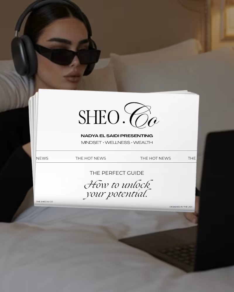
Newspaper Design → A bespoke editorial newspaper format presenting Sheo.Co (http://Sheo.Co) as a publication - because Nadya's content isn't just posts, it's a movement. Mindset · Wellness · Wealth. The perfect guide to unlocking your potential, packaged like a luxury editorial.
Story Series - Brand Framework → A 7-part Instagram story series breaking down the Sheo.Co (http://Sheo.Co) world - opening with Nadya against a private jet, anchoring her three pillars (Mindset, Wellness, Wealth), and walking the audience through exactly what it means to embody them. Not just talk about them.
Personal Brand Breakdown → A structured content series breaking Nadya's brand into its core components - Visual Signature, Principles, and Brand Essence. Image curation, palette direction, authenticity, influence framework, defining traits, aspirational lifestyle. Everything that makes a personal brand feel like a world, not just a page.
Educational Content → Carousel-style posts built around Nadya's expertise - brand story, UVP, content strategy. The kind of content that makes her audience feel like they're getting access to a $10,000 masterclass for free. Because that's exactly how you build the kind of authority she has.
The Aesthetic
Two worlds. One brand.
The dark, cinematic Sheo.Co (http://Sheo.Co) universe - near-black backgrounds, moody photography, and Nadya front and centre in every frame. And the clean, editorial Sheo.Co (http://Sheo.Co) publication world - ivory, serif typography, structured layouts, and a newspaper aesthetic that makes every piece of content feel like it belongs in print.
Both sides of the same coin. Both completely her.
The Relationship
BWA has been the creative studio behind Nadya's content since 2024 - an ongoing partnership built on trust, shared vision, and a mutual understanding that content at this level is never an afterthought. It is the strategy.
The Result
A personal brand content system that positions Nadya El Saidi exactly where she belongs - at the top. Every post, every story, every carousel designed to make her audience feel something. Inspired. Challenged. Elevated. Ready to become the Sheo of their own life.
This is what two years of collaboration looks like when both sides care deeply about the work. ✦
Skills & Tools Used
Personal Brand Strategy · Social Media Design · Story Series Design · Editorial Content · Luxury Aesthetic Direction · Brand Framework Design · Typography · Visual Storytelling · Long-term Client Partnership
0
50

Creative Strategist & Social Media Designer
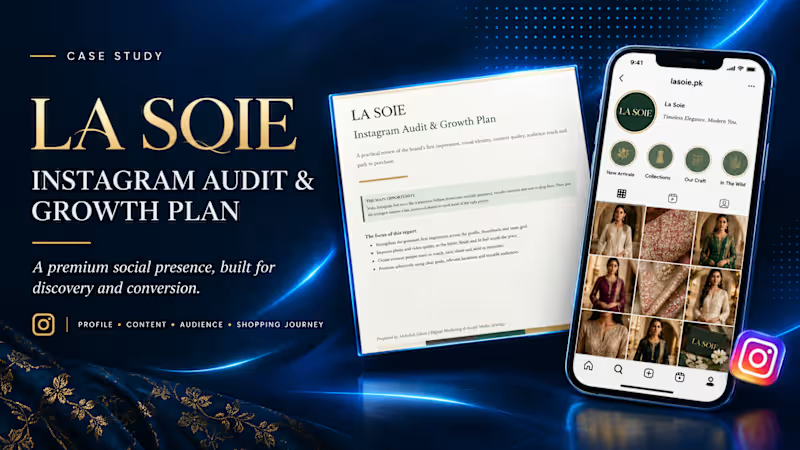
La Soie — Instagram Audit & Growth Strategy
Turning a Fashion Brand’s Instagram Presence into a More Premium, Discoverable and Shoppable Experience
Project Overview
Client: La Soie Pakistan
Project: Instagram Audit & Growth Plan
Services: Social Media Audit, Instagram Strategy, Content Strategy, Brand Positioning & Growth Recommendations
My Role: Digital Marketing Strategist
La Soie is a fashion brand with an opportunity to strengthen its digital presence and create a more compelling shopping experience through Instagram.
I developed a practical Instagram audit and growth plan to evaluate the brand’s profile presentation, visual identity, content quality, audience reach, and customer journey—from discovering a product to considering a purchase.
The goal was to move beyond simply publishing content and build a more strategic Instagram presence aligned with the expectations of a premium fashion audience.
The Challenge
Fashion brands compete in a highly visual environment where first impressions, product presentation, and trust influence purchasing decisions.
For La Soie, the opportunity was to make its Instagram presence feel more like a premium digital showroom: visually consistent, carefully curated, engaging, and easy for potential customers to explore.
The audit focused on four key questions:
Does the profile communicate the brand’s value and identity clearly?
Does the content showcase the quality, craftsmanship, and appeal of the products?
Does the content encourage people to engage, save, share, and discover more?
Is the path from Instagram discovery to purchase clear and convenient?
My Approach
I reviewed the brand’s Instagram presence through four strategic lenses.
1. Profile & Brand First Impression
Evaluated how effectively the profile communicates the brand, presents its visual identity, and guides visitors toward relevant products and information.
2. Content Quality & Visual Storytelling
Identified opportunities to improve product presentation, creative consistency, and fashion-led storytelling so content communicates the fabric, finish, fit, and overall value of the products more effectively.
3. Audience Reach & Growth Opportunities
Developed recommendations to create more engaging, shareable content and approach paid promotion strategically, using clear campaign objectives, relevant locations, audience interests, and testable audience segments.
4. Shopping Journey & Conversion
Considered how the Instagram experience could better guide potential customers from discovering a product to exploring collections, seeking information, and making a purchase.
The Strategy
The central recommendation was to position Instagram as a premium fashion showroom, supported by a more intentional content and growth strategy.
The proposed direction focused on:
Creating a more cohesive and premium-looking visual experience.
Improving product photography and video presentation.
Developing content people have a reason to watch, save, and share.
Making collections and products easier to discover.
Using targeted promotion to test relevant audiences and locations.
Strengthening the connection between content, customer interest, and purchase intent.
Rather than treating every post as an isolated piece of content, the strategy considers how the entire Instagram experience can work together to build interest and support conversion.
Project Deliverables
Instagram profile and first-impression audit
Visual identity and content-quality review
Audience reach and growth recommendations
Paid promotion and audience-targeting suggestions
Shopping journey and conversion improvement recommendations
Prioritized, actionable Instagram growth plan
The Value
The outcome was a practical strategic roadmap designed to help La Soie make more deliberate decisions about its Instagram presence, content, and promotional activity.
The report translates observations into clear improvement opportunities, giving the brand a structured foundation for strengthening its digital presentation, reaching more relevant audiences, and creating a smoother path from product discovery to purchase.
This project demonstrates my approach to social media strategy: combining creative judgment, audience understanding, brand positioning, and conversion-focused thinking to turn an audit into an actionable growth plan.
Project scope: Instagram audit and strategic recommendations. Growth results from implementing the recommendations have not been measured as part of this project.
0
14
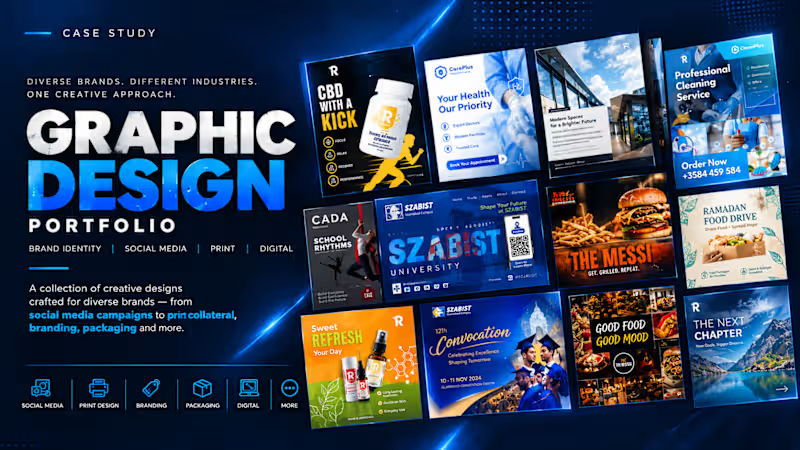
Overview
A curated portfolio of social media graphics and promotional creatives developed for different brands, audiences, and communication objectives.
Creative Approach
I adapt visual hierarchy, typography, imagery, composition, and messaging to the purpose of each design. The goal is to make the message clear, maintain brand consistency, and create visuals suited to the intended audience and platform.
Selected Work
- Social media posts and promotional campaigns
- Product and consumer-brand creatives
- Education and admissions marketing
- Nonprofit and awareness campaigns
- Food, lifestyle, and service-business advertising
Core Skills
- Graphic Design
- Social Media Design
- Creative Direction
- Advertising Creative
- Brand Communication
1
55
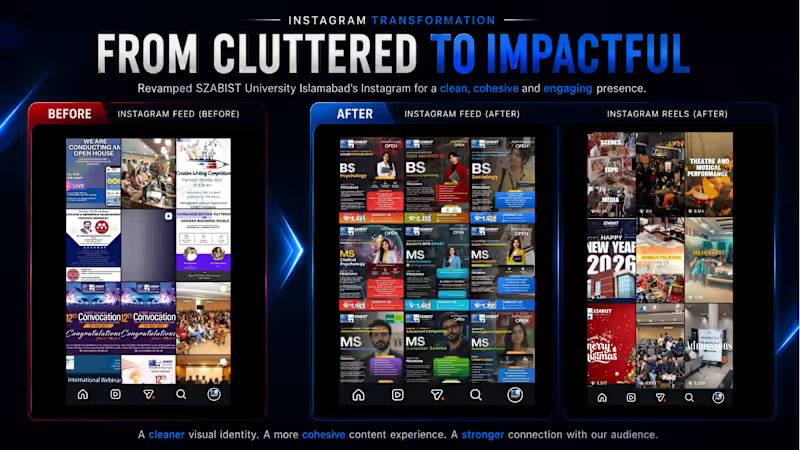
Instagram Growth — SZABIST University Islamabad
I led the social media marketing and content strategy for SZABIST University Islamabad, with a key focus on transforming its Instagram presence into a more engaging, relevant, and student-centric digital platform.
The objective was not simply to increase followers, but to build a stronger social media presence that could support brand awareness, student engagement, admissions, and the university's overall digital positioning.
The Challenge
The Instagram page had significant potential but needed a more strategic approach to content, creative direction, audience engagement, and consistency.
The challenge was to make an institutional university account feel modern, relevant, visually engaging, and connected to its target audience, particularly prospective students and the wider university community while maintaining the brand content consistency.
My Approach
I developed and implemented a more audience-focused social media strategy built around:
Stronger visual storytelling to make university content more appealing and scroll-stopping.
Student-centric content designed around what prospective and current students actually care about.
Strategic content planning around admissions, academic programs, events, achievements, student life, and university initiatives.
Improved creative direction across static posts, carousels, reels, campaigns, and promotional content.
Trend-aware content to make institutional communication feel more contemporary and relatable.
Consistent brand communication while allowing the content to feel more dynamic and social-first.
Performance-focused campaigns to amplify important admissions and awareness initiatives.
Rather than treating Instagram as an announcement board, I approached it as a digital brand experience for prospective students.
The Result
The strategy delivered a 310% growth in Instagram followers, significantly expanding SZABIST University's digital reach and audience base.
More importantly, the growth represented a broader transformation in how the university communicated with its audience—moving towards a more engaging, visually driven, and student-focused social media presence.
Impact
+310% Instagram follower growth
This growth helped strengthen the university's digital visibility and provided a larger owned audience for:
Admissions campaigns
Academic program promotion
University events
Student achievements
Campus activities
Institutional announcements
Brand-building campaigns
My Role
Manager Marketing — SZABIST University Islamabad
I was responsible for developing and executing the marketing and social media direction, including content strategy, creative direction, campaign planning, social media management, paid advertising, and overall brand communication.
Key Takeaway
This project demonstrates how a social media strategy can transform an institutional account from simply publishing information to actively building an audience and a digital community.
The 310% growth in Instagram followers was not achieved by relying on follower acquisition alone—it was the result of combining creative content, audience understanding, consistent communication, strategic campaigns, and a stronger overall digital brand experience.
0
78
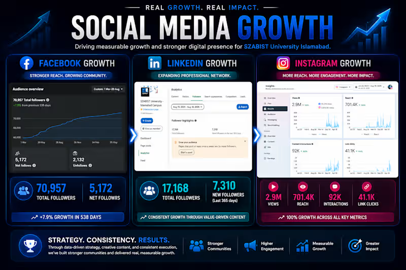
Social Media Growth — SZABIST University Islamabad
Growing a University’s Digital Presence Across Facebook, Instagram & LinkedIn
I led the social media strategy and creative direction for SZABIST University Islamabad, transforming its social media presence across Facebook, Instagram, and LinkedIn into stronger, more engaging platforms for brand awareness, student engagement, and admissions marketing.
Through a combination of content strategy, creative storytelling, audience-focused campaigns, paid social media, and consistent brand communication, the university achieved significant growth across its major social platforms.
The Results
Facebook: +166% growth
Instagram: +310% growth
LinkedIn: Significant growth from approximately 2,100 to 17,000+ followers
The result was a substantially larger digital audience and a stronger online presence for the university—creating more opportunities to communicate with prospective students, showcase academic programs, highlight student achievements, promote events, and strengthen the SZABIST brand.
My Role
As Manager Marketing, I managed the social media strategy, content direction, creative development, campaign execution, paid advertising, and overall digital brand communication across the three platforms.
This case study showcases how a strategic, creative, and data-informed approach can turn institutional social media channels into powerful brand and student acquisition platforms.
0
68

Graphic Designer | E-commerce Manager | Academic Writer
- 5.0
- Rating
Graphic Designer | E-commerce Manager | Academic Writer


View more →

Your Brand & Marketing Designer!!
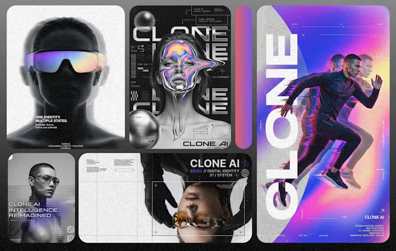
A futuristic social media design exploring the intersection of branding, technology, and AI. The concept combines bold typography, experimental layouts, digital textures, subtle 3D elements, gradients, and cinematic depth to create a modern visual language that feels innovative and ahead of its time. Designed to demonstrate how creative direction can turn complex technology-driven ideas into a strong, premium, and visually engaging brand experience.
0
68
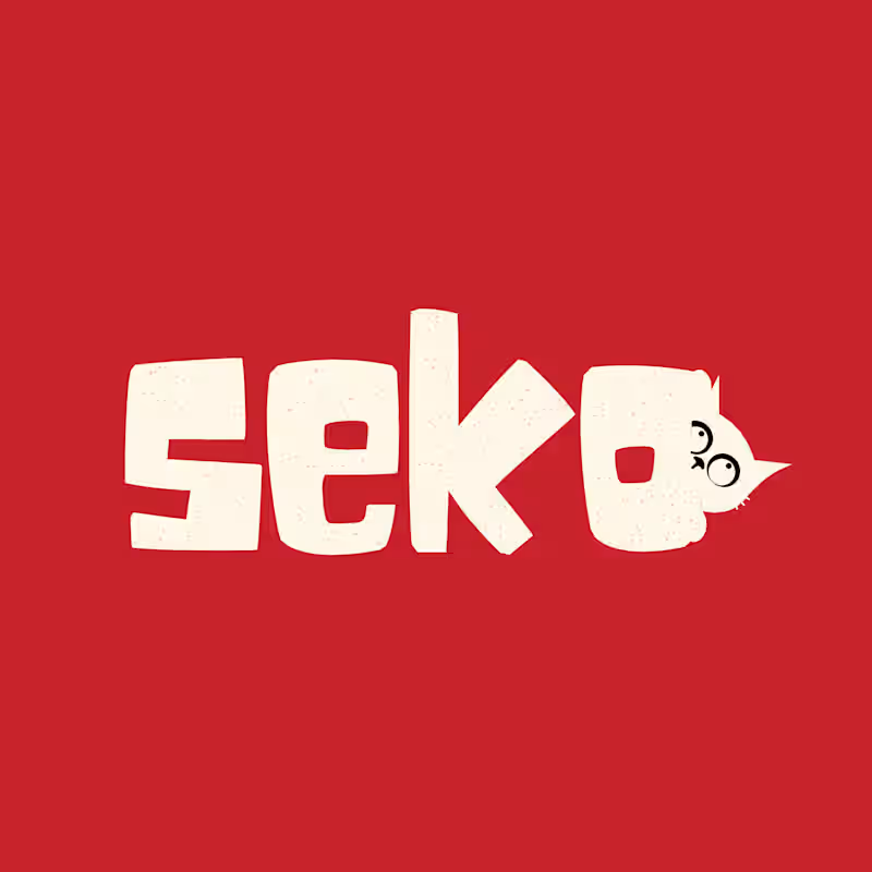
SEKO is a modern pet food brand concept focused on creating a fresh, friendly, and trustworthy identity for everyday pet nutrition. The project explores a complete visual direction for the brand, including logo development, color palette, typography, packaging design, and branded product applications.
The identity is designed to feel approachable and contemporary while communicating quality, care, and reliability. The packaging system translates the brand into clear, memorable pet food products with a strong shelf presence and a cohesive visual language.
This ready-to-use brand concept is available for purchase and can be adapted for pet food, treats, supplements, or other pet-care products.
0
103
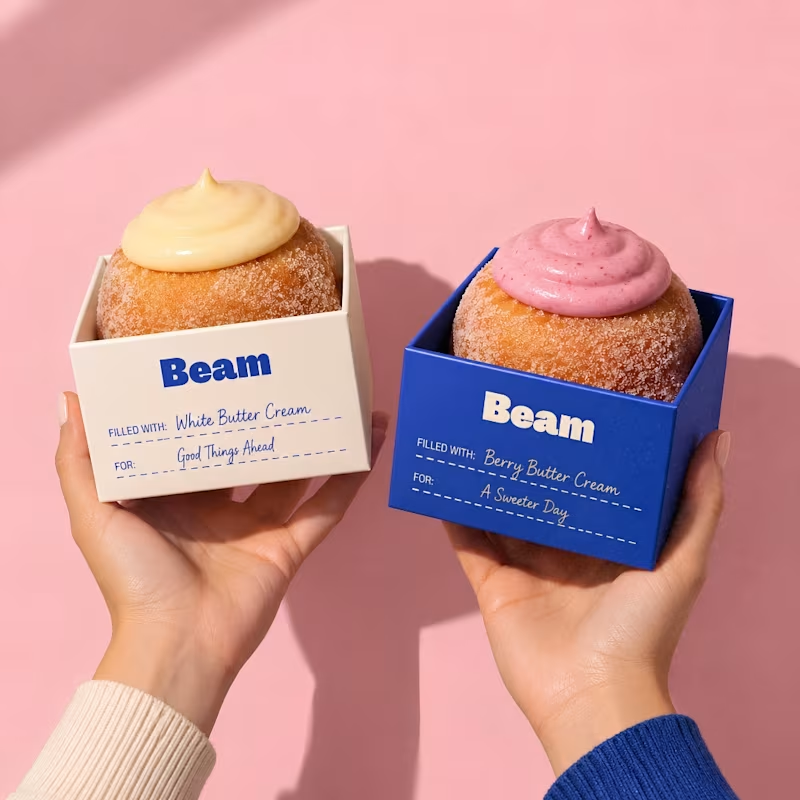
Beam is a complete ready-to-use brand transformation concept created for a modern donut and bakery business. The project includes a strategic brand audit, refreshed visual identity, logo direction, brand style, color system, typography, mascot, packaging concepts, and branded applications. Designed as a complete case study, this project is available for purchase and can be adapted for your own bakery, café, food, or lifestyle brand.
0
99

Revolut Digital Transformation in Banking is a university-level presentation design project focused on how financial technology is reshaping traditional banking and changing the way customers access, manage, and interact with financial services.
The presentation explores Revolut as a fintech case study, covering digital banking, mobile-first financial services, customer experience, technological innovation, digital payment solutions, competitive positioning, business models, security, and the broader impact of digital transformation on the banking industry.
The design combines Revolut’s modern digital aesthetic with a clear academic structure, using bold visual elements, clean layouts, contemporary typography, financial graphics, diagrams, icons, and relevant imagery to present complex concepts in an engaging and easy-to-understand way.
The project was designed for a university student, balancing academic clarity with a professional fintech-inspired visual direction. The final presentation transforms research and strategic information into a cohesive visual story suitable for university assessment, classroom presentations, and academic discussions.
1
110

Video Editing, Branding & AI Content for Growing Brands
New to Contra
Video Editing, Branding & AI Content for Growing Brands
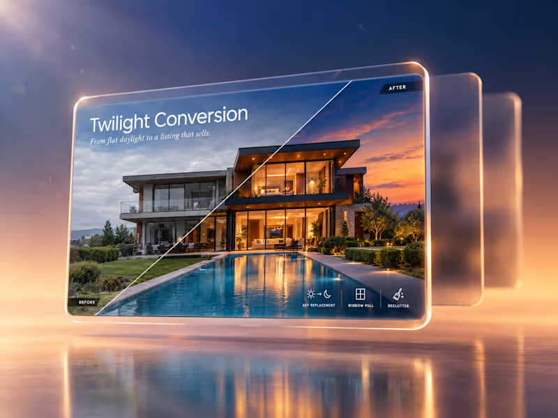
Luxury Real Estate Day-to-Twilight Conversion
Flat, overcast listing photos fail to create the emotional pull that sells premium properties. This showcase converts a dull daytime exterior into a glowing twilight scene using sky replacement, window pulls, warm interior lighting, and decluttering. The resulting image is listing-ready and designed to increase click-through and buyer interest.
Deliverables:
Day-to-twilight conversion
Sky replacement and window pull editing
Declutter and exterior cleanup
Before/after split layout
0
174
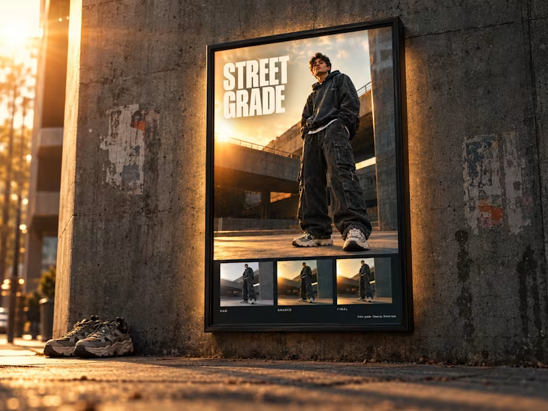
Streetwear Lookbook Grading & Brand Look Development
Streetwear brands need a consistent, recognizable visual identity across every shoot, but raw captures rarely deliver it. This project turns a standard fashion shot into a cohesive lookbook frame through cinematic color grading, fabric detail cleanup, and background refinement. The three-stage raw, graded, and final breakdown shows how a repeatable look elevates brand positioning.
Deliverables:
Hero fashion image retouch
Cinematic color grade and film texture
Fabric detail and skin cleanup
Raw / graded / final triptych breakdown
0
186
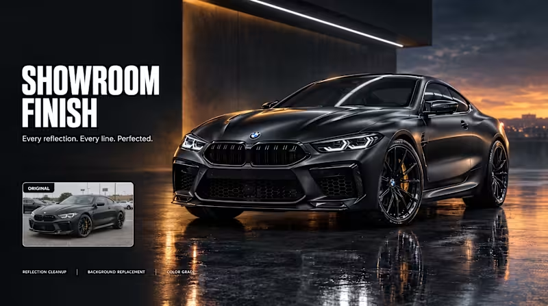
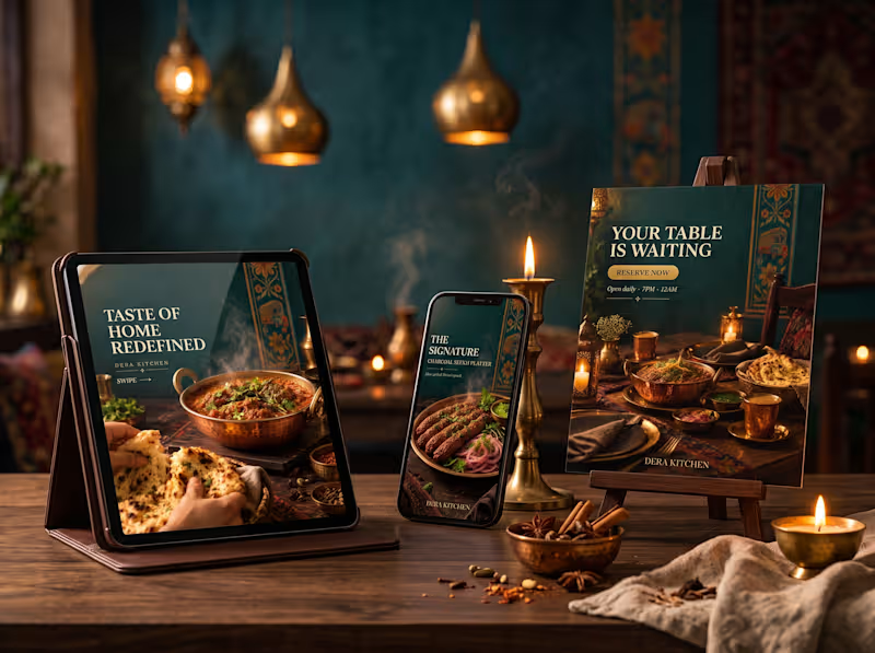
Dera Kitchen | Cinematic Desi Fine Dining Campaign (Concept)
A concept social media campaign for a fictional premium desi restaurant, blending cinematic food photography with local cultural motifs such as truck-art-inspired gold borders. I designed a warm, moody visual world in deep teal, burnt orange and antique gold to make the brand feel luxurious yet rooted in culture. The 3 slides move from a brand statement to a signature dish feature and a reservation call to action. Delivered as a 4:5 Instagram carousel (1080×1350) with a restaurant-setting mockup.
0
216