Projects using Adobe InDesign in RawalpindiProjects using Adobe InDesign in Rawalpindi📐 BRAND STRATEGY — CASE STUDY
⚙️ Koia Objects: Making the Photography Match the Positioning
Goal: Closing the gap between what Koia Objects makes and how it is seen — using photography as the proving ground for the brand's design logic. 📸✨
1. 🎯 The Brief
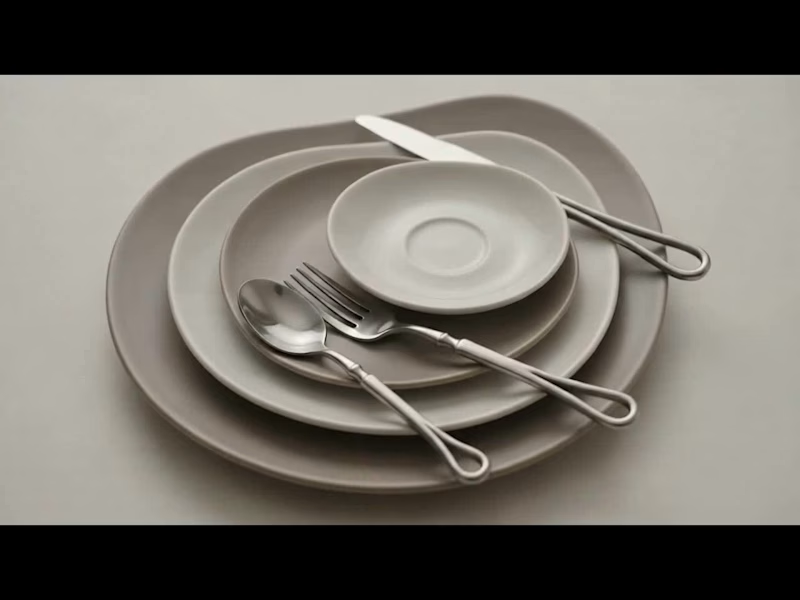
Koia Objects is a Swedish stainless steel tableware and serving brand, two years in, with a design sensibility that sits deliberately between two traditions:
🏛️ Bauhaus Rationalism (Mies van der Rohe): Form follows function & industrial precision.
🌿 Nordic Warmth (Alvar Aalto): Human-centric design that keeps precision warm rather than cold.
💰 The Positioning: Accessible Premium — not luxury, not budget, but a fair price for genuine material quality and craftsmanship.
⚡ The Challenge: This positioning has to be felt, not stated. It must be built into every decision the brand makes, starting with how the product is photographed.
2. 🔍 The Diagnosis
Most young premium tableware brands drift into one of two failure modes:
🚫 The Catalog Trap (Current State): Flat white backgrounds, even front-on lighting, centered objects. It looks like a cheap e-commerce listing and flattens the way light moves across brushed steel.
🚫 The Overcorrection (To Avoid): Dark moody backdrops, heavy gold rim-lighting, and fake luxury marble. It looks like an imitation of luxury watch ads and ignores both Bauhaus and Nordic roots.
💡 The Fix: Build a third direction grounded in Koia’s true design lineage rather than borrowed conventions.
3. ⚖️ The Design Logic
Translating "Bauhaus Rationalism + Nordic Warmth" into 5 concrete photographic principles:
🏷️ Principle🖼️, What It Means in a Photograph🛠️ Function, Visible Show the object doing its job (pouring, serving, being held). Function is the whole premise.✨ Material Honesty Real ,directional light on real steel. Let reflections show weight and precision without over-retouching.🪵 Restraint in Styling Few, purposeful props (raw wood, linen, stone). Nothing on set unless it earns its place.☀️ Warm Directional Light .Soft daylight or a single warm key light instead of flat, cold studio flashes.🏡 Grounded Negative Space, Generous breathing room on a real surface (table, hand, counter) — never a void.
4. 🎬 The Direction, Made Concrete
📋 Shot List
🖼️ Hero Shot: The object alone on a real surface (oiled wood, honed stone) with soft single-direction daylight.
💧 In-Use Shot: The object mid-function (pouring water, serving food, lifted by a hand).
🔍 Material Macro: A tight crop on an edge, weld line, or brushed surface to prove craftsmanship.
🍽️ Grounded Flat Lay: The product with 2–3 purposeful props (linen, raw ceramic, cut citrus) and generous breathing room.
5. 🔄 Before / After — Case Study
🏺 Object: Stainless Steel Serving Pitcher
❌ BEFORE (Catalog Default): Shot dead-on against a white seamless background with flat lighting. The steel looks flat, generic, and cheap.
✅ AFTER (Koia Direction): Shot at a slight angle on an oiled walnut counter, lit by soft side daylight. Highlights catch the spout, shadows add depth, and water is captured mid-pour into a glass.
🌟 Why It Works: Highlights prove the metalwork quality, the pour proves function, and the warm wood adds Nordic cozy vibes without clutter!
6. 📈 Why This Matters Commercially
🏷️ Shifts Value Perception: Replaces price comparison with craftsmanship appreciation ("This is clearly better made").
📦 Scalable Framework: The 5 principles extend directly to packaging, website UI, and social content as the brand scales.
Prepared as an example project — Koia Objects Brand Strategy Engagement. 🚀 Premium Packaging Design for Food, Beverage & Wellness Brands
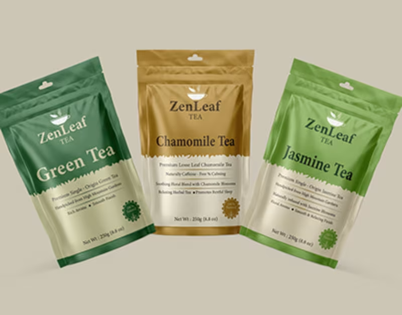
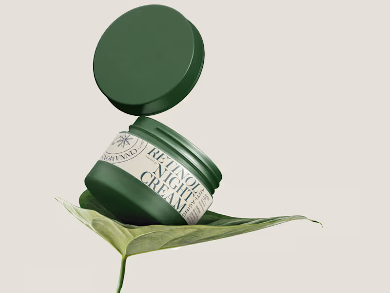
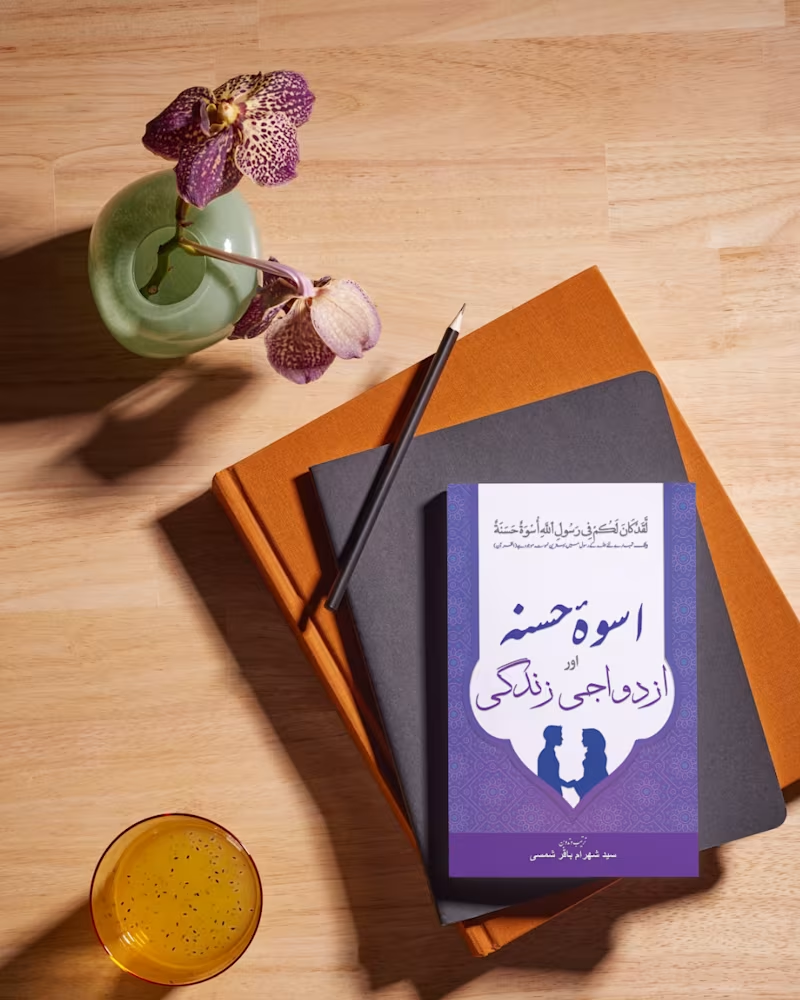
I designed a collection of premium packaging for food, coffee, tea, and wellness brands, focusing on creating products that immediately stand out while reflecting the quality of the brand behind them.
Each design combines strong visual identity, thoughtful typography, and carefully selected colors to create packaging that feels modern, memorable, and ready for the retail shelf.
Rather than treating packaging as a label, I approached every project as a complete brand experience. From logo placement and product hierarchy to color selection and packaging structure, every detail was designed to improve recognition, build customer trust, and make purchasing decisions easier.
What I Designed
• Coffee Packaging
• Matcha & Tea Packaging
• Organic Food Packaging
• Wellness Product Packaging
• Product Labels
• Stand-Up Pouch Designs
• Retail Packaging
• Packaging Mockups
Design Highlights
• Premium, shelf-ready packaging
• Modern and minimal layouts
• Strong brand consistency
• Clean typography and visual hierarchy
• Packaging designed for print and retail production
• High-quality presentation mockups