Projects using Figma in Quito
Projects using Figma in Quito
Sign Up
Post a job
Sign Up
Log In
Filters
2
Projects
People
Message
1
Maty Sandoval
pro
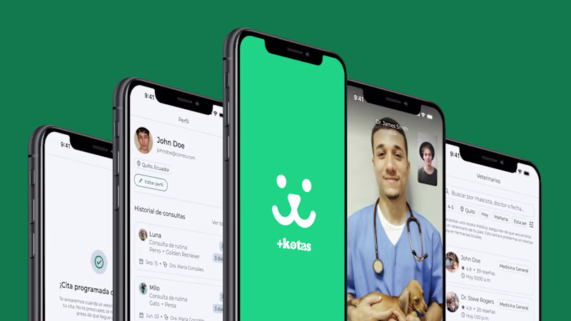
PlusKotas: Pet Telehealth App for Owners & Vets
1
8
Message
1
Fernando Ruiz
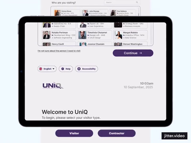
Visitor Kiosk for Logistics
1
12
Message
13
Juan Cornejo
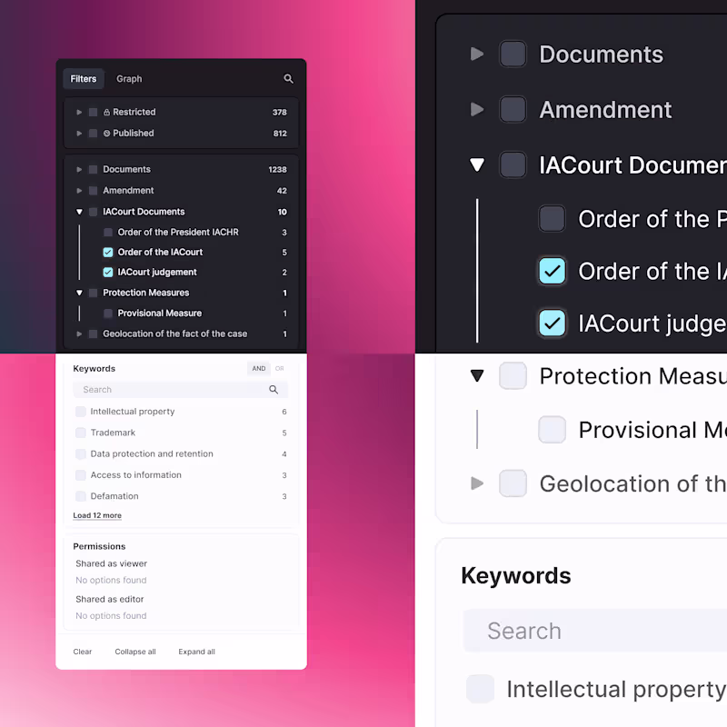
Another component iteration for Uwazi, a revamp of the dynamic filter panel, cleaning up hierarchy, spacing, and states for better readability in both light and dark mode. The goal was to make filtering large datasets feel calm instead of overwhelming: clear typography, consistent alignment, meaningful contrast, dynamic modules, and interaction states that don’t fight for attention. Small UI refinements, big usability gain
13
213
Message
1
Rogger Pesantes
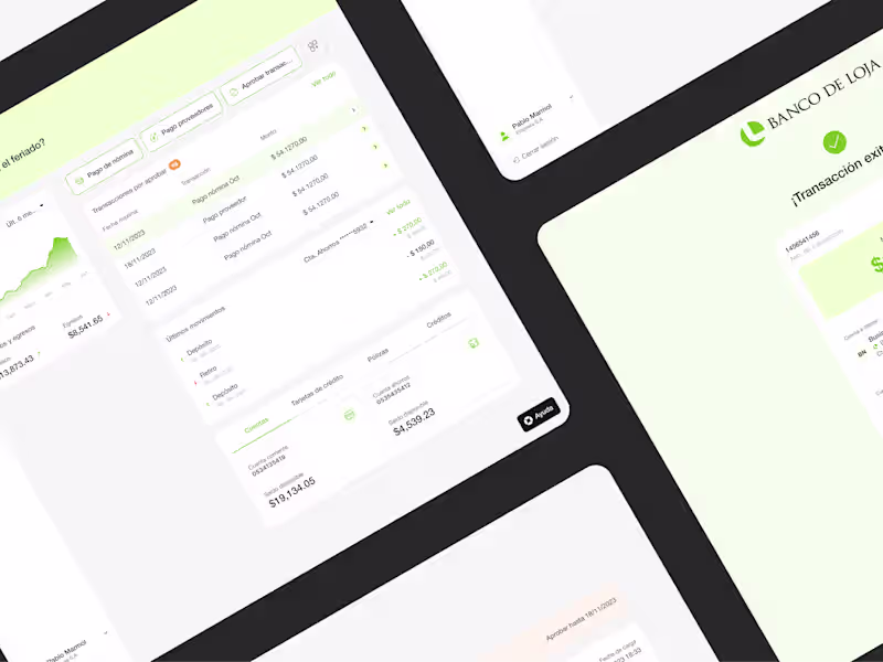
Business banking
1
30
Message
0
Aleksandra S.
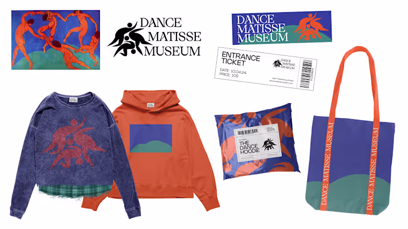
Dance Matisse Museum Brand Identity
0
4
Message
1
Fran Robelly
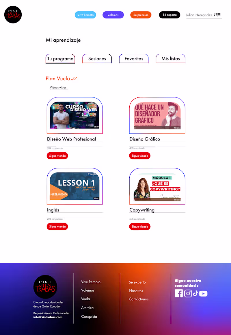
My design perspective for this web project was centered on Information Architecture as a Conversion Tool. I don’t view web design as just a digital storefront, but as a guided journey; I structured the layout to balance high-density information with clean, breathable space to prevent user fatigue. By prioritizing a mobile-first hierarchy and intuitive navigation, I ensured that the most critical value propositions are always front-and-center. The aesthetic choice merging a professional, trustworthy UI with bold, modern accents, was intentional to bridge the gap between institutional credibility and digital innovation. Every element, from the grid system to the interactive touchpoints, was designed to reduce cognitive load and move the user seamlessly toward the final goal.
1
14
Message
0
Robb Vega
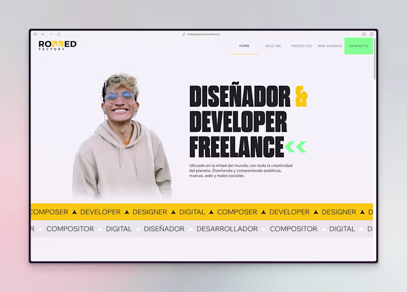
Robbed Factory Refresh
0
8
Message
0
Jonatan Durán Cazar
Social Alert | Redesign
0
1
Message
0
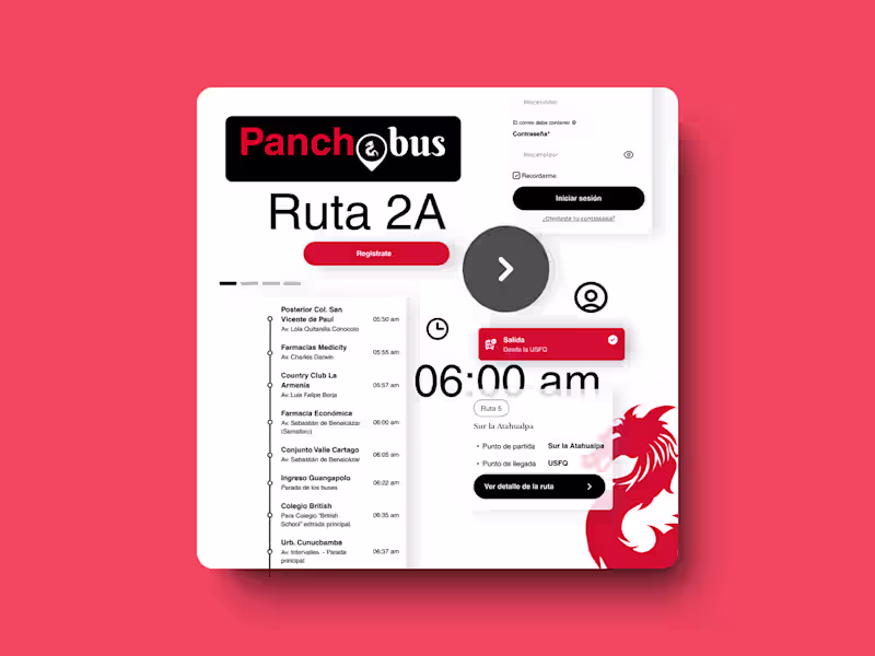
María Fernanda Quintero Montaño
Pancho Bus - Desarrollo web
0
3
Message
0
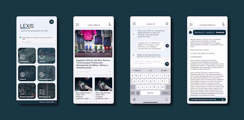
juan galarza
Lexis Legal App
0
2
$5.8K+ earned
Message
4
Maty Sandoval
pro
Designing Core Product Flows for Trading Tools Platform
4
15
Message
0
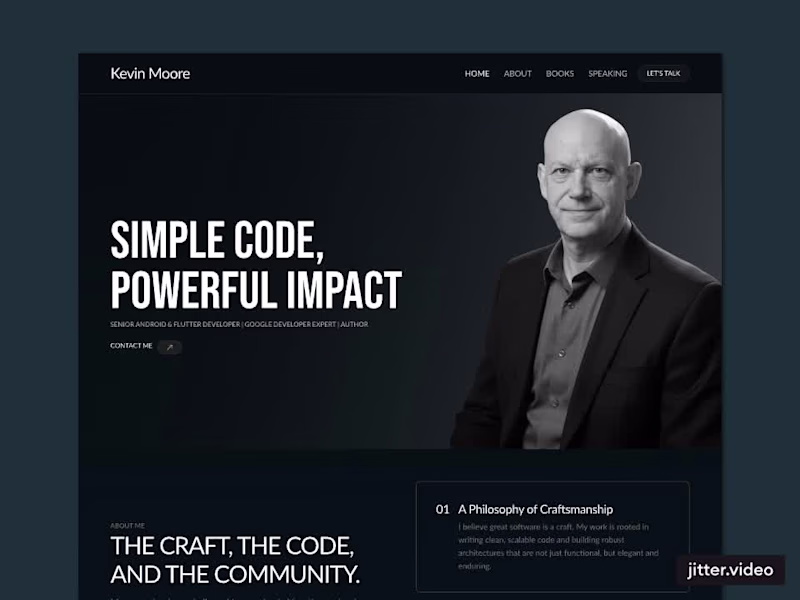
Fernando Ruiz
Kevin Moore's Portfolio
0
7
Message
25
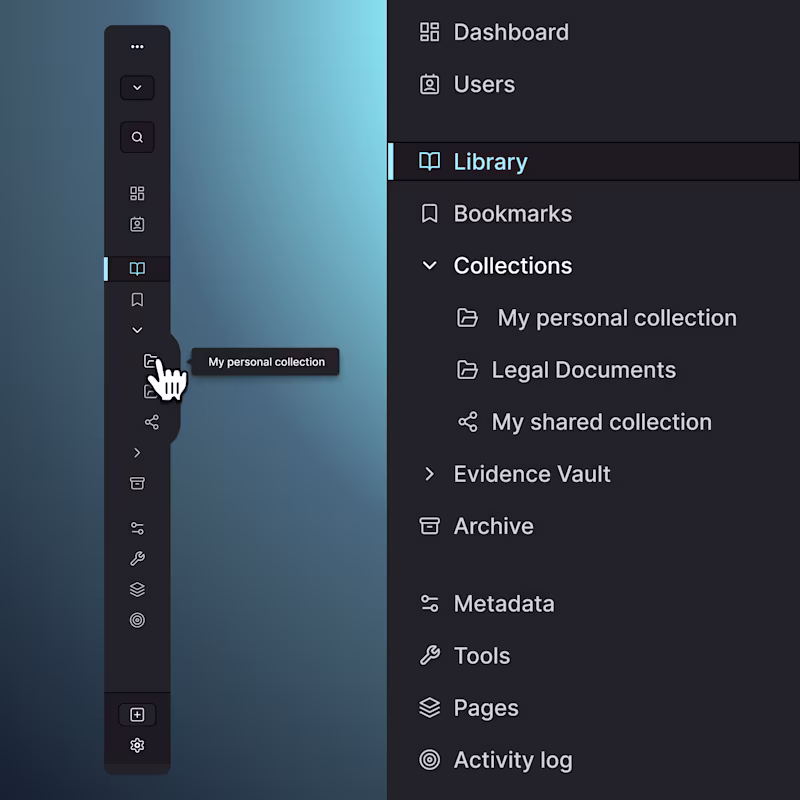
Juan Cornejo
Dark-mode navigation proposal for Uwazi, showing both the collapsed icon-only rail and the full expanded sidebar. The goal was to modernize the IA, reduce visual noise, and make space for power-user features without overwhelming first-time users. Designed as a flexible system that adapts to different screen sizes and workflows.
25
285
Message
1
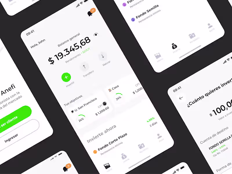
Rogger Pesantes
Investment fund App
1
33
Message
0
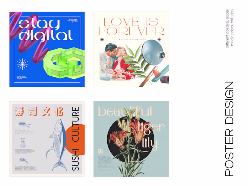
Aleksandra S.
Colorful & Bold Poster Design
0
23
Message
1
Fran Robelly
This campaign merges disruptive visual hooks with a product-focused design perspective, ensuring the offer isn't just seen, but understood. By applying a rigorous information hierarchy and mobile-first layout, I transformed complex info-marketing products into intuitive, high-velocity assets engineered to drive immediate user action.
1
27
Explore projects