Freelancers using HTML5 in Quebec
Sign Up
Post a job
Sign Up
Log In
Filters
2
Projects
People
Jose Mujica
Montreal, Canada
Expert in ReactJS, Webflow, Framer, WordPress
Follow
Message
Expert in ReactJS, Webflow, Framer, WordPress
0
Framer Services Website
0
7
0
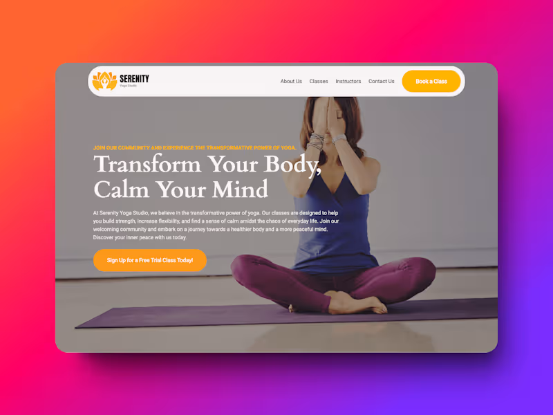
Serenity - Yoga Wordpress Template
0
10
0
Climb Search: SEO Agency Website
0
9
0
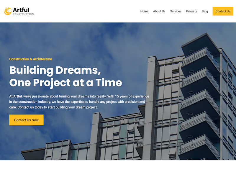
Artful – Construction
0
10
HTML5
(4)
Follow
Message
Faadil Boussari
pro
Gatineau, Canada
Product Designer for AI & Digital Products
18
Followers
Follow
Message
Product Designer for AI & Digital Products
1
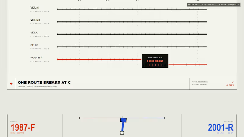
Before Bar One: The First Version Proved the Mechanism. Squarespace Turned It Into an Experience. Before Bar One did not begin as a website. It began as a small functional prototype for Day 3 of my 30 Days of Real Business Problems challenge. The original idea came from a very specific orchestral problem: Five musicians receive their parts and begin rehearsal together. Four parts continue normally from rehearsal mark C to rehearsal mark D. But in one edition, the Horn in F part contains eight missing bars. The page still looks complete. The paper is still ruled. The rehearsal continues. But one musical route has quietly disappeared. That first prototype was designed to prove a single interaction: The mechanism worked. Visitors could move from the fictional 1987-F field edition to the revised 2001-R edition and watch the orchestral route reconnect. But the experience still felt like a product demonstration. It explained the mechanism, but it did not yet feel like the kind of environment where someone might discover, inspect and interpret an edition discrepancy. For the Squarespace Make It Real Challenge, I decided not to replace the original idea with a more conventional brand website. I kept the interaction and rebuilt everything around it. The result is Before Bar One An Interactive Critical Archive. Rather than presenting the problem as a dashboard or software tool, the Squarespace experience treats it as a fictional archival incident. The visitor enters an editorial environment built around records, catalog references, edition controls, rehearsal routes, incident reports and constructed evidence. The visual system uses warm ivory, charcoal, archival brass, fault red and restoration mint. Editorial serif typography is paired with monospace archive labels, fine rules, stamps and catalog notation. The central question remains simple: What changes when the edition changes? In the 1987-F state, the Horn in F becomes silent between rehearsal marks C and D. The visitor can inspect: five orchestral routes; one interrupted path; eight empty measure cells; a ruled but unprinted passage; a tactile archive record; an unresolved incident status; a restoration diagram that remains incomplete. The part does not look damaged. That is the point. The issue is not the physical copy. The issue is the edition. When the visitor selects 2001-R, the archive changes with it. The missing measures return. The archive object is recatalogued. The incident status changes. The Horn in F route reconnects. The five parts arrive together again. The edition selector is therefore not simply a visual toggle. It becomes the central reading device for the entire experience. I also created a second page called The Reading Room. This page expands the interaction into a fuller archival consultation and includes: Archive Record 001; Archive Record 002; a direct edition comparison; an Incident Report; an Evidence Wall; a Build Record; the final closing notice. The Evidence Wall presents several fictional artifacts: a photographed leaf, a copyist-style marginal cue, a constructed sketch source, a restoration analysis tag and a transcribed cue sheet. All institutions, dates, editions, records and musical evidence in the project are explicitly labelled as fictional or constructed. The goal is not to imitate a real historical discovery, but to demonstrate how an edition-comparison workflow could be transformed into an interactive narrative. One of the most important additions came late in the process. I realized that visitors could see the missing passage, but they could not yet hear what it changed. So I created two versions of the same short orchestral rehearsal: Both versions use the same tempo, harmony, strings, duration and arrangement. The only intended difference is the Horn in F during the central eight-bar passage. In 1987-F, the strings continue while the horn disappears. In 2001-R, the horn remains present and rejoins the ensemble through the restored passage. These recordings were added through a native Squarespace Listening Station using Squarespace Audio Blocks. The visitor can now: Squarespace became more than the place where the prototype was published. It provided the structure for turning one interaction into a complete public experience: a clearer five-second introduction; a responsive editorial layout; a two-page narrative architecture; navigation between the Archive and Reading Room; native audio presentation; a stronger visual hierarchy; a final layer of polish and atmosphere. The core edition mechanism is implemented as a custom HTML and CSS interaction embedded within Squarespace. Around it, Squarespace provides the public-facing framework, page structure, responsive composition and native Listening Station that make the project feel complete. The transformation was not: It was: The original version proved that the idea could work. The Squarespace version gave the idea a world, a rhythm and a reason to explore it. Explore the project Interactive Critical Archive https://horse-grey-66kc.squarespace.com/before-bar-one The Reading Room https://horse-grey-66kc.squarespace.com/reading-room Password 1234 Original Day 3 prototype https://faadil1.github.io/before-bar-one/ The first version proved the mechanism. Squarespace turned it into a visual, editorial and audible experience. Before every rehearsal, check the edition. #SquarespaceChallenge #MakeItReal #Squarespace #FinishLayer #WebDesign #CreativeDevelopment #InteractionDesign #EditorialDesign #SoundDesign #UIUX #Contra
1
248
1
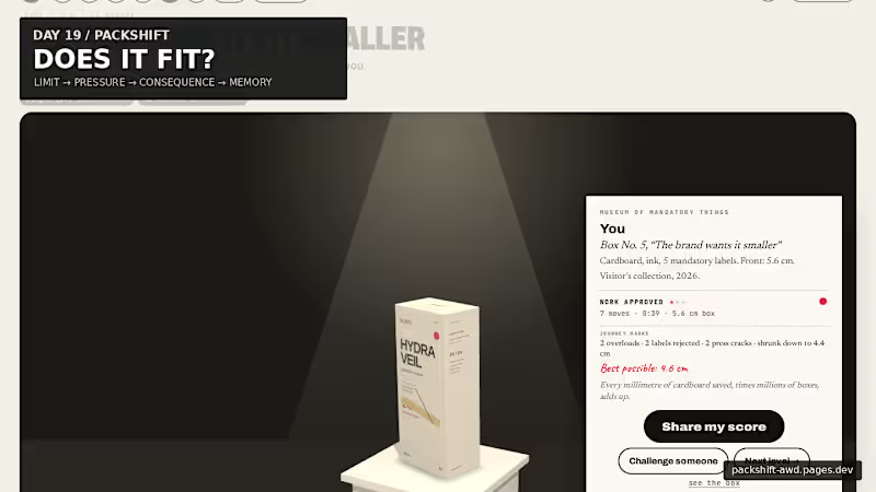
Packaging looks like graphic design. But every word takes physical space. For Day 19, I built PACKSHIFT an interactive packaging experience where claims, languages, warnings and data become pressure on a finite surface. It starts with the real 56 mm width of the carton. Then you try to make everything fit. Make the box smaller and the pressure becomes physical: 56 mm → pressure → CRACK → recovery → museum The final package doesn’t just show the solution — it remembers the negotiation that produced it. Underneath the public game is a deeper spatial compiler built with Blender + Three.js / React Three Fiber, where the same package can open, decompose, expose its dieline, redistribute information and refold. Packaging is not a file. It is a compiled surface. Full case study ↓ https://contra.com/p/3WBccUlM-packshift-packaging-is-a-compiled-surface Live experience ↓ https://packshift-awd.pages.dev/ GitHub ↓ https://github.com/Faadil1/PACKSHIFT Would love to know which moment lands most for you: Actual Size, the Hydraulic Press, or the Museum?
1
66
0
PACKSHIFT: Packaging Is a Compiled Surface
0
2
1
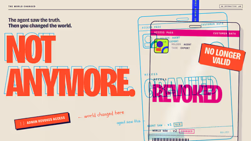
The agent saw the truth. Then I changed the world. Just published THE WORLD CHANGED, an interactive AI agent lab where you change reality after an agent has observed it, then see whether it notices before it acts. The core interaction is simple: LOOK → PULL THE GAP → CHANGE THE WORLD → ACT From there it expands into multiple worlds, a timed challenge, replayable receipts, checked vs. unchecked outcomes, and a genuine recorded Claude Opus 5.5 run. I wanted the idea to feel physical rather than technical, so the whole visual system is built from passes, tickets, stamps, paper and print misregistration. Would love feedback on the interaction and art direction. 🔗 https://contra.com/p/FXvqOAEA-the-world-changed-an-interactive-ai-agent-lab
1
74
HTML5
(1)
Follow
Message
Claudia Bélanger
Montreal, Canada
UI Designer and Full Stack Developer
6
Followers
Follow
Message
UI Designer and Full Stack Developer
0
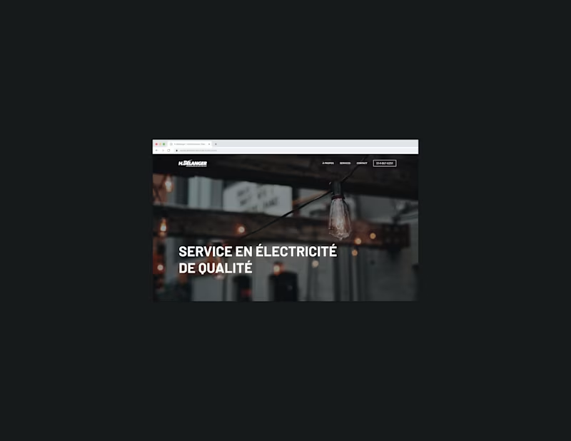
H.Bélanger - Design & Development of a Website
0
15
0
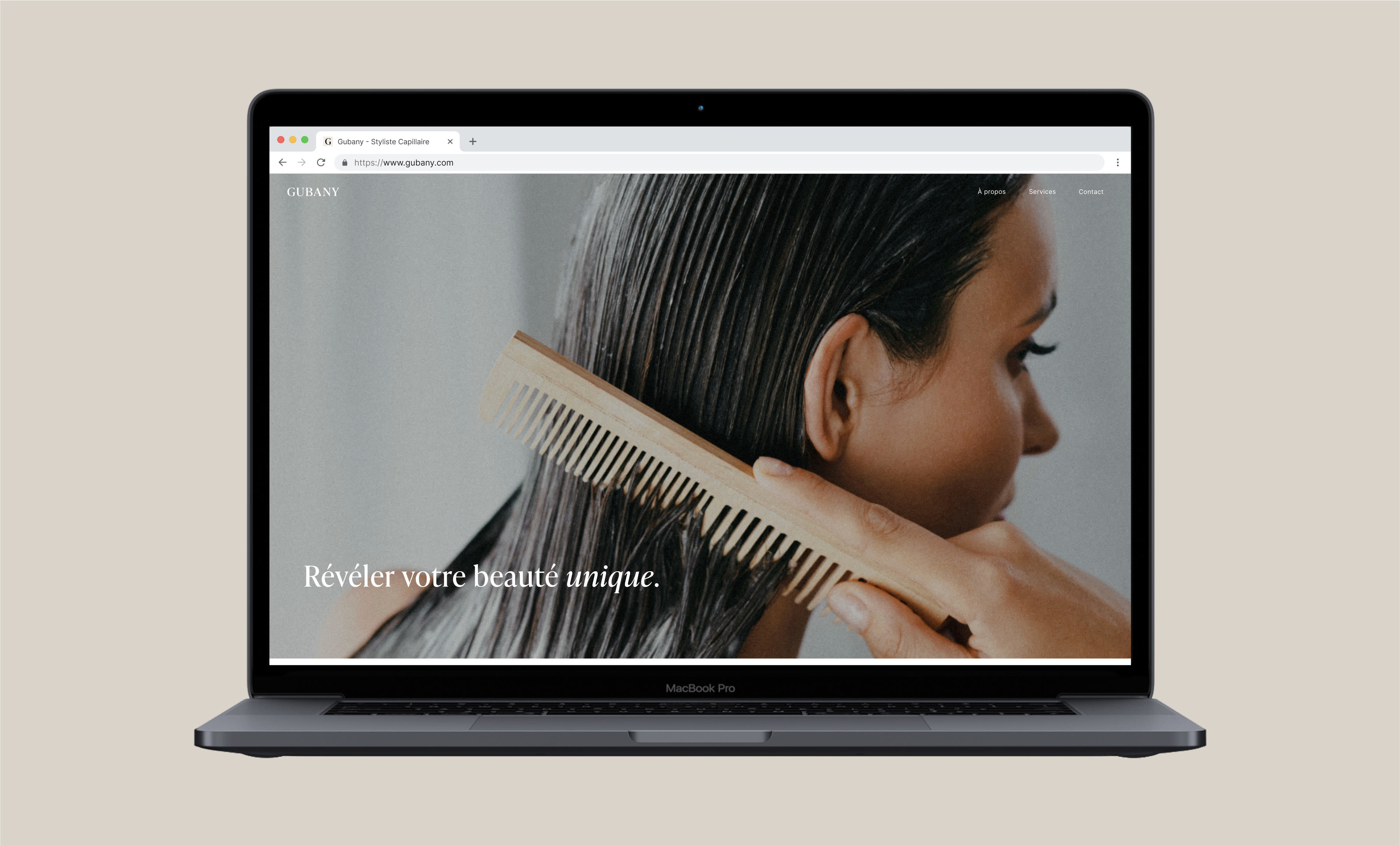
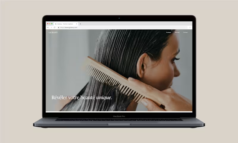
Gubany - Design & Development of a Website
0
13
0
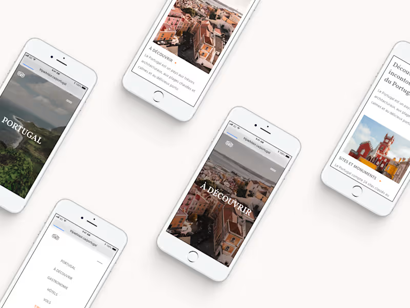
Design of a Website - TripAdvisor (Fictional project)
0
10
View more →
HTML5
(2)
Follow
Message
Anthony Harriman
Montreal, Canada
Luxury website creator 👨💻 7yrs experience
Follow
Message
Luxury website creator 👨💻 7yrs experience
0
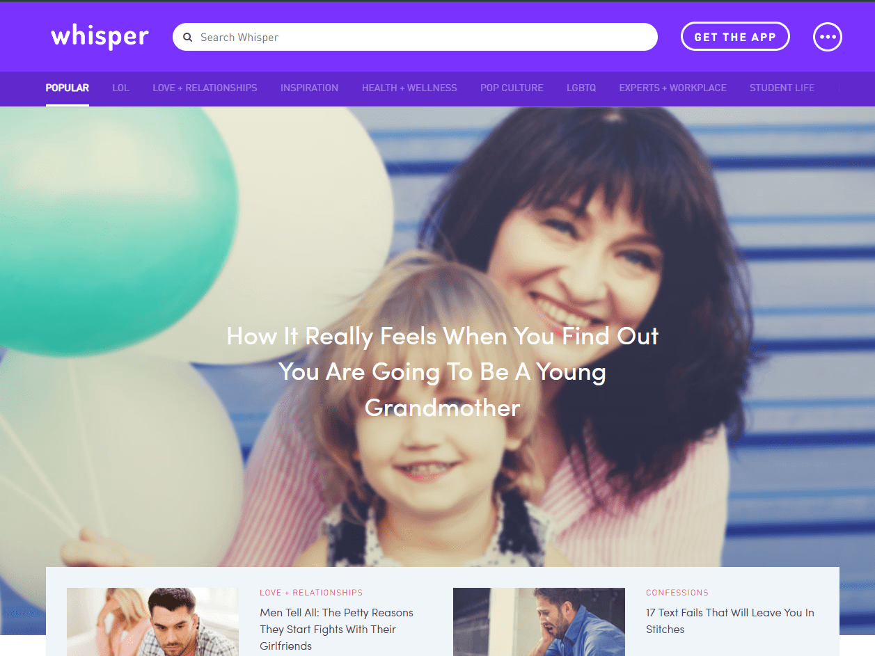
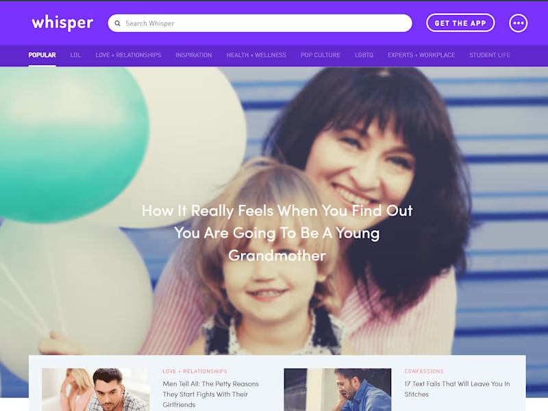
Whisper Online Community
0
16
0
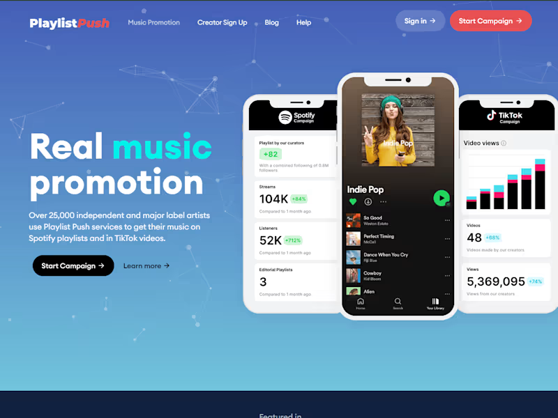
Music Promotion Services | Playlist Push
0
15
0
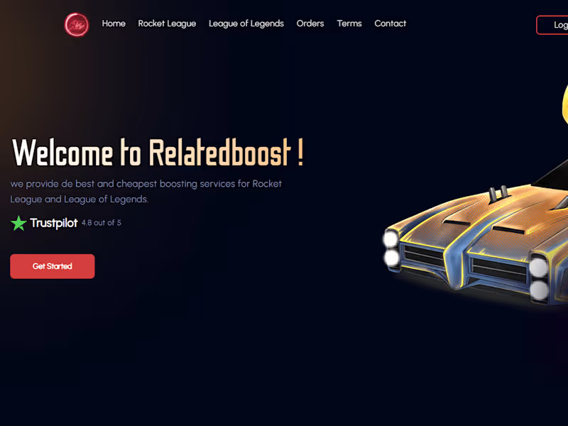
Relatedboost - Rocket League and League of Legends Boosting Ser…
0
18
View more →
HTML5
(1)
Follow
Message
Andrew-David Jahchan
Montreal, Canada
Developer & Designer
Follow
Message
Developer & Designer
1
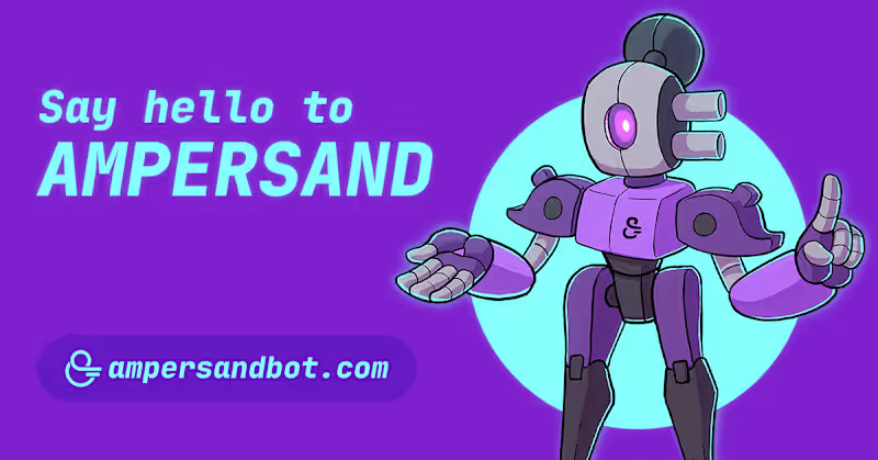
Ampersand Discord Bot
1
10
1
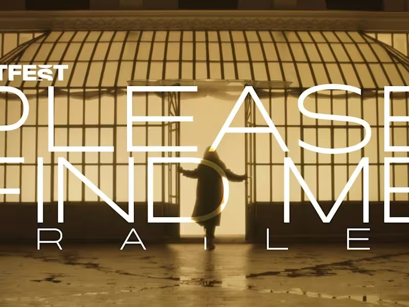
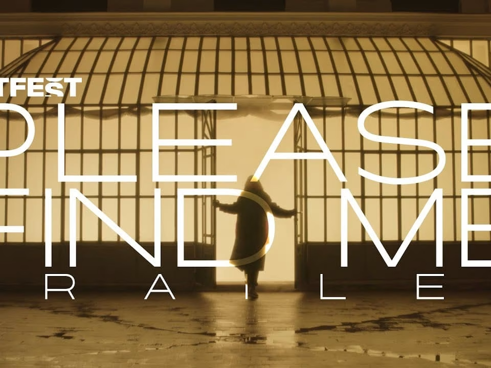
Please Find Me – Mock Trailer
1
4
1
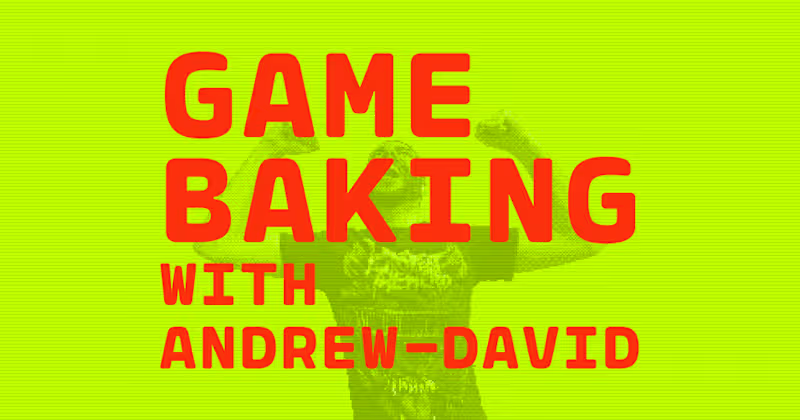
Game Baking – 2021 Edition
1
7
View more →
HTML5
(1)
Follow
Message
nomi Designs
Montreal, Canada
Designing premium SaaS experiences that actually convert.
12
Followers
Follow
Message
Designing premium SaaS experiences that actually convert.

1
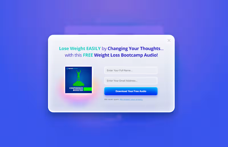
Popup modal concept designed for lead generation. The interface combines glassmorphism, subtle background blur, clean typography, and a focused layout to create a lightweight conversion experience. By limiting the number of fields and emphasizing a single CTA, the design reduces friction while keeping the user's attention exactly where it matters. Design should support conversion without compromising the user experience.
1
75
2
Been busy updating my portfolio. Stay tuned!
2
2
178
1
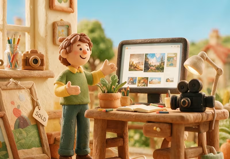
Claymation cartoons were my favorite type of animation when I was a kid. There was something magical about seeing little handmade worlds come to life, frame by frame. I still love that tactile, imperfect feeling, so I tried bringing a bit of it into this campaign.
2
1
145
2
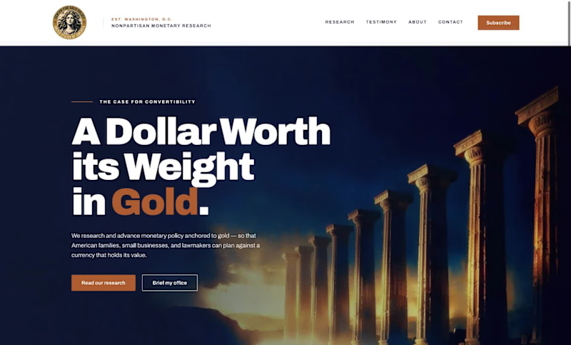
Client: A Washington, D.C.-based monetary policy research and advocacy organization (name withheld per client confidentiality). Direction: Modern, bold, and credible, with large confident typography, minimal color, and real editorial weight. What I delivered: A full brand style guide: color system, type scale, component specs, and logo usage rules A homepage built around a custom seal mark and a cohesive dusk-toned photographic treatment One deliberate accent color (terracotta) instead of predictable palette choices A custom architectural photography direction, anchored by an abstract Doric column hero image Available for similar work: advocacy organizations, think tanks, and institutional brands.
2
105
HTML5
(1)
Follow
Message
Evan Kirby McGregor
Montreal, Canada
Web & Mobile Dev | Custom Interactive Experiences
Follow
Message
Web & Mobile Dev | Custom Interactive Experiences
0
Evan Kirby McGregor - Web Portfolio
0
28
0
Third Place - Official Website
0
9
0
LUNOIRE - Official Website
0
10
View more →
HTML5
(1)
Follow
Message
Zachary Leblanc-Lavigne
Montreal, Canada
SaaS & Web Design Expert
Follow
Message
SaaS & Web Design Expert
0
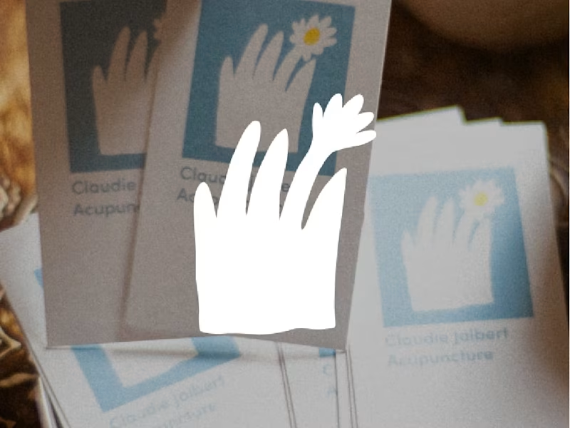
Web Design & Development for Acupuncture Clinic
0
8
0
Merchandise Design and Manufacturing
0
8
0
UX and UI Design for Mobile App
0
7
View more →
HTML5
(1)
Follow
Message
Explore people