Projects using Adobe Illustrator in Puebla
Projects using Adobe Illustrator in Puebla
Sign Up
Post a job
Sign Up
Log In
Filters
2
Projects
People
Message
0
Taller Tintor MX
pro
Dr. Francisco Romero - Médico Nuclear
0
4
Message
0
Cristian Josué Castillo Castro
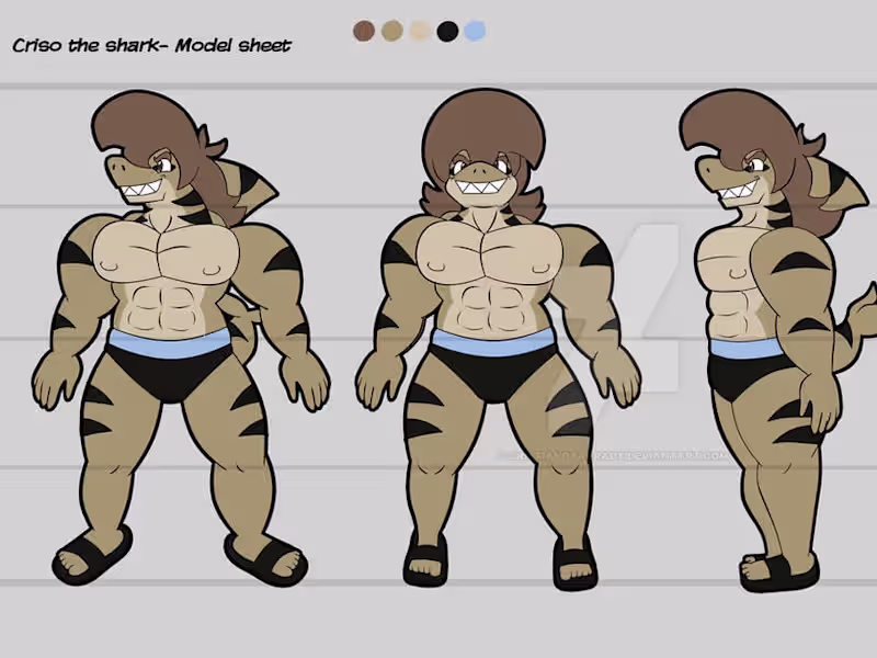
Criso the Shark - Character design
0
11
Message
0
Violeta Zurita
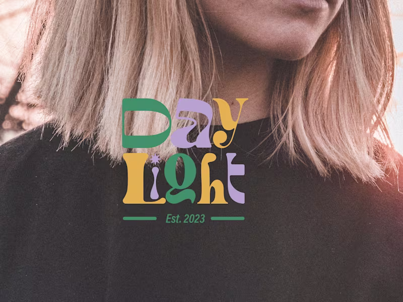
Daylight Brand Identity Design
0
8
Message
0
Michelle Perez
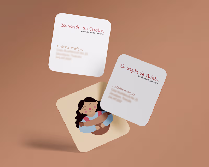
Branding — La sazón de Pabita on Behance
0
3
Message
0
Mariana Pérez
Branding Design for a Hotel Boutique
0
2
Message
0
Naomi Pérez
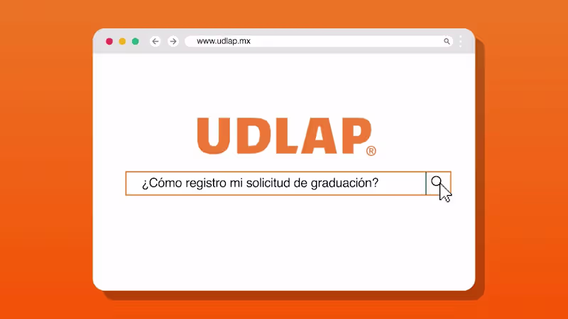
Registro de Graduacion 2024 - YouTube
0
5
Message
22
Taller Tintor MX
pro
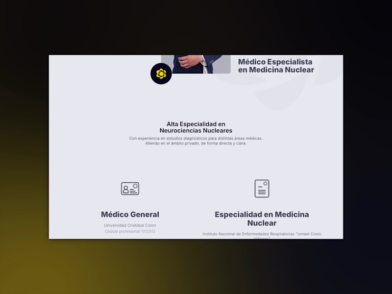
after defining a more human visual identity for dr. francisco romero, the next step was to create a digital home that felt the same way: calm, approachable, and reassuring for anyone trying to understand nuclear medicine. the website was designed as a space for clarity. it guides visitors through who he is, what he does, and how the studies work, always using language and structure that replace fear with understanding. the tone is simple and human, and the layout helps people find what they need without feeling lost. it’s not a medical site that overwhelms. it’s one that listens, built to inform, connect, and comfort. 💬
22
251
Message
0
Cristian Josué Castillo Castro
Shark Jokes
0
7
Message
0
Violeta Zurita
Character Design for a Magazine
0
9
Message
0
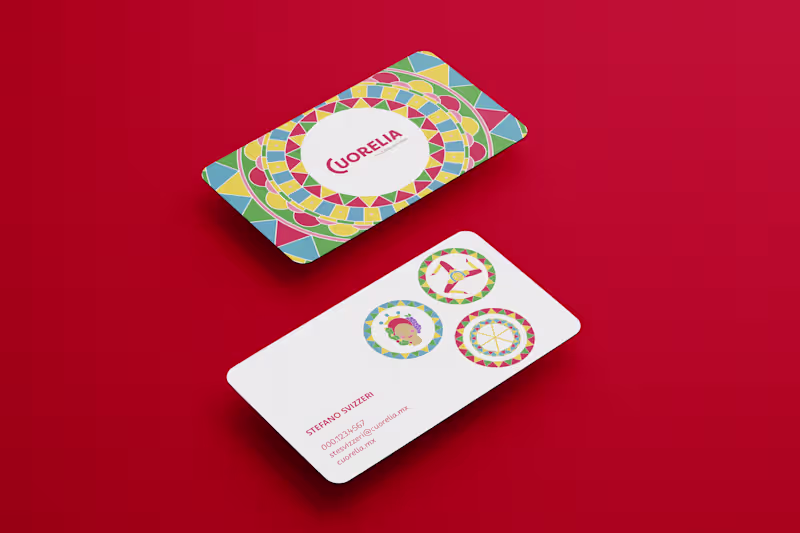
Michelle Perez
Branding — Cuorelia, trattoria siciliana on Behance
0
6
Message
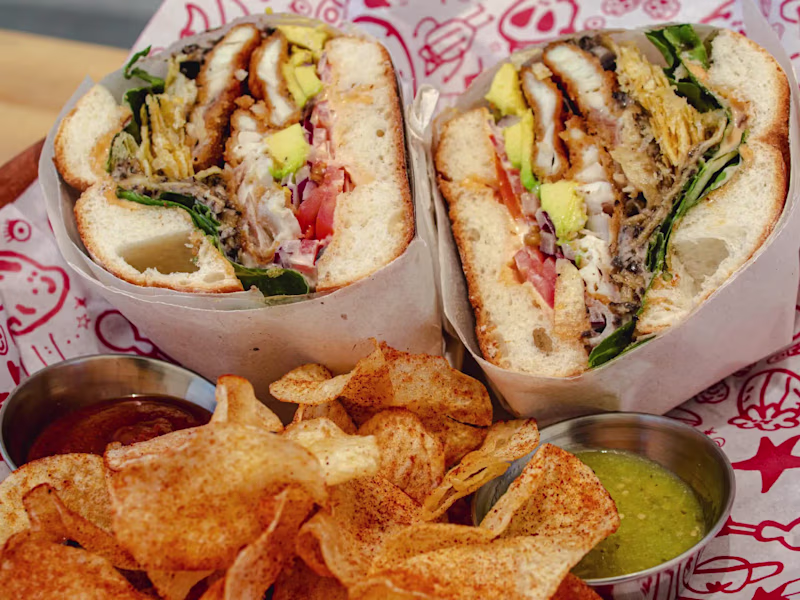
20
Taller Tintor MX
pro
some cravings turn into projects. las espaciales started as one, a craving for something loud, simple, and full of life. we built a brand that feels like its food: warm, playful, and proudly everyday. colors that move, type that smiles back, and a name that rolls off the tongue. it’s mexican street energy, bottled with care. proof that joy can be design language too. 🥪👨🏽🍳
20
285
Message
0
Violeta Zurita
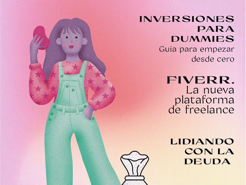
How to Be Financially Savvy
0
15
Message
0
Taller Tintor MX
pro
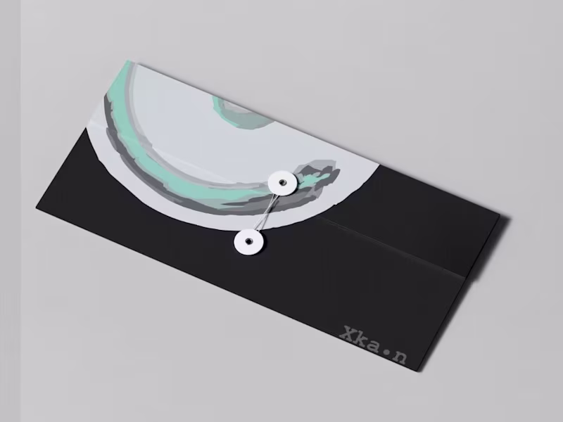
puerto salud
0
4
Message
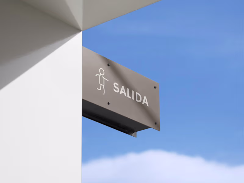
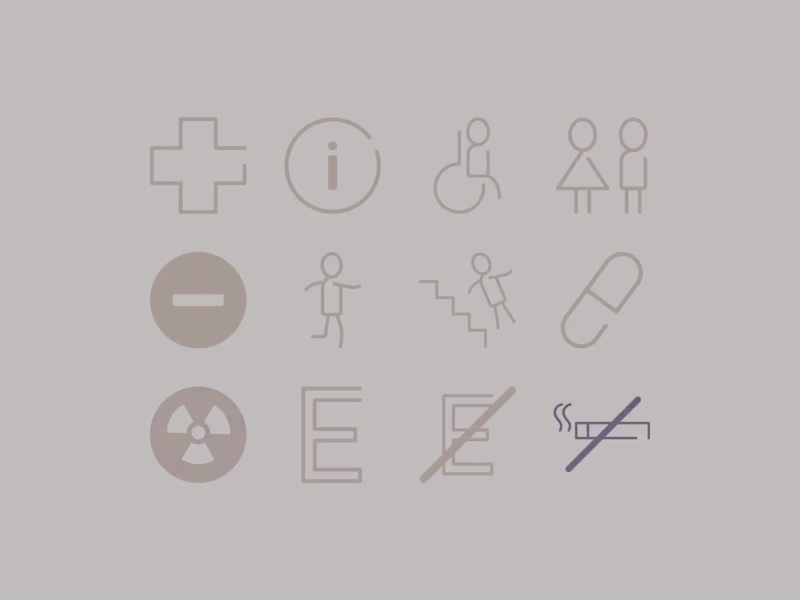
12
Taller Tintor MX
pro
puerto salud is a small clinic led by young specialists who care deeply about people. they came to us looking for a brand that felt human first: calm, clear, and quietly confident. we built a visual identity around that intention: a simple imagotype that feels stable and open, paired with minimal collateral pieces that extend the same sense of care. the signage, the brochures, the stationery… everything speaks in the same gentle tone. sometimes, designing for trust means stepping back. letting space, proportion, and color do the work. for puerto salud, that simplicity became their way of saying: you’re in good hands. 🌿 🩺 📘 TT
12
210
Explore projects