Human by Design — Final Update
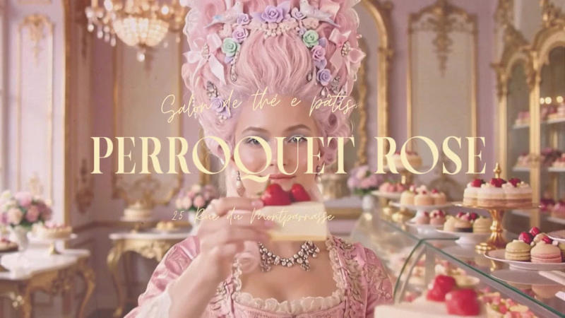
A final update on my Envato Challenge submission: a new video for my Tea Pâtisserie & Flower House brand, and the two "Human by Design" moments behind it.
Texture & warmth: (AI-generated face on the left, my edit on the right) The AI output was clean — too clean. Too smooth, too "perfect," missing the warmth I wanted for a romantic, handcrafted brand. So I stepped in: warmer lighting, added texture and grain, turning a polished AI output into something tactile and human-made.
The eyes don't lie: (two robotic AI takes vs. the final expression) For this new video, character consistency was flawless — but the gaze wasn't. Every take had that flat, robotic stare no amount of polish can fix. I kept rewriting the prompt, take after take, trying to guide the AI toward an expression that felt alive rather than rendered — until I got one where the gaze finally felt real.
AI can nail the character. It takes a human eye to know when it's not looking back.
Want to see the full project? Head to my profile — you'll find the complete brand identity video (logo, full brand explanation) and the behind-the-scenes video too.
1
9
643

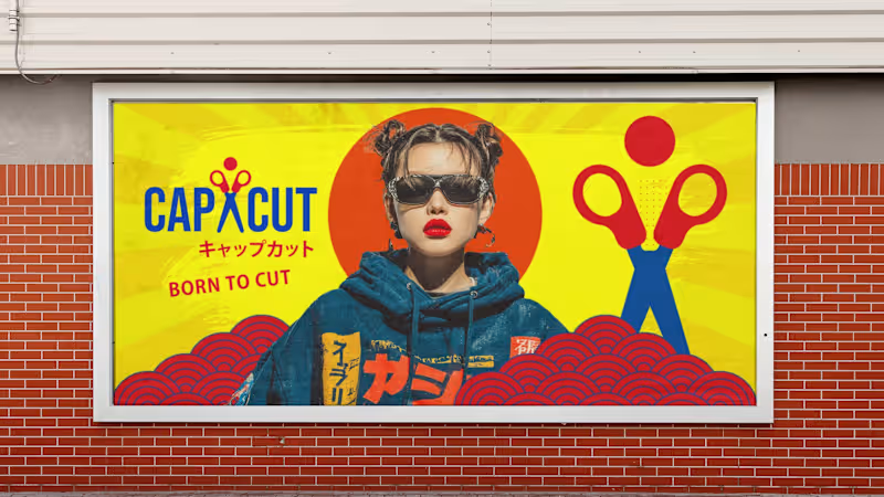



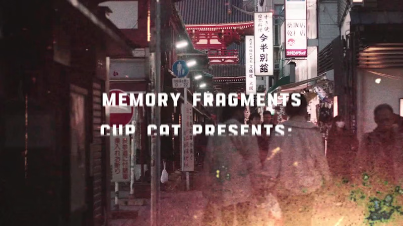
CapCut presents: Fragments of Memory
A retro-Tokyo mood film — extension of the Brand Identity Challenge entry
This project is an extension of my original challenge entry: "Reimagine CapCut – Tokyo Streetwear Brand Identity"
https://contra.com/community/BBshwH0R-reimagine-cap-cut-tokyo-streetwear-brand-identity?r=chiaraalduini
It expands the concept by introducing a motion layer that explores how the brand behaves in movement, bringing the identity system into a more dynamic and applied context.
While the original submission focused on the visual identity system — logo, typography, color palette, and static applications — this addition completes the narrative by translating the brand into motion and reinforcing its Tokyo streetwear-inspired aesthetic.
Together, both parts form a single cohesive exploration of how a digital tool like CapCut can be reimagined as a cultural and fashion-driven brand system.
Born to Cut — but sometimes, born to remember. 🎌
#CapCutDesignStudio #BornToCut #TokyoVibes
0
658