Freelance Art Directors in Prague
Sign Up
Post a job
Sign Up
Log In
Filters
2
Projects
People
Oleksandra Marchenko
pro
Prague, Czechia
Product Designer 🥷 SaaS Mobile App Fintech UI UX
$25k+
Earned
2x
Hired
809
Followers
Top
Follow
Message
Product Designer 🥷 SaaS Mobile App Fintech UI UX
14
🎉 Winning Submission Wispr Flow Challenge & Contra [ UI/UX Design , Platform Saas ]
2
14
2.8K
6
🏆 Web Design for the Awards | Hyperactive
6
44
12
💙 Mobile design for medical app | Hyperactive
12
31
30
🌊 Web design for diving center | Hyperactive
30
150
Art Director
(1)
Follow
Message
Marcos Silfa
pro
Prague, Czechia
Brand design / Art direction / Digital design / Packaging
21
Followers
Follow
Message
Brand design / Art direction / Digital design / Packaging
6
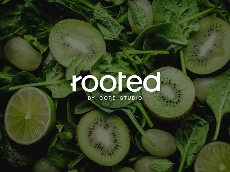
Rooted by Core Studio Logo Design Rooted is a nourishment concept developed as a sub-brand of Core Studio, a ladies-only boutique Pilates studio in Abu Dhabi focused on community and holistic well-being. The logo was conceived as a custom typographic wordmark where meaning is embedded directly into the structure. A subtle branch is integrated into the letter “R”, reinforcing the idea of growth and origin without relying on external symbols or common wellness clichés. The controlled geometry of the typography balances the organic gesture, maintaining a calm, modern, and premium tone aligned with Core Studio’s visual language. The result is a scalable and versatile logo designed to support future growth beyond smoothies into coffee, food, and retail applications, while preserving visual cohesion within the Core Studio ecosystem.
4
6
205
6
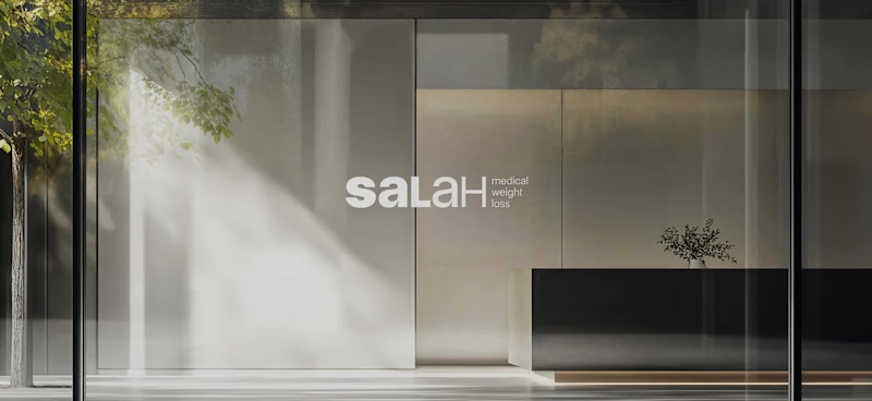
Salah Medical Weight Loss is a medical clinic specializing in physician-supervised, sustainable weight loss and long-term health management. Challenge Communicating a complex, medically driven approach to weight loss while standing apart from generic wellness clinics. Strategy Create a clear and credible visual system that translates medical care, lifestyle guidance, and long-term follow-up into trust and clarity. Identity A bold-to-light wordmark reflects the patient journey. A secondary shield symbol with a downward arrow represents health protection and controlled weight loss. Outcome Stronger medical credibility, clearer communication of services, and increased patient confidence across digital platforms.
6
6
477
3
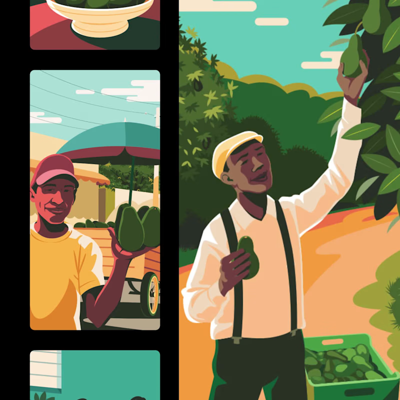
Dominican avocados brand identity system
3
29
41
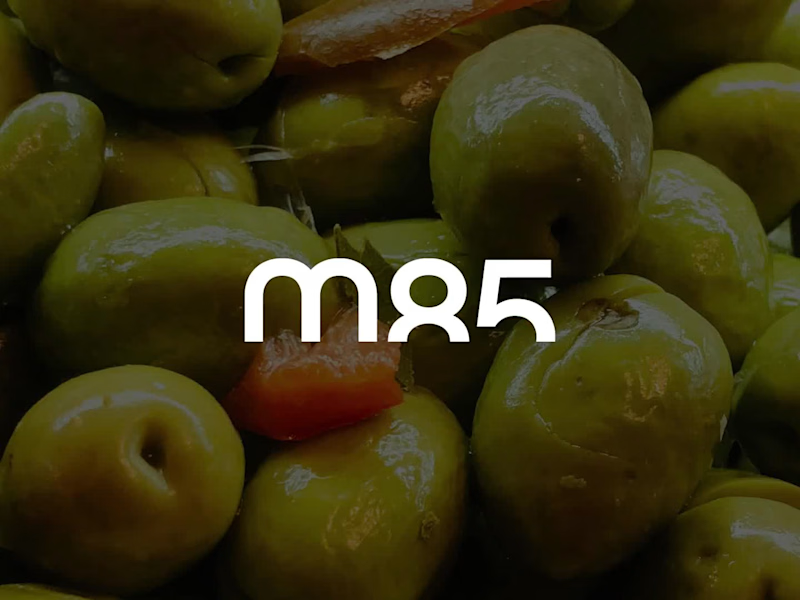
Maison 85 — Brand System What they do Maison 85 is a US-based importer and curator of premium European gastronomy. They act as a logistical and commercial bridge, representing established continental brands. The challenge Building a strong identity that supports—rather than competes with—the brands it represents. The system must integrate diverse product origins and formats under one coherent structure. The strategy A restrained system focused on structure over decoration. I implemented a dual-use logic: maison85: For institutional clarity. m85: A compact mark for operational and logistical efficiency. The result A disciplined, scalable framework designed to stay quiet so the products can speak. Design as infrastructure, not expression. #BrandSystem #VisualIdentity #MinimalistDesign #FoodLogistics #DesignStrategy
16
41
1.2K
Art Director
(6)
Follow
Message
Kryštof Kalina
Prague, Czechia
Passionate Art Director and Photographer 💫

5.0
Rating
3
Followers
Follow
Message
Passionate Art Director and Photographer 💫
0
Impactful Art Direction for Killer Campaigns
0
10
0
Captivating Product Photos with Character for E-Commerce Success
0
13
0
International Storytelling Through Photography
0
10
1
Thumb stopping ad creatives and campaigns powered by AI
1
13
Art Director
(3)
Follow
Message
Fabián Sanabria
Prague, Czechia
Experienced Digital Brand Designer. Webflow and Framer.
8
Followers
Follow
Message
Experienced Digital Brand Designer. Webflow and Framer.
0
Photography Art Direction for STRV
0
8
0
foodit! · Brand identity
0
41
0
GoDaddy Airo · Logo design
0
30
0
GoDaddy Registry · Campaign
0
13
Art Director
(2)
Follow
Message
Alina Mulenko
Prague, Czechia
Digital illustrator and photo editor
Follow
Message
Digital illustrator and photo editor
0
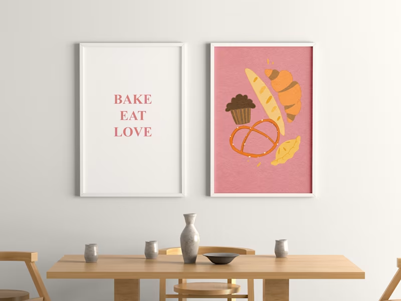
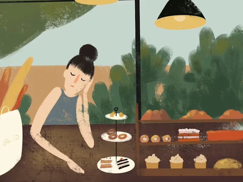
Cozy bakery merch illustration
0
14
0
Caffe Illustrations
0
8
0
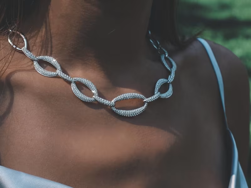
Feed Design for Inbar Diamond
0
42
0
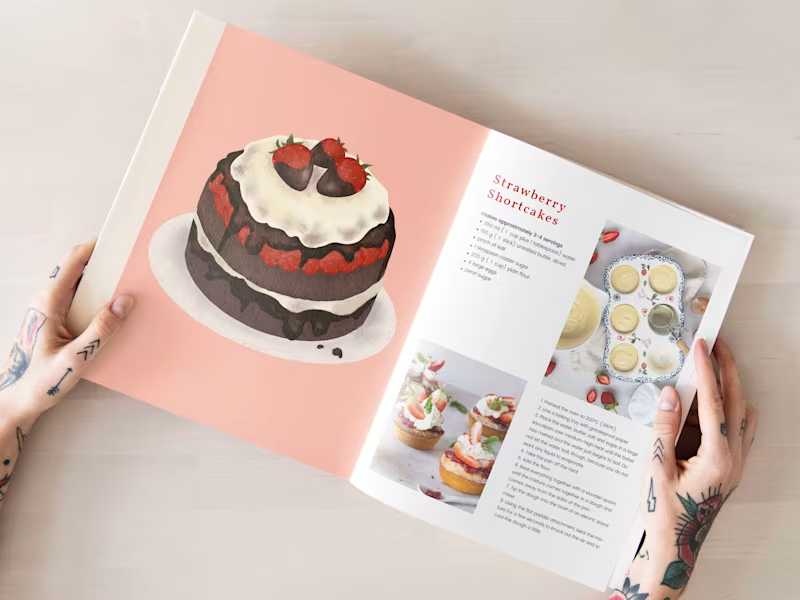
Recipe Book Illustrations
0
15
Art Director
(4)
Follow
Message
Jiri Silha @ Kolektive
pro
Prague, Czechia
Cohesive brand visuals for small businesses & solo founders
$1k+
Earned
1x
Hired
5.0
Rating
10
Followers
Follow
Message
Cohesive brand visuals for small businesses & solo founders
1
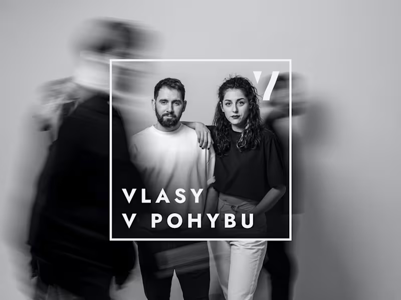
Brand Identity for a Hair Salon
1
8
1
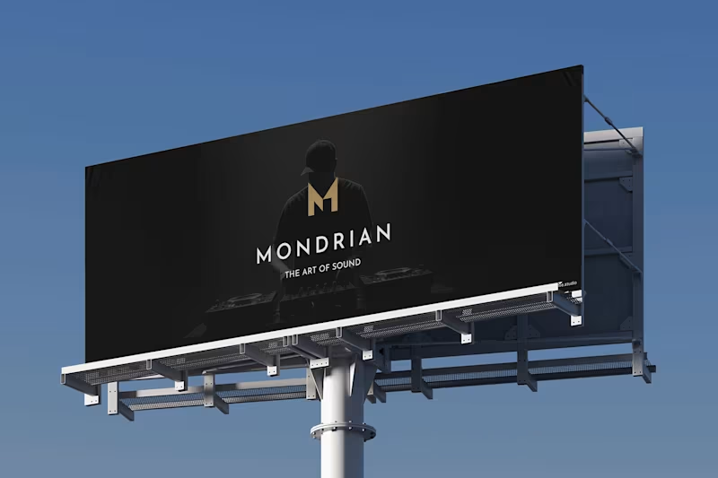
Mondrian Sound
1
11
3
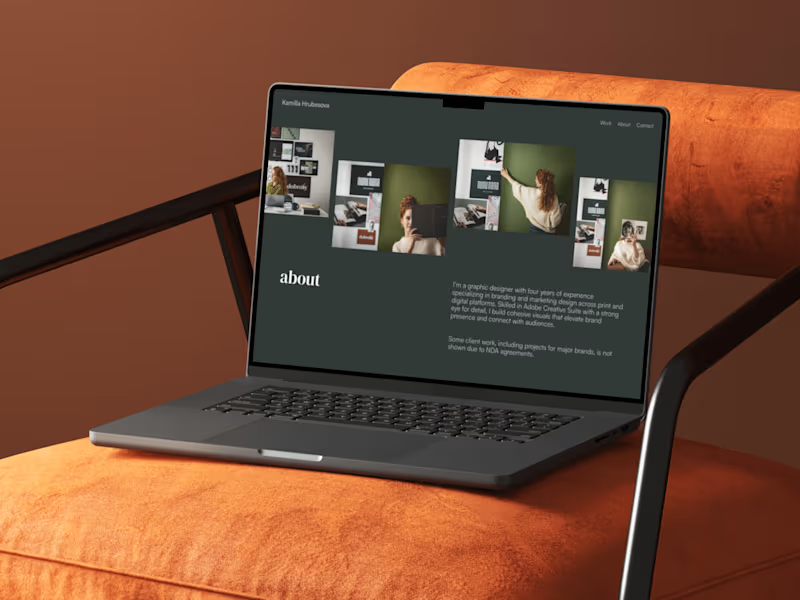
Graphic Designer Portfolio Website (Built in Framer)
3
8
0
Mobile UI Design Showcase
0
8
Art Director
(1)
Follow
Message
Tomas Krcal
Prague, Czechia
Digital Designer | Web & Brand
17
Followers
Follow
Message
Digital Designer | Web & Brand
2
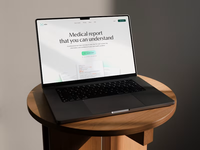
Design concept for a startup focused on making medical reports easier to understand.
3
2
82
17
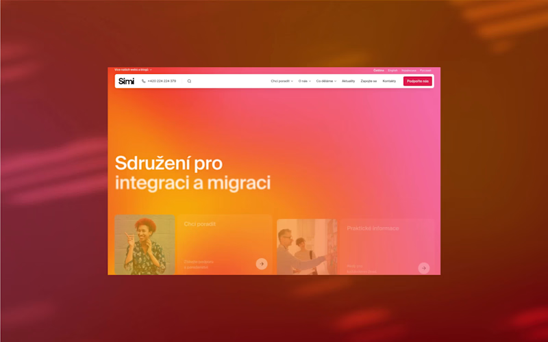
The Association for Intagration and Migration (SIMI) is a human rights organization that supports the rights of migrant women and men, offers wide support, and works towards a fair, informed, and open society. They’ve recently launched a new visual identity created by @dacid___ (https://www.instagram.com/dacid___/) . I’m really happy to have been part of this change and to have worked with the SIMI team on a brand new website. 🌐 migrace.com (http://migrace.com)
17
183
0
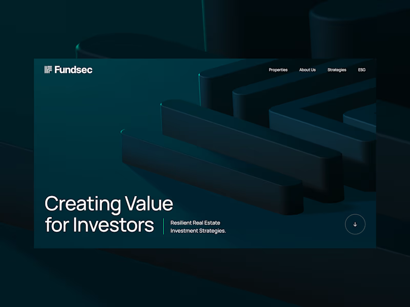
Fundsec — Website Design
0
6
16
From the archives — Exploration of hero section.
16
207
Art Director
(3)
Follow
Message
Tom Garcy
Prague, Czechia
Trusted to design what matters. Built to make you smile.
9
Followers
Follow
Message
Trusted to design what matters. Built to make you smile.
33
Oslo Tennisklubb rebranding coming soon!
1
33
284
23
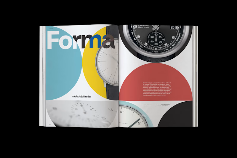
A new @ (https://www.instagram.com/garcy.studio/)garcy.studio (http://garcy.studio) project for Koscom is finally out – and today, we’re sharing a few of the designs. It was an honor to lead the art direction of Koscom’s anniversary magazine and work on 25 articles over the course of five months. We treated each article as a small piece of art. Carefully composed layouts, strong typography, and a visual language that lets the content breathe. For us, the magazine feels like a curated art collection, while the content itself is truly state of the art. Below, we’re sharing a few snaps from the magazine to show how some of the articles were designed. If you get the chance, see the magazine in person and visit Koscom. It’s a beautiful piece of work.
1
23
161
16
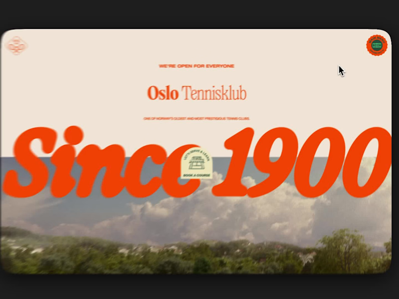
The new Oslo Tennisklubb (https://www.linkedin.com/company/oslo-tennisklubb/) website from garcy.studio (http://garcy.studio) is where the brand truly comes alive. After 125 years, the club has entered a new era, but not just visually. It had to show the range of the identity: from prestige to playfulness, from tradition to modern energy. Every page became a canvas. Different colors, different font combinations, custom stickers, hand-drawn illustrations. Always changing, always connected. The site became the place where we could show what the identity can do. We’re proud of how flexible and expressive this system became. It still feels like Oslo Tennisklubb, no matter where you land. Built with love, and a lot of green and orange. 🟧🟩
1
16
140
13
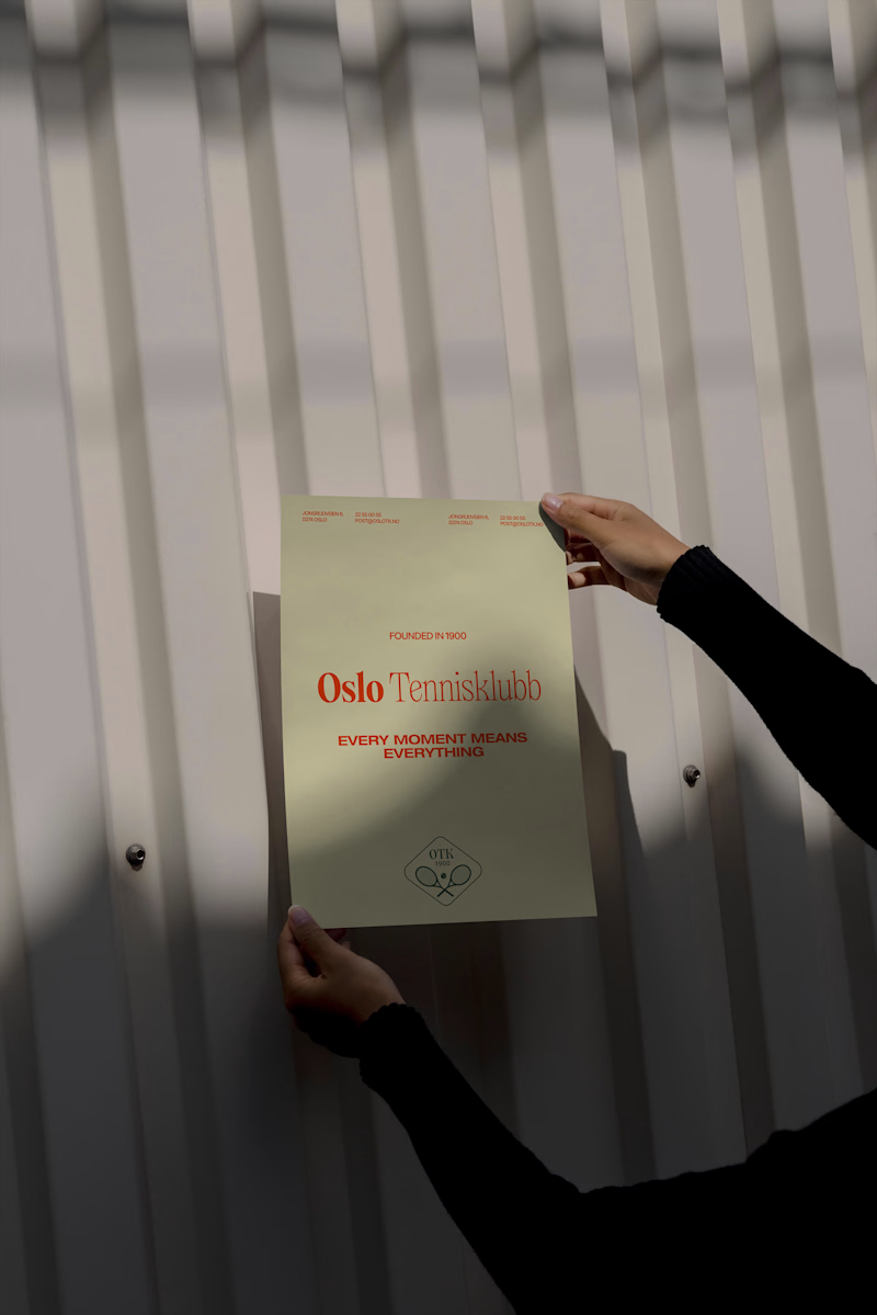
Oslo Tennisklubb Branding by garcy.studio
5
13
120
Art Director
(1)
Follow
Message
Explore people