Product Designer 🥷 SaaS Mobile App Fintech UI UX

Product Designer 🥷 SaaS Mobile App Fintech UI UX

Award-Winning Brand, Web & 3D Design for Startups


Award-Winning Brand, Web & 3D Design for Startups
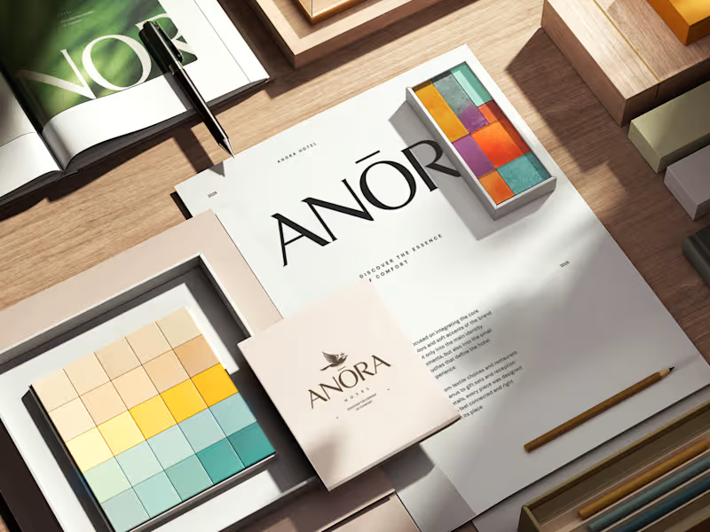

Brand design / Art direction / Digital design / Packaging
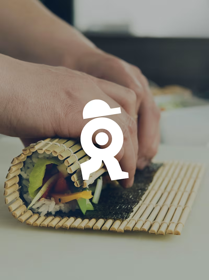
A sushi roll with a life of its own.
The WALKEAT identity transforms the shape of a sushi roll into a walking character. Its circular center references the cross-section of the roll, while the cap and legs bring movement and personality to the figure.
The custom-designed wordmark reinforces this concept through subtle modifications to the W, A, and E, creating a visual connection between typography and symbol.
A simple, playful and contemporary identity that communicates the product without relying on literal Japanese imagery or an overly cartoonish character.
3
9
195
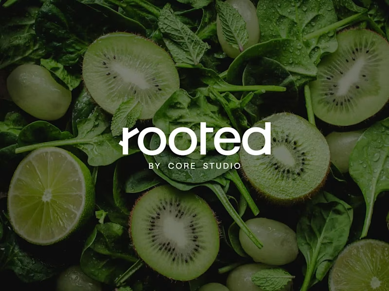
Rooted by Core Studio
Logo Design
Rooted is a nourishment concept developed as a sub-brand of Core Studio, a ladies-only boutique Pilates studio in Abu Dhabi focused on community and holistic well-being.
The logo was conceived as a custom typographic wordmark where meaning is embedded directly into the structure. A subtle branch is integrated into the letter “R”, reinforcing the idea of growth and origin without relying on external symbols or common wellness clichés.
The controlled geometry of the typography balances the organic gesture, maintaining a calm, modern, and premium tone aligned with Core Studio’s visual language.
The result is a scalable and versatile logo designed to support future growth beyond smoothies into coffee, food, and retail applications, while preserving visual cohesion within the Core Studio ecosystem.
4
6
321
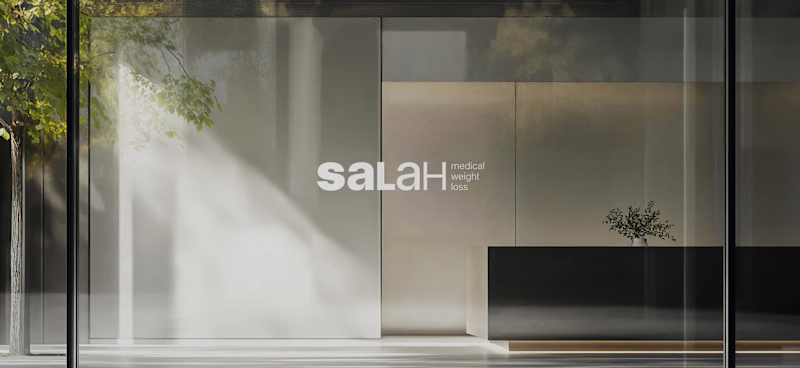
Salah Medical Weight Loss is a medical clinic specializing in physician-supervised, sustainable weight loss and long-term health management.
Challenge
Communicating a complex, medically driven approach to weight loss while standing apart from generic wellness clinics.
Strategy
Create a clear and credible visual system that translates medical care, lifestyle guidance, and long-term follow-up into trust and clarity.
Identity
A bold-to-light wordmark reflects the patient journey. A secondary shield symbol with a downward arrow represents health protection and controlled weight loss.
Outcome
Stronger medical credibility, clearer communication of services, and increased patient confidence across digital platforms.
6
6
529
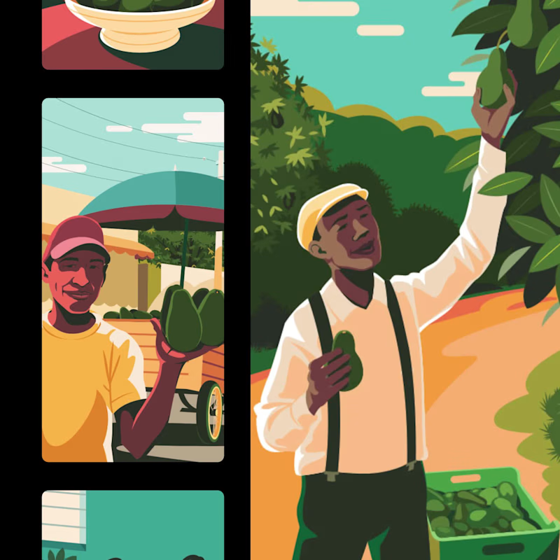

Passionate Art Director and Photographer 💫

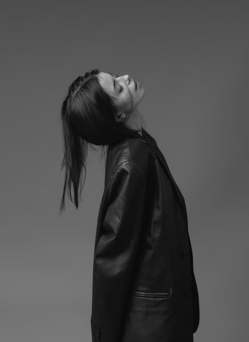
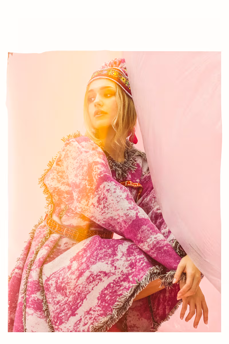


Experienced Digital Brand Designer. Webflow and Framer.
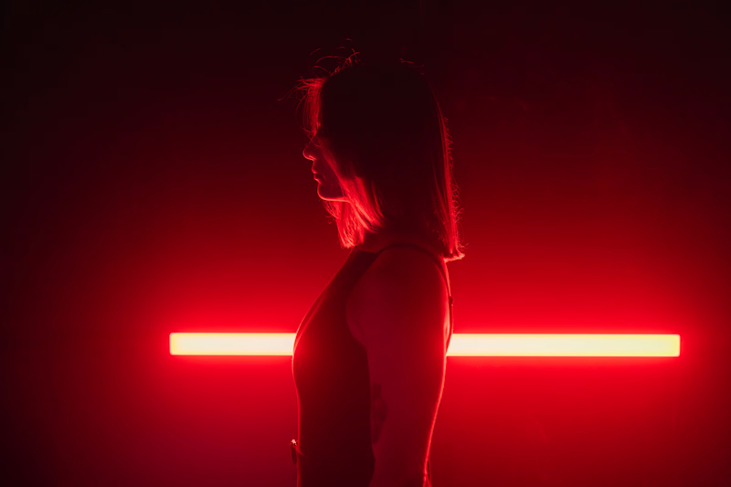

Digital illustrator and photo editor
Digital illustrator and photo editor

Cohesive brand visuals for small businesses & solo founders
- $1k+
- Earned
- 1x
- Hired
- 5.0
- Rating
- 11
- Followers
Cohesive brand visuals for small businesses & solo founders

Digital Designer | Web & Brand
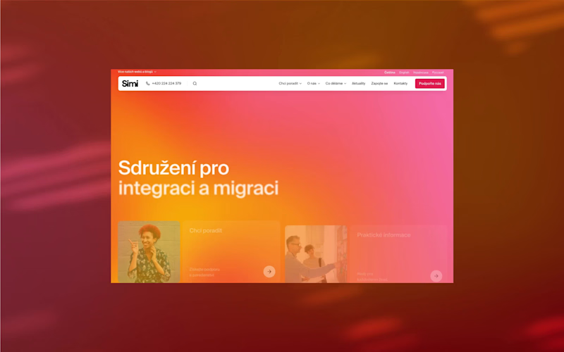
The Association for Intagration and Migration (SIMI) is a human rights organization that supports the rights of migrant women and men, offers wide support, and works towards a fair, informed, and open society.
They’ve recently launched a new visual identity created by @dacid___ (https://www.instagram.com/dacid___/) . I’m really happy to have been part of this change and to have worked with the SIMI team on a brand new website.
🌐 migrace.com
(http://migrace.com)
17
209