
Framer websites for SaaS & AI startups that convert


Framer websites for SaaS & AI startups that convert



Visual-Oriented UI/UX Designer & Brand Expert
- 1x
- Hired
- 5.0
- Rating
- 11
- Followers
Visual-Oriented UI/UX Designer & Brand Expert


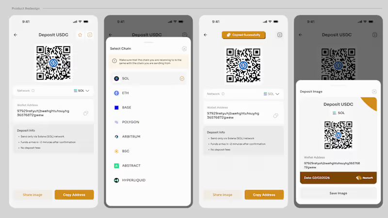
I have been away for a while working with a Fintech startup as a founding designer and this as been one of the eventful experience of my design career.
As the design lead, i handle everything related to design from Branding, illustration and 3d assets to Product UXUI and animation.
This has taught me how to build a product from zero to one and i am excited for the next phase of my progress.
I am now taking new mobile app project and if you need a product design that care about details for your ongoing project, send a DM.
2
240


Creating Professional Landing Pages & Websites

Few weeks ago I designed this Instagram post for a church’s Instagram slide posts. (The Compass Assembly)
My goal is simple: to help churches, ministries, and organizations communicate their vision with clarity through impactful visual designs.
Whether it’s a donation drive, outreach, or event promotion, the right design can attract attention, inspire giving, and move people to action. 🎨✨
Do you have a church program or brand campaign coming up? Let’s work together to bring your vision to life with professional, goal-driven designs.
You can explore my past projects and design approach here:
My portfolio https://reubenemmanuel.framer.website/
1
122


Expert Product & Brand Identity Designer
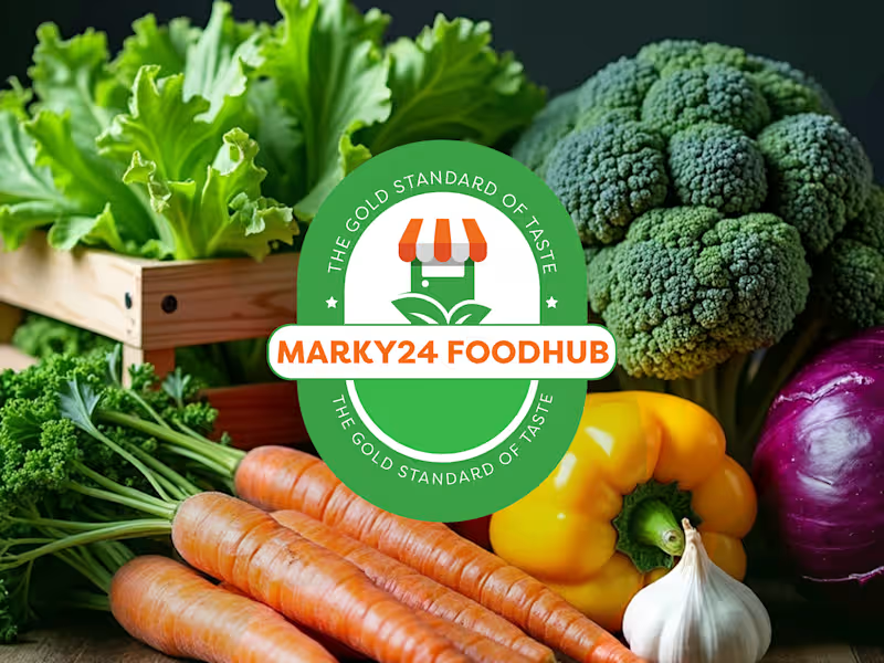
The design for "Marky24 Foodhub" was created to feel as warm, trustworthy, and authentic as the food it represents.
The goal was to build a visual identity that feels simple, recognizable, and rooted in culture, while still being modern and scalable.
The logo features a clean badge-style mark paired with friendly, bold typography—almost like a seal of quality on every product. The green and orange color palette brings a sense of freshness, nourishment, and energy, reinforcing the idea of natural ingredients and rich Nigerian flavors.
What makes the identity truly work is how easily it adapts. From food packaging and export boxes to social media, delivery bags, and digital platforms, the brand always feels consistent and familiar.
0
106
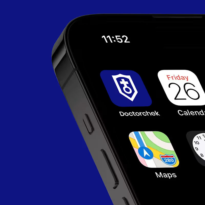
Aligning Doctorchek’s image with trust, accessibility, and modern telemedicine
Designed the brand identity and digital presence of Doctorchek, a growing telemedicine platform whose visual identity no longer reflected the quality, credibility, and scale of its healthcare services.
Doctorchek had evolved into a reliable platform connecting people with qualified healthcare professionals from the comfort of their homes.
Through a strategic design, I elevated the visual identity and online experience to clearly communicate trust, confidentiality, accessibility, and quality care, positioning the brand as a dependable and user-friendly healthcare partner.
0
113


Brand Identity & Logo Designer | Social Media post Design
- 8
- Followers
Brand Identity & Logo Designer | Social Media post Design
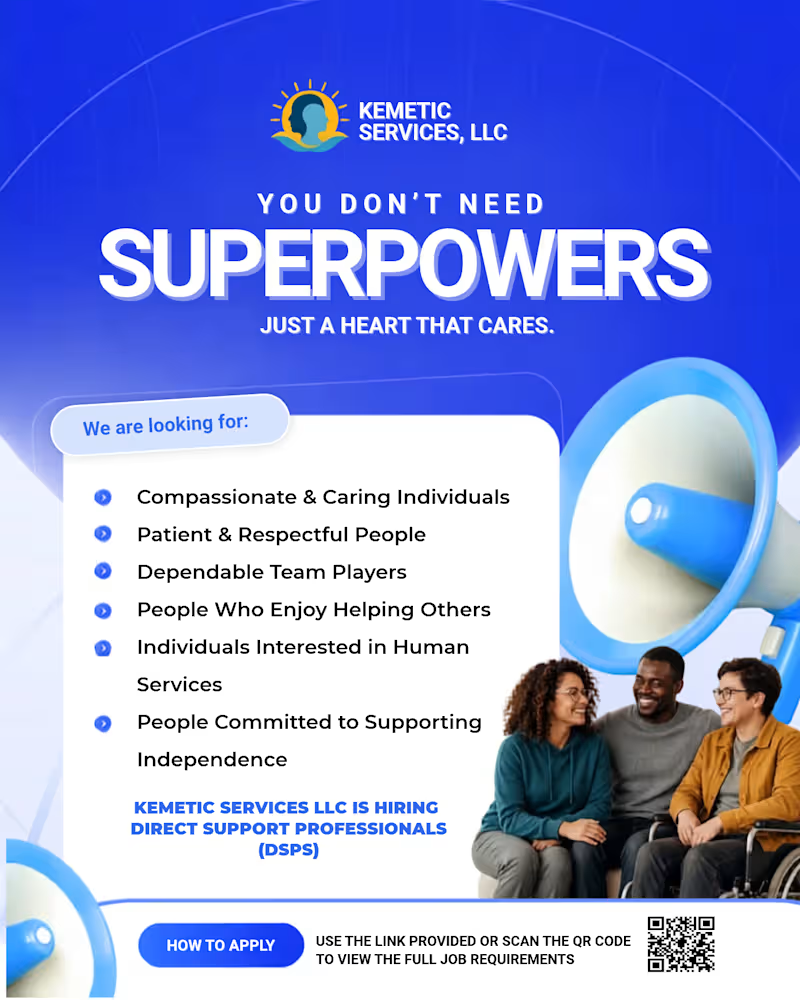
Everyone scrolls past hiring flyers.
But this one made people stop.
When KEMETIC SERVICES, LLC came to me, they didn't just want a flyer that says, "we're hiring." They wanted one that makes people FEEL why this job matters.
So I didn't design a job ad. I designed a human moment.
MAKE SOMEONE FEEL SEEN.
Three words. But for a Direct Support Professional, that's the whole job. It's patience when no one else has it. It's making everyday moments meaningful.
I built this around that feeling bold emotional typography, trust-building blue, urgent orange for action, and real people, real connection.
Because cheap flyers attract people looking for a paycheck.
Powerful flyers attract people looking for a purpose.
And that's why this campaign doesn't just get likes. It gets applications.
Want your design to do the same?
DM me "FEEL SEEN" and I'll build your next hiring magnet.
1
2
219
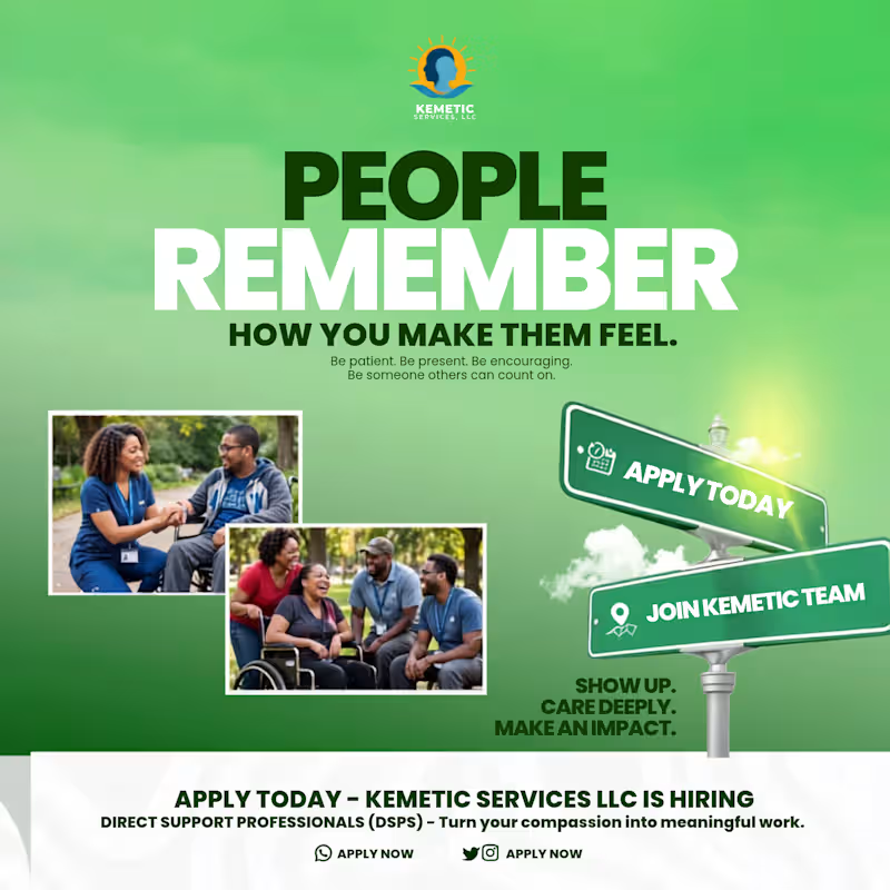
People may forget what you said, but they never forget how you made them feel.
For this KEMETIC SERVICES LLC recruitment design, I didn't want to design just another hiring flyer. I wanted to design a feeling.
The headline PEOPLE REMEMBER HOW YOU MAKE THEM FEEL is the whole story of what a Direct Support Professional does. It is not just a job, it is patience, presence, encouragement. It is being someone others can count on.
I used a calm green gradient to communicate trust and care, paired with real moments of connection the hand-holding, the laughter in the park. Those photos are not stock, they are emotion. On the right, the road sign pointing to APPLY TODAY and JOIN KEMETIC TEAM turns the career decision into a journey. And the closing words SHOW UP. CARE DEEPLY. MAKE AN IMPACT. seals the purpose.
This is the kind of recruitment design that attracts people with heart, not just people looking for a paycheck.
If you need hiring visuals, healthcare recruitment, or human-centered social media designs that connect emotionally and convert, I can create that for your brand.
DM me "FEEL" to get your own emotional converting recruitment design.
2
195
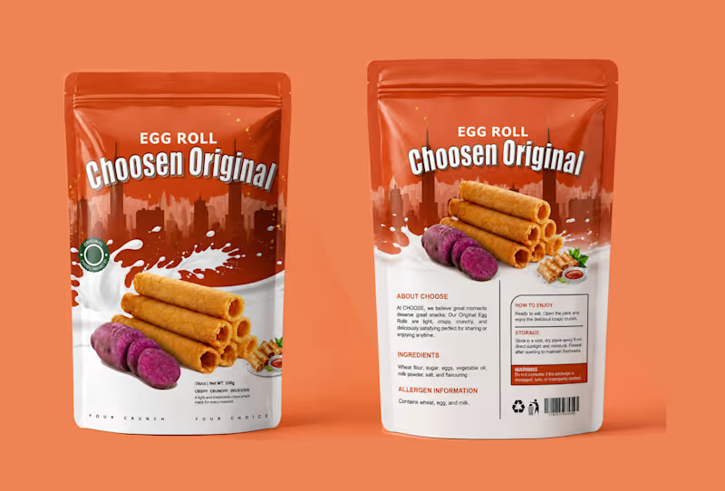
I turned a simple snack into a craving. Choosen Original Egg Roll.
People don't buy snacks with their eyes closed. They buy with craving.
For Choosen Original Egg Roll, the brief was clear — make it look crispy, crunchy, delicious and unforgettable on the shelf. So I built a story around the crunch itself.
The top half is bold city energy with deep orange that pops on any supermarket shelf. The bottom half is pure indulgence, a splash of milk for creaminess and freshness, stacked golden egg rolls that look so crispy you can almost hear them, and the sliced purple yam that tells you instantly this is not your regular flavor, this is original.
I added small details that sell, the Original Foods Industry seal for trust, the small serving shot with dip for appetite, and the tagline at the bottom, YOUR CRUNCH. YOUR CHOICE. It is personal. It makes the buyer feel like this snack was made for their moment.
This is packaging design that does not just sit, it sells.
If you have a food product, snack, or consumer brand that needs to stand out and get picked up, let's create your bestseller packaging.
DM me "CRUNCH" to get your own product packaging that converts.
#PackagingDesign #FoodPackaging #SnackPackaging #EggRollDesign #ProductPackaging #PouchDesign #ChoosenOriginal #FoodBranding #PackagingDesigner #GraphicDesigner #BrandDesigner #DesignThatSells
1
158
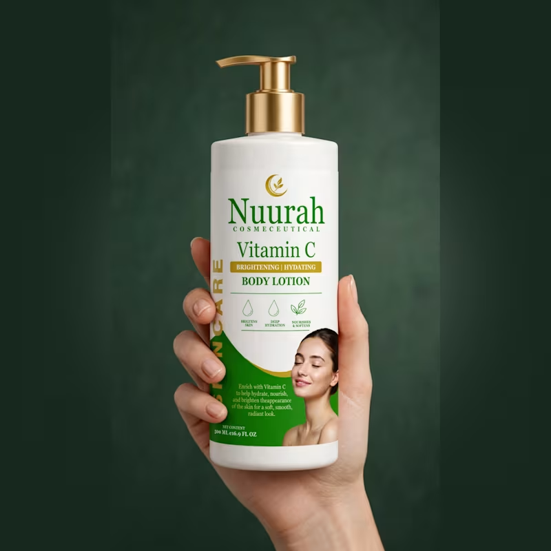
Every bottle tells a story. This one tells the story of GLOW.
This is not just a body lotion label. This is confidence in a bottle.
When the client came to me with Nuurah Cosmeceutical, she didn't just want a label. She wanted a feeling. That feeling you get when your skin is soft, hydrated, and glowing from within. That quiet luxury of knowing you look radiant.
The deep green speaks of nature, purity and healing. The touch of gold speaks of luxury, of a woman who values herself. The name Nuurah, light itself, became the hero. Big, bold, unapologetic. Because skincare should not hide. The woman on the front is not just a model, she is every woman closing her eyes and feeling beautiful in her own skin.
On the back, I kept the promise simple. Brightens. Hydrates. Nourishes. No confusion, just results.
This is design that sells emotion before it sells a product.
If you have a skincare or cosmetic brand that needs to tell a powerful story and not just sit on the shelf, let's make your product unforgettable.
DM me the word GLOW and let's create your bestseller brand story.
1
133

Designing bold, timeless brand identities that stand out.
Designing bold, timeless brand identities that stand out.


View more →

Brand-Aligned Motion & Graphic Design Service
Brand-Aligned Motion & Graphic Design Service


View more →

Efficient Virtual Assistant & Social Media Manager
Efficient Virtual Assistant & Social Media Manager


View more →