Brand Strategy Projects in PittsburghBrand Strategy Projects in Pittsburgh🎉 What do you build when a business has one logo and nothing else?
Little Fawns is a licensed home daycare in Canonsburg, PA. Twelve spots, ages six weeks to six years, run by the owner on her own floor.
What they had was a clip-art fawn, five rainbow letters, and a phone number baked into the artwork. No palette, no typefaces, no rules for any of it.
The hard part wasn't the design though. It was the brief.
Big centers feel safe because they're big. Small reads as risky. So "small" had to stop being the apology and start being the argument.
That's the whole brand. Twelve spots is the pitch, not the limitation.
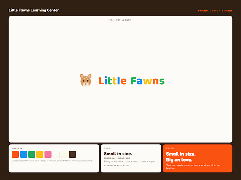
After that the system was straightforward. I drew a new vector mark and kept the five colors out of their old logo, because families already recognize them. Orange is the only color that ever means "do something." The other four decorate and never ask for anything.
Fredoka for headings, Baloo 2 for the wordmark, Nunito Sans for body. Rounded and warm, but properly drawn. Friendly without reading childish.
The headline came from them. "Small in size. Big on love." was already sitting on one of their own social graphics. It just needed to be the first thing you read instead of the last.
Then it goes to work across thirteen sections. Color banding paces the scroll, one accent carries every action, and each block answers a question a parent actually asks before they call.
Every factual claim is logged against a source before it ships. The state license, the 5.0 rating from four reviews, the twenty years of experience. Nothing invented and nothing rounded up.
This one's a concept build, so it isn't their live site.
Swipe for the design board, the brief, and the build.
What's the last brand you saw that turned its smallest feature into its main argument?