UI Design Projects in Petaling JayaUI Design Projects in Petaling JayaI had the incredible opportunity to work as a senior product designer on the redesign of the TED Talk page in collaboration with engineers, product manager, and ux designer and the TED Design System which I had spearheaded. During that time, I also got to contribute to the mini player feature for the TED mobile app, helping to bring TED’s inspiring content to life in new and engaging ways.
TED Talk Page Redesign: The goal of the TED Talk page redesign was to transform it from a one-time viewing experience into an engaging platform where users return regularly to participate and share ideas. We wanted TED.com (http://TED.com) to stand out from other video platforms like YouTube by encouraging meaningful conversations and active community involvement.
To achieve this, we focused on enhancing interactivity—highlighting user discussions, thoughts, and recommendations—to inspire more participation and idea exchange. We also prioritized performance improvements, ensuring faster load times and efficiency by adopting newer technologies and meeting standards like the Google Lighthouse Score. Lastly, we created an updated guide for the talk page’s functionality to make future updates and management smoother.
The result was a more dynamic, interactive hub that reflects TED’s mission of spreading and exchanging ideas.
Design System: In redesigning TED.com (http://TED.com), we blended old features with new, like user-driven discussions, under a modern design system I led. Data-driven decision-making refined essential elements and removed outdated ones, enhancing the site's interactivity and appeal.We also had conducted user testing our prototypes throughout our iterations.
More Than Just a Face Lift: We ran over 20 user tests to make sure our designs were as intuitive as we hoped. I iterated and refined the UI multiple times, using insights from these tests to guide each improvement. Along the way, I incorporated new design system components to keep everything consistent and seamless.
The result? A more user-friendly experience that not only meets our goals for ease of use but also feels cohesive and polished — making sure users stay engaged and find real value in what we’ve built.
TED Mobile iOS Mini Player: There has been a significant demand to enhance the browsing and video-watching experience for viewers on the TED mobile iOS app.
In order to align with the current YouTube viewership standards, it has been crucial for us to deliver what our users truly need — a miniplayer for videos, audio-only functionality, and podcasts.
Throughout this 3-month project, my responsibilities included analyzing the scope and requirements, designing the flow and UI, conducting user testing, and gathering valuable feedback.
Working as a senior product designer at TED was a true privilege. I learned so much from our users by gathering their feedback during testing of the new Talk page, Homepage redesign concepts (built with the design system I had spearheaded), and the mobile mini player. While there were mixed reactions on whether these changes would boost user engagement on the site, every step of the process was a valuable learning experience. Hearth & Honey — Neighborhood Café Landing Page
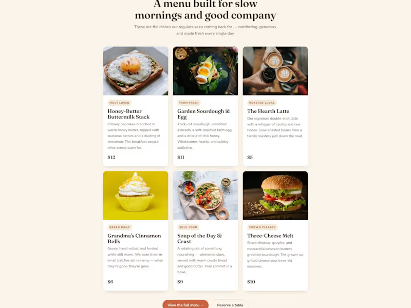
A warm, inviting landing page for a neighborhood café built around comfort and belonging. The design intentionally rejects the cold minimalism most restaurant sites use — soft cream backgrounds, a coral-and-brown palette, a friendly serif, and food photography given room to breathe. Copy is written in a homey, first-person voice ("We didn't set out to build a café. We set out to build a feeling."). Sections include the hero with a trust bar, an origin story, a menu built as appetizing cards with prices, a "why neighbors choose us" block, local testimonials, a functional table-reservation form, and a newsletter CTA offering a free pastry. The whole page is designed to make someone feel welcome before they've walked in.