
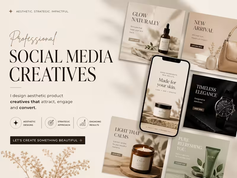
This project showcases a premium presentation layout highlighting a series of high-conversion Social Media Creatives. The design approach is engineered for direct-to-consumer (DTC) e-commerce brands in the wellness, beauty, and luxury lifestyle sectors, focusing on a seamless blend of elevated aesthetics and strategic marketing.
Design Strategy & Layout Highlights
Typography Hierarchy: The main presentation utilizes an elegant, high-contrast serif typeface for the headers ("SOCIAL MEDIA CREATIVES"), paired with a fluid, organic script accent for a touch of luxury. The ad creatives use clean, accessible sans-serif typography designed for maximum readability on mobile feeds.
Color Story & Tone: A deeply cohesive, warm neutral color palette dominates the canvas—utilizing soft cream, warm beige, muted sage green, and striking contrast accents of deep charcoal and rich espresso brown.
Multi-Product Mockup Integration: As showcased in the image, the composition features an array of modular square grid layouts alongside a central smartphone UI mockup. This setup effectively demonstrates how the campaign assets transition seamlessly from Instagram grid posts to high-impact mobile stories or reels.
Visual Styling: The entire layout leverages soft, natural leaf and window-pane shadow overlays, raw stone styling elements, and warm, minimalist photography to communicate a sense of "quiet luxury" and organic purity.
1
112
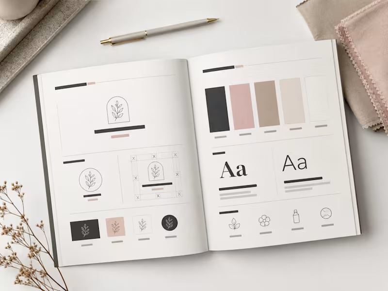
This spread showcases the editorial layout of the CALMÉA Botanical Skincare Brand Style Guide. Designed to serve as the definitive blueprint for the brand's visual identity, the layout maintains a high-end, editorial feel with a focus on generous negative space and clear information hierarchy.
Spread Layout & Specifications
Left Page (Logo Systems & Usage): Dedicated to the structural core of the brand. It outlines the primary arched botanical logo mark, alternative circular sub-marks, and the precise clear-space grid construction. The lower section demonstrates icon versatility across dark, light, and inverted color blocks.
Right Page (Color & Typography): Focuses on the core design systems. The top half displays the refined, earthy color palette blocks (charcoal, dusty rose, warm taupe, soft cream, and crisp white). The midsection dictates the typographic hierarchy, contrasting a bold serif display typeface with a clean, light serif/sans-serif body pairing. The bottom row highlights custom brand iconography for packaging use.
Art Direction: Styled in a flat lay format featuring raw tactile fabric swatches, a minimalist matte pen, and delicate dried florals to reflect the organic essence of the brand.
0
80
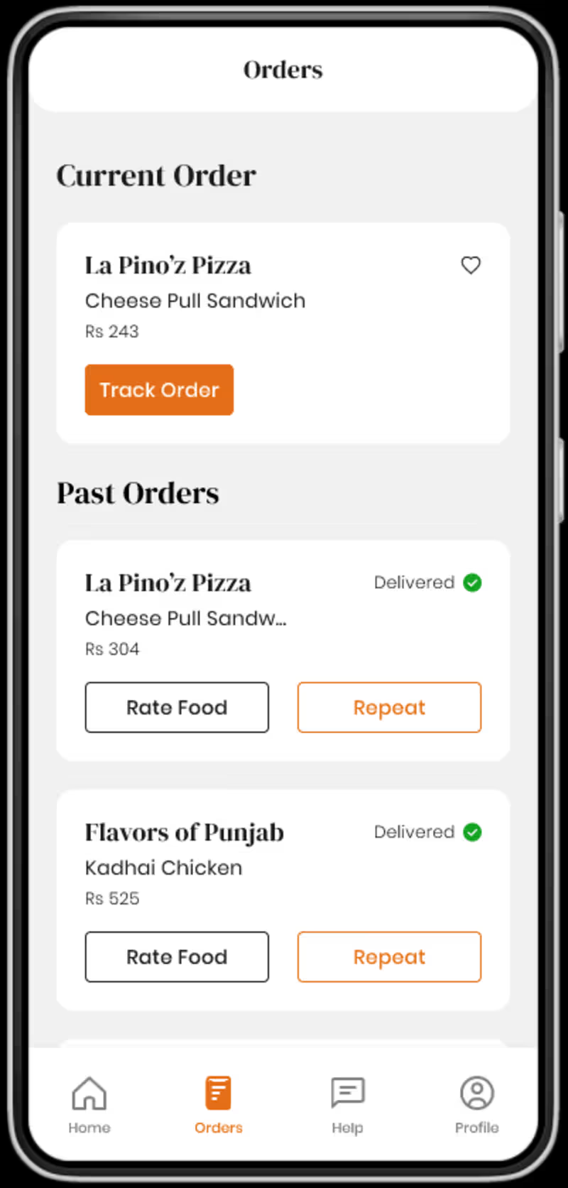
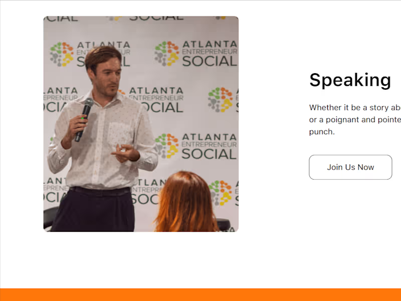
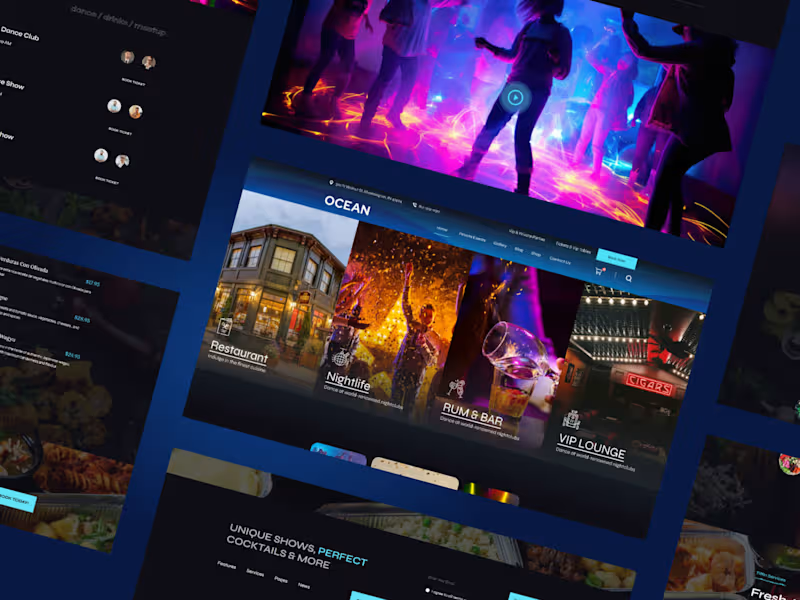
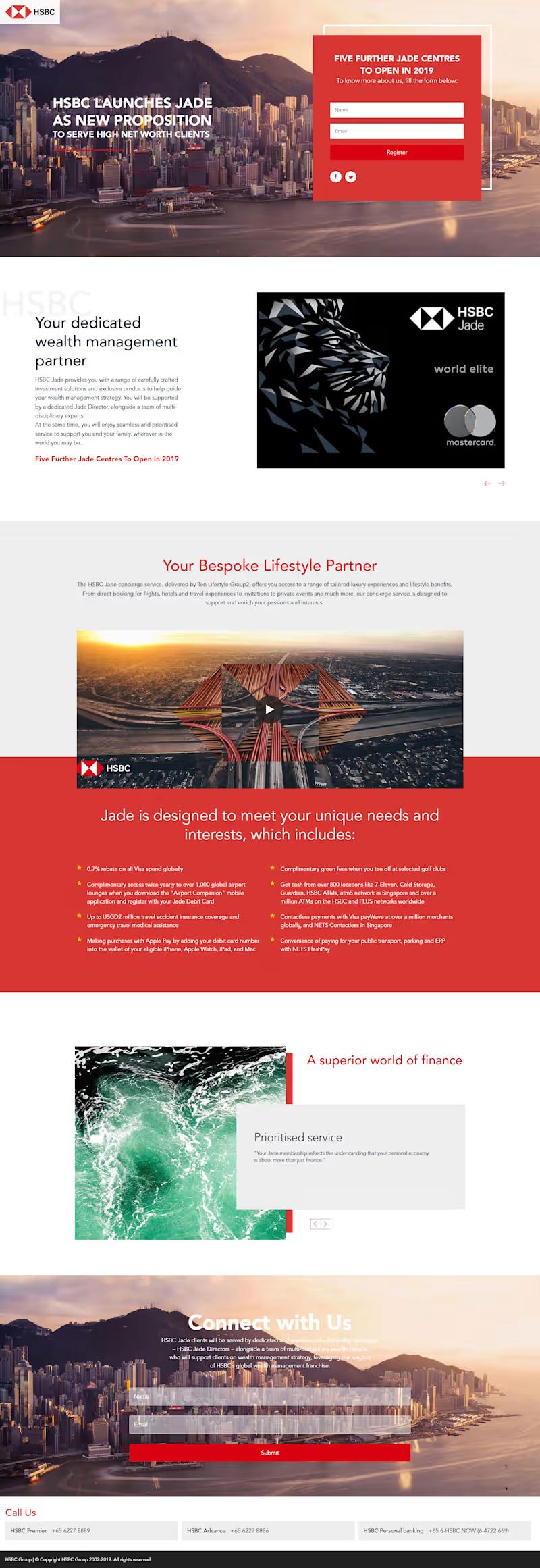
Designed and developed this high-converting landing page for a premium financial services campaign. The focus was on creating a strong visual narrative combined with a clear lead capture flow.
The layout was built to balance brand storytelling with performance, featuring a prominent above-the-fold form, structured content sections, and a smooth user journey to drive registrations. Special attention was given to typography, spacing, and visual hierarchy to match the premium positioning of the brand.
Even though this was created some time back, it reflects my approach to building conversion-focused landing pages that are both visually engaging and strategically structured.
0
208
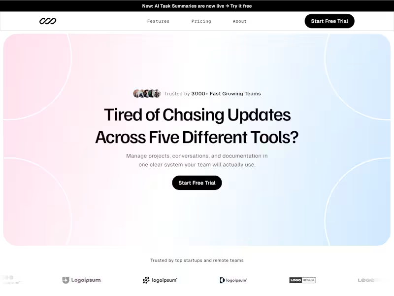

Fintech Website Design & Development Flo2Cash Inspired Landing Page
I designed and developed a high-converting fintech landing page focused on recurring payments, trust, and seamless user experience.
This project was all about balancing modern UI aesthetics with clear business communication, ensuring users instantly understand the value while feeling secure.
What I focused on
• Clean, structured layout with strong visual hierarchy
• Diagonal section transitions for a dynamic, premium feel
• Conversion-driven sections like “Why Us” and “Trusted By”
• Clear service breakdown for better user understanding
• Trust-building elements (security, certifications, stats)
• Mobile-responsive and performance-optimized design
Key Highlights
✔ Fintech-focused UI with strong credibility signals
✔ Strategic use of color (red accents for attention + action)
✔ Modular sections for scalability
✔ Designed to increase engagement and lead conversions
Tech & Approach
• UI/UX Design thinking
• Conversion-focused layout structuring
• Built for scalability across CMS platforms (WordPress / Shopify / React ready)
Outcome
The design communicates trust, security, and ease of payments exactly what a fintech product needs to convert users.
If you're building a fintech, SaaS, or service-based platform and need a clean, high-converting website, let’s connect.
1
193