Freelancers using Figma in Palampur
Sign Up
Post a job
Sign Up
Log In
Filters
2
Projects
People
Vinay Patial
Dharamshala, India
Web Designer & Developer | WordPress & Shopify
New to Contra
Follow
Message
Web Designer & Developer | WordPress & Shopify
0
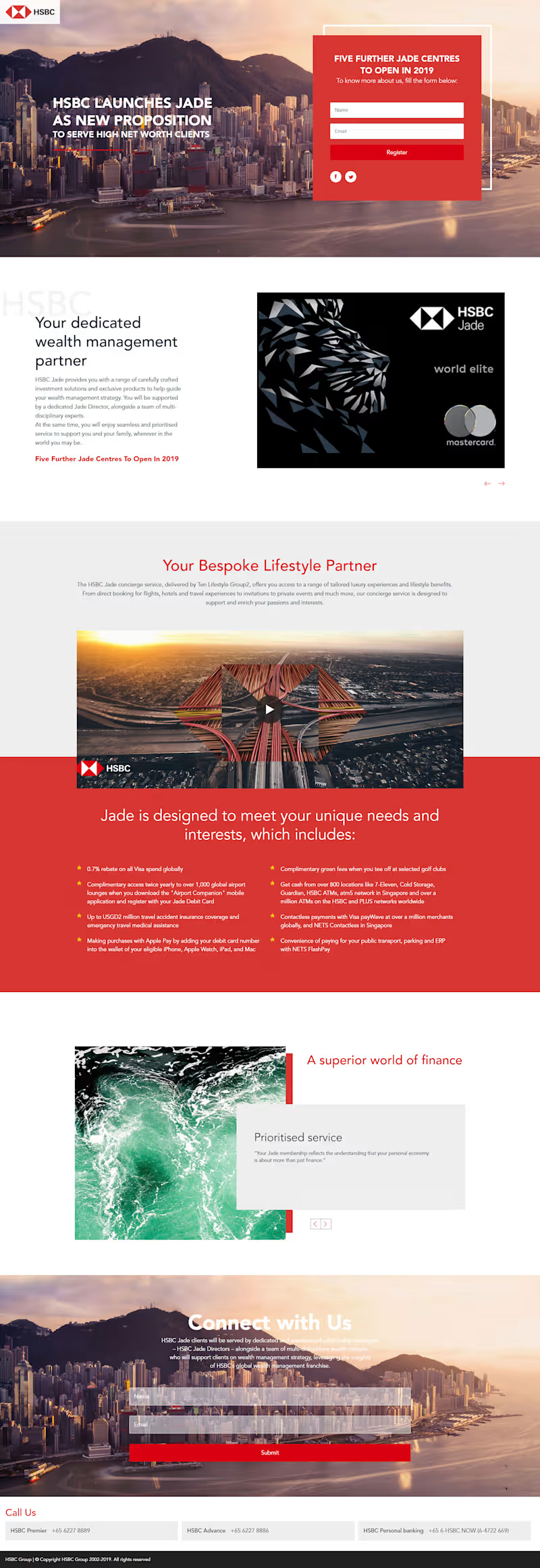
Designed and developed this high-converting landing page for a premium financial services campaign. The focus was on creating a strong visual narrative combined with a clear lead capture flow. The layout was built to balance brand storytelling with performance, featuring a prominent above-the-fold form, structured content sections, and a smooth user journey to drive registrations. Special attention was given to typography, spacing, and visual hierarchy to match the premium positioning of the brand. Even though this was created some time back, it reflects my approach to building conversion-focused landing pages that are both visually engaging and strategically structured.
0
65
1
Fintech Website Design & Development Flo2Cash Inspired Landing Page I designed and developed a high-converting fintech landing page focused on recurring payments, trust, and seamless user experience. This project was all about balancing modern UI aesthetics with clear business communication, ensuring users instantly understand the value while feeling secure. What I focused on • Clean, structured layout with strong visual hierarchy • Diagonal section transitions for a dynamic, premium feel • Conversion-driven sections like “Why Us” and “Trusted By” • Clear service breakdown for better user understanding • Trust-building elements (security, certifications, stats) • Mobile-responsive and performance-optimized design Key Highlights ✔ Fintech-focused UI with strong credibility signals ✔ Strategic use of color (red accents for attention + action) ✔ Modular sections for scalability ✔ Designed to increase engagement and lead conversions Tech & Approach • UI/UX Design thinking • Conversion-focused layout structuring • Built for scalability across CMS platforms (WordPress / Shopify / React ready) Outcome The design communicates trust, security, and ease of payments exactly what a fintech product needs to convert users. If you're building a fintech, SaaS, or service-based platform and need a clean, high-converting website, let’s connect.
1
84
2
Designed a visually engaging and conversion-focused food ordering interface that balances aesthetics with usability. The goal was to create a clean, modern UI that highlights the product while maintaining a smooth user journey from discovery to action. Key highlights: Strong visual hierarchy with product-first focus Soft gradient backgrounds to enhance depth and appeal Clean typography and spacing for readability Intuitive quantity selector and CTA placement for better conversions Balanced composition using organic shapes and product imagery This design approach ensures the interface feels both premium and user-friendly, making it ideal for modern food and eCommerce experiences.
2
131
0
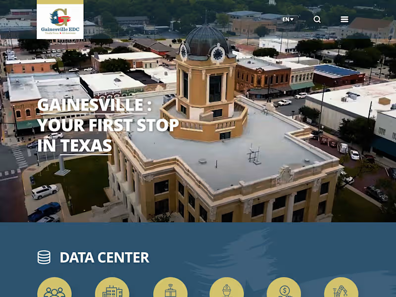
The Bakersfield Economic Development website was designed to showcase the region's business opportunities, economic strengths, and community resources through a modern and engaging digital experience. The focus was on creating a clear information hierarchy that allows investors, businesses, and stakeholders to easily access key economic and demographic insights. As the UI/UX Designer, I was responsible for the overall user experience, visual design, layout structure, and responsive interface design. The project emphasized intuitive navigation, strong visual storytelling, and a user-friendly experience across all devices while effectively highlighting Bakersfield's growth and investment potential.
0
49
Figma
(3)
Follow
Message
Abhishek Sharma
Palampur, India
Designing scroll-stopping creatives for product brands.
New to Contra
Follow
Message
Designing scroll-stopping creatives for product brands.
0
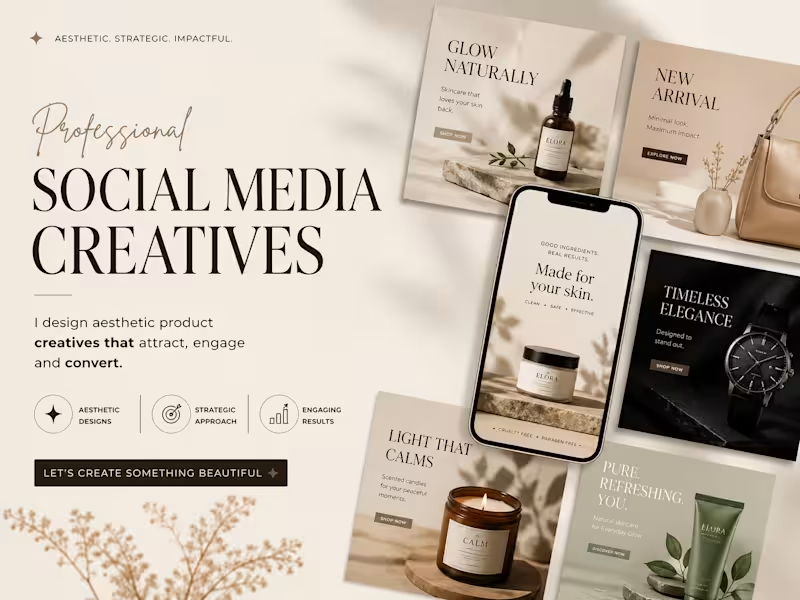
This project showcases a premium presentation layout highlighting a series of high-conversion Social Media Creatives. The design approach is engineered for direct-to-consumer (DTC) e-commerce brands in the wellness, beauty, and luxury lifestyle sectors, focusing on a seamless blend of elevated aesthetics and strategic marketing. Design Strategy & Layout Highlights Typography Hierarchy: The main presentation utilizes an elegant, high-contrast serif typeface for the headers ("SOCIAL MEDIA CREATIVES"), paired with a fluid, organic script accent for a touch of luxury. The ad creatives use clean, accessible sans-serif typography designed for maximum readability on mobile feeds. Color Story & Tone: A deeply cohesive, warm neutral color palette dominates the canvas—utilizing soft cream, warm beige, muted sage green, and striking contrast accents of deep charcoal and rich espresso brown. Multi-Product Mockup Integration: As showcased in the image, the composition features an array of modular square grid layouts alongside a central smartphone UI mockup. This setup effectively demonstrates how the campaign assets transition seamlessly from Instagram grid posts to high-impact mobile stories or reels. Visual Styling: The entire layout leverages soft, natural leaf and window-pane shadow overlays, raw stone styling elements, and warm, minimalist photography to communicate a sense of "quiet luxury" and organic purity.
0
28
0
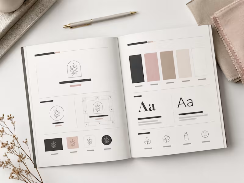
This spread showcases the editorial layout of the CALMÉA Botanical Skincare Brand Style Guide. Designed to serve as the definitive blueprint for the brand's visual identity, the layout maintains a high-end, editorial feel with a focus on generous negative space and clear information hierarchy. Spread Layout & Specifications Left Page (Logo Systems & Usage): Dedicated to the structural core of the brand. It outlines the primary arched botanical logo mark, alternative circular sub-marks, and the precise clear-space grid construction. The lower section demonstrates icon versatility across dark, light, and inverted color blocks. Right Page (Color & Typography): Focuses on the core design systems. The top half displays the refined, earthy color palette blocks (charcoal, dusty rose, warm taupe, soft cream, and crisp white). The midsection dictates the typographic hierarchy, contrasting a bold serif display typeface with a clean, light serif/sans-serif body pairing. The bottom row highlights custom brand iconography for packaging use. Art Direction: Styled in a flat lay format featuring raw tactile fabric swatches, a minimalist matte pen, and delicate dried florals to reflect the organic essence of the brand.
0
37
0
This project showcases the visual identity and packaging design for CALMÉA Botanical Skincare. The goal was to translate the brand’s core philosophy- gentle, plant-based, and science-backed skin nutrition—into a physical product experience that feels deeply calming and luxurious. Design Strategy & Key Elements Color Palette: A soothing, nature-inspired palette featuring a muted sage green and a warm, textured cream tone. The split-tone layout uses organic, fluid curves that mimic natural landscapes or gentle waves. Typography & Visual Assets: The brand name "CALMÉA" is set in an elegant, high-contrast serif typeface, paired with clean, architectural sans-serif typography for product details. The primary logo icon features a minimalist botanical branch enclosed in a delicate arch. Packaging Layout: As seen in the image, the outer box features structured side-panel iconography ("Clean Ingredients," "Plant Based," and "Cruelty Free") and a subtle line-art botanical illustration on the lower section. The theme carries over seamlessly to a matte-finish squeeze tube. Art Direction: The staging emphasizes raw, tactile textures - rough travertine stone, natural direct sunlight, and dried eucalyptus branches- to highlight the organic origin of the product.
0
40
0
Project Overview This project features a comprehensive brand identity system showcased through a premium corporate stationery suite. The design focuses on a refined, sophisticated aesthetic tailored for professional services. Design Elements & Execution Palette: A high-end color scheme pairing textured, crisp off-white stock with deep corporate navy blue. Typography & Assets: The brand utilizes a sharp, intertwined "NR" serif monogram, balanced by a clean, geometric sans-serif for the primary logotype ("Northridge Associates"). Mockup Highlights: Featured items include a minimalist letterhead with a subtle, blind-debossed watermark of the monogram, an elegant textured business card with a matching deep-deboss finish, and a coordinating corporate envelope. Aesthetic: The presentation relies on soft, natural organic shadows, tactile paper grains, and a minimalist stone accent to bring a modern, premium feel to the final presentation as shown in the image.
0
55
Figma
(2)
Follow
Message
Parvesh kumar
Dharamshala, India
Expert Web & UX/UI Webflow WordPress Framer Graphic Designer
Follow
Message
Expert Web & UX/UI Webflow WordPress Framer Graphic Designer
0
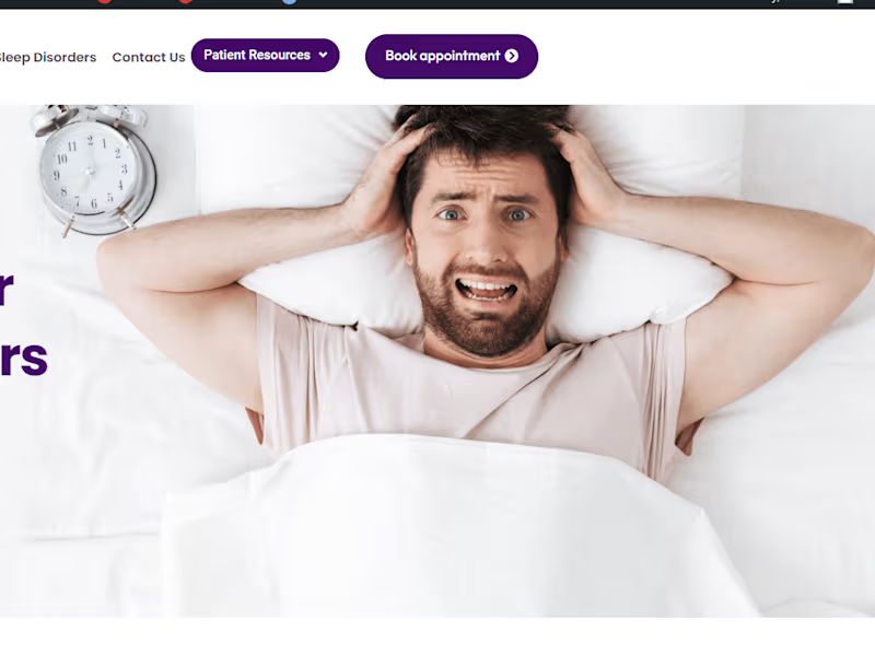
Mid-West Center for Sleep Disorders | Expert Care for Better Sl…
0
5
0
Giving you a higher mental and emotional capacity to overcome y…
0
19
0
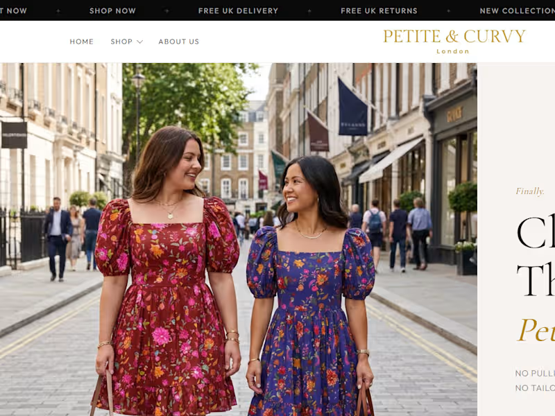
Responsive WordPress Site for Fashion
0
14
0
E-Commerce Store Redesign
0
12
Figma
(2)
Follow
Message
Sanju Kumar
Joginder Nagar, India
Empowering Brands with Elegant Web Solutions
Follow
Message
Empowering Brands with Elegant Web Solutions
0
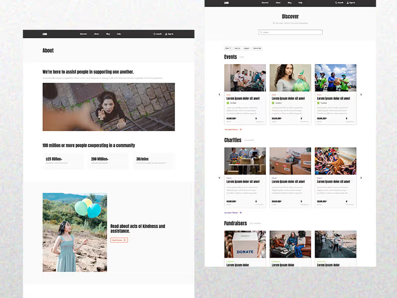
Design a donation flow for a charity
0
7
0
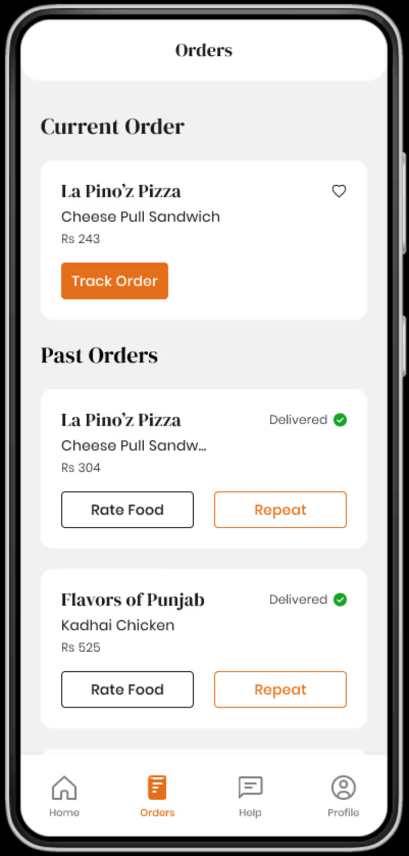
Design a mobile food ordering app
0
10
0
UX Designer for website templates design
0
10
View more →
Figma
(2)
Follow
Message
Bhupinder Kumar
Dharamshala, India
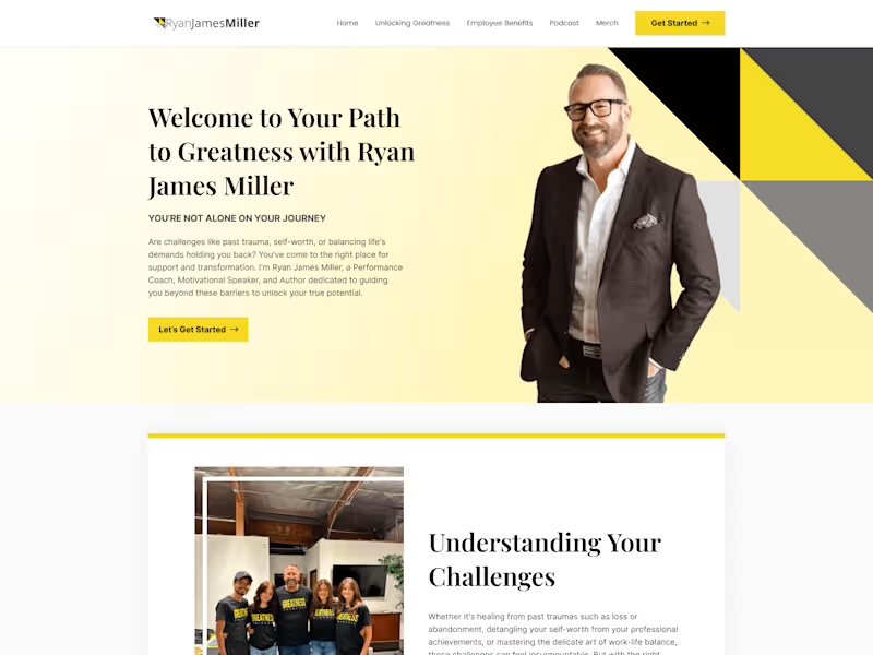
Expert Web Designer & Developer | WordPress, Webflow,Figma
Follow
Message
Expert Web Designer & Developer | WordPress, Webflow,Figma
0
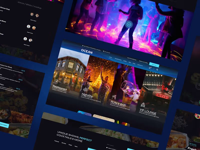
Custom website design
0
2
0
WordPress Website Designing and Development
0
3
0
Custom Webflow Website development
0
2
View more →
Figma
(2)
Follow
Message
Peeyush Guleria
Dharamshala, India
Product Designer
Follow
Message
Product Designer
0
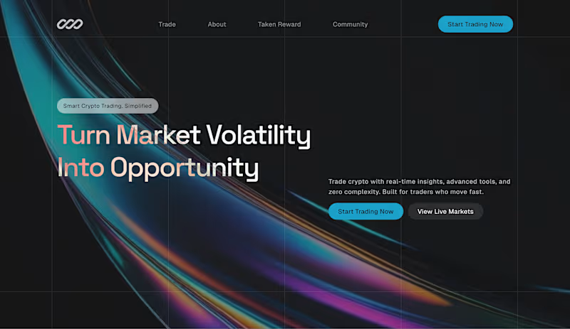
Crypto Trading Platform — Hero Section Design Hero section for a crypto trading platform. Iridescent full-bleed background, split-color headline typography, and a dual-CTA layout designed to convert both ready-to-buy and browse-first visitors.
0
60
0
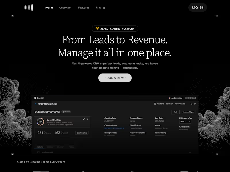
Auxim — CRM SaaS Marketing Site Marketing site for Auxim, an AI-powered CRM SaaS. Dark premium aesthetic, outcome-first messaging, bento feature layout, and integration showcase designed to remove buyer objections.
0
64
0
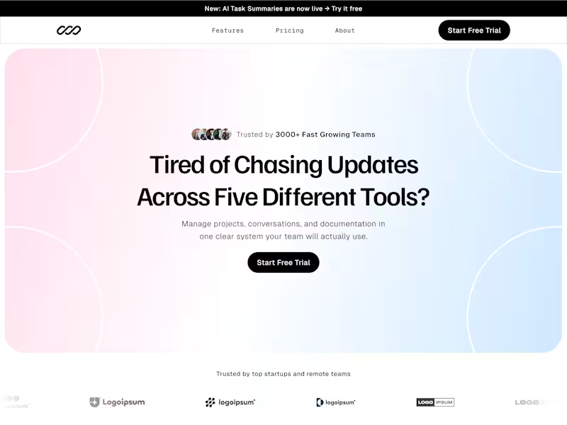
Marketing site for Claryo, a project management SaaS replacing five tools with one. Pain-first messaging, metric-driven testimonials, and a pricing layout designed to convert.
0
62
0
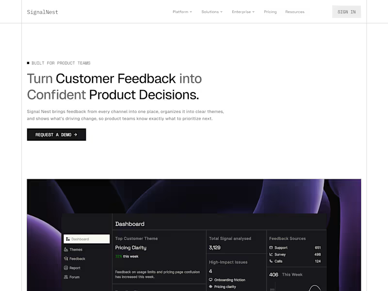
Full marketing site for SignalNest, a SaaS feedback intelligence tool. Designed for conversion, sharp messaging, real product UI in the hero, structured testimonials, and a pricing layout that guides users toward the right plan.
0
67
Figma
(4)
Follow
Message
Explore people