Freelancers using Microsoft SharePoint in Pakistan
Freelancers using Microsoft SharePoint in Pakistan
Sign Up
Post a job
Sign Up
Log In
Filters
2
Projects
People
Moez Khan
Pakistan
Data analytics & Machine Learning Expert
New to Contra
Follow
Message
Data analytics & Machine Learning Expert
1
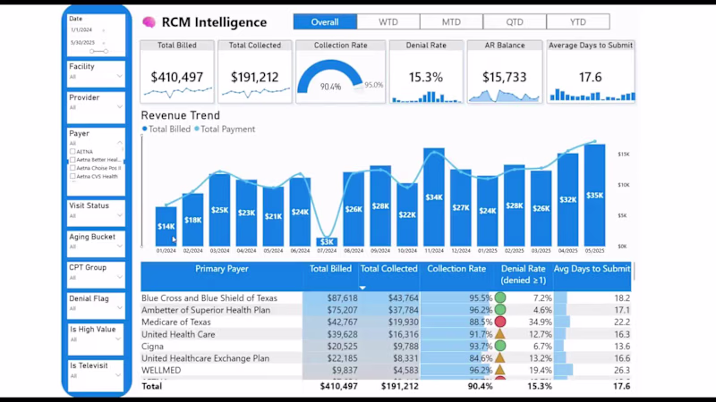
Every month, your clinic bills insurance. Every month, some of that money does not come back. Not because your billing team is not working. They are. But denied claims sit in a queue. Underpayments go unnoticed. AR ages past the point of recovery. And by the time someone runs the month-end report, the window to act has already closed. The problem is not effort. The problem is visibility and timing. Most clinics under $2M in collections do not have a system that tells them which claim was underpaid today, which payer is consistently short-changing them, or which AR balance has been sitting for six months. They find out too late or not at all. I built an RCM Intelligence system with Microsoft Power BI and Power Automate to fix exactly this. It sits on top of your existing billing workflow inside Microsoft 365. Your patient data never leaves your environment. Your billing team gets a live intelligence layer that surfaces underpayments at the claim level, ranks recovery opportunities by dollar value, and sends alerts when something needs immediate attention. No new software. No IT team required. No data leaves your ecosystem. If you are a physician practice owner watching collections trend in the wrong direction and wondering where the gap is, I built this for you. DM me, and I will show you what your own data looks like inside the system.
1
142
1
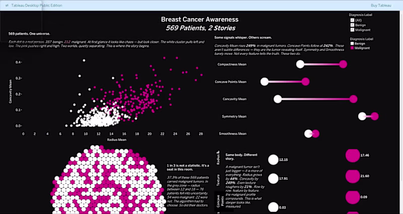
569 real patients. 30 tumor measurements. Two outcomes. I wanted to know what cancer actually looks like in data. The answer is brutal. Concavity rises 249% in malignant tumors. Concave Points by 242%. The tumor doesn't hide. The data screams. Most people just aren't looking at the right signals. So I built a Tableau story that makes it impossible to miss. A scatter plot separating 357 benign from 212 malignant patients in one view. A lollipop chart showing exactly which features predict danger. Bubble cells that look like tumors under a microscope. And a dot matrix where every single dot is a real human being. 357 white. 212 pink. https://lnkd.in/dZs-ydsK (https://lnkd.in/dZs-ydsK)Every dot is a real person.
1
74
0
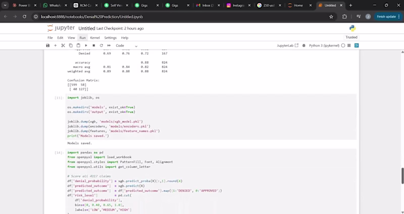
From reactive billing to predictive revenue intelligence in US Healthcare Revenue Cycle Management. Built an end-to-end denial prediction model using XGBoost, integrated with Excel, and deployed in Power BI to surface high-risk claims before submission. Predicts the likelihood of denial at the claim level Helps billing teams prioritize and prevent revenue loss Translates complex ML output into actionable insights. Turning raw data into proactive revenue protection, not just reporting.
0
48
0
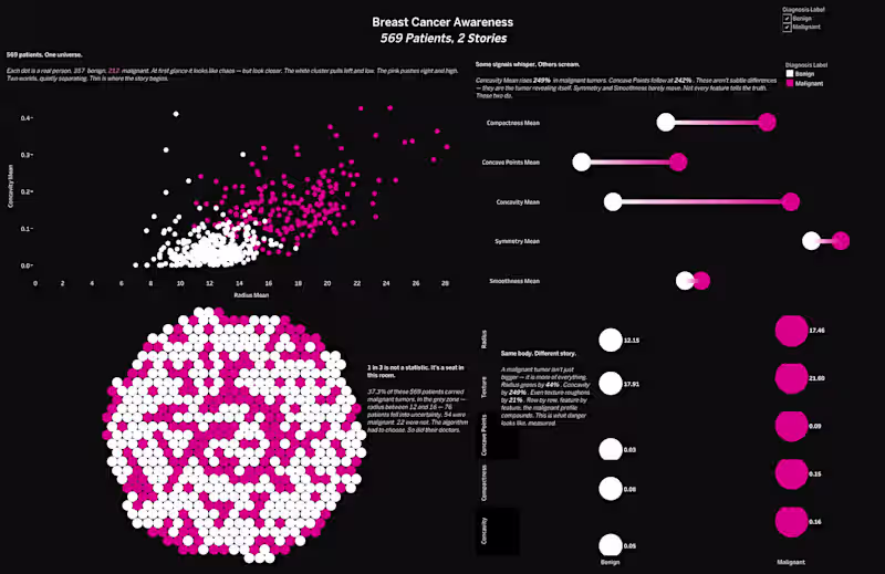
569 real patients. 30 tumor measurements. Two outcomes. I wanted to know what cancer actually looks like in data. The answer is brutal. Concavity rises 249% in malignant tumors. Concave Points by 242%. The tumor doesn't hide. The data screams. Most people just aren't looking at the right signals. So I built a Tableau story that makes it impossible to miss. A scatter plot separating 357 benign from 212 malignant patients in one view. A lollipop chart showing exactly which features predict danger. Bubble cells that look like tumors under a microscope. And a dot matrix where every single dot is a real human being. 357 white. 212 pink. https://lnkd.in/dZs-ydsK (https://lnkd.in/dZs-ydsK)Every dot is a real person.
0
58
Microsoft SharePoint
(1)
Follow
Message
Explore people