The network for creativity
Join 1.25M professional creatives like you
Connect with clients, get discovered, and run your business 100% commission-free
Creatives on Contra have earned over $150M and we are just getting started
Back to feedPost
569 real patients. 30 tumor measurements. Two outcomes.
I wanted to know what cancer actually looks like in data.
The answer is brutal.
Concavity rises 249% in malignant tumors. Concave Points by 242%. The tumor doesn't hide. The data screams. Most people just aren't looking at the right signals.
So I built a Tableau story that makes it impossible to miss.
A scatter plot separating 357 benign from 212 malignant patients in one view. A lollipop chart showing exactly which features predict danger. Bubble cells that look like tumors under a microscope. And a dot matrix where every single dot is a real human being.
357 white. 212 pink.
https://lnkd.in/dZs-ydsK
Every dot is a real person.
great job 👌
The network for creativity
Join 1.25M professional creatives like you
Connect with clients, get discovered, and run your business 100% commission-free
Creatives on Contra have earned over $150M and we are just getting started
Related posts
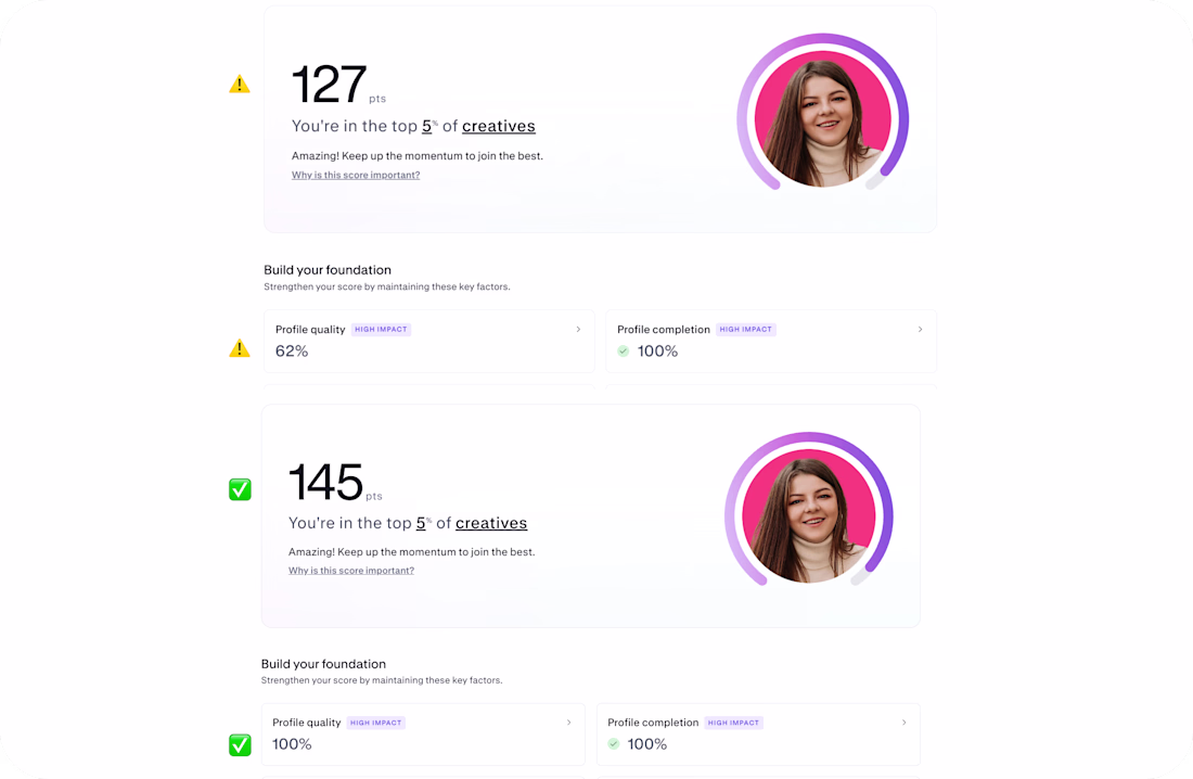
𝐃𝐚𝐲 𝟔𝟖 𝐨𝐟 𝐦𝐲 𝐜𝐡𝐚𝐥𝐥𝐞𝐧𝐠𝐞 𝐭𝐨 𝐫𝐞𝐚𝐜𝐡 𝟏,𝟎𝟎𝟎 𝐟𝐨𝐥𝐥𝐨𝐰𝐞𝐫𝐬
Recently someone told me: “you only show wins.”
So today 𝐈’𝐦 𝐛𝐫𝐢𝐧𝐠𝐢𝐧𝐠 𝐲𝐨𝐮 𝐬𝐨𝐦𝐞𝐭𝐡𝐢𝐧𝐠 𝐝𝐢𝐟𝐟𝐞𝐫𝐞𝐧𝐭 𝐚 𝐫𝐞𝐚𝐥 𝐟𝐚𝐢𝐥𝐮𝐫𝐞 😶🌫️😭 that was silently holding my profile back 👇
Check before / after screenshots first
My Discovery score jumped from 127 → 145 And Profile quality went from 62% → 100%
And here’s what actually happened:
I didn’t “grow overnight” I fixed something I didn’t even know was broken
You can actually reduce your score if your case studies are not structured correctly.
In my case, my work cases were silently underperforming, and I had no idea 😳
⚠️✅ Here’s what I learned (so you don’t repeat this):
📌 𝐈𝐟 𝐲𝐨𝐮 𝐮𝐬𝐞 𝐚 𝐁𝐞𝐡𝐚𝐧𝐜𝐞-𝐬𝐭𝐲𝐥𝐞 𝐜𝐚𝐬𝐞 𝐬𝐭𝐮𝐝𝐲 → don’t just place visuals → add short text blocks between sections (context matters)
📌𝐈𝐟 𝐲𝐨𝐮 𝐮𝐬𝐞 𝐃𝐫𝐢𝐛𝐛𝐛𝐥𝐞-𝐬𝐭𝐲𝐥𝐞 𝐬𝐡𝐨𝐭𝐬 → don’t upload single images only → add at least 2 visuals + description text
📌 𝐄𝐯𝐞𝐫𝐲 𝐜𝐚𝐬𝐞 𝐦𝐮𝐬𝐭 𝐡𝐚𝐯𝐞: → at least ~150 characters of description → clear structure → no “empty” uploads
If you have Contra Pro — you’ll see warnings about what’s wrong. If not — you might not even notice that score reduced
I honestly wish I knew this earlier.
✅ So I fixed it → and this is the result above.
Also, I’m currently at 𝟒𝟒𝟔 / 𝟏,𝟎𝟎𝟎 𝐟𝐨𝐥𝐥𝐨𝐰𝐞𝐫𝐬 still building this challenge step by step.
And now a small ask:
If you like my work please support my new submission in the #Wonderchallenge 🙏❤️ https://on.contra.com/PdDPjB ❤️ Let’s continue building and learning in public.
🐐 + 💬 = ❤️
Cool😊
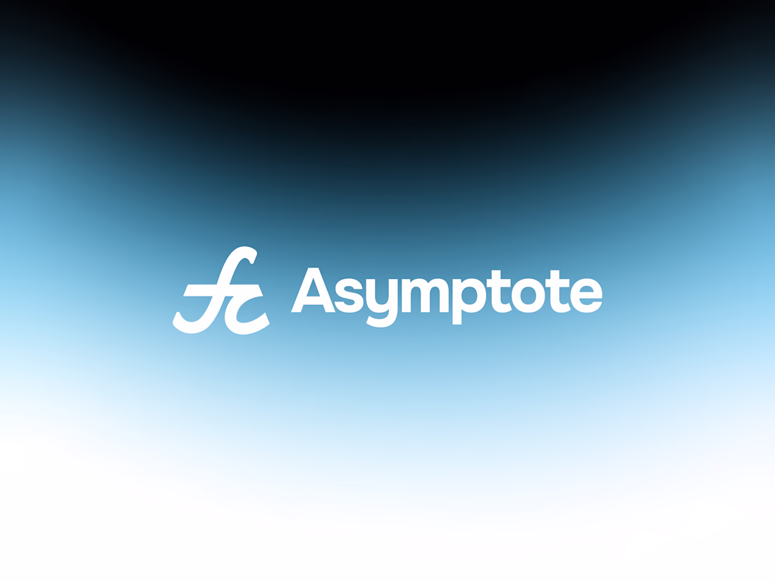
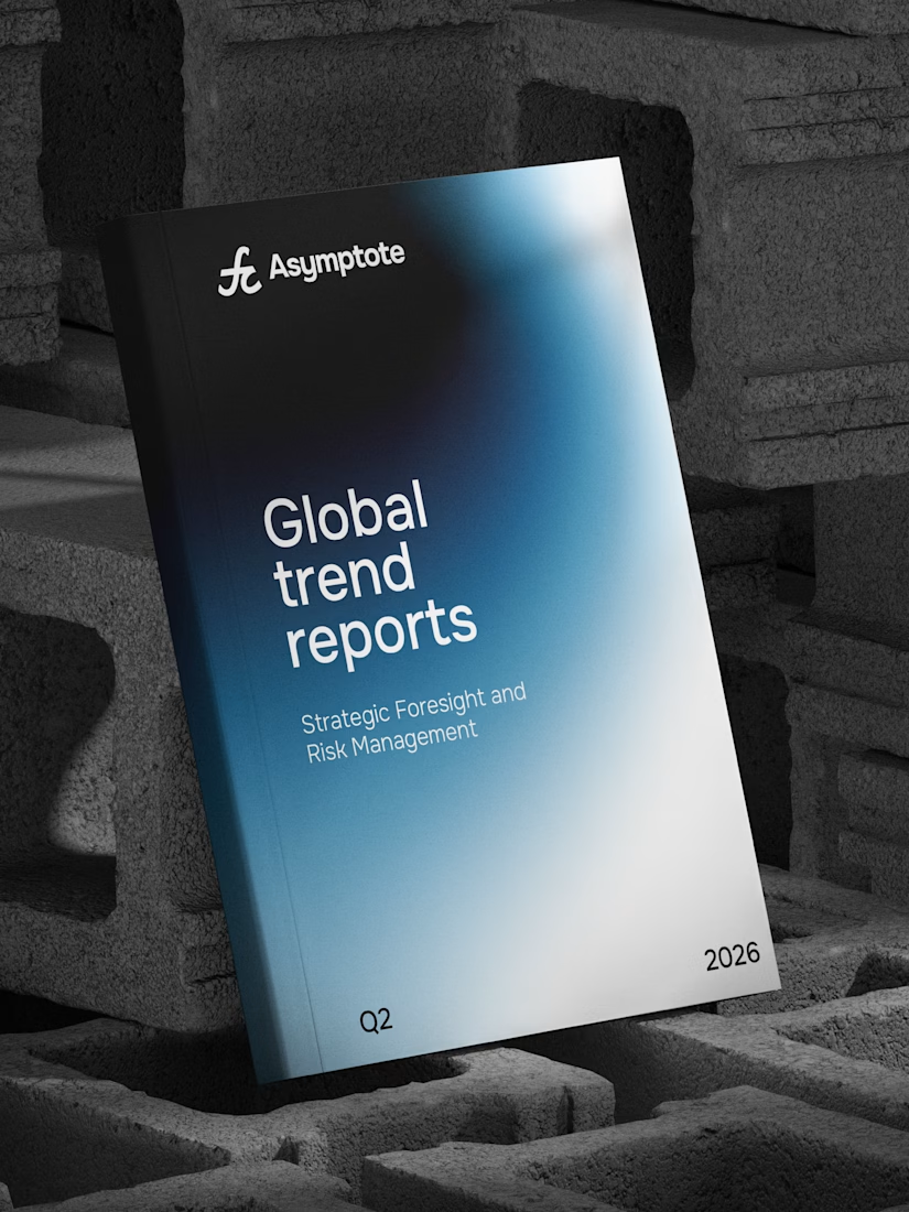
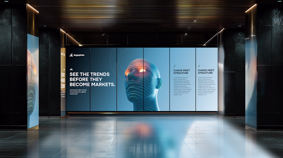
Originally conceived for a completely different space, this identity found its true calling and repurposed for Asymptote a conceptual quantitative speculation firm and strategic think-tank.
Built around the mathematical interplay of the integral symbol (∫) and π, the system bridges the fluid tracking of volatile macro trends with the unyielding, foundational parameters of quantitative science.
A masterclass in transforming abstract mathematical logic into a premium, structure-led visual identity system.
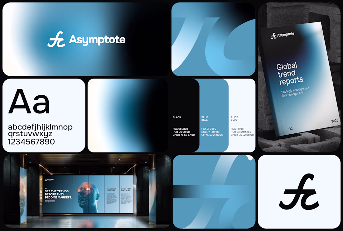
How mindful gradients are they! 👌👀
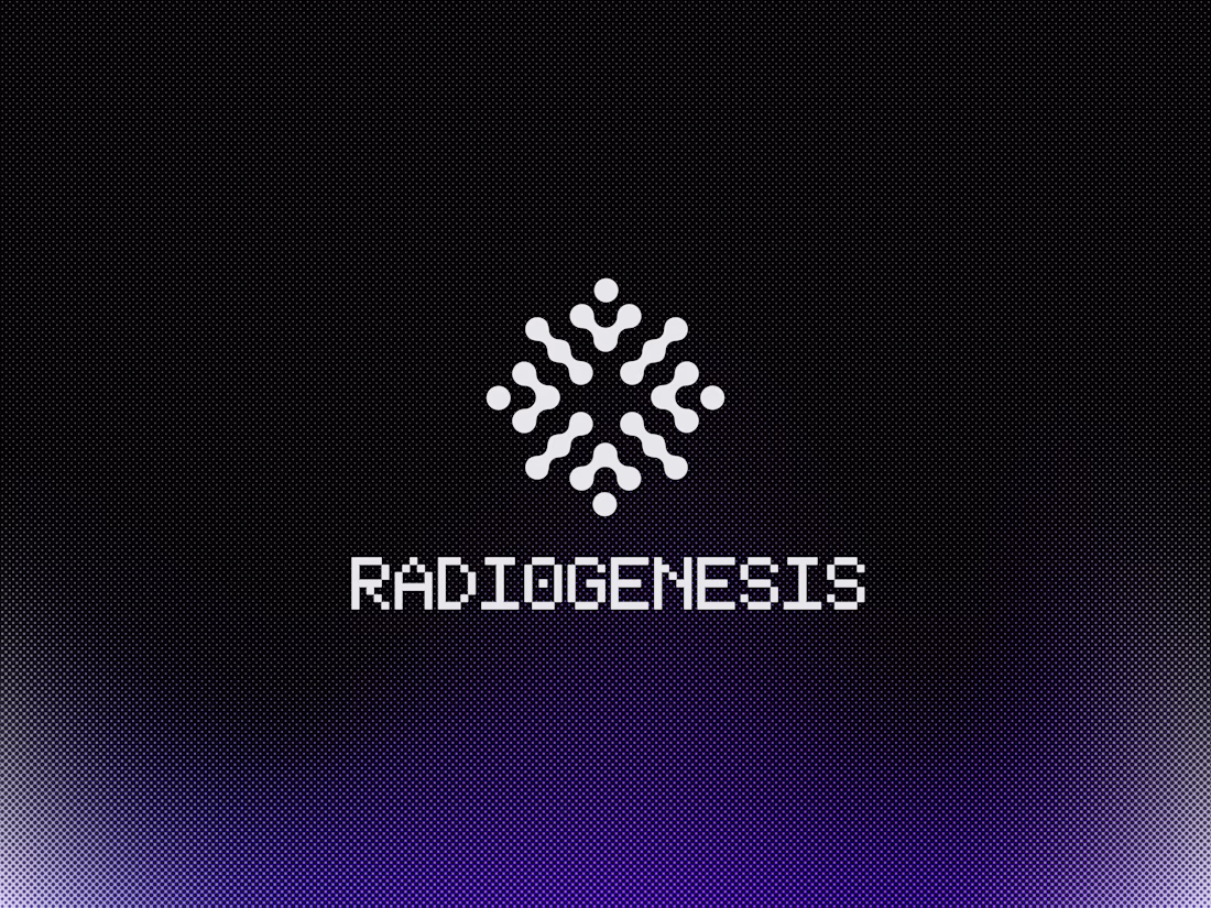
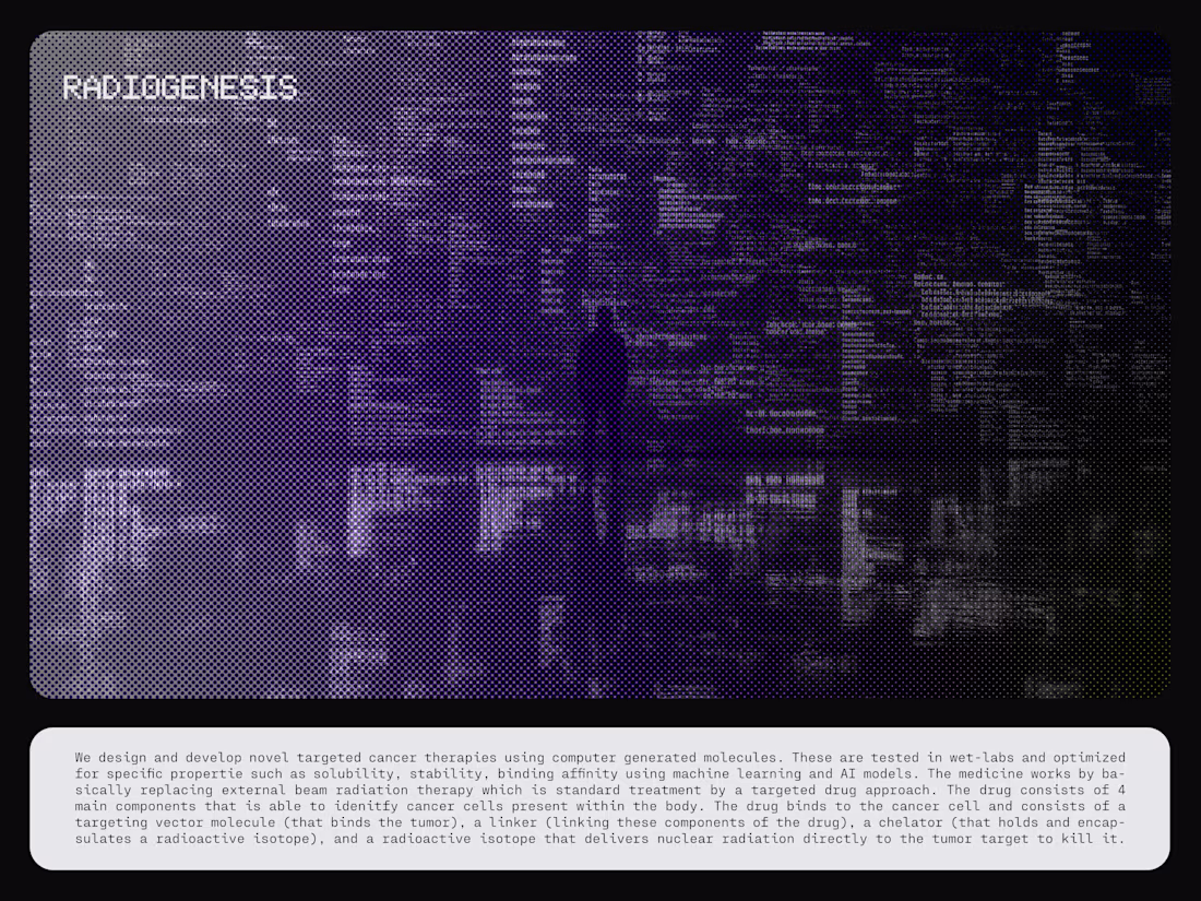
Visual Identity for Radiogenesis, a biotechnology company operating at the intersection of AI, computational science, and precision medicine, pioneering targeted cancer therapies through computer-generated molecules.
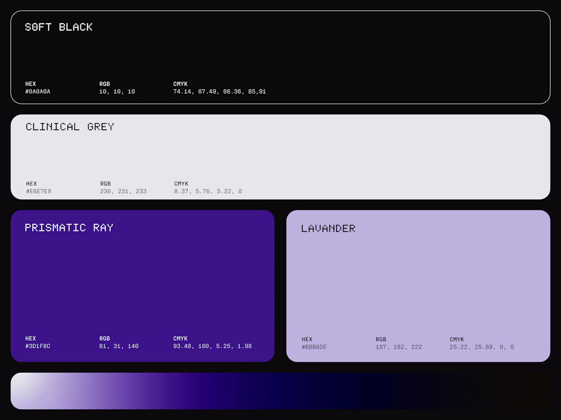
The visual identity reflects this fusion of biology and technology with a modern, algorithmic design system built around the four core components of its drug platform. An abstract symbol expresses energy, connection, and molecular assembly, paired with a monospace typeface inspired by code and computational research. ASCII-inspired graphics, pixelated gradients, and data-driven visual textures reinforce the brand's innovative character, while a dark palette of black, deep purple, and soft grey mesh gradients creates a sophisticated, high-tech aesthetic.
The result is a distinctive identity that communicates scientific precision, computational intelligence, and Radiogenesis' mission to redefine the future of cancer treatment.
Appreciate your feedback 🙏🏻

Perfect!
Trending
Claude
Claude has entered the design space. How are you using Claude Design?
Contra University
Learn from expert creatives how to earn more using next-gen AI tools.
fifaworldcup2026
The World Cup is here and the whole world's watching. How are you designing for the world stage?
creativeaiflow
Creative AI workflows are evolving. What tools do you use, and what are their strengths and weaknesses?
freelancerlife
Freelancer life is wins, pivots, and everything in between. What’s yours right now?