
Frontend Engineer – Webflow and Webstudio Expert

Frontend Engineer – Webflow and Webstudio Expert




Vetted Kajabi Expert for Coaches, Doctors & Course Creators
- 5.0
- Rating
- 290
- Followers
Vetted Kajabi Expert for Coaches, Doctors & Course Creators

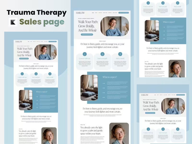
Trauma Therapy Sales Page Design | Kajabi Website Project
Project Overview
This project involved designing and building a high-converting trauma therapy sales page in Kajabi for a therapist focused on helping individuals heal from emotional trauma, anxiety, and past experiences. The goal was to create a calming, trustworthy, and conversion-focused experience that would encourage visitors to book therapy sessions or enroll in healing programs.
The Challenge :
The client needed more than just a visually appealing page—they needed a space where potential clients could immediately feel safe, understood, and confident enough to take the next step. The existing content lacked emotional connection, clear messaging, and a structured user journey that guided visitors toward booking a consultation.
My Process :
I began by understanding the therapist's brand, target audience, and treatment approach. From there, I planned a user-friendly page structure that balanced empathy with strategic conversion principles.
The project included:
- Designing a clean and calming layout within Kajabi
- Creating a clear content hierarchy for better readability
- Organizing sections to guide visitors through their healing journey
- Designing compelling call-to-action sections to increase appointment bookings
- Optimizing typography, spacing, and visual elements for accessibility and trust
- Ensuring the page was fully responsive across desktop, tablet, and mobile devices
- Implementing the complete design directly inside Kajabi
The Solution🔥
The finished sales page provides visitors with a seamless experience—from understanding the therapist's mission to learning about available services and confidently taking action. Every section was intentionally designed to reduce overwhelm, build credibility, and create an emotional connection while maintaining a professional and welcoming aesthetic.
Project Outcome :
The final result is a modern, conversion-focused Kajabi sales page that reflects the therapist's compassionate brand and supports business growth through strategic design. The project demonstrates my ability to combine thoughtful user experience, persuasive page structure, and Kajabi expertise to create websites that are both beautiful and effective.
Services Provided 🚀
✅ Kajabi Sales Page Design
✅ Landing Page Development
✅ UX/UI Design
✅ Conversion-Focused Layout
✅ Mobile Responsive Design
✅ Brand-Aligned Visual Design
✅ CTA Strategy & Implementation
✅ Kajabi Page Builder Customization
4
662

I’m Yiśr āʾēl , an email marketing retention manager who helps both small, large scale business owners and even founders to not only increasing conversions but convert ONE -TIME customers to a real occurring client for a long period. Feel free to reach out to me either Via Contact or Hire Button.
Let's get started today
Best Regards .
6
1.7K
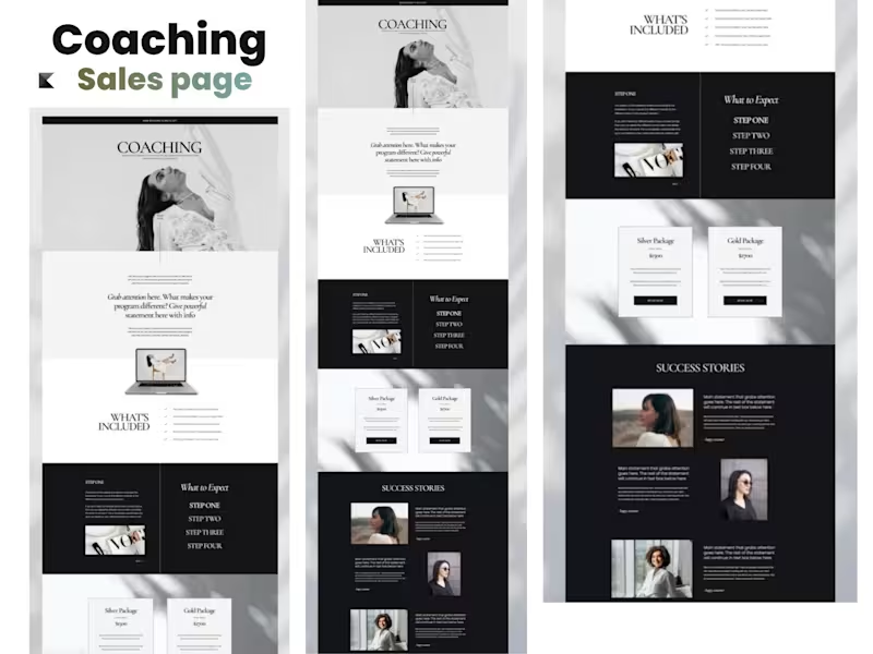
Kajabi Coaching Sales Page
From Strategy to Conversion-Ready Launch
The Starting Point
The project started with a coaching brand that needed a professional sales page to clearly communicate its offer, build trust, and guide potential clients toward taking action. The existing presentation lacked a strong visual hierarchy and a clear conversion-focused structure, making it difficult for visitors to quickly understand the coaching offer and its value.
The Approach
I began by mapping out the customer journey and organizing the page around the key questions a potential client would have: What is the offer? Who is it for? Why should I trust this coach? What will I get? And what should I do next?
From there, I developed the page structure, refined the messaging hierarchy, and created a clean visual direction designed specifically for a coaching audience.
The page was then built in Kajabi, bringing the strategy and design together into a responsive, easy-to-navigate sales experience.
What I Worked On
- Kajabi sales page design and development
- Coaching offer positioning and page structure
- Conversion-focused section layout
- Hero section and CTA strategy
- Offer and benefits presentation
- Social proof and testimonial sections
- FAQ and objection-handling sections
- Responsive desktop and mobile layout
- Visual hierarchy and brand consistency
- Final page optimization and launch preparation
The Finish
The final result was a polished, conversion-focused Kajabi coaching sales page that gives the brand a stronger digital presence while making the offer easier to understand and act on.
The finished page combines strategy, branding, UX, and Kajabi development into one cohesive experience — designed not just to look professional, but to move visitors from interest → trust → action.
Project Outcome
A complete coaching sales page transformed from an initial concept into a professional, structured, and launch-ready Kajabi experience.
2
7
1.2K

I build high-converting sites in WordPress, Webflow & Framer
- $5k+
- Earned
- 3x
- Hired
- 4.4
- Rating
- 70
- Followers
I build high-converting sites in WordPress, Webflow & Framer


Webflow Developer




Framer Designer | Strategic Websites for Founders & Creative

Framer Designer | Strategic Websites for Founders & Creative


Shopify Ecommerce Website Designer

Looking to launch or upgrade a Shopify eCommerce store for a beauty brand? I specialise in building clean, conversion-focused Shopify websites tailored to beauty and skincare businesses. From product page optimisation and branded layouts to seamless checkout flows and mobile-first design, I create stores that don’t just look good but are built to sell. Whether you’re starting from scratch or migrating an existing store, I can help you set up a professional, scalable Shopify site that reflects your brand and turns visitors into customers.
1
139

Professional freelancer
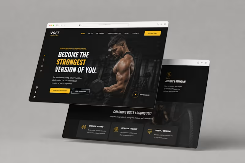
Volt Coaching — Fitness Coaching Website Design
Description
A bold website design concept for Volt Coaching, created to give the brand a strong, energetic digital presence while making its coaching programs easy to explore.
The design combines a dark visual direction with bold typography, yellow accents, strong imagery, clear navigation, and prominent calls to action to create an engaging experience for visitors looking to start their fitness journey.
6
317
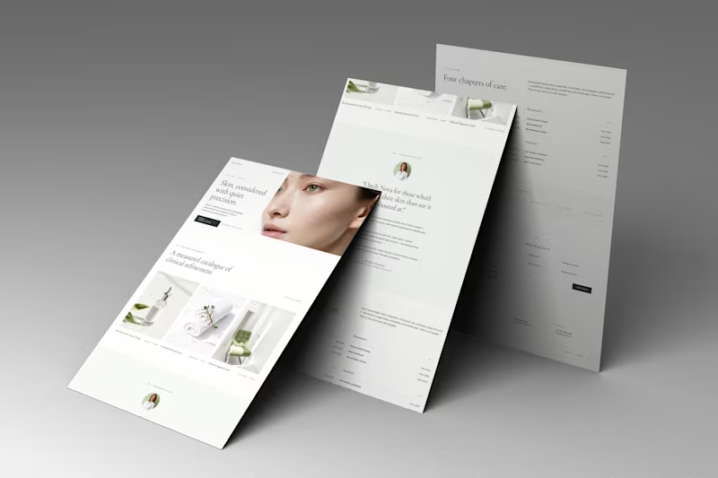
Nova — Clinical & Wellness Web Design
A refined website concept for Nova, a modern clinical and skincare brand focused on precision, care, and a premium patient experience.
The design combines editorial typography, soft neutral tones, spacious layouts, and refined imagery to create a calm and sophisticated digital presence. The website presents Nova’s services, treatments, philosophy, and clinical expertise through a clean, highly intentional visual system.
Focus: Web Design · UI/UX · Art Direction · Luxury Healthcare · Skincare · Editorial Design
#WebDesign #UIDesign #UXDesign #HealthcareDesign #Skincare #WebDesignInspiration #ArtDirection #EditorialDesign
12
690
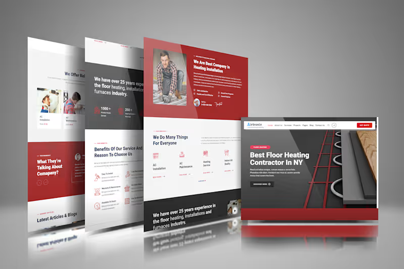
HVAC Website Design
A modern website design concept for Airtronix Airconditioning & Heating, focused on creating a professional, trustworthy, and easy-to-navigate experience for an HVAC service business.
The design combines bold typography, a strong red and dark visual system, clear service sections, trust-building content, and prominent calls to action to make the company's services easy to explore.
1
11
404
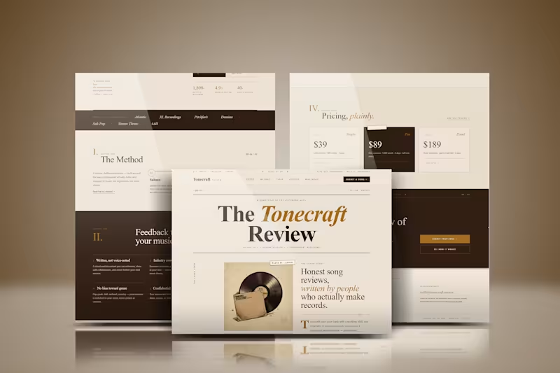
Website Design | UI/UX Design | Web Design
A modern website design concept focused on creating a clean, engaging, and user-friendly digital experience.
The design combines strong visual hierarchy, intuitive navigation, thoughtful spacing, and responsive layouts to create an interface that feels polished while keeping the user journey simple and clear.
From the overall page structure to typography, imagery, and calls-to-action, each element was designed to create a cohesive experience that works across desktop and mobile.
3
12
1.7K

Web Developer | Business Websites | Landing Pages & Funnels
Web Developer | Business Websites | Landing Pages & Funnels
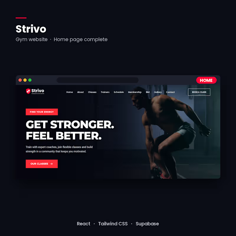
Strivo, a gym website built with React + Supabase (in progress)
A full gym website with class booking, trainer profiles, a weekly schedule, membership plans, and an admin dashboard where the owner approves customer reviews before they go live.
STACK: React, Tailwind CSS, Supabase (database, auth, Row Level Security), Vercel.
STATUS: home page complete. Next are the booking system, reviews flow and admin dashboard.
Available for gym and fitness website projects.
2
83

Project Title: Webinar Funnel with Automated Live-Broadcast Experience
The Problem:
Most webinar funnels are just a video embedded on a page — visitors can skip ahead, get distracted, or leave before the offer is made. There's no structure guiding attention, and no mechanism to reveal the offer at the right psychological moment. The client needed a funnel that felt like a real live event, kept viewers engaged for the full session, and only presented the buy button when it was actually relevant — not before.
How I Solved It:
I built a full funnel flow — opt-in page → post-signup popup → confirmation page → automated webinar room → payment page — with custom JavaScript controlling the experience at each stage:
On the confirmation page, I used JavaScript to automatically redirect visitors into the webinar room at the scheduled start time, removing manual steps and keeping the "live" illusion intact
Inside the webinar room, I stripped out all video player controls (no pause, skip, or scrub) so the video behaves like a live broadcast rather than an on-demand replay
I added a timed reveal system — the purchase button stays hidden until a specific point in the video (e.g. minute 34 of a 40-minute webinar), then appears automatically right as the offer is pitched, keeping attention on the content until that exact moment
Connected the flow into a secure payment page for checkout immediately after the reveal
Result / Other Details:
The finished funnel runs end-to-end with zero manual intervention — a visitor can land on the opt-in page, get carried through confirmation, watch a fully "live-feeling" webinar, and reach checkout at the exact right moment, all timed automatically. Fully responsive across desktop, tablet, and mobile.
Tech used: HTML, CSS, JavaScript, Systeme.io
1
214
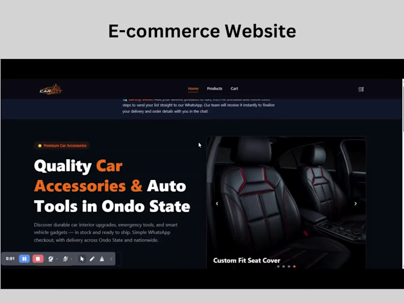
PROBLEM
The client needed a proper e-commerce experience for a car accessories store, but didn't want to process payments directly on the website.
The concern was simple: customers may be hesitant to enter payment details online when they don't yet trust the store.
The challenge was to keep the convenience of e-commerce — browsing, product selection, cart management, quantities, and customer details — without forcing the customer through an online checkout/payment step.
WHAT I BUILT
I designed and built a car accessories e-commerce website with the core functionality you'd expect from an online store, but with a WhatsApp-based order flow instead of online payment.
Customers can:
Browse and explore products
View individual product details
Select quantities and add products to cart
Review and adjust their cart
Enter their delivery/contact information
Review their order before submitting
Send the complete order directly to the vendor via WhatsApp
The WhatsApp action automatically carries the relevant order information — products, quantities, customer details, and order context — so the vendor receives everything needed to continue the conversation and arrange payment/delivery.
TECHNOLOGIES
HTML · Tailwind CSS · JavaScript ·React.js · WhatsApp integration
The focus was on making the frontend feel like a familiar e-commerce store while keeping the checkout flow intentionally lightweight.
RESULT / GOAL
The goal was to reduce the trust barrier without sacrificing the shopping experience.
Instead of asking customers to make a payment to an unfamiliar store, the website lets them complete the shopping process first and then have a direct conversation with the vendor.
Browse → Product → Cart → Customer Details → Order via WhatsApp
The result is an e-commerce experience that adapts the checkout process to how the client's customers are more comfortable buying, rather than forcing a conventional online payment flow.
1
77
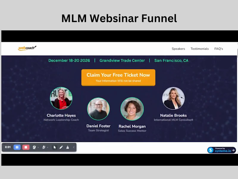
Problem
Webinar funnels need to do more than present information. They need to capture interest quickly, create enough anticipation to keep people moving, and make the transition from registration to the actual webinar feel seamless.
What I built
I designed and built a webinar lead-generation funnel for an MLM/network marketing summit.
The funnel starts with an opt-in landing page designed to communicate the value of the event, introduce the speakers, and encourage visitors to reserve their spot.
From there, I built the supporting journey:
Popup opt-in form for collecting attendee details
Confirmation/transition page after registration
A 5-minute countdown experience to build anticipation before the event
A dedicated webinar room where attendees continue to the actual presentation
The design was built around the event's speakers, schedule, social proof, and educational value while keeping the path to registration straightforward.
Technologies
HTML · Tailwind CSS · JavaScript · Systeme.io
I handled the frontend UI with HTML and Tailwind CSS, using JavaScript for the countdown and smaller interactions. Systeme.io was used for the funnel infrastructure, lead capture, CRM, and automation.
Result / Goal
The goal was to create a complete webinar funnel rather than a standalone opt-in page — giving visitors a clear path from discovering the summit to registering and entering the webinar experience.
Opt-in → Registration → 5-minute countdown → Webinar room.
A good example of how I approach funnel projects: the page is only one part of the experience; the journey between each step matters too.
1
166