Homepage Hero Section Design for a Motorcycle Brand
Munirudeen Abdulmajid
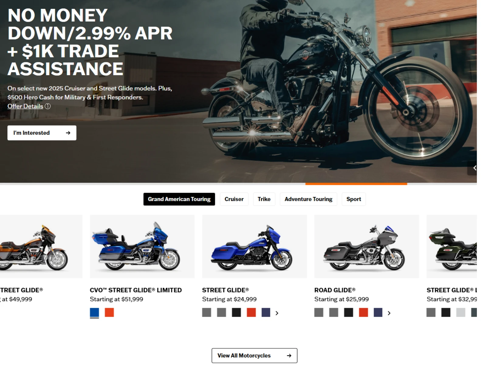
The hero section was designed as the primary conversion driver of the homepage, with a strong focus on clarity, impact, and immediate user engagement. I structured the layout using a 1600 × 1200 canvas, ensuring a balanced composition that maintains visual quality across large screens while still being adaptable for responsive breakpoints. This size allowed me to control spacing, typography scale, and image positioning more precisely, creating a clean and intentional first impression.
From a design perspective, I combined a cinematic lifestyle image with a bold promotional message to capture attention instantly. The image of the rider in motion was carefully chosen to communicate freedom, power, and brand identity, while a subtle dark overlay was applied to improve text readability without reducing the visual impact. I positioned the content on the left side to align with natural reading patterns, guiding users smoothly from the headline to the supporting text and finally to the call-to-action.
Overall, this section was built to balance branding and performance, using strong visual storytelling alongside conversion-focused design principles. Every elementfrom layout and image treatment to typography and spacing was carefully considered to ensure the hero section not only looks premium but also drives user action effectively.
This section was designed to simplify product discovery and help users quickly explore available motorcycle options. I used a structured horizontal layout to present different models in a way that feels organized and easy to scan. Each product card includes essential information such as pricing, model name, and color variations, allowing users to make quick comparisons without needing to navigate away from the page.
From a design perspective, consistency was key. I maintained uniform spacing, alignment, and visual hierarchy across all cards to create a polished and premium feel. This section reduces friction in the browsing experience by bringing key product options directly into view, making it easier for users to move from interest to action.
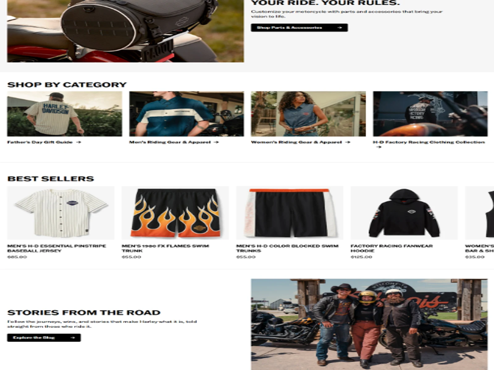
LIFESTYLE AND ACCESSORIES SECTION
This section shifts the focus from product browsing to personalization and brand storytelling. I used a large, visually engaging image paired with supporting text to highlight customization options and reinforce the idea that users can tailor their ride to fit their lifestyle.
The layout balances imagery and content, creating an aspirational feel while still maintaining clarity. This not only strengthens emotional engagement but also encourages users to explore accessories and add-ons, supporting additional revenue opportunities through upselling.
Like this project
Posted Jun 13, 2026
A modern, conversion-focused website designed with strong visuals, clear structure, and intuitive navigation to guide users from discovery to action.”
Likes
1
Views
7