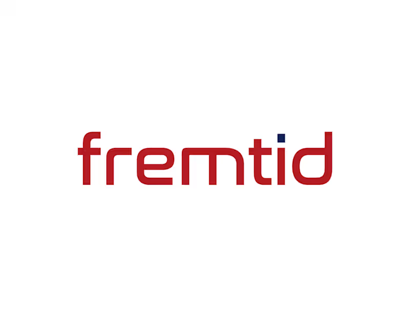
This project was developed as part of my self-employed work. With a new name, the client, who has Norwegian roots, aimed to take a new direction. The company name “fremtid” means “future” in Norwegian. This meaning is reflected in a wordmark designed to communicate the company’s vision and progress within the industrial sector. The color palette, inspired by the Norwegian flag, references the company’s heritage while also symbolizing strength, purity, and passion.
1
45


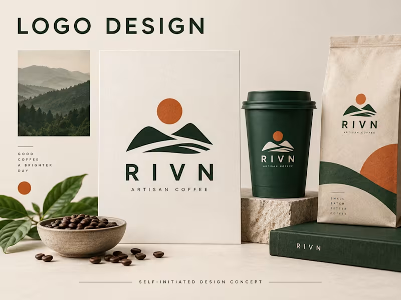
RIVN — a self-initiated identity concept for a fictional coffee brand.
The study explores a confident wordmark, a forest-green and ivory palette, and a small orange accent across a coordinated set of packaging and stationery mockups. The aim is a visual identity that stays recognisable in simple everyday applications.
This image is a portfolio concept, not a client commission. The mockups illustrate a direction; they are not production packaging artwork or delivered client assets.
0
49