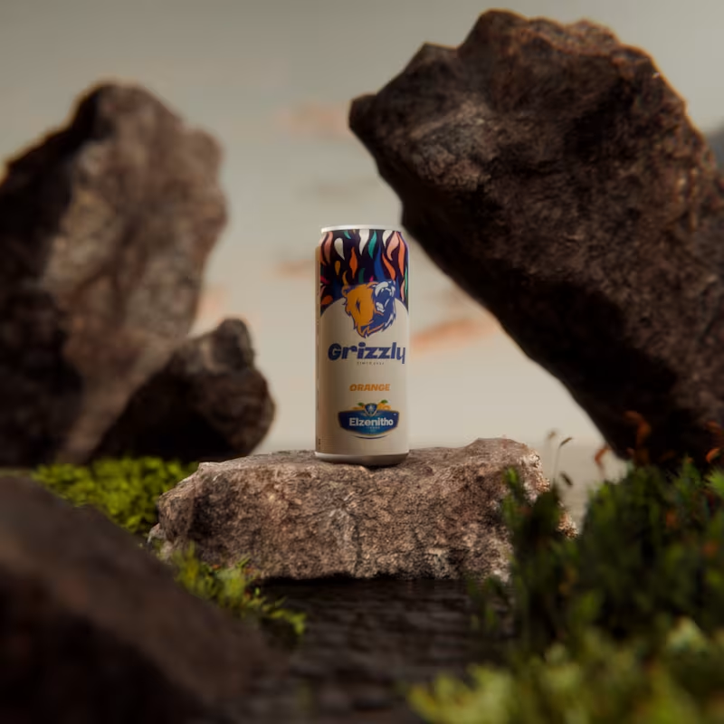
I created this fictional drink brand a while ago and decided to bring it to life inside a Blender scene. The goal was simple. Build a product that feels alive in its world. A drink that belongs in rugged landscapes and quiet moments of strength.
This is Grizzly.
A flavour that hits with confidence.
A design that stands firm in any terrain.
A brand shaped by imagination and craft.
Exploring ideas is one thing. Presenting them in a world where they feel real is another. This scene is a small step toward blending both.
2
3
266

I help founders turn raw ideas into thought leadership that builds authority and sells books.
Last year, I worked with a cybersecurity founder who shared a short video from his talk. Three months later, it became a book that reached CISOs around the world.
As a ghostwriter, I study your voice, align with your vision, and refine your story so it sounds like you and connects deeply.
What’s one idea from your work that deserves to be shared?
31
343

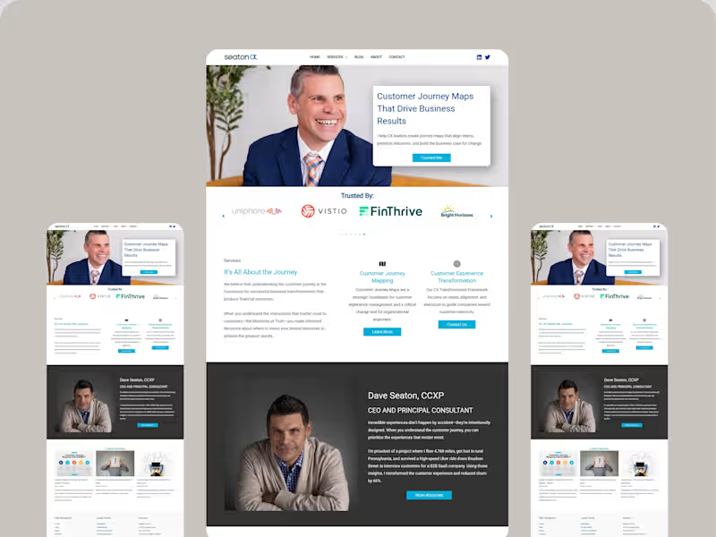
Kajabi Website Design for Executive Consulting & Journey Mapping
A comprehensive Kajabi website transformation designed for high-level business consultants. This project involved a strategic layout to highlight social proof through "Trusted By" logo sections, integrated blog functionality, and a clear service hierarchy. The design balances a professional corporate aesthetic with high-readability frameworks to convert cold traffic into discovery calls.
3
323


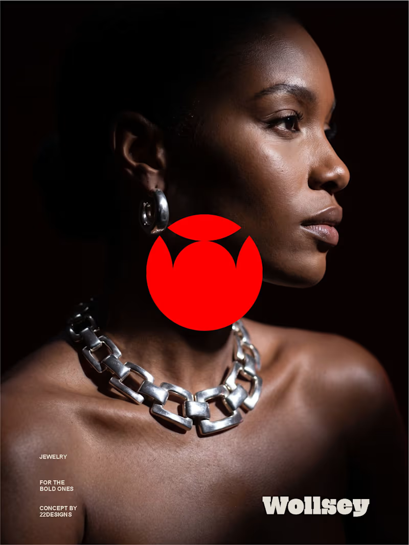
WOLLSEY - Jewelry for the Bold Ones
Wollsey is a jewelry brand built on one idea: bold jewelry should never blend in.
The identity centers on two interconnected principles; presence and permanence. The symbol takes the form of a solid, self-contained mark: a circular silhouette holding a crown-like negative space at its center, representing a piece of jewelry as an object of its own weight and status, not an accessory borrowed from someone else's trend cycle.
This concept carries through the entire visual system. The custom wordmark is built in a bold, condensed sans — compressed, confident letterforms that read as a stamp rather than a script, echoing the same solidity as the symbol itself.
The color palette pairs deep matte black with a controlled, high-impact red, balanced by warm cream and stone tones across packaging and supporting materials — a system built for contrast and attention rather than quiet luxury.
Full casestudy is coming soon
17
20
2.6K