
Sodiq Muftau
Logo & Brand Identity Designer, Product Designer
Ready for work
Sodiq is ready for their next project!
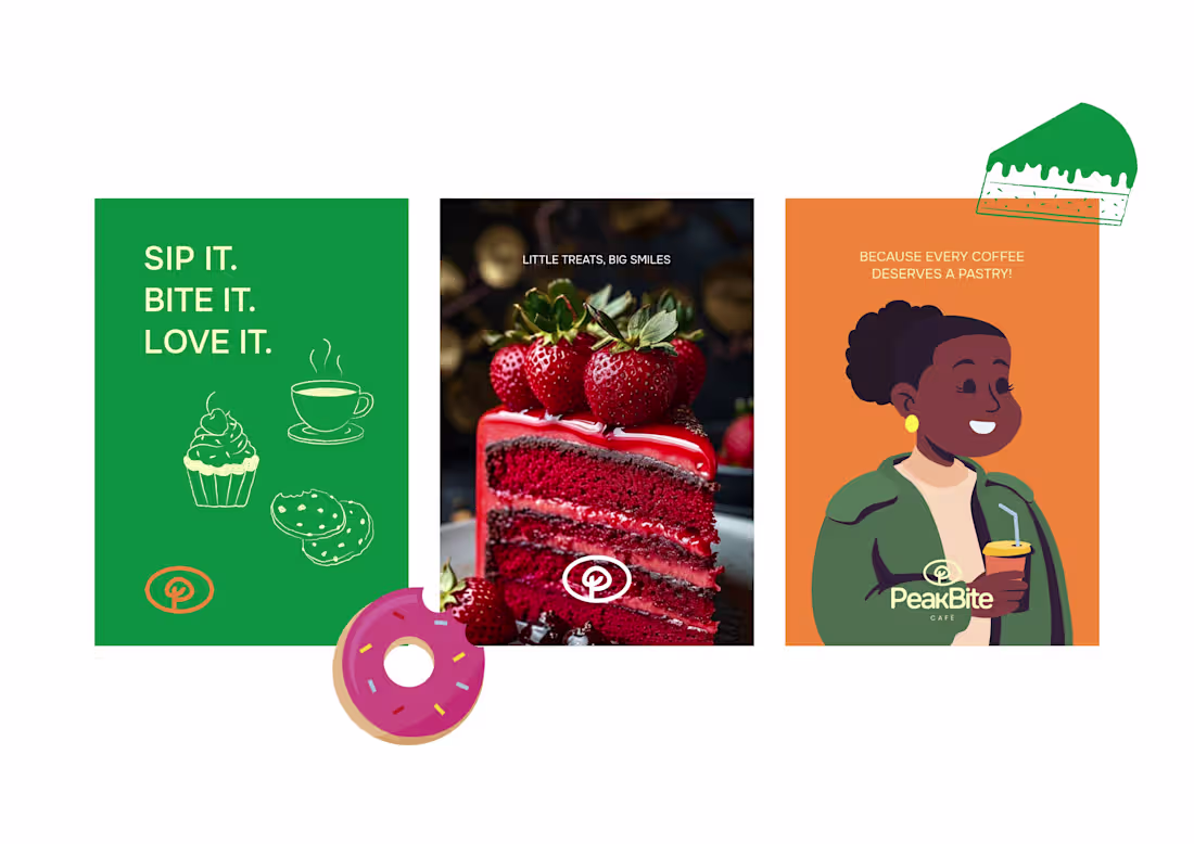
PeakBite Café is a modern café and bakery brand positioned around freshness, quality, and everyday indulgence. The brand is built to appeal to young professionals, creatives, and lifestyle-driven consumers who value taste and experience.
The logo mark is a thoughtful combination of the letter “P” from PeakBite and a coffee bean, seamlessly merged to create a distinctive and meaningful symbol. This fusion directly ties the brand name to its core offering, reinforcing instant recognition and relevance within the café and bakery space.
The circular enclosure enhances the feeling of completeness, and consistency, while also suggesting a plate or bite, subtly aligning with the brand’s food focus. This approach ensures the mark is not only visually appealing but also strategic, memorable, and scalable across all brand touchpoints.
2
56
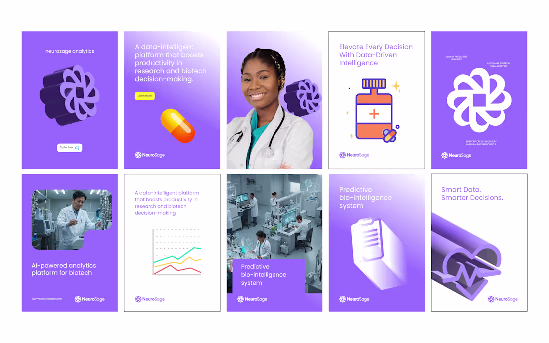
NeuroSage Analytics | Brand Identity & UI System
I designed the complete brand identity and visual system for NeuroSage Analytics, an AI-powered biotech platform helping pharmaceutical companies and researchers unlock predictive insights through data intelligence.
The focus was on creating a visual identity that communicates clarity, intelligence, and trust across branding and UI. The project included a custom logo inspired by neural networks, a cool-toned color palette, and futuristic UI dashboard designs built for clarity and usability.
This was a full-scope project covering brand strategy, design direction, and final visual assets. If you are building a startup, SaaS, or healthtech product and need a smart, credible brand, let’s create something impactful together.
2
49
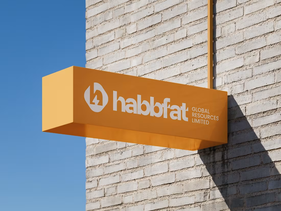
I designed the logo and brand identity for Habbfat Global Resources Limited, an electrical and renewable energy company, with a focus on clarity, reliability, and real world use.
The logo combines the brand initial H with a lightning bolt to represent power, energy, and efficiency. A circular form was used to communicate continuity, protection, and sustainability, reinforcing the idea of a complete and dependable system.
The identity was created to work seamlessly across construction sites, signage, corporate materials, and digital platforms. I also developed selected marketing designs to maintain consistency across all brand touchpoints.
Scope: Logo Design, Brand Identity, Selected Marketing Designs
3
2
62
Lian's Treat Logo design
The idea is to create something fun while service it purpose of a brand primary identity.
This project was fun and memorable
Full project on Behance: https://www.behance.net/gallery/237010583/Lians-Treats-Logo
Tool used: Adobe Illustrator for logo and presentation and Photoshop for mockups
2
47