The network for creativity
Join 1.25M professional creatives like you
Connect with clients, get discovered, and run your business 100% commission-free
Creatives on Contra have earned over $150M and we are just getting started
Back to feedPost
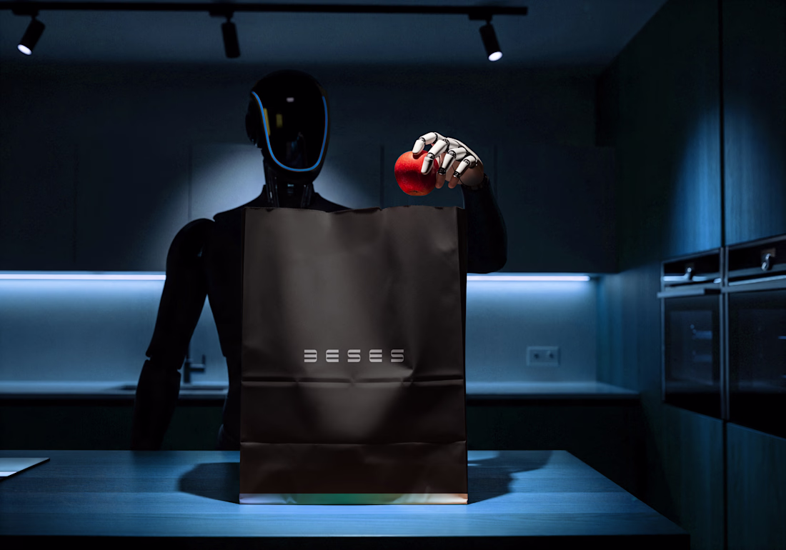
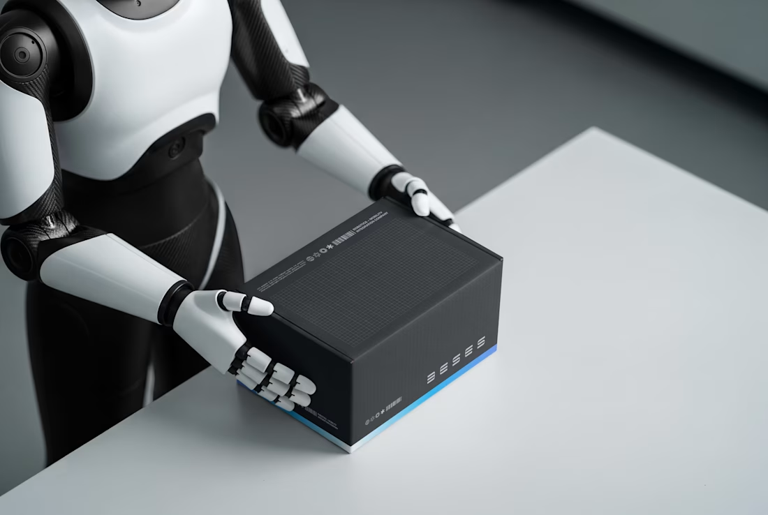
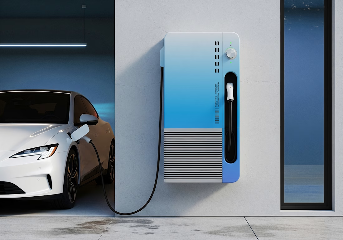
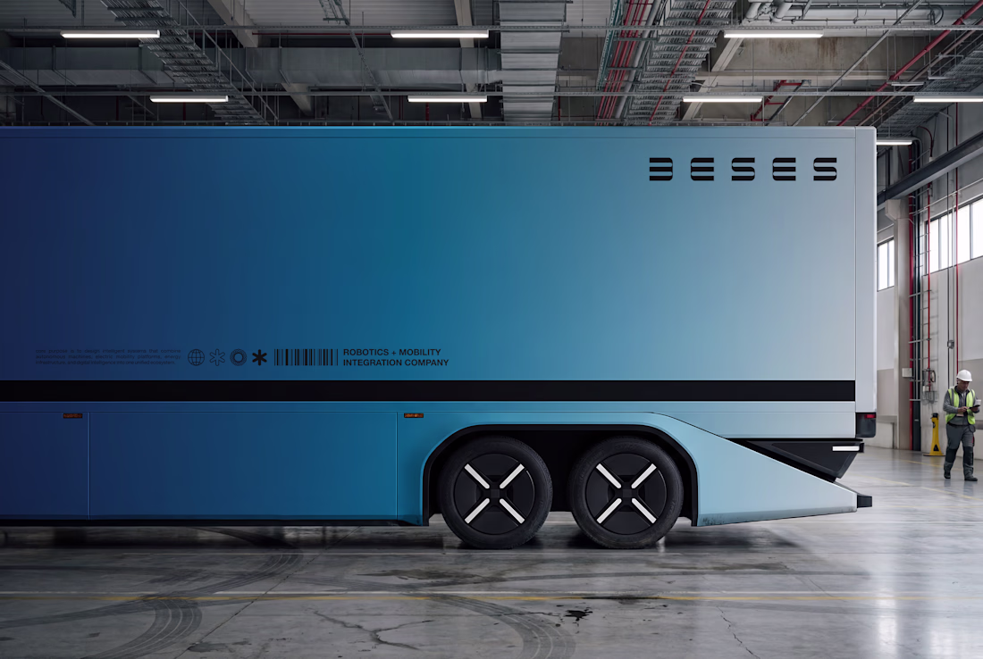
This isn’t a tech brand trying to look futuristic.
It’s a robotics company that looks exactly like what it builds; precise, repeatable, engineered.
Every line was constructed with intent.
Every curve balanced for tension and control.
Nothing added for aesthetics. Everything built for structure.
The symmetry is systematic.
The repetition is deliberate.
The geometry mirrors automation itself.
My role wasn’t just to design a logo.
It was to interrogate it, pressure-test it, and position it where it truly belongs.
From grid exploration to strategic direction, I shaped BESES into what it was always meant to be, a Robotics & Automation company built on logic, not trend.
roboticselectricvehiclelogodesignerBrand DesignLogo DesignGraphic DesignAdobe IllustratorAdobe PhotoshopCorelDraw
The network for creativity
Join 1.25M professional creatives like you
Connect with clients, get discovered, and run your business 100% commission-free
Creatives on Contra have earned over $150M and we are just getting started
Related posts
A New York-based founder of a large real estate consulting agency asked me to work on his rebrand.
He didn't want the look of a traditional agency. He wanted to convey the aesthetics and exclusivity of an ultra-luxury hotel.
His budget was $2,000 for "just a little logo touch-up".
But there is a misconception behind requests like this.
You don't get premium market positioning with just a simple logo tweak.
Visual authority is built on consistency.
If a brand looks "expensive" and reliable, it's because every single touchpoint, from the website to the business card, from the pitch deck to the agency's interior design, right down to the scent of the rooms, speaks the exact same language.
Taking an elegant logo and slapping it on an amateur website won't make you look like a luxury brand.
That’s why when I get these requests, I am brutally honest about the result they will get.
We can design a great logo, sure (and I love doing it). But an isolated logo will never justify the premium rates you ask of your clients.
To position yourself at the top, you need a complete and cohesive system.
True
Що ви думаєте про такий фірмовий стиль для кондитера?
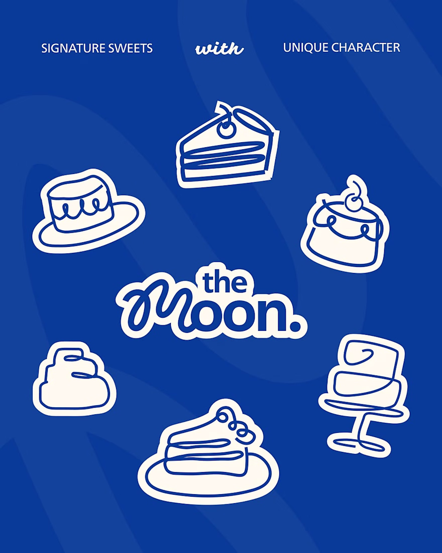
Легкий та витончений стиль 🦋
A simple logo. A strong identity. A brand built to be remembered. ✨🚀
Nice one!
Trending
Claude
Claude has entered the design space. How are you using Claude Design?
Contra University
Learn from expert creatives how to earn more using next-gen AI tools.
MagicPath
The canvas is infinite, and exploration is becoming the workflow. How are you using MagicPath?
creativeaiflow
Creative AI workflows are evolving. What tools do you use, and what are their strengths and weaknesses?
freelancerlife
Freelancer life is wins, pivots, and everything in between. What’s yours right now?