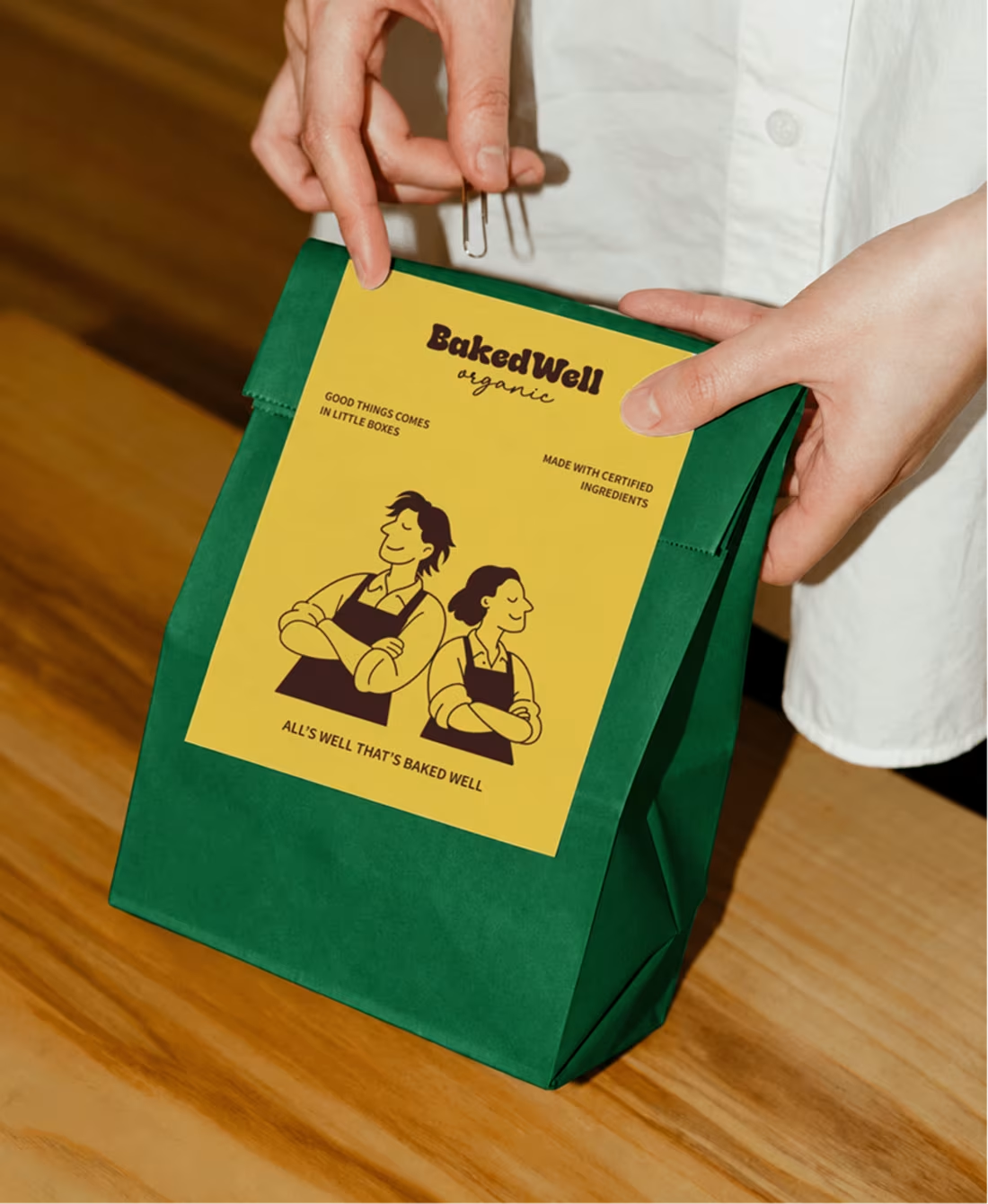
The idea was to create an identity that feels as warm and honest as the people behind the brand, while still standing out on the shelf.
The visual direction brings together bold colours, playful founder illustrations, and a touch of nostalgia to make organic baking feel approachable rather than overly serious.
Every element is designed to reflect brand’s philosophy: real ingredients, no shortcuts, and desserts worth coming back for.
3
4
312




Rocco's: Gelato Branding
What if your gelato brand felt like a whole little world?
My take on Rocco’s, a playful, nostalgic and a little unexpected, with hand-drawn characters, bold blue, cheeky copy and packaging designed to make you stop and look twice.
Because your product might be delicious, but your brand should make people curious enough to try it!!🩵
1
78