Digital illustration Projects in Netherlands
Digital illustration Projects in Netherlands
Sign Up
Post a job
Sign Up
Log In
Filters
2
Projects
People
Message
3
Alena Meshcheriakova
pro
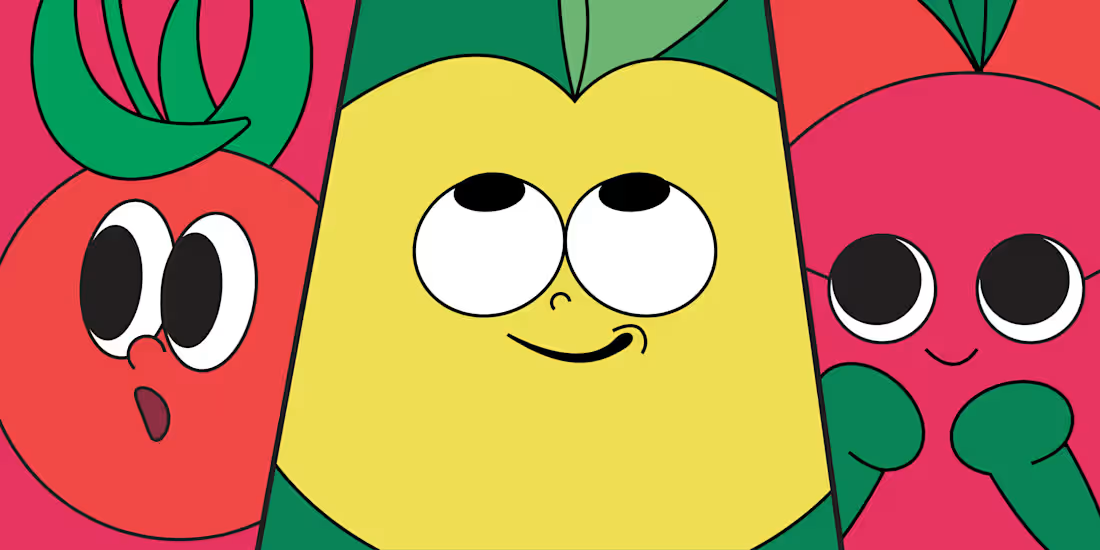
Brat-Tomat: A Playful Identity for a Gardening Brand
3
34
Message
5
Nina Kerkhof
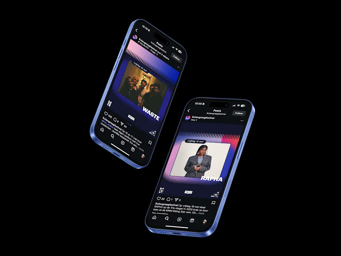
Ik Zie U Graag – Festival Visual Identity
5
71
Message
1
Rachel Cohen
pro
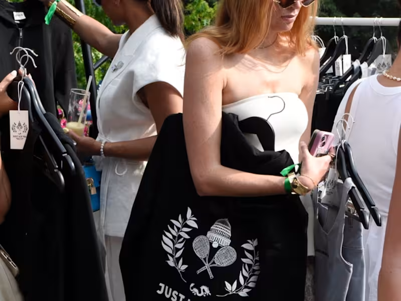
Influencer Merch Design for Sustainable CPG Brand
1
15
Message
0
Tjeerd Kruse
Motion Design Showreel – Client Work Selection
0
6
Message
0
Sayari Banerjee
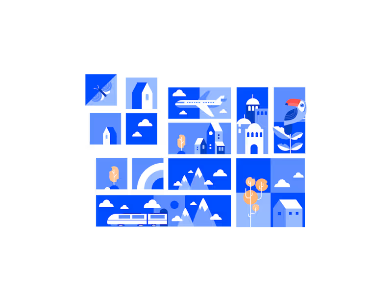
Digital Illustrations
0
8
Message
26
May | Brand designer, strategist & creative director
pro
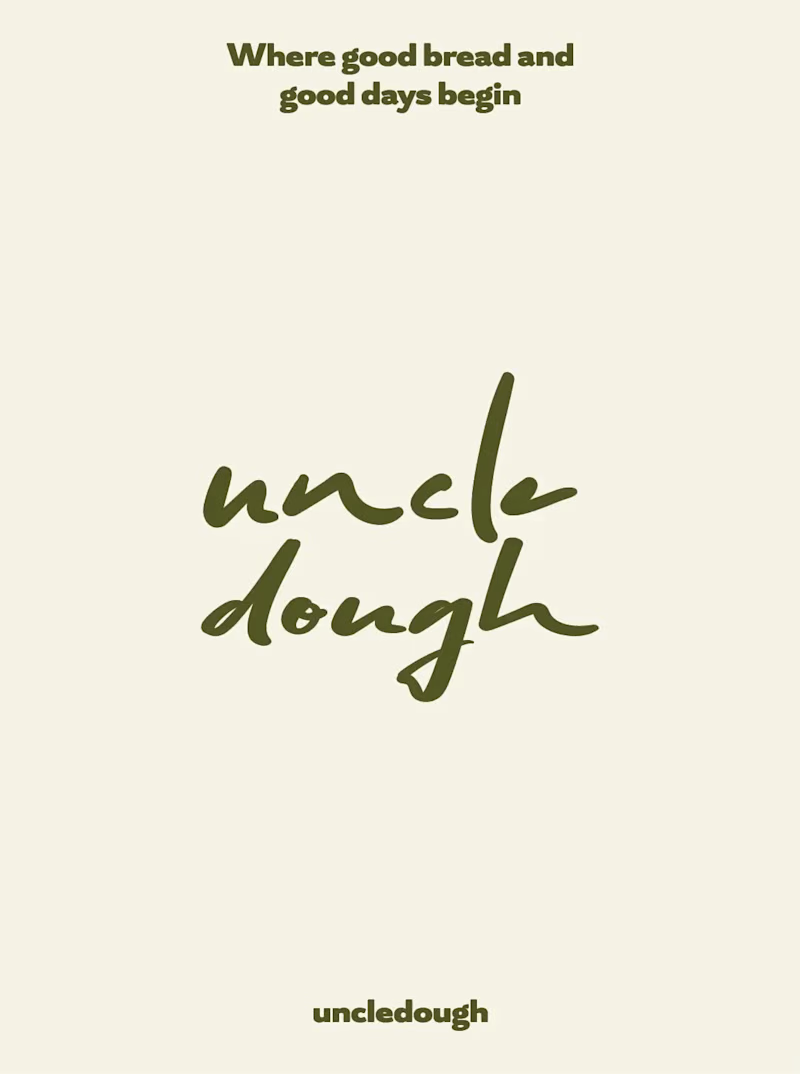
A warm little passion project I have been shaping between late-night coffee and early baked bread in the last 24 hours.🍞 Inherited by her uncle, the first spark of Uncle Dough. Taken in hand by the next generation of sourdough bakers✨
2
26
808
Message
5
Jasmijn Budding
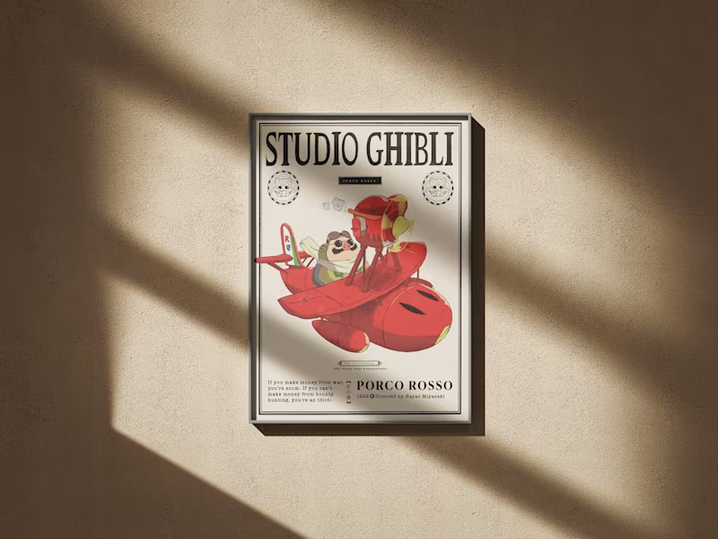
Porco Rosso - GRAPHIC DESIGN, ILLUSTRATION POSTER
5
49
Message
1
Carmine Papa
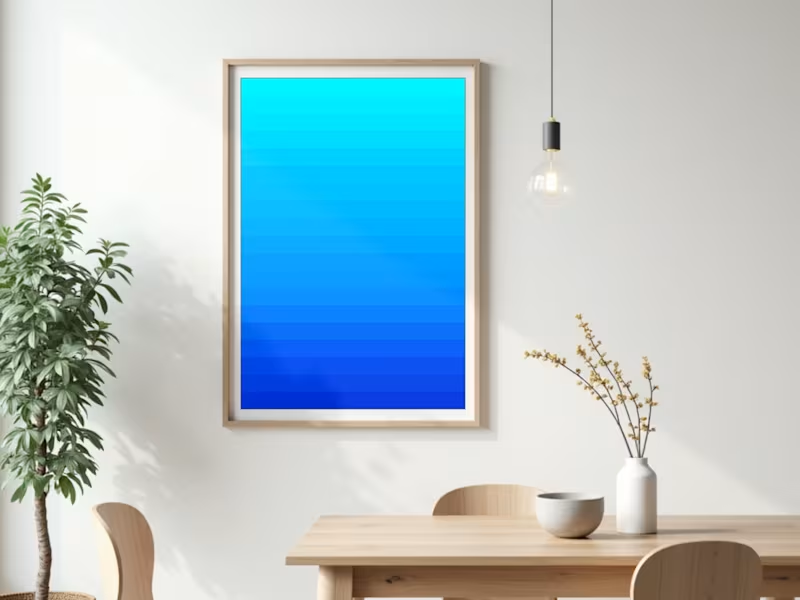
Azzurra is an original digital painting created in Procreate, available for sale through ARCh in multiple sizes and materials including canvas, aluminium, and plexiglass. The work invites the viewer into the serene beauty of sea and sky, blending into a harmonious gradient of blues that brings depth, warmth, and an endless horizon to any interior.
1
198
Message
3
Aleksey Ivanov
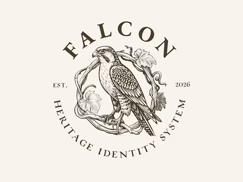
New drop: Falcon 🦅 — an exclusive, engraving-style brand identity system, for people who want their brand to look like it's been around since 1887 (even if it launched last Tuesday). Full pack: bird marks, 6 logo lockups, 4 monogram styles, frames, dividers — all in one moody, hand-illustrated system. The twist: this is an EXCLUSIVE license. The moment someone licenses it, it's pulled from sale for a full year. So if you buy it, your competitor literally cannot show up next month with the same falcon on their wine label. (We checked. It's not possible. We removed it.) $349/year. One buyer at a time. First come, first branded. 👉 https://contra.com/products/0yInhh9i-falcon-exclusive-heritage-brand-identity-system
3
264
Message
0
Bibi Han
pro
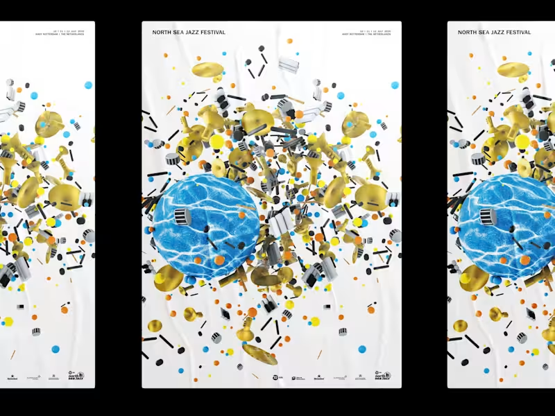
NSJ 2020 | Festival Poster + Merchandise Design
0
32
Message
0
Sami Mehraria
Welcome Package
0
8
Message
0
Nicole van Essen
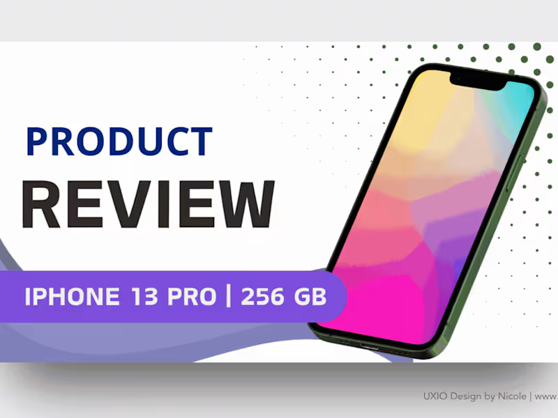
Digital Design: Social Media Banners & Thumbnails 🌟
0
34
Message
0
Ieva Berzina
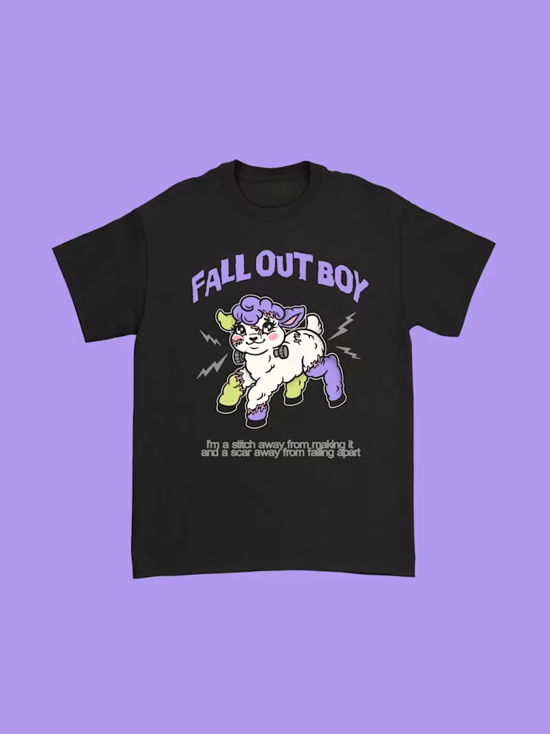
Halloween Merch for Fall Out Boy
0
2
Message
1
Zlatina Decheva
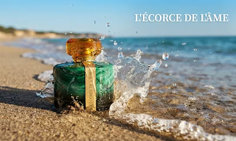
Every time I see the sunlight hitting the turquoise water, I think about the memory it leaves on the skin. I wanted to capture that precise moment where the elements collide: the raw, cooling salt of the ocean and the grounded, deep warmth of amber. I asked myself, "Can a fragrance feel like a sun-kissed horizon?" Meet L'ÉCORCE DE L'ÂME. L'Écorce de l'Âme isn't just a perfume; it’s a design study in duality. It starts with a cool, sharp rush of sea salt and bergamot , a crisp, modern surface ,before blooming into a heart of delicate jasmine and peppered freesia. Finally, it settles into an irresistible amber base, reminiscent of sun-drenched skin against the tide. As a product designer, I treated the bottle design as the "bark" , the solid, protective exterior that, when cracked open, reveals the "soul" of the scent within. It’s about the tension between the mineral and the organic, the stillness and the wave.
1
106
Message
0
Aron Koehoorn
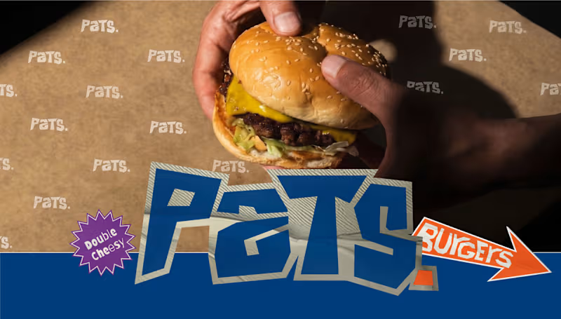
Pats. Smashed Burgers – Brand Identity & Street Food Design Services: Brand Identity, Packaging Design, Illustration, Menu Design, Vehicle Wrap Design About the Project Pats. Smashed Burgers needed a brand identity that hits as hard as their burgers. The goal was to create a bold, unapologetic, and highly recognizable street food brand. Drawing inspiration from retro fast-food culture and modern street aesthetics, I developed a comprehensive visual system that works everywhere—from greasy burger wrappers to a fully wrapped food truck. The Challenge The smash burger market is highly competitive. The challenge was to design an identity that cuts through the noise, communicates "no-nonsense authenticity," and feels instantly familiar yet totally unique to the Pats. brand. The Solution & Design Choices Logo & Typography: The custom wordmark features chunky, dynamic, and slightly jagged typography, giving it a raw, street-ready energy. Starburst stickers highlighting features like "Double Cheesy" add a playful, retro fast-food touch. Color Palette: I utilized a striking, high-contrast combination of bold navy blue, vibrant orange, and off-white. This creates a highly visible, appetizing aesthetic that stands out in urban environments. Character Illustration: To give the brand a friendly face, I designed "The Master Smasher"—a stylized, retro-inspired chef mascot with a prominent mustache, holding a spatula and a signature burger. This character adds personality and approachability. Packaging Design: The visual identity translates seamlessly into physical touchpoints, including custom-printed burger wrappers, checkered paper takeaway bags, and branded "SLURP." beverage cups. Menu System: I designed clear, appetizing digital menu boards that highlight their core offerings like "De O.G. Pats", "De Vegan Pats", and "De Spicy Smash" using the brand's signature typography and colors. Food Truck Wrap: To take the brand on the road, I designed a full exterior wrap for their food truck, utilizing the brand colors, checkerboard elements, and the mascot to serve as a rolling billboard. Deliverables Primary Logo & Typography Variations Custom Mascot Illustration ("The Master Smasher") Packaging Design (Wrappers, Bags, Cups) Menu Design & Digital Signage Food Truck Exterior Design Graphic Banners & Marketing Assets
0
57
Message
0
Get Sparked Studio
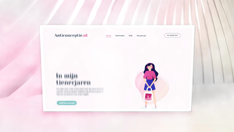
Organon is a global healthcare company with a strong focus on women’s health. One of its flagship public-facing initiatives is Anticonceptie.nl (http://Anticonceptie.nl), the Netherlands’ most widely consulted online platform for information on contraception. The platform functions as an authoritative and accessible resource, offering evidence-based guidance on contraceptive methods, effectiveness, side effects and decision-making support. Scope & Roll For the redesign of Anticonceptie.nl (http://Anticonceptie.nl), Organon commissioned Happy horizon to develop a completely renewed website, including its visual identity and digital experience. Within this multidisciplinary team, my role was to translate complex medical and educational content into a coherent visual language through illustration and animation. Visual System & Motion Design The illustrations were developed to clarify and humanize a wide range of sensitive and information-dense topics across the platform. Following positive client feedback on the static visuals, I proposed extending the system into motion by introducing short, looping animations. This approach was adopted across the site, allowing all illustrations to be animated in a subtle and functional manner. The resulting motion design enhances comprehension, adds rhythm to the interface and contributes to a more engaging, contemporary user experience without detracting from the platform’s informational credibility.
0
60
Explore projects