Freelance Brand Designers in Natore District
Sign Up
Post a job
Sign Up
Log In
Filters
2
Projects
People
Md Zahid Hasan Khan
Rajshahi Division, Bangladesh
I am a professional Brand Designer, I do all kind of Design
16
Followers
Follow
Message
I am a professional Brand Designer, I do all kind of Design
2
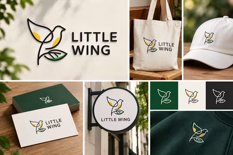
Fresh concept drop: Little Wing đđď¸ A minimal line-art logo mark combining a bird and leaf motif to represent freedom, nature, and growth. Clean, versatile, and modern. Thoughts on this design? đŹ#LogoDesign #Design #Branding #VectorArt #Minimalism #designerjahid
2
59
4
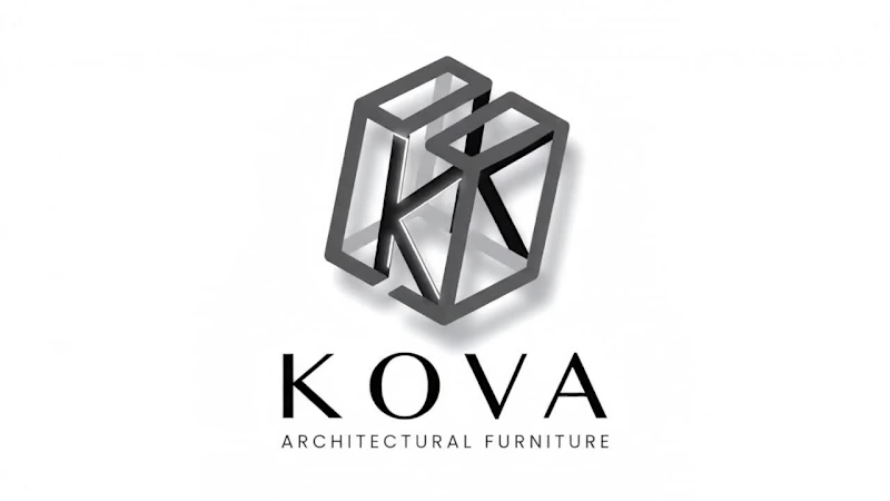
Discover the modern 3D geometric logo design for KOVA Architectural Furniture. Featuring an interlocking 'K' lettermark built on an isometric cube structure, this logo represents precision, architectural design, and luxury furniture branding. Ideal inspiration for architectural firms, interior designers, and luxury furniture brands. Designed by Designer Jahid.
4
4
284
1
KOVA Architectural Furniture â 3D Geometric Logo & Brand Identity Design Discover the modern 3D geometric logo design for KOVA Architectural Furniture. Featuring an interlocking 'K' lettermark built on an isometric cube structure, this logo represents precision, architectural design, and luxury furniture branding. Ideal inspiration for architectural firms, interior designers, and luxury furniture brands. Designed by Designer Jahid.
1
145
2
Excited to share this badge logo design created for BD World Traveler, a travel and adventure YouTube channel! The concept revolves around the essence of explorationâcombining rugged mountain peaks, vibrant coastal views, towering palm trees, and a lone hiker reaching new heights under a bold sun. Designed with clean vector lines and an energetic color palette to represent both land and ocean adventures.
2
2
202
Brand Designer
(34)
Follow
Message
Humaun Atelier
Natore, Bangladesh
Brand & UI/UX Designer â Design + Web Development
New to Contra
Follow
Message
Brand & UI/UX Designer â Design + Web Development
1
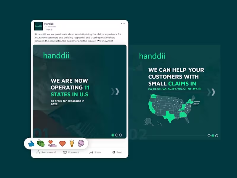
A LinkedIn carousel post designed for handdii, a company expanding across 11 U.S. states. The goal was to visually communicate their growth and service areas while maintaining their brand identityâusing their signature green (#00FF99), supporting colors, and a clean, modern layout. I incorporated the 2-letter state abbreviations (CA, TX, OH, GA, etc.) into the design, creating a map-like visual that immediately conveys the company's reach. The carousel structure allowed me to present the key messageâoperating in 11 states with more expansion comingâacross multiple slides, keeping each one clean, scannable, and on-brand. The design uses bold typography, consistent spacing, and a professional tone suitable for LinkedIn's audience, without relying on the logo since the post was published from the company page.
1
167
0
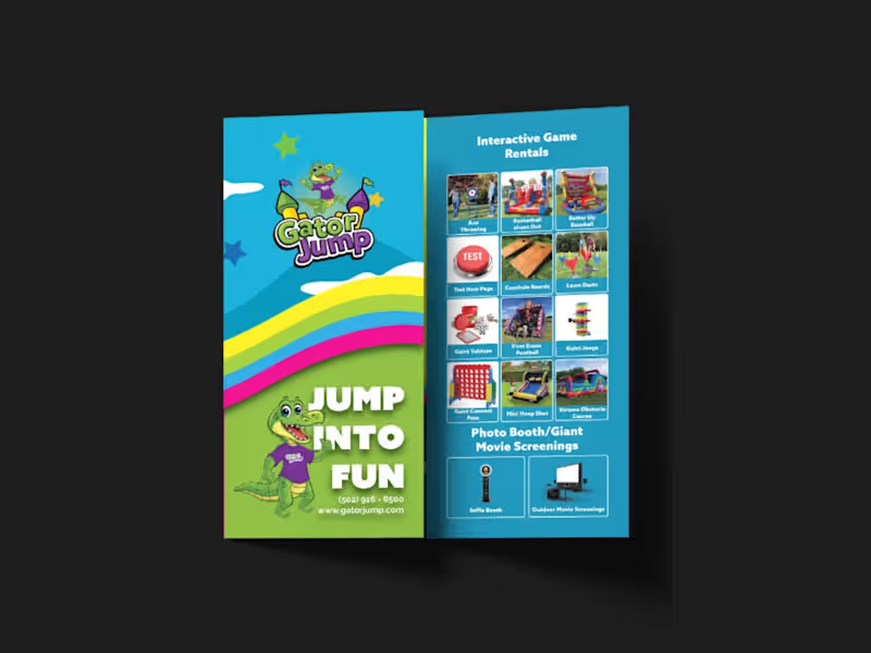
I designed a strategic, high-impact tri-fold brochure for Gator Jump, an event rental company transitioning its focus toward large-scale corporate clients, churches, and schools. The primary challenge was balancing a wide product catalogâInflatables (Bounce Houses, Slides, Obstacle Courses), Games, Photo Booths, and Giant Movie Screensâwhile distinctly guiding the viewerâs attention toward the premium, high-ticket items ideal for corporate events. To solve this, I applied a strict visual hierarchy on the A4 tri-fold canvas. Obstacle Courses, Slides, and Games were given prominent placement with large, dynamic visuals on the most visible panels (front cover and center-fold), while secondary services like Bounce Houses and Photo Booths were positioned strategically on the back and side panels to ensure visibility without competing for the spotlight. Visually, the client adored a specific rainbow gradient color palette, so I used it as the structural backbone of the designâallowing the colors to flow seamlessly across the front and back panels. This creates a cohesive, energetic brand experience and transforms the brochure from a simple price list into a professional statement. I paired this with bold, modern typography inspired by the Azo Sans family (avoiding their old website fonts as requested) to ensure high readability against the colorful backdrop. All required functional elements were integrated seamlessly: the logo and contact details on the front, categorized product grids inside, and a QR code, email, phone number, and the specific brand messaging on the back. The result is a print-ready, visually striking tri-fold brochure that captures the excitement of large events while maintaining the premium credibility needed to attract corporate clients.
0
186
1
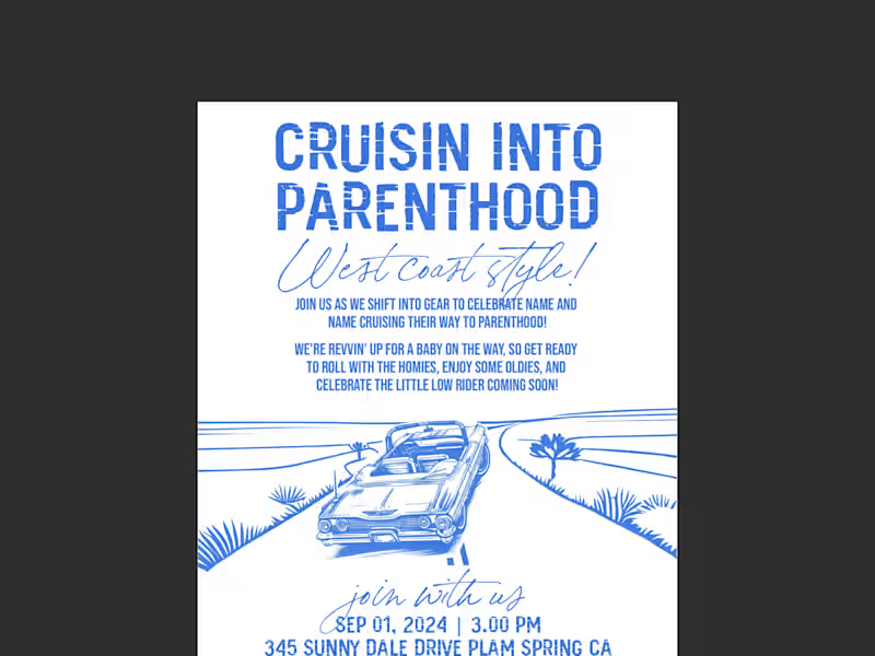
This project was a custom hand-drawn invitation design for a West Coast, lowrider-themed baby shower. The core challenge was beautifully balancing two seemingly opposing worldsâthe gritty, nostalgic aesthetic of 90s car club culture (lowriders, oldies, hydraulics, and cruising) with the soft, joyful innocence of a baby celebration. I leaned heavily into a hand-drawn illustration style to capture the authentic vintage feel of classic lowrider artwork. The composition centers on a lovingly detailed lowrider, but instead of standard rims, I infused baby elementsâlike a tiny rattle dangling from the rearview mirror and a crib-shaped 'bed' in the backâto bridge the two themes perfectly. I used a warm, sun-soaked West Coast color palette of pastel pinks, blues, and creams, contrasted with deep blacks and chrome greys to keep the 'car club' edge intact. Typography was crucial; I paired a bold, graffiti-inspired script for the title ('Cruisin' into Parenthood') to capture the urban vibe, with a clean, readable sans-serif for the event details to maintain clarity. I carefully laid out all the supplied verbiage ('Rims, rides, and rattles') using a classic cruise-night poster layout, ensuring the flow felt like a vintage event flyer. The result is a nostalgic, humorous, and deeply personal invitation that makes the parents-to-be feel seen as a couple, while celebrating the exciting journey ahead into parenthoodâproving that even a baby shower can have serious street cred.
1
185
2
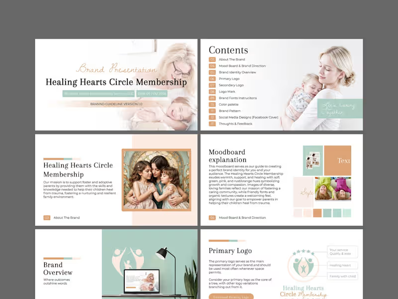
This is a comprehensive brand identity and guidelines project for Healing Hearts Circle Membership, a coaching service dedicated to supporting foster and adoptive parents. The mission is deeply emotional: to equip parents with the skills to help their children heal from trauma and build resilient, nurturing family environments. The design challenge was to translate this profound sensitivity into a visual language that feels warm, safe, and professionalânever cold or clinical. I began with a strategic moodboard to align on visual direction, anchoring the brand in soft green hues to symbolize growth and renewal, balanced with gentle pinks and rust/orange tones to evoke compassion and emotional warmth. I developed a versatile logo suiteâprimary, secondary, and a distinct logo markâto ensure the brand works cohesively across all touchpoints, from a website header to printed materials. Organic textures and friendly, approachable typography were selected to create a welcoming, community-driven feel. The full brand guideline document (Version 1.0) encapsulates the complete system: color palette, typography instructions, brand pattern, social media designs (Facebook cover), and actionable feedback sections. The visual narrative focuses on diverse, loving family imagery to reflect inclusivity. The final result is a nurturing, trustworthy, and cohesive brand identity that makes foster and adoptive parents feel seen, supported, and empoweredâturning the complex journey of healing into a beautifully structured visual story.
2
300
Brand Designer
(6)
Follow
Message
Md Suman Ali
Rajshahi, Bangladesh
Brand Strategist & Identity Designer for Property Developers
New to Contra
Follow
Message
Brand Strategist & Identity Designer for Property Developers
10
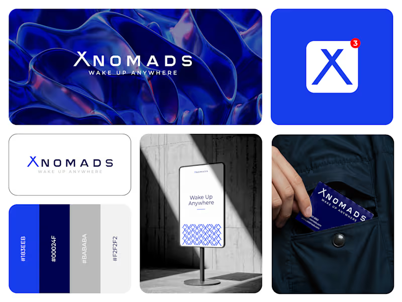
XNOMAD â Brand Identity Design! XNOMAD is a premium modular camper brand based in Scandinavia, offering both rental experiences and ownership of off-road pickup campers. The goal was to create an identity that could sit naturally between two worlds: Scandinavian minimalism + rugged outdoor capability. Rather than following the typical loud adventure aesthetic, we kept the system clean, modern, and confident, reflecting XNOMAD's idea of quiet luxury and freedom. The identity was built around a distinctive X, supported by a minimal wordmark, bold blue palette, typography, graphic patterns, and applications across digital and physical touchpoints. Wake Up Anywhere. One of those projects where simplicity did most of the talking.
9
10
110
1
The best part of any project? Is a happy client. Another project completed. Another kind testimonial. That reminds us why we love what we do. Thank you for trusting the Dizift team with your brand. Really grateful for these words and for the trust throughout the process. On to the next one.
1
77
0
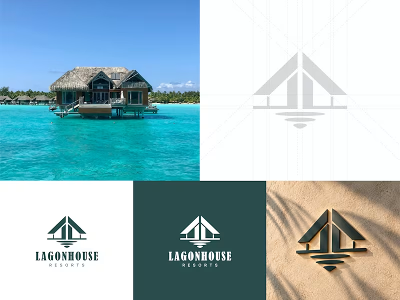
What if the view became the brand? That was the idea behind Lagonhouse Resorts. The symbol brings together the shape of a resort home, its architectural roofline, and the reflection of the property on water. Simple, calm, and designed to feel connected to the destination. Would love to hear your thoughts on this concept. đ #ResortBranding #BrandIdentity #LogoDesign #HospitalityBranding
0
47
1
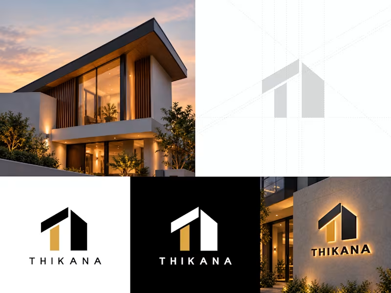
THIKANA, Real Estate Brand Identity design. THIKANA is a real estate identity concept built around one simple idea: a place to belong. The symbol brings together the shape of a home, architectural structure, the letter T, and the feeling of an entrance into one simple mark. The identity was designed to feel clear, memorable, and strong enough to work across property signage, print, and digital applications. This is an unused concept and is currently available for purchase. Services: Logo Design, Brand Identity, Visual Identity, Typography, Property Branding, Marketing Collateral.
1
61
Brand Designer
(9)
Follow
Message
Iqbal Hssain
Rajshahi, Bangladesh
Graphic Designer
Follow
Message
Graphic Designer
0
Packaging Design
0
3
0
Social Media Post Design
0
2
0
Amazon A+ Content Design
0
2
View more â
Brand Designer
(3)
Follow
Message
Alex sabbir Bibard
Ishwardi, Bangladesh
Logo designer graphics designer video editor
Follow
Message
Logo designer graphics designer video editor
0
Design Creation with Canva
0
5
0
Company logo design
0
1
0
1. "Brand Marks: Crafting Identity Through Logo Design
0
3
View more â
Brand Designer
(1)
Follow
Message
HD Design
Rajshahi, Bangladesh
Framer Expert building custom websites for businesses
7
Followers
expert
Follow
Message
Framer Expert building custom websites for businesses
3
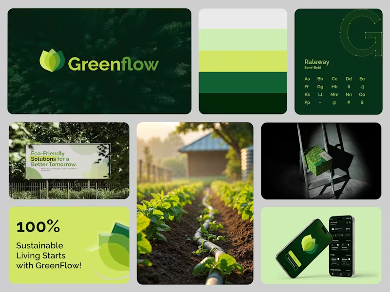
Sustainable Branding Design for a Greener Future Sustainable Design for a Greener Future. Brand Identity & UI for GreenFlow â an eco-conscious energy management system.
3
102
1
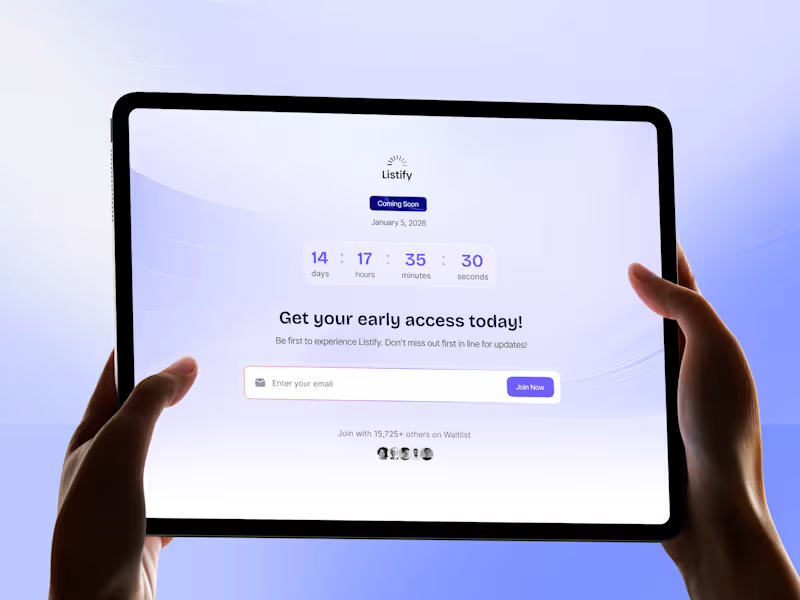
Listify | Modern Waitlist Template for SaaS Products.
1
141
3
Brand Designer (https://Framer Expert)
1
3
229
1
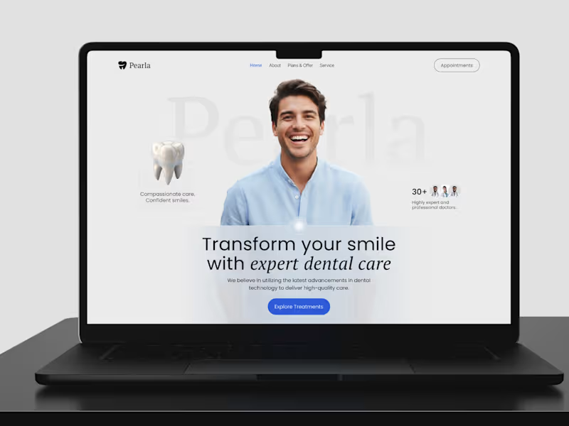
Pearla is a modern dental care brand that values comfort, expertise, and confidence. This design moves away from the usual cold, clinical vibe by using soft tones, inviting imagery, and balanced typography to create a trustworthy, approachable experience. Itâs all about making visitors feel cared for and at ease.
1
161
Brand Designer
(1)
Follow
Message
MD FARHAD ALI
Natore District, Bangladesh
Branding Specialist
5.0
Rating
Follow
Message
Branding Specialist
0
ACT OF LIFE MINIMALIST LOGO DESIGN
0
27
0
Pixellab App Icon Design
0
18
0
New Impact Media Logo Design
0
15
View more â
Brand Designer
(2)
Follow
Message
S. M. Abu Seyam
Rajshahi, Bangladesh
Graphic Designer
Follow
Message
Graphic Designer
0
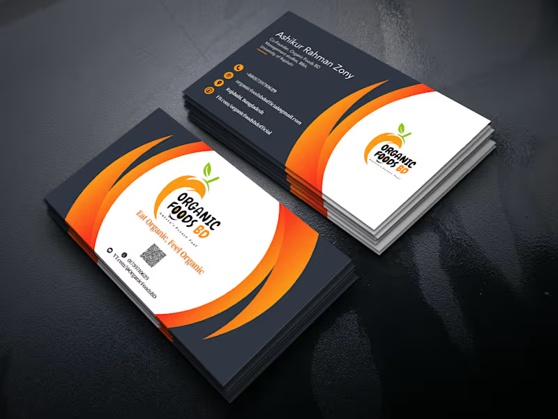
Logo design of Organic Foods BD
0
5
0
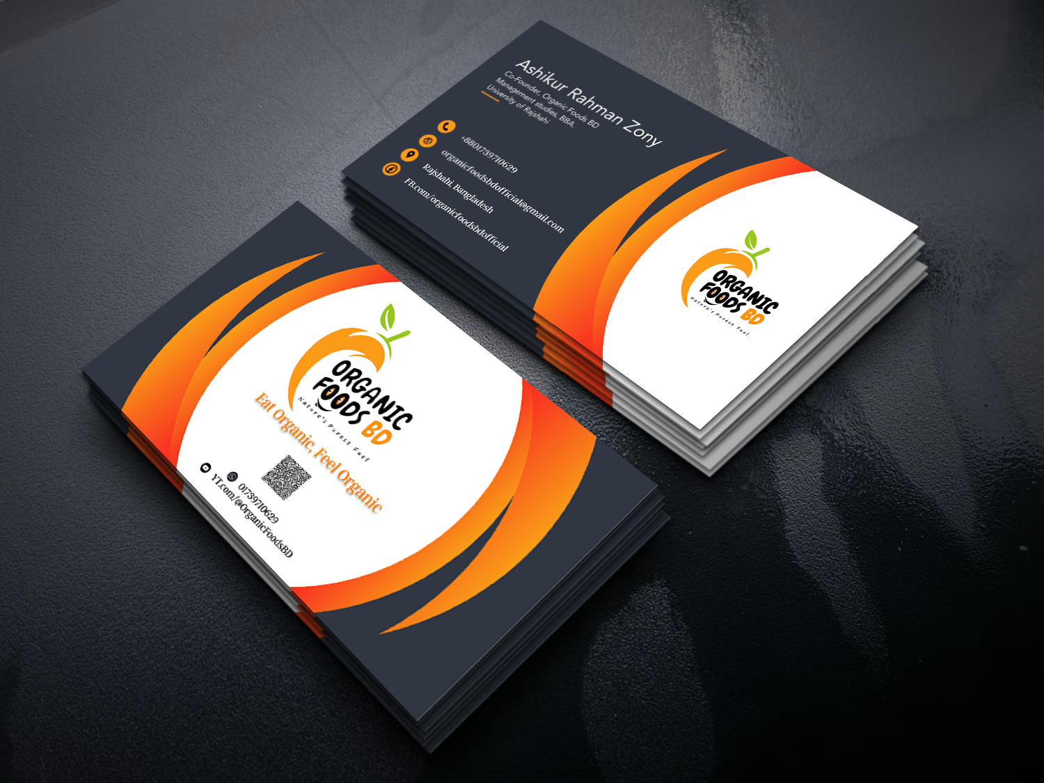
Business Card Design
0
9
0
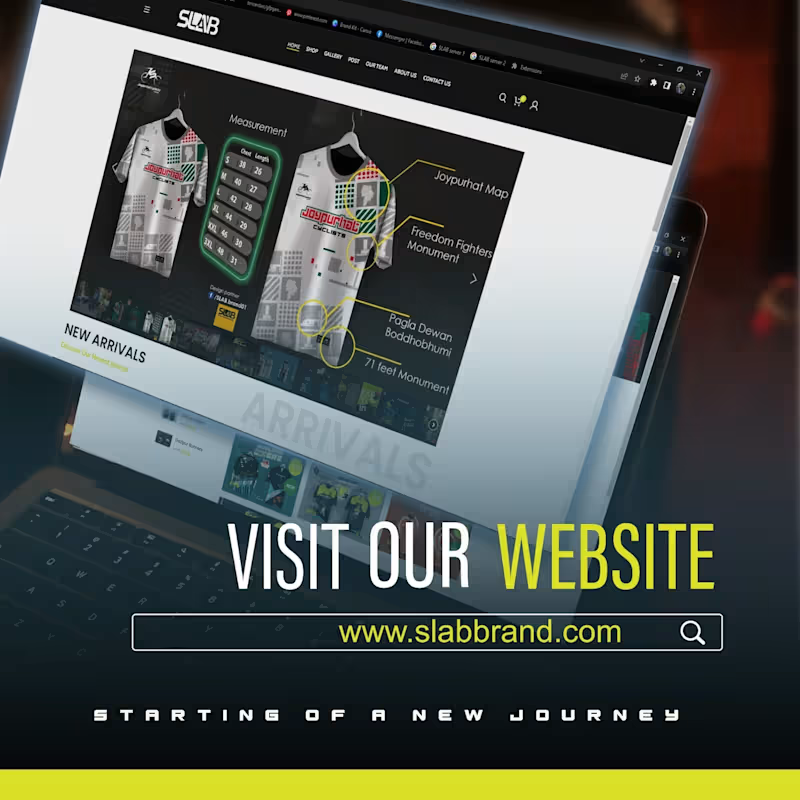
E-Commerce WP Website Design
0
7
View more â
Brand Designer
(1)
Follow
Message
Explore people