Freelancers using Figma in NatoreFreelancers using Figma in Natore
Shopify, CRO, GoHighLevel Automation & Landing Page Expert
    7x
    Hired
    5.0
    Rating
    35
    Followers
Shopify, CRO, GoHighLevel Automation & Landing Page Expert
Brand & UI/UX Designer — Design + Web Development
New to Contra
Brand & UI/UX Designer — Design + Web Development
Cover image for I designed a modern, clean,
I designed a modern, clean, and uplifting website for The Creek Pub and Grill, a restaurant situated within a prestigious golf club community. The primary challenge was to transform their existing online presence into a vibrant, standalone digital storefront that captures the warmth and energy of a premium pub experience—rather than feeling like an overlooked amenity page attached to the golf club. To achieve the client's specific request for a 'clean and happy' aesthetic, I built the layout around a bright, airy framework with generous white space, allowing the content to breathe. I balanced warm, earthy tones with vibrant accent colors (such as fresh greens and sunny yellows) to evoke positivity and stimulate appetite appeal. While the client allowed the use of stock imagery, I carefully selected high-quality photos that showcase the restaurant's inviting ambiance, signature dishes, and craft beverages to establish an immediate emotional connection with hungry visitors. The user experience was prioritized throughout the design. I ensured that the menu, operating hours, and contact/reservation details are prominently positioned above the fold, minimizing friction for potential guests. The visual hierarchy was carefully structured to guide the eye smoothly from a welcoming hero banner down to the restaurant's key offerings, encouraging casual visitors to convert into confirmed diners. The final design successfully bridges the gap between a casual, energetic pub atmosphere and the refined expectations of a country club clientele. It positions The Creek Pub and Grill as a must-visit dining destination, packaged in a scannable, high-converting, and genuinely 'happy' visual layout.
0
171
Product Designer & Developer | AI Web & Mobile Apps | Figma
    7
    Followers
Product Designer & Developer | AI Web & Mobile Apps | Figma
Cover image for East Coast Stone & Cabinets
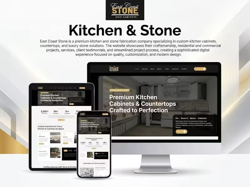
East Coast Stone & Cabinets Website Design & Development Overview East Coast Stone & Cabinets is a premium kitchen and stone fabrication business specializing in custom kitchen cabinets, countertops, and luxury stone solutions. The website presents the company's craftsmanship, services, and residential and commercial projects through a polished digital experience designed to build trust and encourage client inquiries. The Challenge The website needed to communicate the quality of premium kitchen and stone fabrication services while presenting project details and service offerings in a clear, professional format. The challenge was to balance visual appeal with practical business goals: showcasing craftsmanship, making services easy to explore, and helping potential customers take the next step toward a consultation. My Approach I focused on a modern, premium visual direction using a refined black, white, and gold color palette to communicate quality and sophistication. The layout emphasizes high-quality project imagery, clear service sections, strong typography, and prominent calls to action. Responsive layouts ensure the experience adapts to desktop, tablet, and mobile screens. Key Features Premium kitchen cabinet and countertop showcase Residential and commercial project presentation Dedicated service sections Responsive desktop, tablet, and mobile layouts Clear navigation and content hierarchy Prominent consultation and contact calls to action Brand-focused visual design My Role Website design and development, with a focus on presenting the brand professionally, structuring service information, and creating a responsive user experience. Specific responsibilities can be refined to reflect the work completed directly on this project. Tools & Technologies To be confirmed based on the actual project tools and technology stack. Outcome The project showcases a premium, responsive website concept that presents East Coast Stone & Cabinets' services and craftsmanship in a cohesive digital experience, with a clear path for prospective customers to explore services and make inquiries. Project Link https://ecstonemd.com Planning a website for your construction, interior design, or home improvement business? Send me a message on Contra.
0
129
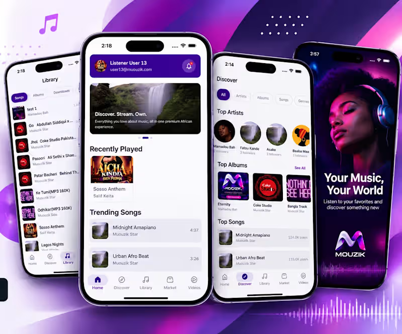
Cover image for MUOUZIK — Music Streaming &
MUOUZIK — Music Streaming & Marketplace Mobile App Overview MUOUZIK is a music-focused digital platform designed to connect listeners with artists, songs, albums, and music videos in one mobile experience. The platform brings music discovery, personal libraries, and music marketplace functionality together to create an engaging experience for music enthusiasts. The Challenge The platform needed a cohesive mobile experience that would make discovering music, exploring artists, managing a personal library, and accessing marketplace content straightforward. The key design challenge was organizing multiple music-related experiences into a clear, intuitive interface while maintaining a consistent visual identity. My Approach I focused on a modern, mobile-first interface with a distinctive purple visual identity, clear navigation, and structured content discovery. The interface organizes the experience into dedicated sections for home, discovery, library, marketplace, and videos. Content cards, artist profiles, album artwork, and song lists help users explore the platform without unnecessary complexity. Key Features Music discovery across artists, albums, songs, and genres Home dashboard featuring recently played and trending songs Personal music library for songs, albums, downloads, and favorites Artist and album browsing Dedicated marketplace section Music video discovery Mobile-first navigation and content layouts My Role Product design and development contribution focused on the mobile music platform experience. The specific responsibilities completed by me and any team contributions can be detailed according to the actual project scope. Tools & Technologies To be confirmed based on the tools and technologies used in the actual project. Outcome The project showcases a mobile music platform concept that brings music discovery, library management, and marketplace navigation into a unified interface. The screenshots demonstrate the proposed user experience and visual direction. Project Link https://play.google.com/store/apps/details?id=com.afrikora.app Interested in building a music streaming platform, artist marketplace, or custom mobile app? Send me a message on Contra.
2
1
255
Cover image for AI Small Talk ||
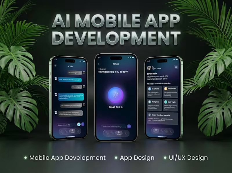
AI Small Talk || AI-Powered Mobile Communication App Overview AI Small Talk is a mobile communication app concept designed to make conversations more accessible, engaging, and natural through AI-powered interactions. It aims to help users practice everyday conversations, explore different topics, and improve their communication experience through an intuitive mobile interface. The Challenge Creating a conversational mobile experience requires more than a chat interface. The app needs to make interactions feel simple and approachable while helping users navigate conversations without unnecessary complexity. The key challenge is designing a user-friendly experience that encourages engagement and makes AI-assisted communication easy to access. My Approach The project focuses on a clean, user-centered mobile experience with an emphasis on intuitive navigation, accessible conversation flows, and a modern interface. The design and development approach prioritizes usability, clear information hierarchy, and a flexible foundation for AI-powered communication features. Key Features AI-assisted conversational interactions Simple and intuitive mobile communication interface Conversation-focused user experience Topic-based small-talk possibilities User-friendly navigation and interaction flows Mobile-first interface design My Role Product design and development, with a focus on translating the app concept into a practical mobile communication experience. Specific responsibilities and team contributions can be added to reflect the work completed on the project. Tools & Technologies To be confirmed based on the actual project stack. Only verified tools and technologies should be listed here. Outcome The project demonstrates a concept for making AI-assisted conversations more approachable through a focused mobile experience. The final outcome and current product status should be described according to the completed design, prototype, or live application. Interested in building a similar AI-powered communication app? Send me a message on Contra.
0
185
Graphic Design, UI UX Design, (Webflow & Framer) Website
New to Contra
Graphic Design, UI UX Design, (Webflow & Framer) Website
Brand Strategist & Identity Designer for Property Developers
    11
    Followers
Brand Strategist & Identity Designer for Property Developers
Webflow Premium Partner | Framer Expert |Designer 🚀
UI/UX | Web | B2B Leads | SEO | Google Ads | FB Ads | GA4
New to Contra
UI/UX | Web | B2B Leads | SEO | Google Ads | FB Ads | GA4
SEO & AI Workflow Specialist | Claude Code Expert

New to Contra
SEO & AI Workflow Specialist | Claude Code Expert
Cover image for I built my entire portfolio
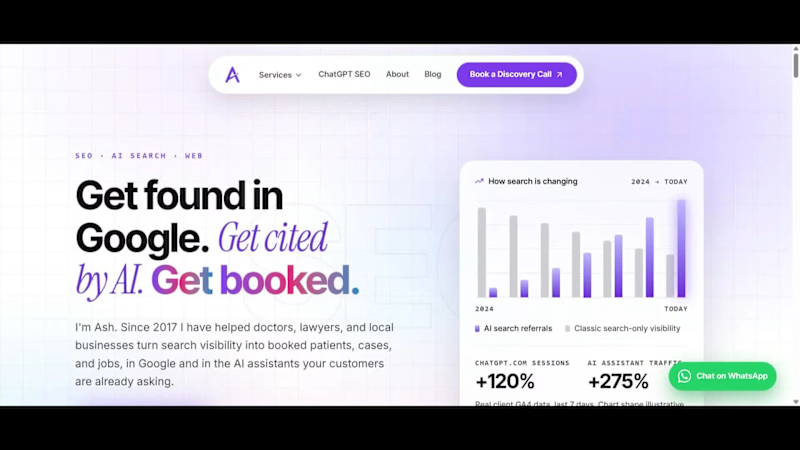
I built my entire portfolio site with 10 Lovable credits. Here's the exact workflow. Most people burn through Lovable credits fast because they try to build the whole thing inside Lovable, prompt after prompt after prompt. I don't. Here's how I kept it to 10. The workflow: Lovable + Claude Code + GitHub 1. Lovable for the scaffold only. One clean generation to get the project skeleton, routing, and a starting design. That is where the ~10 credits went, and that is the last time I spent any. 2. Claude Code does the real building. Every page, the whole design system, the content, the SEO, the performance work, all of it happens in Claude Code on my machine. No per-prompt credit meter running. 3. GitHub is the bridge. Claude Code commits and pushes straight to the repo. 4. Lovable auto-syncs from GitHub. The changes land back in Lovable with zero extra credits burned. So Lovable stays the front door and the deploy target, but the heavy lifting lives in Claude Code, where I am not paying by the prompt. What that actually produced (in the video): - A 15-page site where every page is an original design, not a template reskin - 100 PageSpeed on desktop, every category green - Built for AI search, not just Google. llms.txt, clean structured data, the full AEO setup - Self-hosted fonts, accessibility at 100, real Core Web Vitals work Live at hey-ash.com (http://hey-ash.com). Loveable Link: hey-ash.lovable.app If you are spending real money on Lovable credits, this is the unlock. Scaffold in Lovable, build in Claude Code, sync through GitHub. Happy to break down any part of it.
0
114