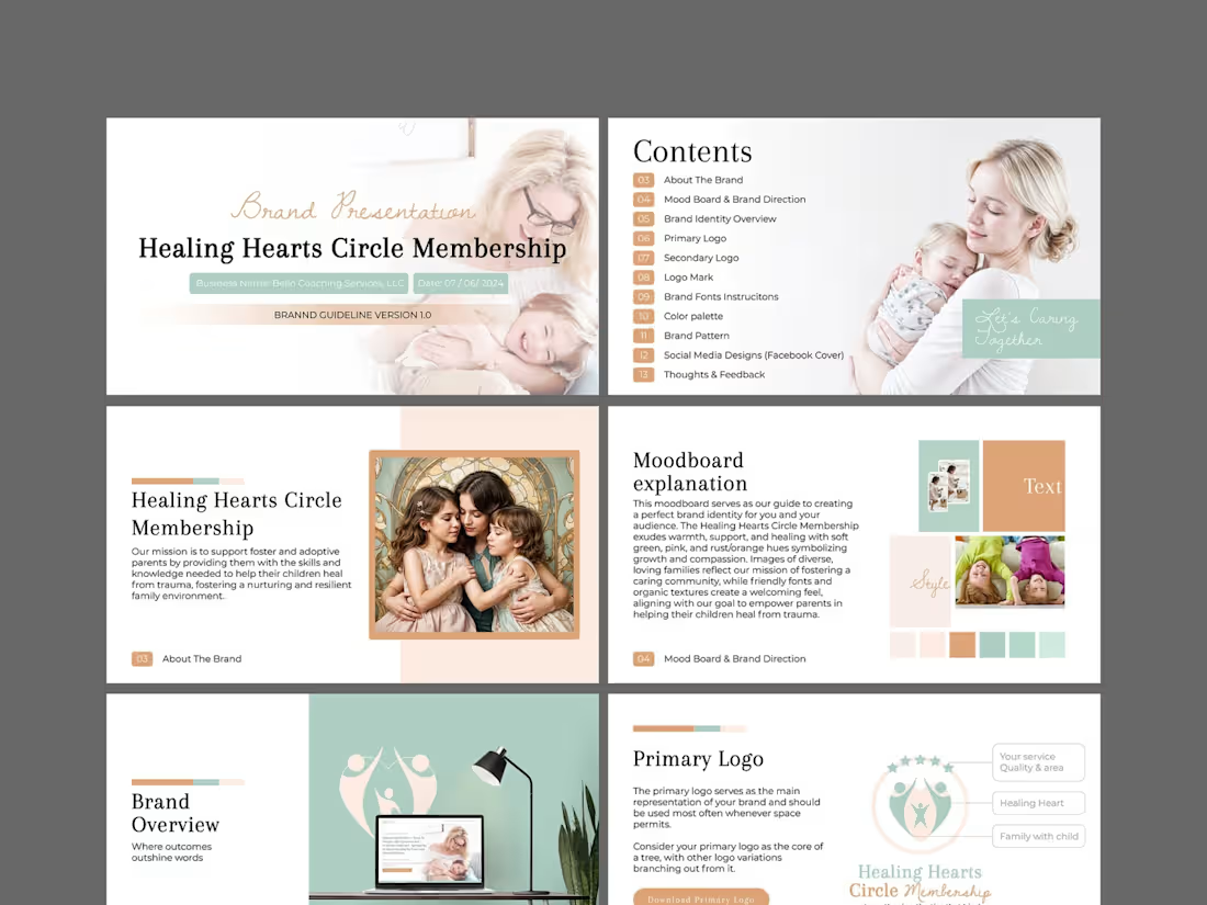
Brand Design Projects in NatoreBrand Design Projects in NatoreThis is a comprehensive brand identity and guidelines project for Healing Hearts Circle Membership, a coaching service dedicated to supporting foster and adoptive parents. The mission is deeply emotional: to equip parents with the skills to help their children heal from trauma and build resilient, nurturing family environments. The design challenge was to translate this profound sensitivity into a visual language that feels warm, safe, and professional—never cold or clinical.
I began with a strategic moodboard to align on visual direction, anchoring the brand in soft green hues to symbolize growth and renewal, balanced with gentle pinks and rust/orange tones to evoke compassion and emotional warmth. I developed a versatile logo suite—primary, secondary, and a distinct logo mark—to ensure the brand works cohesively across all touchpoints, from a website header to printed materials. Organic textures and friendly, approachable typography were selected to create a welcoming, community-driven feel.
The full brand guideline document (Version 1.0) encapsulates the complete system: color palette, typography instructions, brand pattern, social media designs (Facebook cover), and actionable feedback sections. The visual narrative focuses on diverse, loving family imagery to reflect inclusivity. The final result is a nurturing, trustworthy, and cohesive brand identity that makes foster and adoptive parents feel seen, supported, and empowered—turning the complex journey of healing into a beautifully structured visual story. XNOMAD — Brand Identity Design!
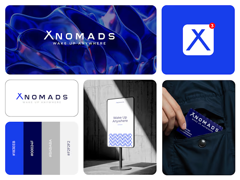
XNOMAD is a premium modular camper brand based in Scandinavia, offering both rental experiences and ownership of off-road pickup campers.
The goal was to create an identity that could sit naturally between two worlds:
Scandinavian minimalism + rugged outdoor capability.
Rather than following the typical loud adventure aesthetic, we kept the system clean, modern, and confident, reflecting XNOMAD's idea of quiet luxury and freedom.
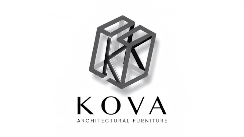
The identity was built around a distinctive X, supported by a minimal wordmark, bold blue palette, typography, graphic patterns, and applications across digital and physical touchpoints.
Wake Up Anywhere.
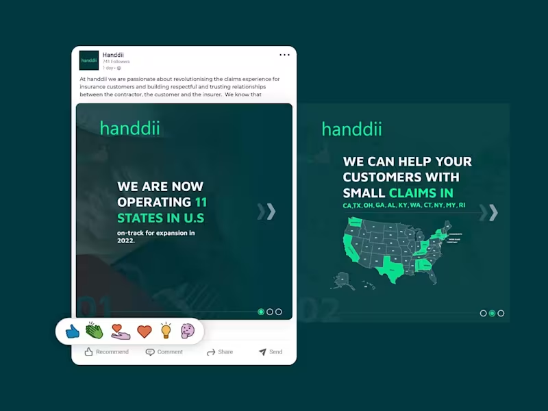
One of those projects where simplicity did most of the talking. A LinkedIn carousel post designed for handdii, a company expanding across 11 U.S. states. The goal was to visually communicate their growth and service areas while maintaining their brand identity—using their signature green (#00FF99), supporting colors, and a clean, modern layout.
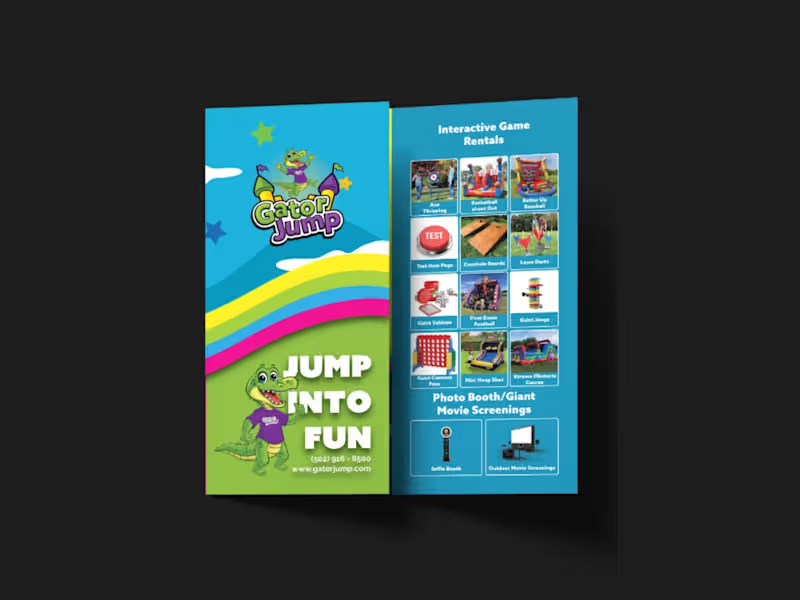
I incorporated the 2-letter state abbreviations (CA, TX, OH, GA, etc.) into the design, creating a map-like visual that immediately conveys the company's reach. The carousel structure allowed me to present the key message—operating in 11 states with more expansion coming—across multiple slides, keeping each one clean, scannable, and on-brand. The design uses bold typography, consistent spacing, and a professional tone suitable for LinkedIn's audience, without relying on the logo since the post was published from the company page. I designed a strategic, high-impact tri-fold brochure for Gator Jump, an event rental company transitioning its focus toward large-scale corporate clients, churches, and schools. The primary challenge was balancing a wide product catalog—Inflatables (Bounce Houses, Slides, Obstacle Courses), Games, Photo Booths, and Giant Movie Screens—while distinctly guiding the viewer’s attention toward the premium, high-ticket items ideal for corporate events.
To solve this, I applied a strict visual hierarchy on the A4 tri-fold canvas. Obstacle Courses, Slides, and Games were given prominent placement with large, dynamic visuals on the most visible panels (front cover and center-fold), while secondary services like Bounce Houses and Photo Booths were positioned strategically on the back and side panels to ensure visibility without competing for the spotlight.
Visually, the client adored a specific rainbow gradient color palette, so I used it as the structural backbone of the design—allowing the colors to flow seamlessly across the front and back panels. This creates a cohesive, energetic brand experience and transforms the brochure from a simple price list into a professional statement. I paired this with bold, modern typography inspired by the Azo Sans family (avoiding their old website fonts as requested) to ensure high readability against the colorful backdrop.
All required functional elements were integrated seamlessly: the logo and contact details on the front, categorized product grids inside, and a QR code, email, phone number, and the specific brand messaging on the back. The result is a print-ready, visually striking tri-fold brochure that captures the excitement of large events while maintaining the premium credibility needed to attract corporate clients.